

Creating toggle sets
This article describes how you can define toggle sets to enable switching the style of design elements or changing text strings. Toggle sets are defined in the JSON format, and you can create and edit them in the Customer's Canvas JSON editor or in any other editor that supports JSON validation and subsequent import.
Toggle set format
The JSON representation of a toggle set contains the following fields:
{
    "id": "some-unique-string",
    "name": "Human readable toggle set name",
    "toggles": [
        {
            "id": "unique-string-for-toggle",
            "name": "Human readable toggle name",
            "selector": ".classname",
            "colorParams | fontParams | textParams": { ... }
        }
    ]
}
The id property is used within the editor to reference the toggle programmatically. The toggle name will be displayed in the user interface and can be, for example, Primary Color or Add plaid mark. A selector describes which design elements the toggle will affect.
The toggles array contains descriptions of different types of toggles. Each toggle has a unified structure, but depending on its type, they have different parameters specified by:
colorParamsfor color togglesfontParamsfor font style togglestextParamsfor text toggles
Selectors
The selector syntax can resemble a very simplified version of CSS. It allows referencing elements in three ways:
- By specifying the name of a specific element.
- By specifying a unique ID preceded by the
#sign. - By specifying the class name prefixed with a period (
.).
Let's consider the following design.
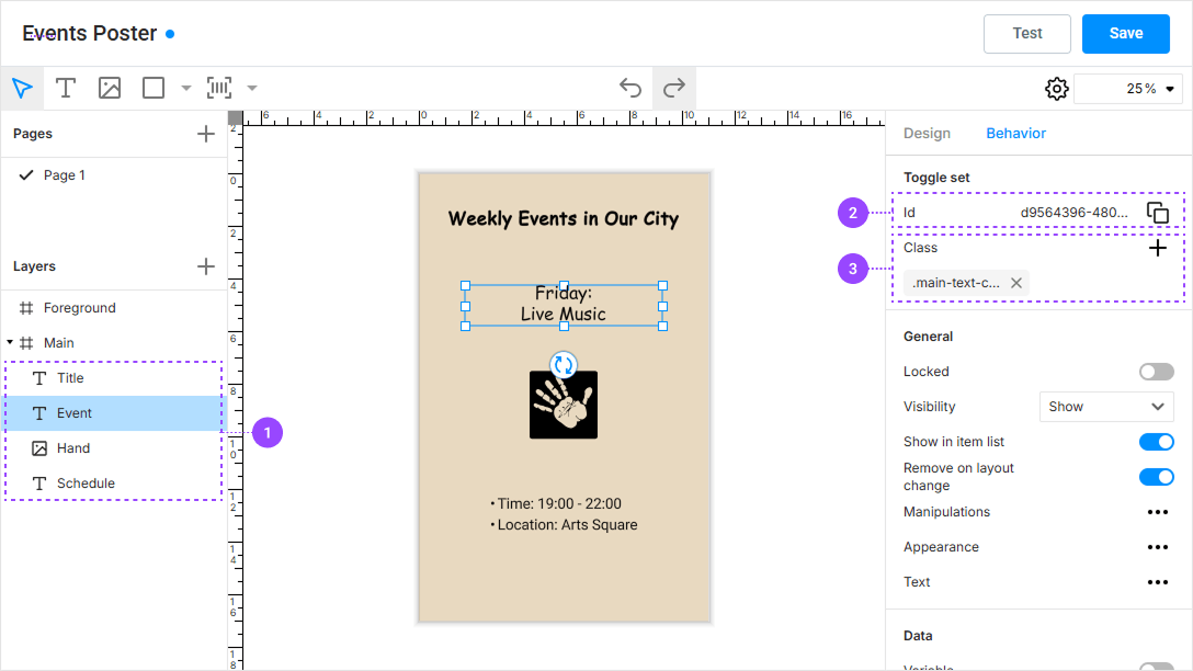
If we want to refer to the element Event, we can use the selectors:
Event#d9564396-4800-4d0e-a116-0685c881d10e.main-text-color
Multiple selectors can be combined by separating them with a space. In this case, the selection will include all elements that match at least one selector. For example, to select the Title and Event fields in the image above, you can use "#d9564396-4800-4d0e-a116-0685c881d10e Title" or "Event Title", etc.
To specify design element names in the selectors, avoid using names with spaces.
In practice, it is preferable to use classes, reusing the same classes across all your design. This allows using the same toggle set with different designs.
Types of toggles
Now let's look at the different types of toggles and their parameters.
Color toggle
This toggle allows selecting the color of elements from a list. It supports the following arguments:
items: An array of color samples.
Color samples are described by the following structure:
{
    "label": "Dodger Blue",
    "previewColor": "rgb(0, 144, 255)",
    "value": {
        "fillColor": "cmyk(100%, 44%, 0%, 0%)",
        "strokeColor": "cmyk(100%, 44%, 0%, 0%)",
        "color": "cmyk(100%, 44%, 0%, 0%)"
    }
}
The label specifies a human-readable name for the color, which may be displayed in the user interface. The previewColor property sets the color visible in the interface. Use the format rgb(0, 144, 255) for this property. The value object contains several color values applied to different types of elements: fillColor and strokeColor for shapes, and color for text color. If you do not want to change a property, just omit it. Values are also specified in string representation, according to the format described below.
Example:
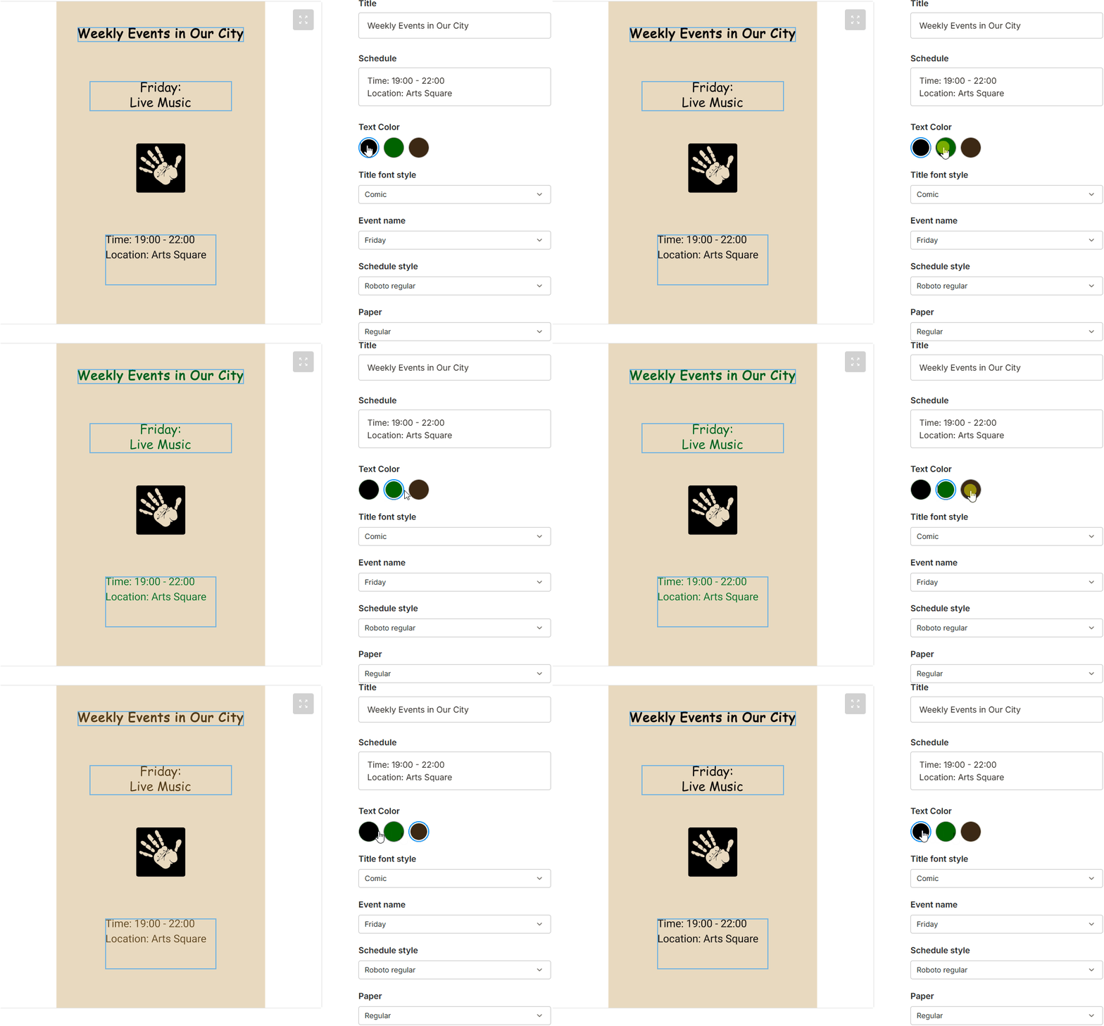
{
    "id": "some-unique-string",
    "name": "Human readable toggle set name",
    "toggles": [
        {
            "id": "main-text-color",
            "name": "Primary color",
            "selector": ".main-text-color Title Event",
            "colorParams": {
                "items": [
                    {
                        "label": "Green",
                        "previewColor": "rgb(0,100,0)",
                        "value": {
                            "color": "cmyk(100%,0%,100%,50%, 1.0)",
                            "fillColor": "cmyk(100%,0%,100%,50%, 1.0)"
                        }
                    },
                    {
                        "label": "Brown",
                        "previewColor": "rgb(60,40,20)",
                        "value": {
                            "color": "cmyk(0%,33%,67%,76%, 1.0)",
                            "fillColor": "cmyk(0%,33%,67%,76%, 1.0)"
                        }
                    }
                ]
            }
        }
    ]
}
When you don't specify all color properties, make sure each color sample has the same properties defined. If you don't, you might run into issues where only some properties update when switching toggle values. For example, the following definition would be incorrect:
[
    {
        "label": "Green",
        "previewColor": "rgb(0,100,0)",
        "value": {
            "color": "cmyk(100%,0%,100%,50%, 1.0)"
        }
    },
    {
        "label": "Brown",
        "previewColor": "rgb(60,40,20)",
        "value": {
            "color": "cmyk(0%,33%,67%,76%, 1.0)",
            "fillColor": "cmyk(0%,33%,67%,76%, 1.0)"
        }
    }
]
Font toggle
The font style toggle works like the color toggle but modifies only the font and other style properties. It accepts these arguments:
items: An array of style descriptions.
Each style description looks like this:
{
    "label": "Classic Style",
    "value": {
        "postscriptName": "ArialMT",
        "size": 16,
        "underline": false,
        "fauxBold": true,
        "letterSpacing": 100,
        "fontCaseRule": "uppercase"
    }
}
The "fontCaseRule" supports the "uppercase", "lowercase", and "original" values.
You can omit any style properties to keep them unchanged. However, it's recommended to use the same set of properties for all values within the same toggle.
Example:
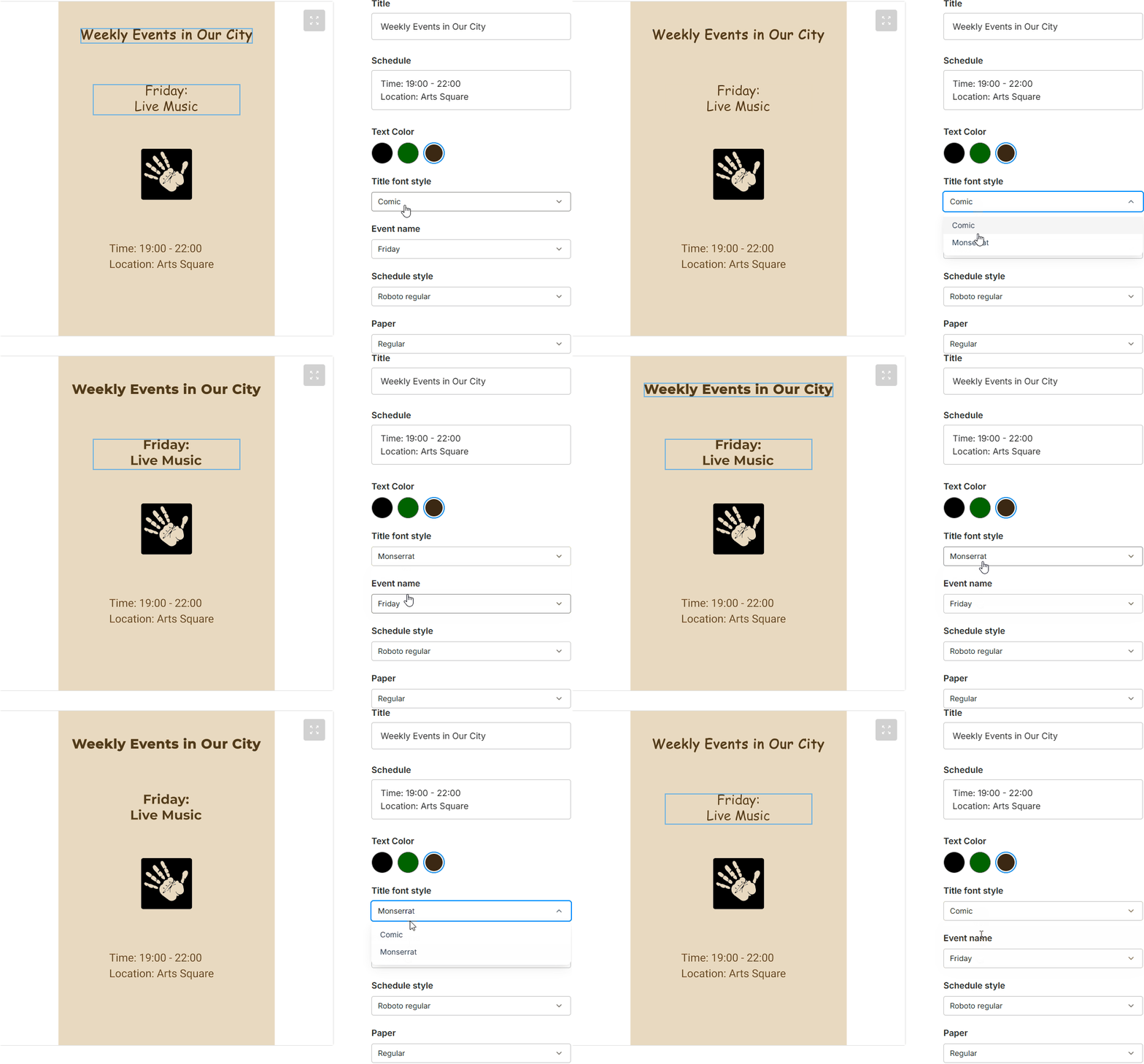
{
    "id": "some-unique-string",
    "name": "Human readable Toggle Set name",
    "toggles": [
        {
            "id": "main-font-style",
            "name": "Main font",
            "selector": ".main-style",
            "fontParams": {
                "items": [
                    {
                        "label": "Comic",
                        "value": {
                            "postscriptName": "ComicSansMS"
                        }
                    },
                    {
                        "label": "Monserrat",
                        "value": {
                            "postscriptName": "Montserrat-Bold"
                        }
                    }
                ]
            }
        }
    ]
}
Text toggle
This toggle allows changing the content of a text element either from a list or by entering custom text. It supports the following parameters:
allowCustom: Iftrue, allows entering custom text. Iffalse, restricts input to the list, which is the default behavior.items: A list of text strings.
Each text value description looks like this:
{
    "label": "Roman greeting",
    "value": {
        "value": "Ave, Caesar!"
    }
}
The text can use markup in Graphics Mill format, as described in the Advanced Formatted Text article.
{
    "label": "Roman greeting",
    "value": {
        "value": "<p><span>Ave, </span><span style='bold:true'>Caesar!</span></p>"
    }
}
For special characters, you can use their escaped versions:
<-\u003c>-\u003e&-\u0026"-\u0022
Example:
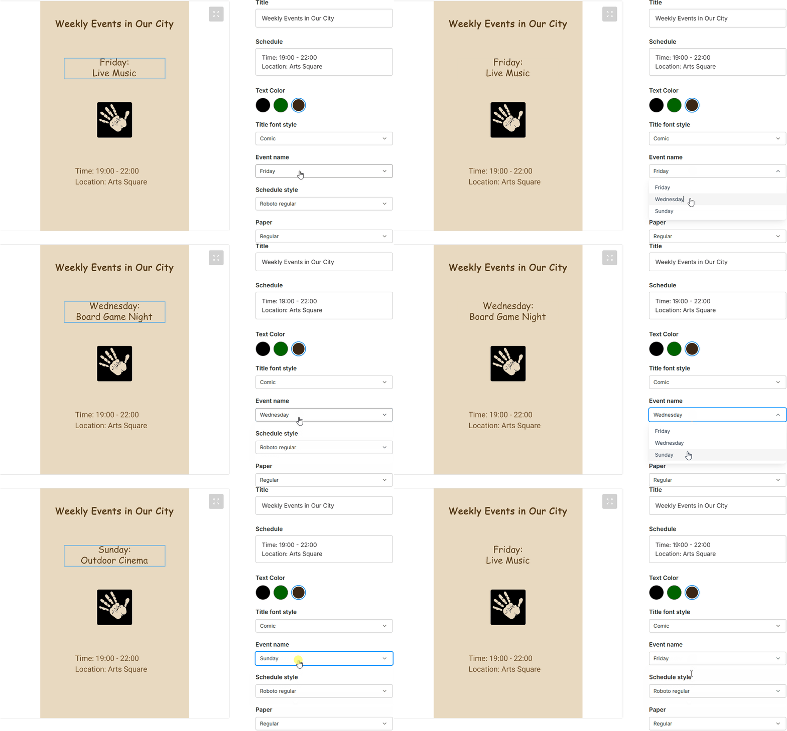
{
   "id": "some-unique-string",
   "name": "Human readable toggle set name",
   "toggles": [
       {
            "id": "event-text",
            "name": "Event name",
            "selector": "Event",
            "textParams": {
                "allowCustom": false,
                "items": [
                    {
                        "label": "Friday",
                        "value": {
                            "value": "Friday:\n Live Music"
                        }
                    },
                    {
                        "label": "Wednesday",
                        "value": {
                            "value": "Wednesday:\n Board Game Night"
                        }
                    },
                    {
                        "label": "Sunday",
                        "value": {
                            "value": "Sunday:\n Outdoor Cinema"
                        }
                    }
                ]
            }
       }
   ]
}
Defining colors
When defining colors in Customer's Canvas configuration files or API, you can use the RGB and CMYK color spaces, as well as Lab and spot colors. To learn about the representation of colors on a computer, refer to the Color Spaces article.
RGB Colors
Customer's Canvas supports both RGB and RGBA color models to display products. To define the alpha channel in RGBA, use values in the range [0, 1].
"rgb(0, 255, 255)"
"rgba(0,121,0,0.8)"
CMYK Colors
When you have CMYK templates, you may find it important to specify colors in the CMYK color space.
The following example illustrates how you can specify CMYK components and the alpha channel as percentages and values in the range [0, 1].
"cmyk(0%, 0%, 100%, 0%, 100%)"
"cmyk(0, 0.9, 0, 0, 1.0)"
Spot Colors
When you print certain products, you may want to limit the colors available to a user by a specific list of values, which correspond to the spot colors of your printer.
To add a spot color to the Color picker, define it in the following format: spot('Color name', altColor, solidity, tint). Here, you need to specify the name of the ink, an alternative color for the color preview, a solidity value in the range [0, 1], and a tint of the spot color, for example:
"spot(PANTONE Rubine Red C, cmyk(30%,100%,90%,36%,100%), 1, 100%)"
Lab Colors
To add a Lab color, you need to define its components as follows: lab(lightness, a, b, alpha). For example:
"lab(62, -44, -50, 50%)"