

Handy Editor
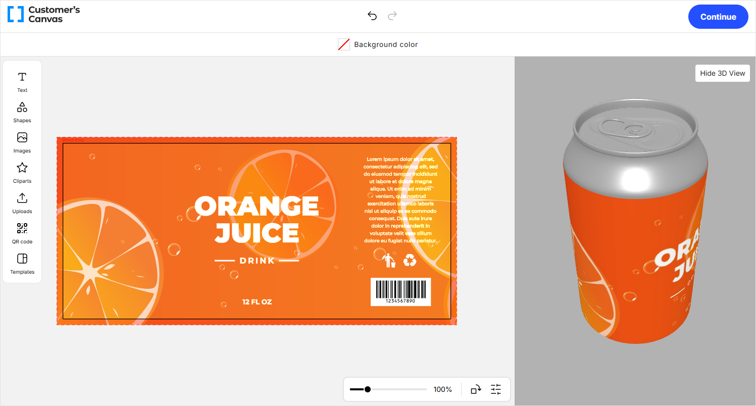
Use this section to embed the Handy Editor into your storefront, initialize it with product data, and handle customization results. The Handy Editor is a WYSIWYG editor for freehand design editing — your customers can create designs from scratch or customize templates without rigid constraints.
The editor is available in two versions: the base version au-handy-editor and a version with 3D preview support au-handy-editor-3d. Both versions share the same settings and customization options. In the 3D version, the init and update methods take IHandyEditor3DConfiguration, which extends IHandyEditorInitArgs with 3D viewer settings.
What you can do
- Add the Handy Editor to a web page and configure it with a workflow file.
- Load products by PIM data, product reference, or design ID.
- Connect external image storage and AI tools for background removal, upscaling, and text-to-image generation.
- Customize the editor's appearance with CSS variables and embed your own HTML through slots.
- Localize the interface and override default text labels.
- Receive customization results and save them as private designs.
Recommended path
If you are integrating the Handy Editor for the first time, follow these pages in order:
- Quick start — launch the editor with minimal configuration.
- Initialization — learn all supported initialization scenarios.
- Input — choose the right way to pass product data.
- Settings — configure features, tools, and validation rules.
Section map
- How-to guides — step-by-step instructions for common integration tasks:
- Initialization — add the editor to a page and pass the configuration.
- Input — choose how to load products into the editor.
- External storage — connect an external image source.
- Connecting AI tools — enable background removal, upscaling, and text-to-image.
- Localization — change the interface language and override labels.
- Slots — embed your own HTML into the editor.
- Reference — complete reference for configuration and APIs:
- Settings — all feature flags and configuration sections.
- Resources — additional data such as image library folders.
- Styling — CSS variables for customizing the appearance.
- Output data — the structure of customization results.
- Web component API — methods and events of the component.
- Plugin API — the API for building plugins.
- Desktop and mobile feature comparison — which features each version supports.