Resources
- Last updated on March 25, 2026
- •
- 1 minute to read
Resources are supplementary data used to help users personalize designs. Unlike input data, these elements remain unchanged by the user. In contrast to settings, resources do not influence the editor's functionality.
Resources are organized into the following sections:
{
    "resources": {
        "quantity": {},
        "productImages": []
   }
}
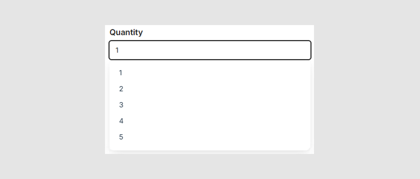
Quantity control
The Quantity control can appear either as a pre-defined list or as a free-form numeric input field. To enable the list mode, set the quantity.type property to "list" within the settings. Then, specify its values through the quantity.list array.
{
    "resources": {
        "quantity": {
            "list": [1, 2, 3, 4, 5]
        }
    }
}
Using this example, you can limit selections to between one and five items. If no custom values are provided, the default options — [1, 5, 10, 20] — will be displayed instead.
Product images
The paginator near the viewer can display thumbnails of design and product images, allowing the user to list and browse them in the viewer. To enable product images, add them through the configuration.
{
    "resources": {
        "productImages": [
            {
                "url": "https://example.com/front.jpg",
                "title": "Front View"
            },
            {
                "url": "https://example.com/side.jpg",
                "title": "Side View"
            }
        ]
    }
}
For example, if you have a two-sided product, this configuration will add two product images to the paginator.

Note
When you have defined product images, you can enable a viewerless mode to display only the images. To do so, set settings.designViewer.noViewerMode to true.