Icons
- 2 minutes to read
In this article, you can learn how to customize icons in the Design Editor, like replacing them in the Toolbox or Asset manager, for example.
Replacing icons in the interface
The Design Editor has widgets that allow you to replace icons through the editor config. They are the Toolbox, through which the user can perform actions, and the Asset Manager, where you can define tabs for different image sources.
To specify an icon in the Design Editor, you need to set its class name to the iconClass property in the editor configuration.
{
    "widgets": {
        "Toolbox": {
            "buttons": [
                {
                    "translationKey": "Toolbox.IMAGE",
                    "translationKeyTitle": "Toolbox.TITLE_ADD_IMAGE",
                    "iconClass": "cc-icon-add-image",
                    "action": "Image"
                }
            ]
        }
    }
}
Getting the list of standard icons
To display icons, the Design Editor uses glyphs of TTF, WOFF, and WOFF2 fonts.
In the distribution package, you can find \Resources\Generated\{version number}\design-editor-theme-aurum.css containing definitions of all CSS classes of icons. When you open this file, you can find the following icon classes used in the Toolbox:
.cc-icon-add-image:before,
.cc-icon-add-text:before, ... {
    font-family: 'new-cc-icons' !important;
}
.cc-icon-add-image:before {
    content: '\f101' !important;
}
.cc-icon-add-text:before {
    content: '\f103' !important;
}

.cc-icon-background {
    font-family: "Material Icons Extra";
}
.cc-icon-background:before {
    content: "\eb62";
}
According to this definition, the Add image and Add text icons are in the new-cc-icons font, and the Background is in MaterialIcons-Regular-Extra. The classes refer to the glyphs by their character codes: f101, f103, and eb62. If needed, you can select other glyphs from these fonts.
Getting the glyph numbers in font files
You may want to see which glyphs are in the font file and find their codes. To do so, you need to open your font file in an editor, for example, FontForge or an online service for working with icons.
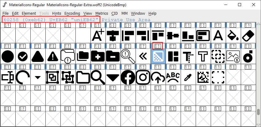
If there are glyphs in the file that you would like to use, but they are not in CSS, you can add them yourself and connect this CSS through customStyle. In the next paragraph, we will give an example of this technique.
For reference, you can download fonts with standard icons of the Design Editor.
Using custom fonts
You can also create custom glyphs to implement new icons. Although the Design Editor works with icons in TTF, WOFF, and WOFF2 formats, you can only use icons in the WOFF2 file to display them in modern browsers. Then, you can apply icons through custom styles. For example, let's assume that you have created a new glyph in a my-icons font to add images.
First, add your font my-icons.woff2 to the \Configuration\customCss\ folder.
Then, create a CSS file, for example, my-styles.css, in that folder:
@font-face {
    font-family: 'my-icons';
    src: url("my-icons.woff2") format("woff2");
}
.cc-icon-add-image:before {
    font-family: 'my-icons' !important;
    content: '\100' !important;
}
Finally, pass your styles in the editor configuration:
let editorConfig = {
    customStyle: "my-styles"
};
let editor = await CustomersCanvas.IframeApi.loadEditor(
    document.getElementById("editorFrame"), product, editorConfig);