UI themes
- Less than a minute to read
Design Editor supports several visual themes and you can choose between them using the editor's configuration. This topic explains how you can do that.
Supported themes
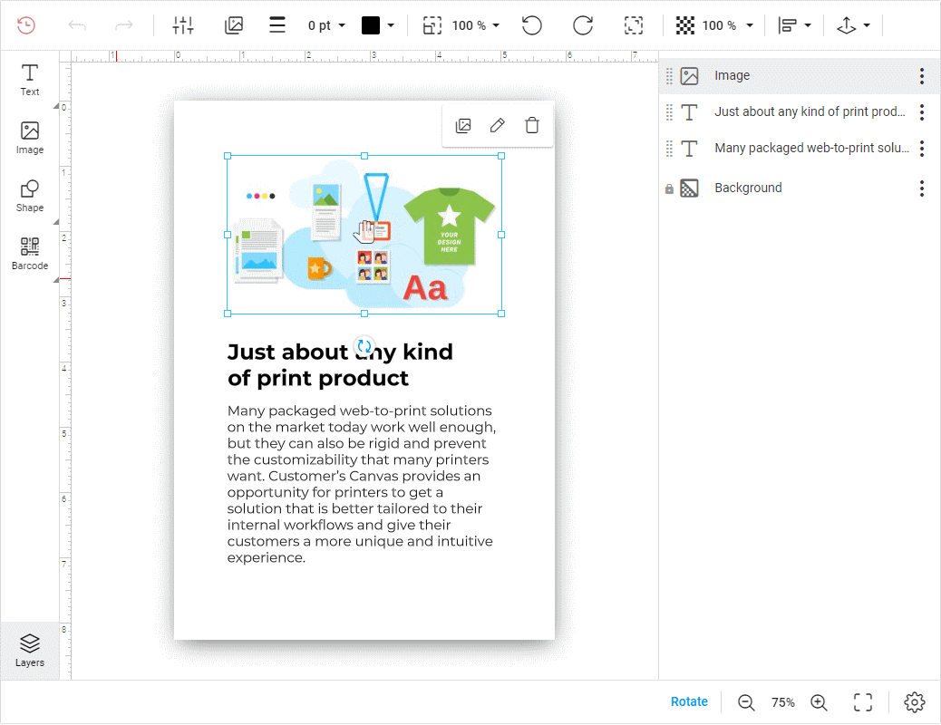
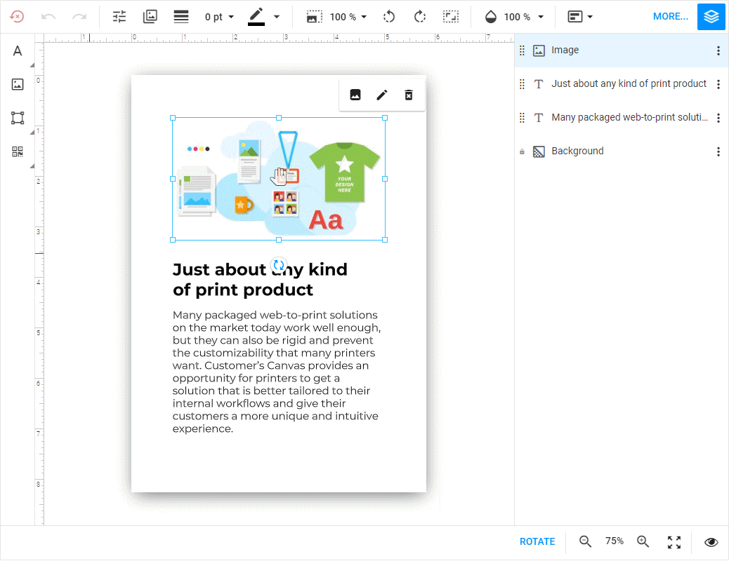
At the moment, Design Editor supports two themes - Aurum and MdLight. Currently, the Aurum is the default theme. The MdLight theme was the default theme for Design Editor prior to 6.16.
Aurum
A default Customer's Canvas theme with a better mobile friendliness in comparison to other themes. It is the recommended choice.

MdLight
A classic Customer's Canvas theme introduced in version 5. You may want to stick to this version if you don't want to change the experience for the existing users.

How to specify a theme
To switch the theme, pass the theme property in the editor's configuration as follows:
let product = {
    "surfaces": ["collage"]
};

let editorConfig = {
    "theme": "MdLight"
};

let editor = await CustomersCanvas.IframeApi.loadEditor(
                document.getElementById("editorFrame"), product, editorConfig);
Warning
The UI theme cannot be changed after loading the editor. For this reason, the theme parameter in clientConfig.json is ignored. Use it only in the CustomersCanvas.IframeApi.loadEditor method.