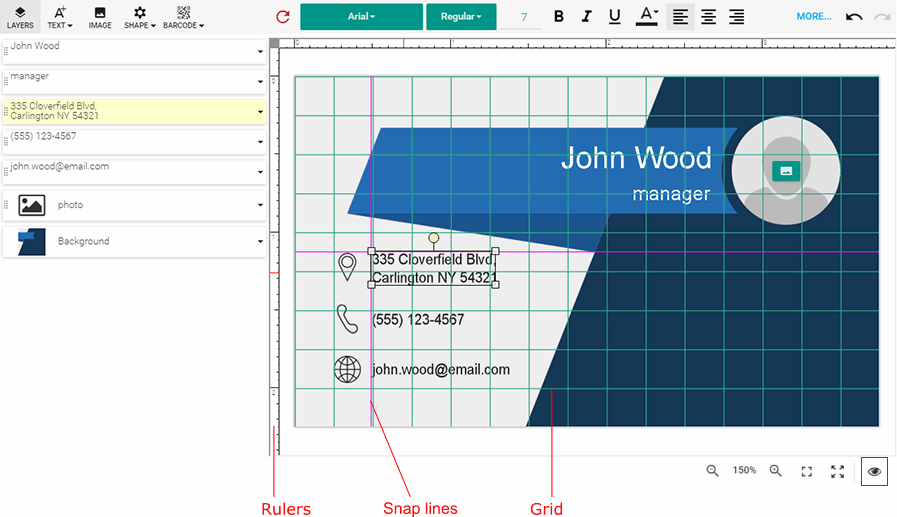
Rulers, grids, and snap lines
- 6 minutes to read
When you build an online print product designer for end users who are not computer-savvy, you want to keep the user interface as simple as possible and turn off all the elements that may confuse them. However, in many cases, it is important to give them some tools to place elements precisely.
The Design Editor includes three useful tools for this - rulers, grids, and snap lines.

Let us see how to enable and configure them.
Rulers
To configure rulers, open the ~/Configuration/clientConfig.json file and make sure there is a block which looks like this:
"rulers": {
    "enabled": true,
    "unit": "inch",
    "origin": { "X": 0, "Y": 0 }
}
The properties are self-explanatory, but let us take a closer look at them.
Measurement Units
The standard length unit in the Design Editor is a point, i.e. 1/72 of an inch. However, regular users are most likely more comfortable with traditional units like inches or millimeters. You can use the unit property to switch the units to one of the following values:
- inch
- mm
- cm
- point
- custom
If you prefer to use some other measurement unit, set this property to custom and specify the additional customUnitScale property. This property should contain a ratio allowing Design Editor to convert your unit to points.
For example, imagine that you want to use picas as a unit of length. This is a traditional typography unit, which equals 1/72 of a foot (equivalent to 1/6 of an inch). In other words, 1 point = 1/12 pica (0.0833333 pica). Your rulers entry will look as follows:
"rulers": {
    "unit": "custom",
    "customUnitScale": 0.0833333
}
A Point of Origin
You can specify the point of origin relative to the upper-left corner of the template using the origin property. It accepts the {"X": number, "Y": number} object specifying the offset in measurement units of the rulers.
Display of Rulers
When the enabled property is true, rulers are visible; otherwise, Design Editor hides both the horizontal and vertical rulers.
Override of Rulers for a Specific Product
If for some reason you want to use custom settings for rulers for a specific product, you may do this using the IConfiguration interface.
let configuration = {
    canvas: {
        rulers: {
            enabled: true,
            unit: "inch",
            origin: { X: 0, Y: 0 }
        }
    }
};
If you just want to disable the rulers for a specific product, use the following configuration.
let configuration = {
    canvas: {
        rulers: {
            enabled: false
        }
    }
};
Grids
Like rulers, grids are configured in clientConfig.json. Open this file to find the following object:
"grid": {
    "horizontalColor": "rgba(0, 255, 255, 0.2)",
    "verticalColor": "rgba(0, 255, 255, 0.2)",
    "stepX": 0.25,
    "stepY": 0.25,
    "lineWidthPx": 1,
    "enabled": true
}
Appearance
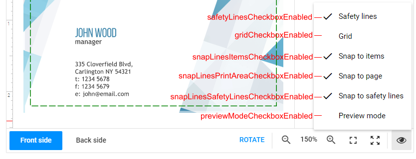
This marking is disabled by default. To allow your users to enable and disable the grid in the user interface, set the gridCheckboxEnabled property of the Bottom Toolbar to true. After that, the Grid command appears on the Marking menu.
To change the color of horizontal and vertical lines, you can specify a color value in the CSS format in the horizontalColor and verticalColor properties. You can also use lineWidthPx to set the gridline width in pixels.
Cell Size
To control the size of the grid cells, use the stepX and stepY properties to specify the horizontal and vertical distance between grid lines in the measurement units of the rulers.
Override of Grids for a Specific Product
If for some reason you want to use custom grid settings for a specific product, you may do this using the IConfiguration interface.
let configuration = {
    grid: {
        horizontalColor: "rgb(208, 224, 227)",
        verticalColor: "rgb(208, 224, 227)",
        stepX: 1,
        stepY: 1,
        lineWidthPx: 1,
        enabled: true
    }
};
If you just want to disable the grid for a specific product, simply use the following configuration.
let configuration = {
    grid: {
        enabled: false
    }
};
Snap Lines
The Design Editor allows you to configure snap lines that will cling to:
- design elements (
items) - product pages (
printArea) - safety lines (
safetyLines) - interactive zones (
interactiveZones) - regions (
region) - grid (
grid)
In the clientConfig.json file, you can configure them as follows:
{
    "canvas": {
        "snapLines": {
            "items": {
                "enabled": true,
                "color": "rgb(255,0,0)",
                "tolerance": 5,
                "priority": 2,
                "includeLocked": true
            },
            "printArea": {
                "enabled": false,
                "color": "rgb(0,255,0)",
                "tolerance": 20,
                "priority": 3
            },
            "safetyLines": {
                "enabled": true,
                "color": "rgb(0,0,255)",
                "tolerance": 5,
                "priority": 4
            },
            "grid": {
                "enabled": true,
                "color": "rgb(0,255,0)",
                "tolerance": 5,
                "priority": 1
            }
        }
    },
    "widgets": {
        "BottomToolbar": {
            "snapLinesItemsCheckboxEnabled": {
                "enabled": true, "defaultValue": false
            },
            "snapLinesPrintAreaCheckboxEnabled": {
                "enabled": true, "defaultValue": false
            },
            "snapLinesSafetyLinesCheckboxEnabled": {
                "enabled": true, "defaultValue": true
            }
        }
    }
}
Appearance
Snap lines are enabled by default. The initial appearance on the canvas is defined by the snapLinesVisible property in the common config. Use the color property to change the color of snap line types. When you configure snap lines so that they align to items, you can specify whether to align the lines to locked items or not with the includeLocked property.
To allow your users to turn on and turn off snap lines through the Marking menu, you can use the snapLinesItemsCheckboxEnabled, snapLinesPrintAreaCheckboxEnabled, and snapLinesSafetyLinesCheckboxEnabled parameters of the BottomToolbar to toggle each type of the snap lines separately.
In the advanced config, these parameters support not just a boolean value but also an ICheckboxConfig object, where you can both enable a checkbox in the Marking menu and set its default value.
{
    "snapLinesItemsCheckboxEnabled": {
        "enabled": true,
        "defaultValue": true
    }
}
Tolerance
To control the distance between an object and a snap line, starting from where the object clings to the line, specify the tolerance property. This value is measured in pixels and works independently of the current zoom level.
Priority
In the advanced configuration, you can specify the priority of snap lines of a single type. In the case of overlapping tolerance zones, a snap line with the highest priority is displayed on the canvas. The higher this value, the higher the priority.
Override of Snap Lines for a Specific Product
You can also define custom settings for snap lines for a specific product through the IConfiguration interface.
Configuring the Marking menu
The Marking menu contains commands with check marks to turn on or turn off safety lines, bleed and slug, the grid, and snap lines.
You can configure this menu by using the following properties.

To enable or disable the commands, you can define these properties with true or false. If true, the corresponding command will be added to the menu, and the initial state of the check mark will depend on the value specified in the IFrame API library.
let configuration = {
    widgets: {
        BottomToolbar: {
            gridCheckboxEnabled: true,
            snapLinesItemsCheckboxEnabled: true,
            snapLinesPrintAreaCheckboxEnabled: true,
            snapLinesSafetyLinesCheckboxEnabled: true,
            snapLinesInteractiveZonesCheckboxEnabled: true,
            previewModeCheckboxEnabled: true
        }
    }
};
To add commands to the Marking menu in a state you need, use the ICheckboxConfig interface. For example, to create the menu with check marks displayed in the previous image, you can use the following config.
let configuration = {
    widgets: {
        BottomToolbar: {
            gridCheckboxEnabled: {
                enabled: true, defaultValue: false
            },
            snapLinesItemsCheckboxEnabled: {
                enabled: true, defaultValue: true
            },
            snapLinesPrintAreaCheckboxEnabled: {
                enabled: true, defaultValue: true
            },
            snapLinesSafetyLinesCheckboxEnabled: {
                enabled: true, defaultValue: true
            },
            snapLinesInteractiveZonesCheckboxEnabled: {
                enabled: true, defaultValue: true
            },
            previewModeCheckboxEnabled: {
                enabled: true, defaultValue: false
            }
        }
    }
};