Checkbox
- Less than a minute to read
A simple widget that adds a checkbox.
General info
- type:
checkbox
Params
prompt- a text string displaying the checkbox caption.valueor_- a checkbox value, whether it is checked or not (falseif omitted).
Example
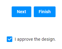
Let's assume you want to add a checkbox that should lock the FinishButton when it is not set. The config may appear as follows:
{
"widgets": [
{
"name": "agree-checkbox",
"type": "checkbox",
"params": {
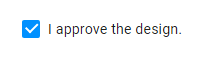
"prompt": "I approve the design.",
"value": true
}
},
{
"name": "finish-button",
"type": "finish-button",
"params": {
"enabled": "{{$['agree-checkbox']._}}"
}
}
]
}
Now, when you select the checkbox, the Finish button gets enabled.