Datasheet
- Last updated on December 10, 2025
- •
- 5 minutes to read
This widget is designed to display data as a spreadsheet. You can import a file with data, predefine cells in the config, and let your user fill in the cells.
General info
- type:
datasheet
Params
fileName– The name of the file (with extension) to export.data– A table schema, an array of the IWidgetDataSheetColumnScheme objects with column definitions:name– The field name.value– The default value.type– The field type ("Image"|"ImagePlaceholder"|"Text"|"InString"|"BarcodePlaceholder"), optional.barcodeFormat– Defines the format for barcodes, optional.barcodeSubType– Defines the subtype for QR codes ("Phone"|"Url"|"None"), optional.readonly– Iftrue, disables field editing, optional. The default value isfalse.
tableData– An array of objects, each representing one table row. The keys in these objects are column names.order– An array of strings defining the sort order of the columns. If thedataarray contains more columns than theorderarray, they are displayed afterward in their original order.hideButtonsLeft– Iftrue, hides theExportandImportbuttons. The default value isfalse.hideButtonsRight– Iftrue, hides theAdd rowandDelete rowbuttons. The default value isfalse.updateItem– Updates cell information for the specified column in the current row. For fields of theImagePlaceholdertype, a value from thevalueproperty will be assigned.customTexts– Defines custom error messages:tableIsEmpty– The table has no rows.tableNotCreatedText– The table is not created.
allowedFileTypes– File types that can be selected for downloading.itemsPerPage– The number of items displayed on a page. The default value is50.onRowChange– A function ("{{#function <expression>}}") or an array of functions that execute after changing a cell.onCellTextChange– A function ("{{#function <expression>}}") or an array of functions that execute after changing a text cell.
Properties
valueor_– The selected row.selectedRowIndex– The index of the selected row.
Methods
getSelectedRowData()– Returns an array of selected row data, including all column-associated data and the field value.getTableData()– Returns an array of objects representing rows with all associated data.setErrors(errors: DataSheetCellError[])– Defines an error for a table cell.getTableItemsData()– ReturnsitemsDatafor all fields in the table.getSelectedRowItemsData()– ReturnsitemsDatafor the currently selected row in the table.
Examples
Defining fields
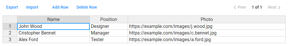
In this example, we will create a table of three columns and predefine three rows of data. Your users will be able to create and delete rows in this table.
{
    "name": "table",
    "type": "datasheet",
    "params": {
        "data": [
            { "name": "Name" },
            { "name": "Photo" },
            { "name": "Position" }
        ],
        "tableData": [
            { "Name": "John Wood", "Position": "Designer", "Photo": "https://example.com/images/j.wood.jpg" },
            { "Name": "Cristopher Bennet", "Position": "Manager", "Photo": "https://example.com/images/c.bennet.jpg" },
            { "Name": "Alex Ford", "Position": "Tester", "Photo": "https://example.com/images/a.ford.jpg" }
        ],
        "oerder": [ "Name", "Position", "Photo" ]
    }
}
Importing files
If a larger sample is expected, it will be more convenient to download it from a file. By default, you can open files of any type. In this example, we will create a table with names and emails and allow users to import only files in the CSV and XSLS formats for downloading.
{
    "name": "table",
    "type": "datasheet",
    "params": {
        "data": [
            {  "name": "UserName"  },
            {  "name": "Email"  }
        ],
        "allowedFileTypes": [
            ".csv",
            ".xsls"
        ]
    }
}
To disable file import, set the hideButtonsLeft param to false.
Filling with variable data
Using this widget, you can implement a scenario in which a table is created based on variable fields added in the editor, and after filling this table, a proof image will be created for a data set from one of the table rows.
First, you will need to define a design-editor widget. In this example, its initialization is omitted to keep it brief.
Then, define a datasheet widget using the variableData property obtained from design-editor when calling the getVariableData() method. This property will contain an array of all fields defined through double braces {{}}.
To display a preview, you can use any widget displaying images. Now, let's define a slider that uses URLs obtained from ajax widget (image-request-vdp).
{
    "name": "editor",
    "type": "design-editor",
    "params": {
        "initial": { ... }
    }
},
{
    "name": "table",
    "type": "datasheet",
    "params": {
        "data": "{{ $['editor'].variableData }}"
    }
},
{
    "name": "vdp-preview",
    "type": "slider",
    "params": {
        "direction": "tile",
        "rows": 1,
        "columns": 1,
        "images": [
            { "url": "{{ $['image-request-vdp'].response }}" }
        ]
    }
}
For more details about defining and processing requests, refer to the Ajax widget.
Finally, define a step for when both the datasheet and slider widgets will be displayed. Note that getVariableData() is executed when this step is activated.
{
    "name": "Variable data",
    "mainPanel": {
        "name": "vdp-preview"
    },
    "toolPanel": {
        "name": "table",
        "height": "50%"
    },
    "onActivate": [
        "{{ #function $['editor'].saveProduct() }}",
        "{{ #function $['editor'].getVariableData() }}"
    ]
}
Processing table data
This example demonstrates how use getSelectedRowItemsData() to dynamically process table data and generate proof images for the currently selected data instance.
{
    "name": "table",
    "type": "datasheet",
    "params": {
        "data": "{{ $['editor'].variableData }}",
        "onRowChange": [
            "{{ #function $['editor'].getProofImages(800, 800, false, false, false, 1000, 1000, { itemsData: ($['table'].getSelectedRowItemsData()) }) }}"
        ],
        "onCellTextChange": [
            "{{ #function $['editor'].getProofImages(800, 800, false, false, false, 1000, 1000, { itemsData: ($['table'].getSelectedRowItemsData()) }) }}"
        ]
    }
}
To render high-resolution images, you can retrieve all the table data when the Finish button is clicked. Use the getTableItemsData() method to pass the entire dataset to the editor.
{
    "name": "finish",
    "type": "finish-group",
    "params": {
        "buttonText": "Add to cart",
        "onClick": [
            "{{ #asyncFunction await $['editor'].getHiResImages(800, 800, null, false, null, { dataSet: { 'surfacesData': [{ 'surfaceBinding': { 'surfaceIndexes': [0] }, 'data': $['table'].getTableItemsData() }] } }) }}"
        ]
    }
}
You can find more details about the properties of this widget in AuWidgetDataSheet.
For more details about configuration parameters, refer to IWidgetDataSheetConfig.