Input text
- 1 minute to read
A text input field widget.
General info
- type:
input-text
Params
placeholder- a string that is displayed as a hint. By default, this is an empty string.label- a string that is used as a label of the widget. By default, this is an empty string.supportText- an optional string. By default, this is an empty string.defaultValue- the default value of the widget, either a string or number. By default, this is an empty string.type- the widget type, either"number"or"text". The default value is"text".maxLength- the max text length. For numbers,maxLengthdefines the number of digits and only works with positive values.minandmax- the allowed range of values of thenumbertype. The default values are-999999and999999.isTextArea- iftrue, enables a text area instead of single-line text. The default value isfalse.rows- the widget height in rows if the text area mode is on. The default value is2.pattern- a regular expression to limit input. The default value is".+".
Events
onChange- a function ("{{#function <expression>}}") or an array of functions. This event triggers when the user changes the text in the widget.
Referring to a value in the config
You may refer to a value of a widget by using the value or _ shortcut:
{
    "text": "{{$['main-text']._}}"
}
Example
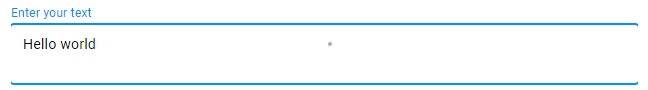
{
    "name": "main-text",
    "type": "input-text",
    "params": {
        "isTextArea": true,
        "defaultValue": "Hello world",
        "prompt": "Enter your text",
        "maxLength": 20
    }
}