Option
- 3 minutes to read
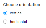
A control displaying product options provided by an e-commerce system such as paper types, colors, sizes, shapes, and so on. Typically, they are grouped together by using the Group widget.
General information
- type:
option
Associating with e-commerce options
In the case where you just want to refer to an option from your ecommerce-driver, pass either its id or title:
id- the option identifier in the ecommerce-driver. If there is no such an option, the editor will create a new option with thisid(in this case, specify the advanced settings).title- the option title in the ecommerce-driver.
If you define both id and title, the editor searches for id first. If you want the editor to create a new option, you need to specify advanced settings.
Advanced settings for options
The multistep editor requires advanced settings in two cases:
- To redefine some properties received from a driver (for example, to change an option type).
- To create a new option.
orderIndex- the order index. You can specify this value to bind options to a single order when working with several products or orders and using the cart widget. If you do not specify this value, thenorders.currentis used by default.type- the option type -radio|image|color|list|checkbox|multilist.subType- defines visual representation forradio,image, andcolortypes -detailed|compact.props- an object defining the option-specific properties. For example,listandcheckboxmay take{ maxCount: 3 }. Here, you can also specify arbitrary properties that can be used in dynamic configs.values- the option values as defined in the ecommerce-driver.
You can define option values as follows:
{
   "values": [{
        "id": 0,
        "title": "Custom size",
        "price": 5,
        "color": "#ff00ff",
        "imageUrl": "http://example.com/something.png",
        "props": {
             "flag": "bar"
         }
    }]
}
Here, only the title is mandatory. You can define the props object when you need to attach some data to an option that should be used in dynamic configs. You can also specify other properties if needed.
Mixing values
As we explained earlier, if you specify the same id as in the driver, you can connect to the option and override its properties:
{
   id: 0,
   type: "image"
}
Say, if the option with id=0 is radio in the driver, then it becomes image in the editor.
The same logic is applicable to values. Say, we have the option with id=0, which has the "L" and "XL" values, and then define:
{
   id: 0,
   values: [{title: "XXL"}]
}
In this case, this option will have three possible values in the editor: "L", "XL", and "XXL".
If you refer to an existing value in values, then you can replace it or add a new property in the same way as the whole option. For example, we may have an option with id=0 of the radio type and want to create a list of icons based on this option. If a driver does not contain links to icons, you can add them as follows:
{
   id: 0,
   type: "image",
   values: [{
      "title": "L",
      "imageUrl": "/assets/images/l.png"
   },
   {
      "title": "XL",
      "imageUrl": "/assets/images/xl.png"
   }]
}
How to add an option from a driver
{
   "type": "option",
   "title": "Choose size",
   "name": "size-selector",
   "params": {
       "id": 0
    }
}
How to change a type of an option from a driver
{
   "type": "option",
   "title": "Choose size",
   "name": "size-selector",
   "params": {
       "title": "Size",
       "type": "list",
       "props": { maxCount: 1 }
    }
}
How to create an option from scratch
{
   "type": "option",
   "title": "Choose a layout",
   "name": "layout-selector",
   "params": {
       "title": "Layout",
       "type": "image",
       "subType": "detailed",
       "values": [
           {
               "title": "Layout 1",
               "imageUrl": "/assets/img/layout1.png",
               "props": {
                     "template": "layouts/1"
               }
           },
           {
               "title": "Layout 2",
               "imageUrl": "/assets/img/layout2.png",
               "props": {
                     "template": "layouts/2"
               }
           }
        ]
    }
}
How to define an option size
You can define the size by changing the style of a widget as follows:
{
    "name": "available-colors",
    "type": "option",
    "params": {
        "style": {
            "--border-radius": "0",
            "--item-content-width": "50px",
            "--item-content-height": "50px"
        },
        "title": "Product Color",
        "type": "color",
        "subType": "compact",
        "values": []
    }
}