Overview
A widget is a small UI element that can be inserted into a left, main, or bottom panel (or in a special Group widget). This section describes supported widgets, what settings they have, and how to work with them.
Anatomy of widgets
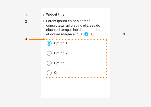
Each widget consists of the following elements:
- A widget header, or title.
- A hint explaining what the user is supposed to do with it, or prompt.
- An additional description, which appears as a tooltip, or description.
- A widget body.

In a JSON structure, each widget contains the following properties:
name- a unique widget name (in the scope of one config), which you use to refer to this widget in expressions.type- a widget type.params- widget settings, which configure its behavior. See documentation for each widget for more details.
The following properties are optional. They have the same meaning as depicted in the figure above.
titlepromptdescription
JSON example
A widget looks like this:
{
    "name": "stub",
    "title": "Hello world",
    "prompt": "This is a concept that I had in mind for a long time and I am happy to share it.",
    "description": "This is a concept that I had in mind for a long time and I am happy to share.",
    "type": "static-text",
    "params": {
        "text": "Hello world"
     }
}
How to refer to widgets inside the config
In dynamic expressions, you may refer to widgets using the $. Note, it does not have anything to do with jQuery, it is just a shortcode. Alternatively, you can use such aliases as wig and widget.
Many widgets have some elements that you may select. To refer to the selected element of such a widget, you can use a selected property or its shorter version, _.
For example, to get the title of the selected item of a widget called list, use the following expression:
$['list']._.title
Widgets in UI Framework
Here, you can find a list of widgets implemented in the UI Framework.