Configuring the user interface
- 8 minutes to read
The preflight widget configuration includes several sections that allow for customizing the user interface of the Preflight Tool. You may configure the following UI features:
- User interface languages
- Uploader
- Viewer
- Toolbars and buttons
Let's learn how to do it.
General config structure
The widget's params include the config section. It includes multiple subsections for the product definition, preflight rules, and UI. The relevant part of a config looks like this:
{
    "widgets": [{
        "name": "preflight",
        "type": "preflight",
        "params": {
            "config": {
                "language": "en",
                "startFromUploader": true,
                "uploader": {
                    "fileTypes": [".pdf", ".jpg", ".jpeg"],
                    "multiple": true
                },
                "viewer": {
                    "zoom": {
                        "min": 0.05,
                        "max": 5,
                        "step": 0.1
                    }
                },
                "interface": {
                    "topToolbar": [
                        {
                            "name": "upload"
                        },
                        {
                            "name": "fitToBleed"
                        },
                        {
                            "name": "fitToTrim"
                        },
                        {
                            "name": "reset"
                        }
                    ],
                    "rightToolbar": {
                        "infoCard": {
                            "isDialog": false
                        }
                    }
                }
            }
        }
    }]
}
The complete list of configuration parameters is available in the Config reference.
Now, let's describe these properties in more detail.
Uploader
Depending on your needs, you can either force the upload screen as the first step (set the startFromUploader to true) or start from the Preflight Tool right away. The user can still use the Upload button in the upper-left corner.
For the uploader, you can specify a list of accepted file extensions. At this step, it does not check real file types – this action happens only after a user adds a file to the tool. The main purpose of the fileTypes property is to filter out unwanted file types in the file selection dialog.
Note
If you are interested to learn how to work with unsupported file formats, refer to the Configuring image formats article.
You may set the multiple property to true to enable multiple file selection. In this case, it will merge the files you add to a single document until the product definition allows for adding the necessary number of pages. To remove this limit, you can set product.allowAddPagesUploading to true, and the required number of pages will be added when uploading.
By default, when a file is uploaded, it is inserted into the product pages as-is. However, you can define how the file should be adjusted to pages. The initialMode property allows you to fit or fill the file to the BleedBox and TrimBox using the following values:
"fitToBleed""fitToTrim""fillToTrim""fillToBleed""default"
To define the place in the product where the uploaded file will be inserted, you can set the fileUploadBehavior property to one of the following values:
"replaceFull"- clears the product and inserts the file starting from the first page."insertCurrent"- inserts the uploaded file starting from the current page; this is the default behavior."insertNew"- inserts the uploaded file into the newly added pages.
Here is a sample portion of the config relevant to the file uploader.
{
    "startFromUploader": true,
    "uploader": {
        "fileTypes": [".pdf", ".jpg", ".jpeg"],
        "multiple": true,
        "initialMode": "default",
        "fileUploadBehavior": "insertCurrent"
    }
}
Viewer
Use the viewer object to configure the working area.
Measurement units
Using the rulers section, you can enable rulers in the viewer and configure their units: inch, mm, cm, point, or custom. For custom units, you must additionally define the rulers.customUnitScale property, which is the ratio of the custom unit to points. For example, imagine that you want to use picas as a unit of length. This is a traditional typography unit, which equals 1/72 of a foot (equivalent to 1/6 of an inch). In other words, 1 point = 1/12 pica (0.0833333 pica). Your rulers entry will look as follows:
"rulers": {
    "unit": "custom",
    "customUnitScale": 0.0833333
}
By default, the rulers display the scale in inches.
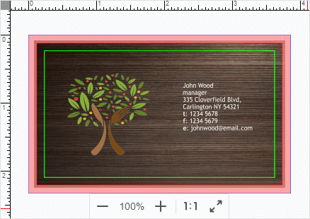
Bleed zone
Using the shadeBleedZone parameter, you can specify whether a bleed should be masked. To change the default color of the mask, pass the bleedZoneColor property in the CSS format, for example:
"viewer": {
    "shadeBleedZone": true,
    "bleedZoneColor": "rgba(250,137,137,0.75)",
     // Other properties
}
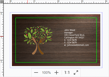
Let's see how this changes the appearance of the bleed area.
| Bleed area without a mask | Masked bleed area |
|---|---|
 |
 |
Preflight issues
With the highlightImages parameter, you can have the Preflight Tool highlight image elements where it finds some issues, for example, low resolution. Just set it to true to enable this behavior.
Aspect ratio
By default, the Preflight Tool does not let a user change the proportions of a document when resizing it. However, your users can click the Keep aspect ratio button in the Toolbar to allow this and fix some problems when the aspect ratio is slightly different. To allow this behavior by default, set the keepAspectRatio to false.
Zoom
The zoom section allows for configuring the zooming functionality: min and max zoom values, zooming step, the initial zoom value, and even certain values of the zoom levels.
As an alternative to setting the initial value, you can specify the zoom.mode in which the product pages will be displayed:
"bestFit"- the content is scaled to fit the viewer."bestFitShrinkOnly"- the content is scaled to fit the viewer, but the zoom value is limited by1."fitToWidth"- the content is scaled so that its width matches the width of the viewer."fitToWidthShrinkOnly"- the content is scaled so that its width matches the width of the viewer, but the zoom value is limited by1."fitHeight"- the content is scaled so that its height matches the height of the viewer."fitHeightShrinkOnly"- the content is scaled so that its height matches the height of the viewer, but the zoom value is limited by1.
For example:
"zoom": {
    "mode": "bestFit",
    "min": 0.1,
    "max": 2.0
}
To specify the values that zoom levels can take, use the zoomValues array.
"zoom": {
    "zoomValues": [0.1, 0.2, 0.3, 0.5, 1]
}
Here, 0.1 corresponds to the 10% zoom, and 1 corresponds to the 100% level.
Config example
Here is a sample portion of the config relevant to the viewer.
{
    "viewer": {
        "shadeBleedZone": true,
        "highlightImages": true,
        "keepAspectRatio": false,
        "rulers": {
            "enabled": true,
            "unit": "point"
        },
        "zoom": {
            "min": 0.2,
            "max": 2.0,
            "step": 0.2,
            "default": 1
        }
    }
}
Toolbar
In the interface section of the config, you can configure a toolbar from any combination of standard buttons. It is achieved using the topToolbar array where you describe all buttons using the structure like this:
{
    "name": "<action name>",
    "style": {
        // CSS properties
    }
}
If you omit the topToolbar, the standard toolbar will be created. However, if you add at least one button, it will be created based on this list.
The following actions are supported:
"upload"- uploads a new file or files."rotateCanvas"- rotates the canvas 90 degrees."fillToBleed"- fills the bleed zone with the image."fillToTrim"- fills the trim zone with the image."fitToBleed"- fits the image to the bleed zone."fitToTrim"- fits the image to the trim zone."center"- centers the image."reset"- resets the image to the initial position."keepAspectRatio"- allows for changing the aspect ratio of the image."rotateImage"- rotates the image 90 degrees."applyToAll"- applies the image position on the current page to the images on other pages."history"- adds the Undo and Redo buttons to navigate through user actions.
In the style section, you can pass CSS properties to change the button color, background-color, and more. A new style is defined through a key-value pair, where the key is the property name, and the value is in the CSS format. For example, if you want to eliminate all buttons except for Upload, you can define the toolbar as follows:
{
    "interface": {
        "topToolbar": [{
            "name": "upload",
            "style": {
                "background-color": "white",
                "color": "#505253",
                "border": "1px solid rgba(33, 43, 54, .2)"
            }
        }]
    }
}
Right Toolbar
You can also configure the right panel displaying the legend and validation results in the interface.rightToolbar object.
{
    "interface": {
        "rightToolbar": {
            "infoCard": {
                "isDialog": true
            },
            "reportCard": {
                "useCustomLayout": false
            }
        }
    }
}
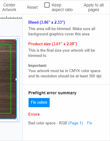
infoCard
The first part of the right panel represents an info card with a legend. The legend section displays the dimensions of the bleed and trim zones corresponding to the design layout. This section also displays technical details such as the required color profile, color space, and minimum DPI resolution.
To display the legend in a modal window, set the infoCard.isDialog property to true.

To display the legend on the right panel, set the infoCard.isDialog property to false.

You can change the text style through the infoCard style properties.
reportCard
The report card displays validation results in the right panel. Using the reportCard.useCustomLayout property, you can enable one of the following layouts:
| useCustomLayout = true | useCustomLayout = false |
|---|---|
 |
 |
You can change the text style through the reportCard style properties.
Custom buttons
You can add custom buttons to the right panel to fix preflight problems.
Such buttons allow you to fix one, several, or even all violations that have been detected. To define a custom button, you must pass its title and the filter of rules.
Here is a config for the custom button called Fix colors, which converts colors to the correct color space only if the color space rule severity is error.
{
    "interface": {
        "customButtons": [{
            "title": "Fix colors",
            "filter": {
                "severity": ["error"],
                "types": ["colorspace"]
            },
            "style": {
                "background-color": "var(--theme-primary-color)",
                "color": "white"
            }
        }]
    }
}
You can change a button style in the same way as the toolbar.
For more details about creating custom buttons, refer to the Defining preflight rules article.
You can learn the complete specs in the Config reference. In the Changing the appearance article, you can find details on how to apply styles and localize text resources.