Slider
- 1 minute to read
This widget displays multiple images. You can scroll through these images and use a lightbox to look at them closer.
General information
- type:
slider
Defining a slider
In params, you must define an array of images, where each element contains the following properties:
{
  "title": "Preview",
  "url": "http://example.com/images/online.png",
  "urlHD": "http://example.com/images/online%5b1920x1920%5d.png"
}
You can also define the direction - either "vertical", "horizontal", or "tile".
When the direction is "vertical" or "horizontal", you can also specify the quantity of images on the screen and enable scrolling images with arrows in listPage. By default, the images are scrolled one by one. If you need to scroll more images, define this number in increment.
When the direction is "tile", you can specify the number of columns and rows.
For more details about configuration parameters, refer to ISliderConfig.
Styles
To configure the appearance of the slider widget, you can define the style object and apply the following properties:
--au-widget--height- the widget height.--au-widget-padding- the padding inside the container.--au-widget-images-gap- the distance between images.--au-widget-background- the background color of the image container.--aurigma-responsive-image-border- the style of image borders.--au-widget-title-margin-top- the top margin of the image title.--au-widget-title-margin-bottom- the bottom margin of the image title.--au-widget-image-border- the border of the cards (the image with its title).
Examples
Displaying proof images
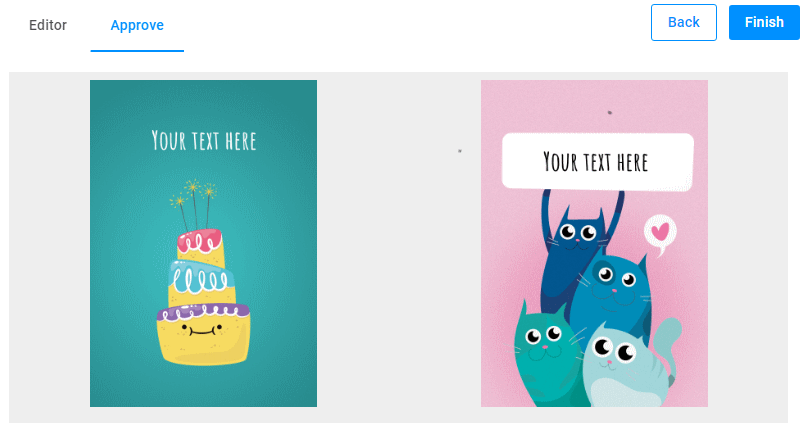
Let's look at how you can display proof images generated in the DesignEditor widget.
{
    "name": "preview",
    "type": "slider",
    "params": {
        "style": {
            "--au-widget-height": "430px",
            "--au-widget-background": "#f2f2f2"
        },
        "direction": "tile",
        "rows": 1,
        "columns": 2,
        "showImageIndex": false,
        "lightbox": false,
        "images": [
            {
                "url": "{{ $['editor'].proofImageUrls[0][0] }}"
            },
            {
                "url": "{{ $['editor'].proofImageUrls[1][0] }}"
            }
        ]
    }
}
To preview multipage products, you can pass images in this widget as follows:
{
    "name": "preview",
    "type": "slider",
    "params": {
        "style": {
            "--au-widget-background": "#eee",
            "--au-widget-height": "50%",
            "--au-widget-padding": "8px"
        },
        "direction": "tile",
        "rows": 1,
        "columns": "{{Math.min(2,$['editor'].proofImageUrls.length)}}",
        "containerColor": "#eee",
        "images": {
            "{{#each $['editor'].proofImageUrls.map(s=>s[0]) as imageUrl }}": {
                "url": "{{imageUrl}}"
            }
        }
    }
}
Changing the widget style
In this example, we display a preview generated in the Ajax widget. Here, we completely change the appearance of the widget.
{
    "name": "preview",
    "type": "slider",
    "params": {
        "direction": "vertical",
        "quantity": 1,
        "lightbox": true,
        "style": {
            "--au-widget-height": "1200%",
            "--au-widget-width": "100%",
            "--au-widget-padding": "1px",
            "--au-widget-images-gap": "10px",
            "--au-widget-background": "#fff",
            "--aurigma-responsive-image-border": "2px solid var(--theme-primary-color)",
            "--aurigma-image-border": "2px solid var(--theme-primary-color)",
            "--au-widget-title-margin-top": "0",
            "--au-widget-title-margin-bottom": "2px"
        },
        "images": [
            {
            "title": "Preview",
            "url": "{{$['image-request'].response}}",
            "urlHD": "{{$['image-request'].response}}"
            }
        ]
    }
}