Steps
- Last updated on December 29, 2023
- •
- 6-7 minutes to read
When you create a workflow, you divide it into steps. Each step appears in a separate tab and contains widgets that allow you to personalize a product.
Let's take a look at the typical steps.
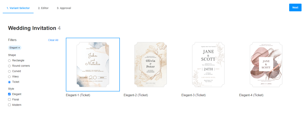
This step contains options from the PIM module. Based on filters, you select a design.
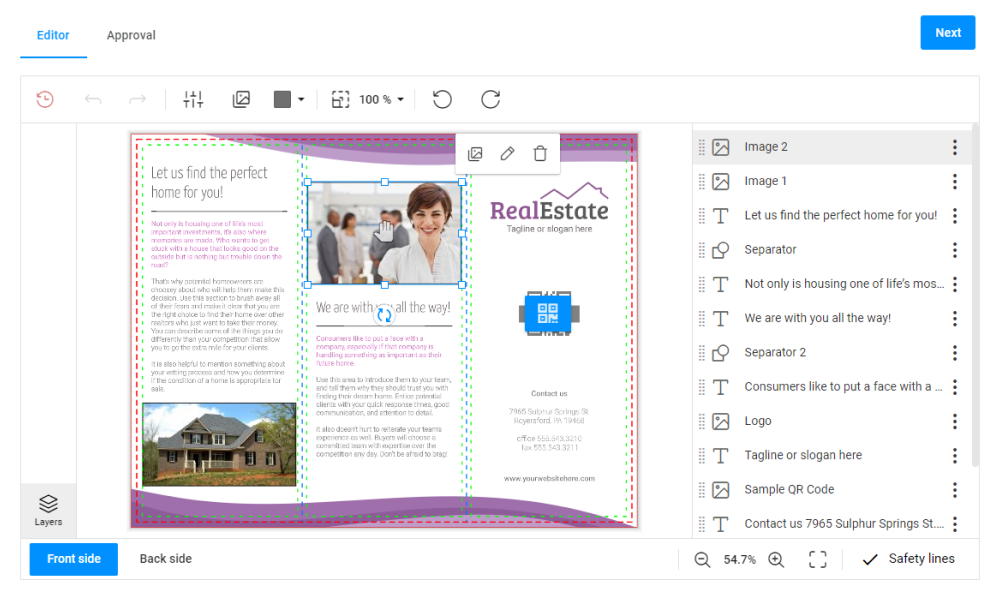
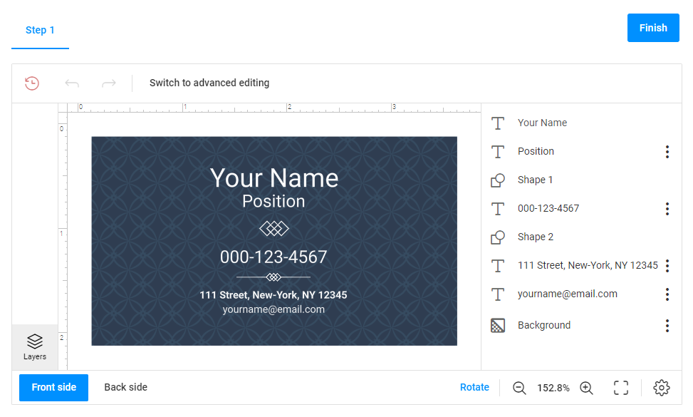
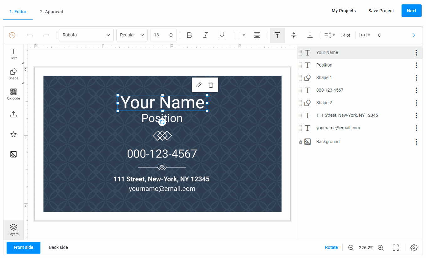
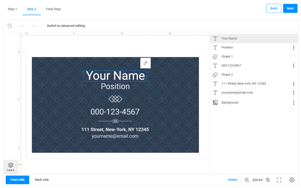
When a design is selected, the customer usually navigates to the editor. This is how the step with Design Editor looks.
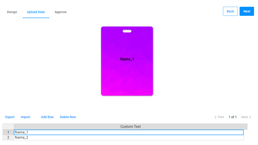
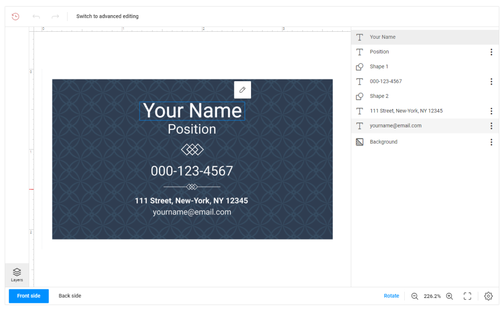
At this step, you can add variable names. The system will create many cards with the same design but with different names.
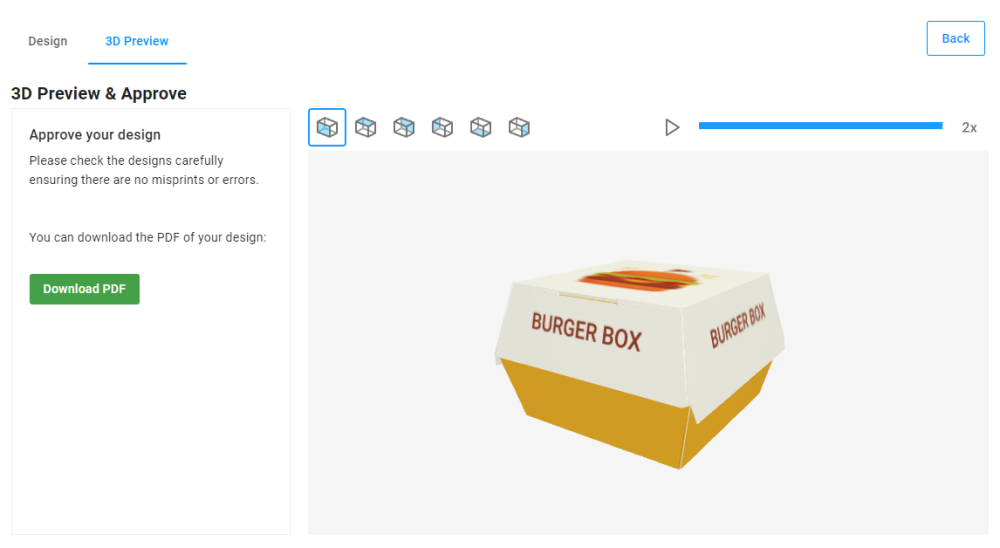
For designs to be rendered on 3D models usually used for packaging, you can add a step with 3D preview. Here, you can see a step with a 3D preview of a burger box.
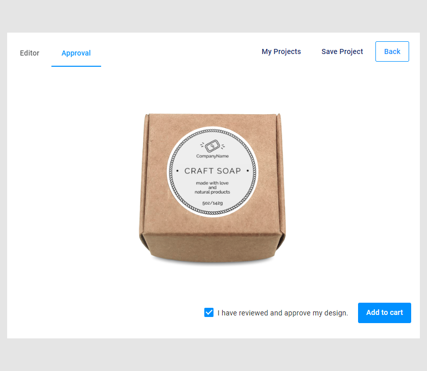
Typically, the last step is the Approval step. Here you can see the result of personalization — a sticker on a box preview mockup.
As you can see, the steps are used for different purposes, such as selecting product options, editing designs, checking personalization results, and others. Depending on the purpose of the step, you add the appropriate widgets.
Let's consider the step anatomy.
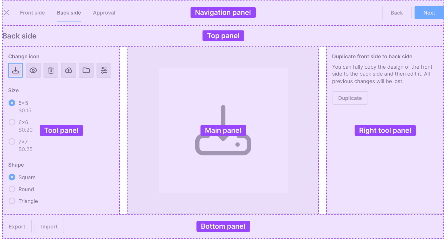
Step anatomy
This is an example schema of a step.
| Name | Location | Content |
|---|---|---|
Navigation panel |
located at the top of the page | contains tabs with steps names, navigation buttons, the title and description |
Top panel |
located under the Navigation panel |
contains widgets |
Tool panel |
located on the left side | contains widgets |
Main panel |
located in the center of the page | contains widgets |
Right tool panel |
located on the right side | contains widgets |
Bottom panel |
located at the bottom of the page | contains widgets |
Let's see how steps look in a workflow file.
Steps in a workflow file
When you create a workflow file, steps will represent an array. This array is on the same level as attributes, vars, and widgets.
{
  "attributes": [],
  "vars": {},
  "widgets": [],
  "steps": []
}
In the steps array, a step is an object. To add a new step, embed it under the previous step. The system will show them in the order you wrote them.
{
 "steps": [
    {
      "name": "Step 1",
      ...
    },
    {
      "name": "Step 2",
      ...
    }
  ]
}
A step has mandatory and optional properties.
{
  "steps": [
    {
      "name": "...",
      "panel": {
        "name": "...",
        "width": "...",
        "height": "..."
      },
      "icon": "...",
      "title": "...",
      "description": "...",
      "onActivate": [...],
      "onLeave": [...]
    }
  ]
}
Let's see these properties in detail.
Name
To create a step, add a steps array and an object for a new step inside. In this object, define a step name by the name property. In this example, only the name Step 1 will be displayed in the browser.
{
  "steps": [
    {
      "name": "Step 1"
    }
  ]
}
To add a widget to a step, you need to create a panel.
Panels
As we have seen, panels are containers for widgets that are located in a predefined place. To add a widget to the desired place of a step, you first need to add a panel to the step and then specify the name of the widget in this panel.
Let's embed an editor widget in a step like this:
To do it, define a panel and add a widget name. In this example, we define the design-editor widget and add its name to the mainPanel.
The result will look as follows:
{
  "widgets": [
    {
      "name": "my-editor",
      "type": "design-editor",
      "params": {
        "initial": {
          "productDefinition": "61790e9c8c41a706a618abcb"
        }
      }
    }
  ],
  "steps": [
    {
      "name": "Step 1",
      "mainPanel": {
        "name": "my-editor"
      }
    }
  ]
}
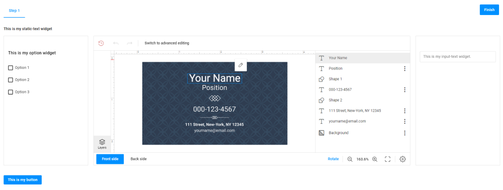
Let's consider other panels with widgets. In this screenshot, each panel contains a widget.
{
 "steps": [
    {
      "name": "Step 1",
      "mainPanel": {
        "name": "my-editor"
      },
      "toolPanel": {
        "name": "my-option"
      },
      "rightToolPanel": {
        "name": "my-input-text"
      },
      "topPanel": {
        "name": "my-text"
      },
      "bottomPanel": {
        "name": "my-button"
      }
    }
  ]
}
If you want to add more than one widget to a panel, you will need to embed them in the group widget. For more details, refer to the Group article.
Panel size
You can manage the panel size by using the width and height properties measured in pixels and in percent.
Let's see how we can set the width of the left panel to 150px and the height of the bottom panel to 5% of the screen height:
{
  "steps": [
    {
      "name": "Step 1",
      "mainPanel": {
        "name": "my-editor"
      },
      "toolPanel": {
        "name": "my-tool-panel-group",
        "width": "150px"
      },
      "rightToolPanel": {
        "name": "my-right-panel-group"
      },
      "topPanel": {
        "name": "my-text"
      },
      "bottomPanel": {
        "name": "my-button",
        "height": "5%"
      }
    }
  ]
}
Title
Now, let's add a title to the step that will appear under the navigation panel.
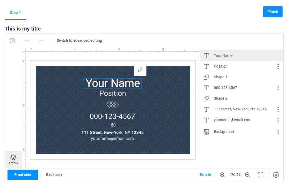
{
  "steps": [
    {
      "name": "Step 1",
      "title": "This is my title",
      "mainPanel": {
        "name": "my-editor"
      }
    }
  ]
}
Description
A description will appear under the title.
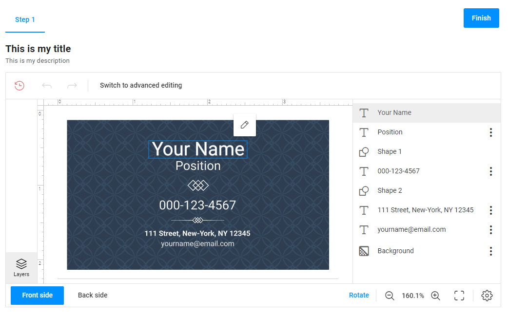
{
  "name": "Step 1",
  "title": "This is my title",
  "description": "This is my description",
  "mainPanel": {
    "name": "my-editor"
  }
}
Icons
You can add an icon to a step. Icons appear above the step names. Icons of inactive steps are displayed paler than the active step.
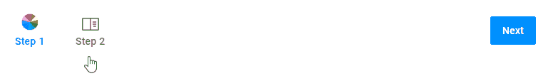
{
  "steps": [
    {
      "name": "Step 1",
      ...
      "icon": "custom-icons:coloricon"
    },
    {
      "name": "Step 2",
      ...
      "icon": "custom-icons:greeting"
    }
  ]
}
OnActivate
If you need an action to be performed when you open a step, define this action in the OnActivate array.
For example, after you complete personalization in the editor and navigate to the result approval, the system will create proof images when you activate the Approval step.
{
  "steps": [
    {
      "name": "1. Editor",
      "mainPanel": {
          "name": "editor"
      }
    },
    {
      "name": "2. Approval",
      "mainPanel": {
          "name": "preview"
      },
      "bottomPanel": {
          "name": "finish"
      },
      "onActivate": [
          "{{ #function $['editor'].getProofImages(1000,1000) }}"
      ]
    }
  ]
}
OnLeave
This event is triggered when you leave a step.
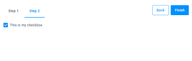
In this example, you start from Step 2, select a checkbox, and then go to Step 1.
When you go back to Step 2, the checkbox will be clear.
{
  "widgets": [
    {
      "name": "my-checkbox",
      "type": "checkbox",
      "params": {
        "prompt": "This is my checkbox.",
        "value": true
      }
    }
  ],
  "steps": [
    {
      "name": "Step 1",
      "mainPanel": {
        "name": "..."
      }
    },
    {
      "name": "Step 2",
      "mainPanel": {
        "name": "my-checkbox"
      },
      "onLeave": [
        "{{ #function $['my-checkbox'].value = false }}"
      ]
    }
  ]
}
Properties
| Name | Type | Description | Default value |
|---|---|---|---|
name |
string | Defines a step name | undefined |
icon |
string | Shows an icon above the step name. custom-icons:preloader  | | custom-icons:icon-cross  | | custom-icons:coloricon  | | custom-icons:front  | | custom-icons:greeting  | | custom-icons:envelope  | | custom-icons:approve  Optional Optional |
empty string |
title |
string | Shows a step title. Optional | empty string |
description |
string | Shows a step description. Optional | empty string |
onActivate |
string | array of strings | Defines functions that are executed when the step is activated. Optional | empty string |
onLeave |
string | array of strings | Defines functions that are executed when the step is deactivated. Optional | empty string |
| panel | object | Container for widgets, one of mainPanel | toolPanel | rightToolPanel | topPanel | bottomPanel |
empty string |
Panel
| Name | Type | Description | Default value |
|---|---|---|---|
name |
string | Defines the widget name that will be displayed in this panel | undefined |
width |
string | Defines the panel width, measured in pixels (px) or percent (%). Optional |
empty string |
height |
string | Defines the panel height, measured in pixels (px) or percent (%). Optional. |
empty string |
Manipulating steps
Now let's consider how you can change the default appearance of steps.
Show steps
The showSteps property displays or hides the navigation panel. To hide this panel, set the showSteps porperty to false.
{
  "showSteps": false,
  "steps": [
    {
      "name": "Step 1",
      "mainPanel": {
        "name": "my-editor"
      }
    },
    {
      "name": "Step 2",
      "mainPanel": {
        "name": "my-text"
      }
    }
  ]
}
Default step
The defaultStep property allows you to open a workflow from a step other than the first.
In this example, a workflow has three steps: Step 1, Step 2, and Final Step. When you start to personalize a product, the workflow will start from Step 2.
{
  "defaultStep": "Step 2",
  ...
  "steps": [
    {
      "title": "Step 1",
    },
    {
      "title": "Step 2",
    },
    {
      "title": "Final Step",
    }
  ]
}
If you need more control over the steps, you can use the Steps widget.