Minimal workflow file for product specifications
- Last updated on April 27, 2024
- •
- 7 minutes to read
Let's assume that you have a business card product and want your customers to personalize this product. To do so, you need to create a workflow where customers personalize the default card template and confirm their changes before placing an order.
In this tutorial, you'll learn how to create such a basic workflow file that configures the necessary personalization steps.
Defining steps
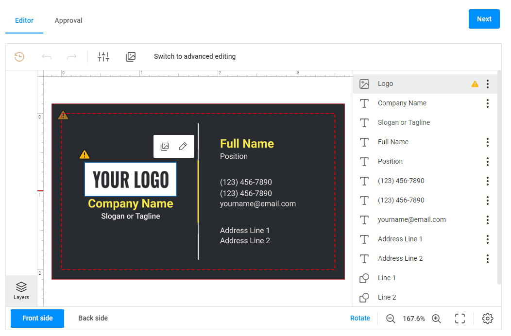
This workflow may contain two steps: Editor and Approval.
In the Editor step, you will display the Design Editor.
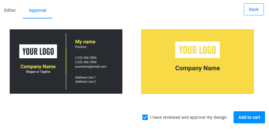
In the Approval step, you will display preview images and the confirmation checkbox. Once approved, you will display the Add to cart button.
"steps": [
  {
    "name": "Editor"
  },
  {
    "name": "Approval"
  }
]
Defining widgets
Let's select the widgets you need. To customize a product, use the design-editor widget. For displaying proof images, add the slider widget. To use the confirmation checkbox and the Add to cart button, embed the finish-group widget.
Then, add the widgets that can help customers creare an order:
- the
stepswidget, which hides the Finish button in the Navigation panel. - the
Orderwidget, which passes the data to a cart.
"widgets": [
  {
    "name": "editor",
    "type": "design-editor",
    "params": {...}
  },
  {
    "name": "preview",
    "type": "slider",
    "params": {...}
  },
  {
    "name": "finish",
    "type": "finish-group",
    "params": {...}
  },
  {
    "name": "steps",
    "type": "steps",
    "params": {...}
  },
  {
    "name": "order",
    "type": "order",
    "params": {...}
  }
]
Attributes
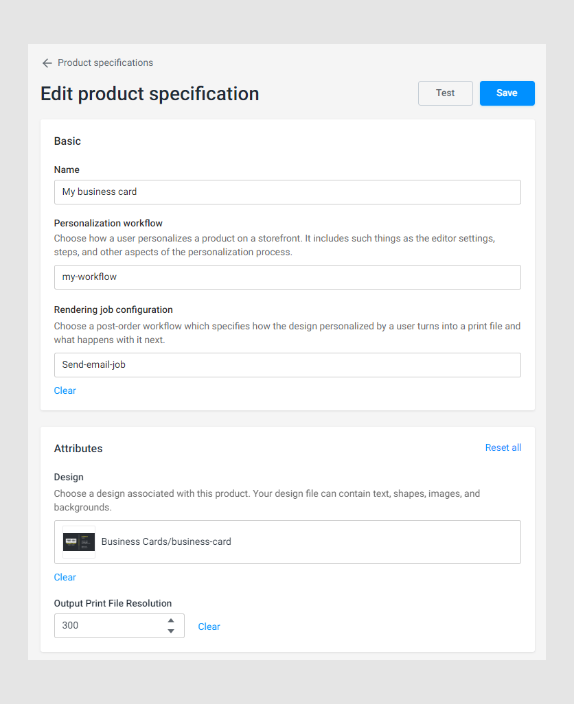
In this workflow file, you will need two attributes. First, add the Design attribute, which will allow you to select a template for your product. This is the design that your customers will personalize.
Then, add the Output Print File Resolution attribute. This will be an input field to define a DPI value while creating a product. If the DPI is less than this value, warnings will appear.
When you create a product in Product specification, you will see these attributes as follows:
"attributes": [
  {
    "name": "Design",
    "label": "Design",
    "type": "single-asset",
    "assetType": "design",
    "description": "Choose a design associated with this product. Your design file can contain text, shapes, images, and backgrounds.",
    "validations": [
      {
        "type": "required",
        "message": "Choose a design which should be used as a template."
      }
    ]
  },
  {
    "name": "Output Resolution",
    "label": "Output Print File Resolution",
    "defaultValue": 300,
    "validations": [
      {
        "type": "min",
        "min": 1,
        "message": "Resolution should be a positive number."
      }
    ],
    "type": "number"
  }
]
Vars
Let's assign attribute values to variables in the vars block to use this shortened form later.
"vars": {
    "design": "{{product.attributes?.find(x=>x.name==='Design')?.value}}",
    "outputResolution": "{{ product.attributes.find(x=>x.name==='Output Resolution').value}}"
  }
Steps
Editor step
The Editor step is the first step in our workflow file. It consists of the design-editor widget. This widget will be embedded in the mainPanel.
{
  "name": "Editor",
  "mainPanel": {
    "name": "editor"
  }
}
Let's define its commands.
Design Editor
The design-editor widget allows customers to personalize a product template. Let's define basic settings for this widget.
First, define the initial command with the productDefinition property to open a design. This design is selected in the attributes, and you can get its ID through the variable.
Next, add the editorConfig property. Here, you attach allowed fonts in the fontList property and set up the rendering parameters. In this example, we define the output resolution, file format, and color space and enable safety lines.
This is what the design-editor widget looks like:
{
  "name": "editor",
  "type": "design-editor",
  "params": {
    "initial": {
      "productDefinition": "{{vars.design?.id}}",
      "editorConfig": {
        "fontList": {
          "appFonts": [
            "*"
          ]
        },
        "rendering": {
          "hiResOutputDpi": "{{vars.outputResolution}}",
          "hiResOutputFileFormat": "pdf",
          "hiResOutputColorSpace": "cmyk",
          "proofImageSafetyLinesEnabled": true
        }
      }
    }
  }
}
Approval step
In this paragraph, you will fill the Approval step.
In this step, the slider widget displays the personalization result, and the finish-group widget displays controls, which help you finish this process.
Embed the slider widget into the mainPanel and the finish-group into the bottomPanel.
{
  "name": "Approval",
  "mainPanel": {
    "name": "preview"
  },
  "bottomPanel": {
    "name": "my-finish-finish"
  }
}
Slider
Slider gets the proof images from the design-editor widget and creates one or two columns to display them.
{
  "name": "preview",
  "type": "slider",
  "params": {
    "direction": "tile",
    "rows": 1,
    "columns": "{{Math.min(2,$['editor'].proofImageUrls.length)}}",
    "containerColor": "#eee",
    "images": {
      "{{#each $['editor'].proofImageUrls.map(s=>s[0]) as imageUrl }}": {
        "url": "{{imageUrl}}"
      }
    }
  }
}
Finish-group
The Approval step contains controls that allow your customers to add a product to their order. These are the confirmation checkbox and the Add to cart button.
These controls are components of the finish-group widget. This widget also starts rendering high resolution images and updates the order widget.
{
  "name": "finish-group",
  "type": "finish-group",
  "params": {
    "checkboxPrompt": "I have reviewed and approve my design.",
    "value": false,
    "checkboxEnabled": true,
    "checkboxVisible": true,
    "buttonText": "Add to cart",
    "buttonClassStyle": "primary",
    "onClick": [
      "{{#function main.showPreloader(true, 'Creating print files...')}}",
      "{{#function $['editor'].getHiResImages(800,800)}}",
      "{{#function $['order'].widgetUpdated}}",
      "{{#function main.showPreloader(false)}}"
    ]
  }
}
Steps widget
The steps widget allows you to hide the Finish button in the Navigation panel, which appears by default.
{
  "name": "steps",
  "type": "steps",
  "params": {
    "finishButton": {
      "visible": "false"
    }
  }
}
Connecting steps
Let's connect the first and the second step to send data from the design-editor widget to the slider widget. To do so, use the onActivate event. When you click the Next button in the Navigation panel in the Editor step, the system will render proof images.
Then, the system clears the confirmation checkbox. It is needed for the situations when you see the result and decide to go back to the editor to make additional changes. After that, you go back to the Approval step, and the confirmation checkbox will be empty.
"steps": [
  {
    "name": "Editor",
    "mainPanel": {
      "name": "editor"
    }
  },
  {
    "name": "Approval",
    "mainPanel": {
      "name": "preview"
    },
    "bottomPanel": {
      "name": "finish-group"
    },
    "onActivate": [
      "{{#function $['editor'].getProofImages(800,800)}}",
      "{{#function $['finish'].value = false}}"
    ]
  }
]
Creating an order
To finish the personalization process, define the order widget. Here, the widget passes high resolution images, proof images, and other related information.
{
  "name": "order",
  "type": "order",
  "params": {
    "data": "{{ $['editor'].hiResUrls.reduce((acc, cur, i) => { acc['_downloadUrls_' + i] = cur;return acc; }, {}) }}",
    "images": "{{ $['editor'].proofImageUrls.map(u=>u[0]) }}",
    "props": {
      "_stateId": [
        "{{ $['editor'].stateId }}"
      ],
      "_userId": "{{ $['editor'].userId }}",
      "_hidden": {
        "snapshot": "{{ main.editorState }}",
        "images": "{{ $['editor'].proofImageUrls.map(u=>u[0]) }}",
        "downloadUrls": "{{ $['editor'].hiResUrls }}"
      }
    }
  }
}
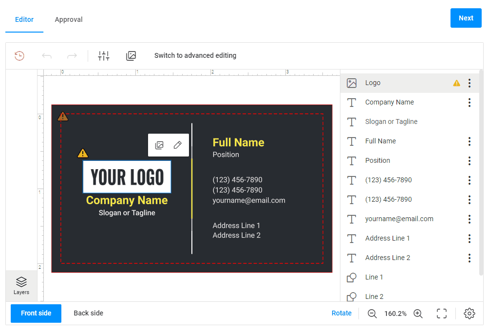
Results
If you use this workflow file and the Business card product, the results will look as follows:
This is the whole workflow file we created.
{
  "attributes": [
    {
      "name": "Design",
      "label": "Design",
      "type": "single-asset",
      "assetType": "design",
      "description": "Choose a design associated with this product. Your design file can contain text, shapes, images, and backgrounds.",
      "validations": [
        {
          "type": "required",
          "message": "Choose a design which should be used as a template."
        }
      ]
    },
    {
      "name": "Output Resolution",
      "label": "Output Print File Resolution",
      "defaultValue": 300,
      "validations": [
        {
          "type": "min",
          "min": 1,
          "message": "Resolution should be a positive number."
        }
      ],
      "type": "number"
    }
  ],
  "vars": {
    "design": "{{product.attributes?.find(x=>x.name==='Design')?.value}}",
    "backgrounds": "{{ product.attributes?.find(x=>x.name==='Backgrounds')?.value?.fullPath?.replace(/^\\/+|\\/+$/g, '') ?? ''}}",
    "outputResolution": "{{ product.attributes.find(x=>x.name==='Output Resolution').value}}"
  },
  "widgets": [
    {
      "name": "editor",
      "type": "design-editor",
      "params": {
        "initial": {
          "productDefinition": "{{vars.design?.id}}",
          "editorConfig": {
            "fontList": {
              "appFonts": [
                "*"
              ]
            },
            "rendering": {
              "hiResOutputDpi": "{{vars.outputResolution}}",
              "hiResOutputFileFormat": "pdf",
              "hiResOutputColorSpace": "cmyk",
              "proofImageSafetyLinesEnabled": true
            }
          }
        }
      }
    },
    {
      "name": "preview",
      "type": "slider",
      "params": {
        "direction": "tile",
        "rows": 1,
        "columns": "{{Math.min(2,$['editor'].proofImageUrls.length)}}",
        "containerColor": "#eee",
        "images": {
          "{{#each $['editor'].proofImageUrls.map(s=>s[0]) as imageUrl }}": {
            "url": "{{imageUrl}}"
          }
        }
      }
    },
    {
      "name": "finish-group",
      "type": "finish-group",
      "params": {
        "checkboxPrompt": "I have reviewed and approve my design.",
        "value": false,
        "checkboxEnabled": true,
        "checkboxVisible": true,
        "buttonText": "Add to cart",
        "buttonClassStyle": "primary",
        "onClick": [
          "{{#function main.showPreloader(true, 'Creating print files...')}}",
          "{{#function $['editor'].getHiResImages(800,800)}}",
          "{{#function $['order'].widgetUpdated}}",
          "{{#function main.showPreloader(false)}}"
        ]
      }
    },
    {
      "name": "steps",
      "type": "steps",
      "params": {
        "finishButton": {
          "visible": "false"
        }
      }
    },
    {
      "name": "order",
      "type": "order",
      "params": {
        "data": "{{ $['editor'].hiResUrls.reduce((acc, cur, i) => { acc['_downloadUrls_' + i] = cur;return acc; }, {}) }}",
        "images": "{{ $['editor'].proofImageUrls.map(u=>u[0]) }}",
        "props": {
          "_stateId": [
            "{{ $['editor'].stateId }}"
          ],
          "_userId": "{{ $['editor'].userId }}",
          "_hidden": {
            "snapshot": "{{ main.editorState }}",
            "images": "{{ $['editor'].proofImageUrls.map(u=>u[0]) }}",
            "downloadUrls": "{{ $['editor'].hiResUrls }}"
          }
        }
      }
    }
  ],
  "steps": [
    {
      "name": "Editor",
      "mainPanel": {
        "name": "editor"
      }
    },
    {
      "name": "Approval",
      "mainPanel": {
        "name": "preview"
      },
      "bottomPanel": {
        "name": "finish-group"
      },
      "onActivate": [
        "{{#function $['editor'].getProofImages(800,800)}}",
        "{{#function $['finish'].value = false}}"
      ]
    }
  ]
}