Workflow with designs
- Last updated on April 27, 2024
- •
- 5-6 minutes to read
Let's consider that your product has one option with connected designs. Customers select and edit one of them at the same page. Such a workflow is convenient for the products with different elements in designs but the same idea.
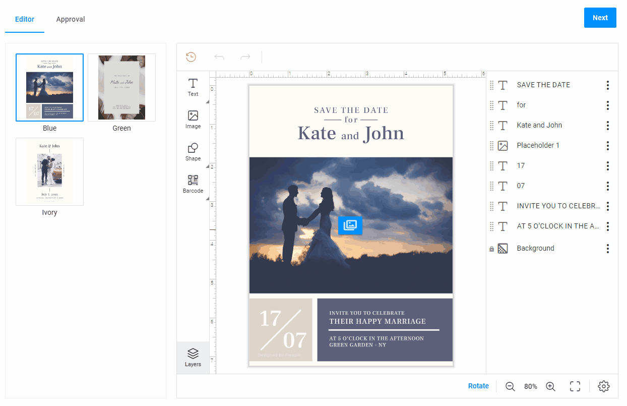
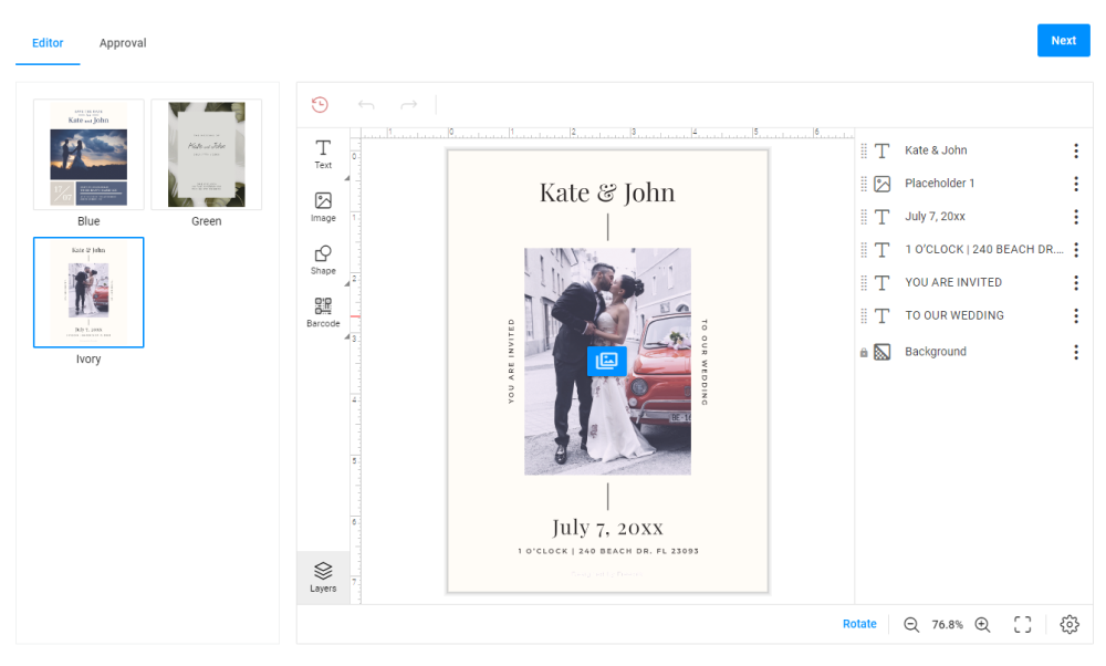
In this example, the product is a wedding invitation. The product has three different designs, but they have the same text field name.
Let's see some ideas where you can use this workflow:
- Your product has only one option.
- Designs are created by the same template, for example, they have the same text fields.
- It's enough to see only design for customers in your product. You needn't show the option name and the text of option values.
Planning
Let's plan your future workflow. For this, decide how many steps and what widgets you need for your workflow.
Let's see each point in detail.
Steps
This workflow has two steps: Editor and Approval.
At the Editor step, you will select a design and personalize it.
At the Approval step, you can approve the result.
"steps": [
  {
    "name": "Editor"
  },
  {
    "name": "Approval"
  }
]
Widgets
Let's define what widgets you need for this workflow:
pim-ajaxfor getting designs and options from a server.design-editorfor personalizing designs.design-selectorfor representing designs.finish-groupfor creating theApprovalstep.stepsfor hiding theFinishbutton in the Navigation panel.orderfor creating an order.preview-mockup-sliderfor showing a personalization result.
"widgets": [
  {
      "name": "my-editor",
      "type": "design-editor",
      "params": {...}
  },
  {
      "name": "my-pim-design-selector",
      "type": "pim-design-selector",
      "params": {...}
  },
  {
      "name": "my-finish-group",
      "type": "finish-group",
      "params": {...}
  },
  {
    "name": "steps",
    "type": "steps",
    "params": {...}
  },
  {
      "name": "my-order",
      "type": "order",
      "params": {...}
  },
  {
      "name": "my-preview-mockup-slider",
      "type": "preview-mockup-slider",
      "params": {...}
  }
]
Getting data from a server
To get designs from a server, use the pim-ajax widget. This widget gets data from the server and returns design, options, SKU, and other related information.
{
  "name": "my-pim-ajax",
  "type": "pim-ajax",
  "params": {
    "settings": {
      "designs": {
          "enabled": true
      }
    }
  }
}
Defining steps
Editor
The Editor step displays both designs and the editor. This step contains the pim-design-selector widget, which is embedded in the group widget in the toolPanel, and the design-editor widget in the mainPanel.
"steps": [
  {
    "name": "Editor",
    "toolPanel": {
        "name": "my-design-group"
    },
    "mainPanel": {
        "name": "my-editor"
    }
  }
]
PIM design selector
The pim-design-selector widget shows designs in the workflow. This widget is embedded in the group widget. It takes designs from the pim-ajax widget.
{
  "name": "my-design-group",
  "type": "group",
  "params": {
    "type": "noncollapsible",
    "scrollable": true,
    "unifySelection": false,
    "tabs": [
      {
        "widgets": [
          {
            "name": "my-pim-design-selector",
            "type": "pim-design-selector",
            "params": {
                "designs": "{{ $['my-pim-ajax'].designs }}"
            }
          }
        ]
      }
    ]
  }
}
Design editor
The design-editor widget allows you to personalize a design.
{
  "name": "my-editor",
  "type": "design-editor",
  "params": {
    "changeDesignVariant": {
        "designVariant": "{{ $['my-pim-design-selector']._ ?? undefined }}"
    },
    "initial": {
      "productDefinition": {
        "surfaces": [
          {
              "width": "1",
              "height": "1"
          }
        ]
      },
      "showPreloader": true,
      "editorConfig": {
        "initialMode": "Advanced",
        "canvas": {
            "shadowEnabled": true,
        }
      }
    }
  }
}
Approval
At the Approval step, you will see the personalization result, approve it, and create an order.
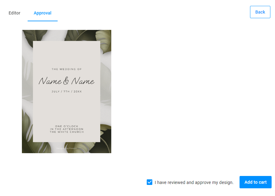
Preview mockup slider
The preview-mockup-slider represents the personalization result.
{
  "name": "my-preview-mockup-slider",
  "type": "preview-mockup-slider",
  "params": {
    "autoCompile": false,
    "productId": "{{ $['my-pim-design-selector']._.productId }}",
    "productVersionId": "{{ $['my-pim-design-selector']._.productVersionId }}",
    "productVariantId": "{{ $['my-pim-design-selector']._.productVariantId }}",
    "stateId": "{{ $['my-editor'].stateId }}",
    "previewSize": {
        "width": 1200,
        "height": 1200
    }
  }
}
Finish group
The finish-group widget shows the confirmation checkbox and the Add to cart button. When the user clicks this button, the widget will render hi-res images.
{
  "name": "my-finish-group",
  "type": "finish-group",
  "params": {
      "checkboxPrompt": "I have reviewed and approve my design.",
      "value": false,
      "checkboxEnabled": true,
      "checkboxVisible": true,
      "buttonText": "Add to cart",
      "buttonClassStyle": "primary",
      "onClick": [
          "{{#function main.showPreloader(true, 'Creating print files...')}}",
          "{{ #function $['my-editor'].getHiResImages(1000,1000) }}",
          "{{#function $['my-preview-mockup-slider'].createPreviewResource()}}",
          "{{ #function new Promise((res) => setTimeout(res, 2500)) }}",
          "{{#function main.showPreloader(false)}}"
      ]
  }
}
Steps widget
The steps widget allows you to hide the Finish button in the Navigation panel, which appears by default.
{
  "name": "steps",
  "type": "steps",
  "params": {
    "finishButton": {
      "visible": "false"
    }
  }
}
Connecting steps
The onActivate event is executed when you open the Approval step. It shows a preloader, saves the product, and updates proof images to show.
{
  "name": "Approval",
  "mainPanel": {
      "name": "my-preview-mockup-slider"
  },
  "onActivate": [
      "{{ #function main.showPreloader(true, 'Saving product...') }}",
      "{{ #function $['my-editor'].saveProduct($['my-editor'].stateId) }}",
      "{{ #function $['my-preview-mockup-slider'].compile() }}",
      "{{ #function main.showPreloader(false) }}"
  ],
  "bottomPanel": {
      "name": "my-finish-group"
  }
}
Creating an order
The order widget creates an order in the e-commerce system and a project in Customer's Canvas. For this, order gets all the necessary data like SKU and other related information.
{
    "name": "order",
    "type": "order",
    "params": {
        "props": {
            "_userId": "{{ $['my-editor'].userId }}",
            "_stateId": [
                "{{ $['my-editor'].stateId }}"
            ],
            "_hidden": {
                "images": "{{ [ $['my-preview-mockup-slider'].previewResourceUrl || '' ] }}",
                "originalProductId": "{{ product.id }}",
                "sku": "{{ $['my-pim-design-selector']._.sku || ''}}"
            }
        },
        "data": {
            "stateId": "{{ $['my-editor'].stateId }}",
            "sku": "{{ $['my-pim-design-selector']._.sku }}"
        }
    }
}
Result
Let's observe how this workflow file looks:
{
  "widgets": [
    {
      "name": "my-pim-ajax",
      "type": "pim-ajax",
      "params": {
        "currentSku": "{{ $['my-pim-design-selector']._ ?? null}}",
        "settings": {
          "designs": {
            "enabled": true
          }
        }
      }
    },
    {
      "name": "my-design-group",
      "type": "group",
      "params": {
        "type": "noncollapsible",
        "scrollable": true,
        "unifySelection": false,
        "tabs": [
          {
            "widgets": [
              {
                "name": "my-pim-design-selector",
                "type": "pim-design-selector",
                "params": {
                  "designs": "{{ $['my-pim-ajax'].designs }}"
                }
              }
            ]
          }
        ]
      }
    },
    {
      "name": "my-editor",
      "type": "design-editor",
      "params": {
        "changeDesignVariant": {
            "designVariant": "{{ $['my-pim-design-selector']._ ?? undefined }}"
        },
        "initial": {
          "productDefinition": {
            "surfaces": [
              {
                "width": "1",
                "height": "1"
              }
            ]
          },
          "showPreloader": true,
          "editorConfig": {
            "initialMode": "Advanced",
            "canvas": {
              "shadowEnabled": true
            }
          }
        }
      }
    },
    {
      "name": "steps",
      "type": "steps",
      "params": {
        "finishButton": {
          "visible": "false"
        }
      }
    },
    {
      "name": "my-preview-mockup-slider",
      "type": "preview-mockup-slider",
      "params": {
        "autoCompile": false,
        "productId": "{{ $['my-pim-design-selector']._.productId }}",
        "productVersionId": "{{ $['my-pim-design-selector']._.productVersionId }}",
        "productVariantId": "{{ $['my-pim-design-selector']._.productVariantId }}",
        "stateId": "{{ $['my-editor'].stateId }}",
        "previewSize": {
          "width": 1200,
          "height": 1200
        }
      }
    },
    {
      "name": "my-order",
      "type": "order",
      "params": {
        "props": {
          "_userId": "{{ $['my-editor'].userId }}",
          "_stateId": [
            "{{ $['my-editor'].stateId }}"
          ],
        "_hidden": {
          "images": "{{ [ $['my-preview-mockup-slider'].previewResourceUrl || '' ] }}",
          "originalProductId": "{{ product.id }}",
          "sku": "{{ $['my-pim-design-selector']._.sku || ''}}"
          }
        },
        "data": {
          "stateId": "{{ $['my-editor'].stateId }}",
          "sku": "{{ $['my-pim-design-selector']._.sku }}"
        }
      }
    },
    {
      "name": "my-finish-group",
      "type": "finish-group",
      "params": {
        "checkboxPrompt": "I have reviewed and approve my design.",
        "value": false,
        "checkboxEnabled": true,
        "checkboxVisible": true,
        "buttonText": "Add to cart",
        "buttonClassStyle": "primary",
        "onClick": [
          "{{#function main.showPreloader(true, 'Creating print files...')}}",
          "{{ #function $['my-editor'].getHiResImages(1000,1000) }}",
          "{{#function $['my-preview-mockup-slider'].createPreviewResource()}}",
          "{{ #function new Promise((res) => setTimeout(res, 2500)) }}",
          "{{#function main.showPreloader(false)}}"
        ]
      }
    }
  ],
  "steps": [
    {
      "name": "Editor",
      "toolPanel": {
        "name": "my-design-group"
      },
      "mainPanel": {
        "name": "my-editor"
      }
    },
    {
      "name": "Approval",
      "mainPanel": {
        "name": "my-preview-mockup-slider"
      },
      "onActivate": [
        "{{ #function main.showPreloader(true, 'Saving product...') }}",
        "{{ #function $['my-editor'].saveProduct($['my-editor'].stateId) }}",
        "{{ #function $['my-preview-mockup-slider'].compile() }}",
        "{{ #function main.showPreloader(false) }}"
      ],
      "bottomPanel": {
        "name": "my-finish-group"
      }
    }
  ]
}