Settings
- Last updated on March 4, 2026
- •
- 12 minutes to read
Settings are a set of feature flags and configurations that change the Handy Editor behavior.
The settings are organized in sections. Each section configures one group of related features, such as an image gallery or the editor's workspace.
The supported sections are listed below.
{
    "settings": {
        "assetLibrary": {},
        "designViewer": {},
        "imageUploader": {},
        "itemBuilder": {},
        "itemTools": {},
        "results": {},
        "itemValidation": {},
        "leaveConfirmation": {},
        "approveScreen": {},
        "colorPicker": {}
    }
}
Let's learn parameters of each section.
assetLibrary
The assetLibrary object manages the buttons for creating new elements. You can configure the following elements:
texts: A tool that adds new text items.enabled: Enables the text tool. Default:true.
shapes: A tool that creates new lines, rectangles, ellipses, and custom shapes from assets.enabled: Enables the entire shapes tool. Default:true.lineEnabled: Enables the creation of lines. Default:false.rectangleEnabled: Enables the creation of rectangles. Default:true.ellipseEnabled: Enables the creation of ellipses. Default:true.shapesFromResourcesEnabled: Enables custom shapes from assets. Default:false. Note that you must also specify the source folder for custom shapes in resources.
images: An image manager that allows inserting image items from a library.enabled: Enables the images tool. Default:true.textToImage: Configures the AI-based text-to-image generation feature.enabled: Enables the text-to-image tool. Default:false.vendor: Optional. Specifies the service provider for text-to-image generation. Available values:"OpenAi","Picsart". Default: taken from tenant settings.
externalImageStorage: A tool for managing images from external storage.enabled: Enables the external image storage tool.
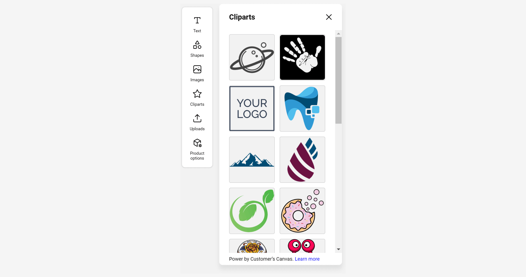
cliparts: A library of clipart (vector elements used as decorations, icons, etc.).enabled: Enables the cliparts tool. Default:true.
imageUploader: A tool for uploading and inserting new images from the user's device.enabled: Enables the image uploader tool. Default:true.
qrCode: A tool that adds new QR codes.enabled: Enables the QR code tool. Default:true.
templates: A design selection tool for choosing from available templates.enabled: Enables the templates tool. Default:true.changeBehavior: Defines the behavior when changing templates:"transfer"or"reset".
options: A tool for selecting product options.enabled: Enables the options tool. Default:true.
custom: A panel for displaying custom content, such as tutorials or additional information for users. To provide your content, set up thecustom-panelandcustom-panel-mobileslots, depending on your target editor environment.enabled: Enables the custom panel button in the toolbar. Default:false.icon: A custom icon for the panel. Default:"he-help".
If you omit the assetLibrary object, the following default values will be applied:
{
    "settings": {
        "assetLibrary": {
            "texts": {
                "enabled": true
            },
            "shapes": {
                "enabled": true,
                "lineEnabled": true,
                "rectangleEnabled": true,
                "ellipseEnabled": true,
                "shapesFromResourcesEnabled": false
            },
            "images": {
                "enabled": true,
                "textToImage": {
                    "enabled": false,
                    "vendor": "OpenAi"
                }
            },
            "externalImageStorage": {
                "enabled": false
            },
            "qrCode": {
                "enabled": true
            },
            "cliparts": {
                "enabled": true
            },
            "templates": {
                "enabled": true,
                "changeBehavior": "transfer"
            },
            "imageUploader": {
                "enabled": true
            },
            "options": {
                "enabled": true
            },
            "custom": {
                "enabled": true,
                "icon": "he-video"
            }
        }
    }
}
designViewer
The designViewer object is responsible for the user experience with the work area (design viewer) where the user manipulates the design elements.
{
    "settings": {
        "designViewer": {
            "grid": {}
        }
    }
}
The grid object configures the grid that makes it easier for the user to position and align the elements on the design.
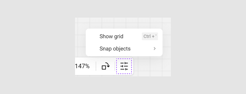
step: defines the grid step, in points (1/72 inch).gridEnabled: defines whether the grid is enabled when the editor is opened. The user can toggle it later through the user interface or a hotkey (Ctrl+').
If you omit the grid object, the following default values will be applied:
{
    "settings": {
        "designViewer": {
            "grid": {
                "step": 10,
                "gridEnabled": false
            }
        }
    }
}
imageUploader
The imageUploader object defines the format in which the uploaded images will be added to the design. You can set a single option for all supported image types in the insertByDefaultAs property, which will be applied by default. At the same time, you can specify how different types of uploaded images will be added to the design in the insertFileAs object. This setting may look as follows:
{
    "settings": {
        "imageUploader": {
            "insertByDefaultAs": "Auto",
            "maxFileSizeMb": 50,
            "multipleUploadEnabled": false,
            "allowedFileFormats": [".jpg", ".jpeg", ".png"],
            "allowedFileFormatsVectorOnly": [".svg", ".psd", ".eps"],
            "insertFileAs": {
                "svg": "Shape",
                "pdf": "Clipart",
                "png": "Image",
                "jpeg": "Image"
            },
            "itemBuilder": {
                "image": {
                    "width": "original",
                    "height": "40%"
                }
            }
        }
    }
}
maxFileSizeMb: The maximum file size in megabytes.multipleUploadEnabled: Enables the ability to upload multiple files simultaneously.allowedFileFormats: A list of allowed file formats.allowedFileFormatsVectorOnly: Allowed file formats when the Constraints > Raster objects container setting is disabled.insertByDefaultAs: The preferred type for file extensions that are not defined in the configuration.insertFileAs: Determines the internal element type of the editor that will correspond to the images of the uploaded file format. The keys in this object are the file formats (e.g.,svg,pdf,png,jpeg, etc.), and the values may be"Clipart","Image","Shape","Group", or"Auto", where:"Clipart": creates a clipart item if possible."Image": creates an image item if possible."Shape": creates a shape item if possible."Group": creates a group of shapes if possible."Auto": automatically determines the type of uploaded graphics on the server.
itemBuilder: Defines how uploaded images are sized and positioned within the editor. You can specify thewidthandheightof the image using one of the following formats:- "original": Retains the original dimensions of the uploaded image.
- Percentage (e.g., "40%"): Scales the image proportionally based on the current area (e.g., the entire canvas or an interactive zone).
- Absolute value (e.g., 300): Sets the
widthorheightto a fixed pixel value.
itemBuilder
The itemBuilder object allows you to define the initial properties of objects to be created in the editor. This object is defined by using the IItemData interfaces. Currently, you can set initial properties for the following design element types:
text
For example, this is how you can enable vertical orientation for text:
{
    "itemBuilder": {
        "text": { "isVertical": true }
    }
}
itemTools
The itemTools section allows you to configure certain elements of the properties panel. Let's learn the available subsections.
Transform
The transform object configures the availability and behavior of the transform control, which allows users to change the position, size, and rotation of objects, implementing the translate, scale, and rotate operations.
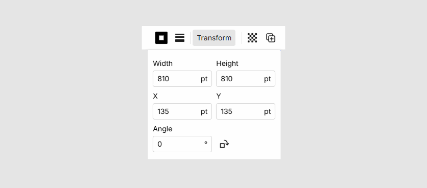
Configuration:
{
    "settings": {
        "itemTools": {
            "transform": {
                "enabled": true,
                "translateEnabled": true,
                "scaleEnabled": true,
                "rotateEnabled": true,
                "unit": "pt"
            }
        }
    }
}
enabled: Enables or disables the Transform button. Default:true.translateEnabled: Allows or blocks changing the position (X, Y) using the control. Default:true.scaleEnabled: Allows or blocks changing the size (Width, Height) using the control. Default:true.rotateEnabled: Allows or blocks changing the angle (Angle) using the control. Default:true.unit: Sets the displayed unit of measurement. Available values:"pt","cm","mm","in". Default:"pt".
Align
The align object configures the availability and behavior of the align control, which allows users to align an object relative to the page.
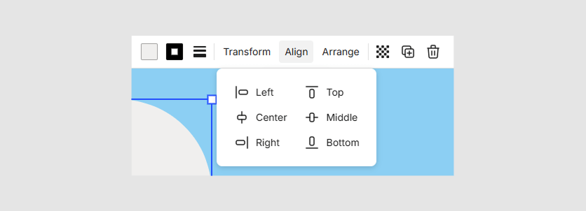
Configuration:
{
    "settings": {
        "itemTools": {
            "align": {
                "enabled": true
            }
        }
    }
}
enabled: Enables or disables the Align button. Default:true.
Arrange
The arrange object configures the availability and behavior of the arrange control, which allows users to set the rendering order of an object relative to other objects.
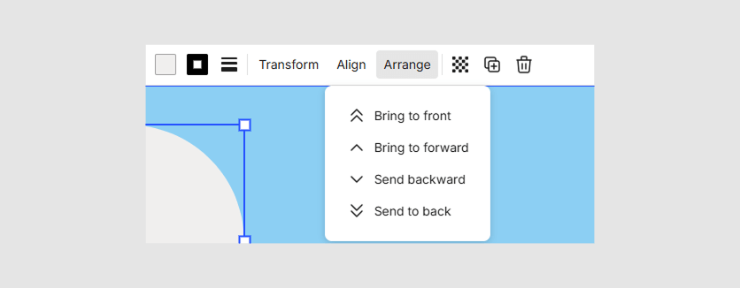
Configuration:
{
    "settings": {
        "itemTools": {
            "arrange": {
                "enabled": true
            }
        }
    }
}
enabled: Enables or disables the Arrange button. Default:true.
Background Removal
The backgroundRemoval object configures the availability of the Background Removal button, which allows users to remove the background from an image using AI. The button is only displayed for objects of type ImageItem.
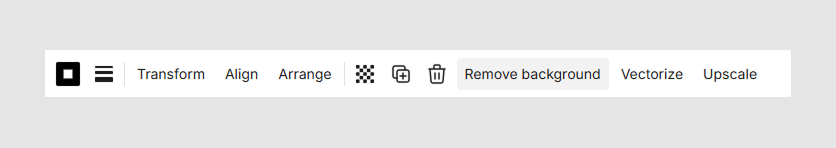
Configuration:
{
    "settings": {
        "itemTools": {
            "backgroundRemoval": {
                "enabled": false,
                "vendor": "Picsart"
            }
        }
    }
}
enabled: Enables or disables the Background Removal button. Default:false.vendor: Specifies the service provider for background removal. Available values:"Picsart","RemoveBg". Default: taken from tenant settings.
Vectorize
The vectorize object configures the availability of the Vectorize button, which allows users to vectorize raster images using AI. The button is only displayed for objects of type ImageItem.
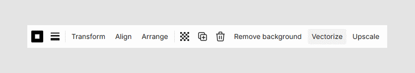
Configuration:
{
    "settings": {
        "itemTools": {
            "vectorize": {
                "enabled": false,
                "vendor": "VectorizerAi"
            }
        }
    }
}
enabled: Enables or disables the Vectorize button. Default:false.vendor: Specifies the service provider for vectorization. Available values:"VectorizerAi". Default: taken from tenant settings.
Upscale
The upscale object configures the availability of the Upscale button, which allows users to improve the image quality using AI. The button is only displayed for objects of type ImageItem.
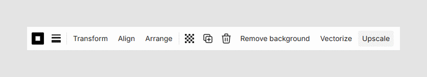
Configuration:
{
    "settings": {
        "itemTools": {
            "upscale": {
                "enabled": false,
                "vendor": "Picsart"
            }
        }
    }
}
enabled: Enables or disables the Upscale button. Default:false.vendor: Specifies the service provider for image quality improvement. Available values:"Picsart". Default: taken from tenant settings.
results
The results object controls how previews are generated and displayed, including whether to use mockups. You can configure the appearance of the editor's output—such as for the addToCart event—by defining the preview type:
{
    "settings": {
        "results": {
            "previews": {
                "type": "design-on-mockup"
            }
        }
    }
}
type: Allows you to customize how the personalized design is presented, whether as a standalone image or integrated into a mockup for a more realistic preview. Two values are supported:"design-only": Generates a preview image of the design only (the default value)."design-on-mockup": Generates a preview image of the design placed on a mockup.- If using PIM, the mockups are taken from the product configuration.
- If using public/private designs, the mockups are taken from the
inputsection.
itemValidation
The itemValidation object configures the validation rules for items in the design. You can enable an image quality meter with low DPI warnings, check for minimum font sizes for text elements, and verify vector graphics compliance for images. The following example demonstrates properties of these checks and their default values.
{
    "settings": {
        "itemValidation": {
            "allowRasterElements": {
                "enabled": true,
                "severity": "Error"
            },
            "targetResolution": {
                "errorLevel": 50,
                "warningLevel": 100
            },
            "minFontSize": {
                "enabled": true,
                "severity": "Warning"
            }
        }
    }
}
severity: Determines the level of validation issues:Warning: Indicates that there are validation issues but does not prevent the user from proceeding to the next step.Error: Stops the user from proceeding to the next step until the validation issues are resolved.
allowRasterElements
The allowRasterElements setting restricts the type of images being added to the design to either vector-only or both vector and raster elements.
By default, the enabled property is true, which enables this validation. To prevent the client from proceeding to the approval page, set severity to "Error".
{
    "settings": {
        "itemValidation": {
            "allowRasterElements": {
                "enabled": false,
                "severity": "Error"
            }
        }
    }
}
targetResolution
The targetResolution validates the resolution for raster objects that will be used for rendering print files.
This setting determines the image resolution levels at which validation violations will be reported. It has a higher priority compared to the warning and bad settings of qualityMeter. However, the target DPI value is taken from the container's printing restrictions, not from the configuration.
The warningLevel is the percentage of the target DPI (default is 100%) below which a warning will be displayed for the image. It shows a yellow icon on the canvas and a warning message at the approval page, but still allows the user to click the Approval checkbox and the Continue button on the approval page. To disable this setting, change its value to null.
The errorLevel is the percentage of the target DPI (default is 50%) below which an error will be displayed for the image. It shows a red icon on the canvas and a warning message at the approval page. If this validation fails, the Approval checkbox and the Continue button will be disabled on the approval page, preventing the user product personalization from being completed. To disable this setting, change its value to null.
{
    "settings": {
        "itemValidation": {
            "targetResolution": {
                "errorLevel": 50,
                "warningLevel": 100
            }
        }
    }
}
minFontSize
The minFontSize setting imposes a limit on the minimum font size to prevent using extremely small text that cannot be printed. This setting affects the font size in the font size selector and is also checked when resizing text. This check is enabled by default.
{
    "settings": {
        "itemValidation": {
            "minFontSize": {
                "severity": "error" | "warning"
            }
        }
    }
}
qualityMeter
Note
This object remains for compatibility purposes. It's recommended to use the targetResolution object for DPI validation. Otherwise, the warning and bad properties will be applied only when errorLevel and warningLevel are set to null.
The warning and bad properties define the raster image quality levels as a percentage of the targetResolution property that will be used for rendering print files. The warning value should be greater than or equal to the bad value.
You can enable a bar displaying the DPI change when the user resizes images. To display this bar, set qualityChangeContainersEnabled to true.
In the following example, a DPI lower than 150 (50% of 300) will be considered bad, a DPI in the range from 150 to 240 will display a warning, and a DPI higher than 240 will be considered acceptable. For DPI values corresponding to the bad and warning levels, an icon appears near the image.
{
    "settings": {
        "itemValidation": {
            "qualityMeter": {
                "enabled": true,
                "targetResolution": 300,
                "warning": 80,
                "bad": 50,
                "qualityChangeContainersEnabled": true
            }
        }
    }
}
leaveConfirmation
The leaveConfirmation object contains an enabled property that allows you to disable confirmation dialog when leaving the page with the editor. By default, this dialog will appear in a browser, and the property value is true.
{
    "settings": {
        "leaveConfirmation": {
            "enabled": false
        }
    }
}
enabled: Disables confirmation dialog when leaving the page with the editor. Default:true.
approveScreen
The approveScreen section allows configuring the behavior of the approval screen.
{
  "settings": {
    "approveScreen": {
      "requireAllPageReview": {
        "enabled": true
       }
    }
  }
}
enabled: Enables the mode where the screen will require mandatory reviewing of all existing pages. If the user has not reviewed the pages and has not confirmed this, a warning message is displayed. Default:true.
colorPicker
The colorPicker object allows you to configure color selection behavior in the editor.
{
    "settings": {
        "colorPicker": {
            "picker": {
                "colorSpace": "cmyk"
            }
        }
    }
}
picker.colorSpace: Determines the color space mode for the color picker. Supported values are"cmyk"or"rgb". The default value is"cmyk".
Note
If your template uses containers of the FullColor type, the color space setting from the container takes precedence over this property.