Group elements
- 6-7 minutes to read
The Design Editor allows you to group design elements, including nested groups, and manipulate them as a single object on the canvas. You can edit elements in a group, enable the auto layout, and ungroup them if needed. You can also use a special type of group called clipart to manipulate colors in such a group of vector shapes.
In this topic, you can learn how to create groups and work with them in the Design Editor. For reference, you can download a PSD file with groups and an SVG file representing clipart.
Creating Groups
You can enable groups in the following ways:
- Group elements in the web-to-print editor.
- Load SVG, PDF, or PSD assets in the group mode.
- Create groups of layers in Photoshop or InDesign templates.
Grouping Elements on the Canvas
In the Advanced editor mode, your users can select several elements on the canvas and then click Group either on the Item Menu or in the Top Toolbar.

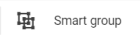
For groups, the Ungroup and Smart group buttons appear in the Top Toolbar.
To split grouped elements into separate objects, select a group on the canvas or click a group name in the Object Inspector, and then click Ungroup.
To apply the auto layout to grouped elements, click Smart group and select the layout properties.
Loading Groups through the Asset Manager
When configuring asset sources, you can define how SVG, PDF, and PSD graphics should be loaded to the canvas - as an image element or a group of design elements. You can define this behavior through the actionMode property. The following two modes enable groups:
- The
groupmode imports elements from SVG and PDF files and layers from PSD files combined into a group element. - The
clipartmode imports SVG graphics combined into a clipart element.
For example, the following configuration of the private user gallery allows them to open SVG files as clipart and layers of a PSD file combined into a group.
{
    "assetSources": {
        "My files": {
            "type": "PrivateSource",
            "allowedExtensions": [ "svg", "psd" ],
            "actionMode": {
                "svg": "Clipart",
                "psd": "Group"
            }
        }
    }
}
Importing Groups from Product Templates
The Design Editor maintains layer groups designed in Photoshop and InDesign templates and allows you to define how the grouped layers should be loaded.
To define a general behavior in the editor, use the FlattenGroups parameter in Aurigma.DesignAtoms.config. By default, this parameter is false, and a layer group is loaded as a group element. If true, layers of the group will be imported as separate objects.
You can also define how to load a single layer group by using the <GR> marker. <GR_f> splits the group into separate objects, whereas <GR_t> enables a group element in the editor.
Let's look at how the Design Editor imports design elements from the following template.
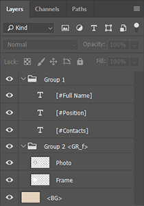
In the Object Inspector, these layer groups will appear depending on the FlattenGroups parameter:
FlattenGroups is false |
FlattenGroups is true |
|---|---|
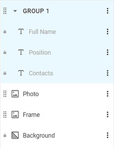 |
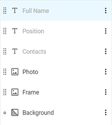 |
To apply the auto layout to a group, use the <GR_autolayout> marker. At the same time, you can define additional properties of such a group:
<AGRO_vertical>- the Direction of elements, eitherhorizontalorvertical.<AGRA_center>- Alignment of elements:left/top,right/bottom,center,auto, ornone.<AGRM_6>- Spacing between elements.
For example, if you define markers <GR_autolayout><AGRO_vertical><AGRA_left><AGRM_6> for a group, the elements of this group will be vertically arranged and aligned to the left at a distance of 6 pt from each other. These properties will be maintained until the user changes them through the Top Toolbar.
Manipulating Groups on the Canvas
You can manipulate elements in a group as a single object: move, delete, and rotate them together. However, if one of the elements is disallowed for manipulation, then the whole group will have this restriction. For example, if you assign the <MAD_f> marker to a layer, then your users will not be able to delete this layer and the group that contains it.
When resizing a group object, the Design Editor proportionally resizes images and adjusts the font size of text elements. Since only proportional resizing is supported, you cannot apply the <MRC> marker to a group.
Replacing the Content of Groups
To allow your users to replace the content of groups defined in Photoshop and InDesign templates, add the <GARC> marker to the group name. This marker enables the Replace content command on the Item Menu.
By clicking Replace content, the user opens the Asset Manager. When the user selects an asset, the Design Editor deletes all elements from the group and inserts that asset at the same position on the product. According to the defined action mode, the asset will be inserted as a nested group, clipart, or an image element.
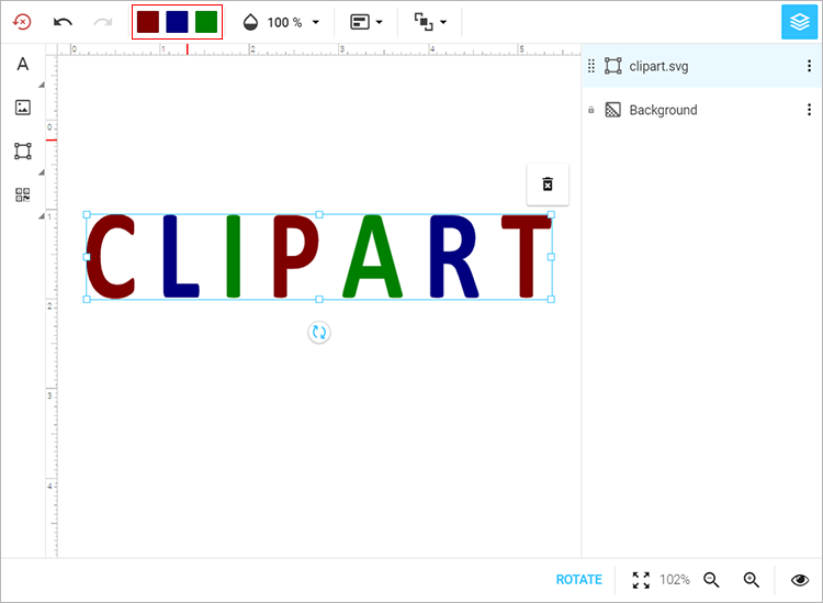
Manipulating Colors in Clipart
To import SVG graphics as a shape element, you can enable either shape or clipart modes when configuring your asset sources. In the first case, you get a shape on the canvas that combines vector elements from the SVG file and applies the color of the first element to the resulting shape. In the clipart mode, you get a shape that represents a multicolor group of vector elements.
Clipart maintains all colors from the original SVG files. When you select clipart in the Design Editor, it displays a list of all applied colors in the Top Toolbar. If clipart contains too many colors to display in the toolbar, the list collapses into a button.
Note
The Design Editor does not apply tolerance when retrieving colors from SVG graphics. If two elements have similar tints, which visually look like the same color but actually have different color components, say 254 and 255, then they will be treated separately.
Manipulating Auto-layout Groups
When the user changes the default properties through the Top Toolbar, changes are applied to the group and the elements are automatically rearranged. You can change the Direction of elements, their Alignment, and Spacing. You can also disable the auto layout.

If the user deletes only the content of a text element in an auto-layout group or deletes the element completely, then the auto layout will not allow extra spaces to appear. Instead of empty elements, the next ones are pulled up and spacing is adjusted. If the user changes the size of an element, then the size of the group's other elements will be automatically adjusted.
An auto-layout group may contain empty text elements and empty nested auto-layout groups if they are not locked. When all such elements in a group become empty, this group becomes invisible in the product. When at least one element becomes non-empty, the group becomes visible again. If there are no elements in a group that can become empty, it is always visible.
For example, you may want to design a business card where every contact field consists of two elements: an icon specifying the field type and a text element. You can group these two elements in an auto-layout group and include this group in another auto-layout group.
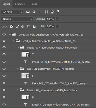
In the editor, this group will look as follows:
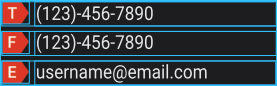
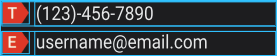
If you delete the fax number, then the entire Fax group is hidden and the Email group moves up to take its place automatically.
Now, if you type in a fax number in the Object Inspector, this field will appear on the canvas.
When an element appears or hides in an auto-layout group, its layout is rearranged, and as a result, the size of this group may change. You can use the <AGRAP> marker to define the anchor point for the group:
<AGRAP_start>anchors the layout to the start point and moves elements up (in vertical orientation) or to the left (in horizontal orientation).<AGRAP_center>anchors the layout to the center of the group.<AGRAP_end>anchors the layout to the end point and moves elements down (in vertical orientation) or to the right (in horizontal orientation).
By default, auto-layout groups are anchored to the start point.