Design File Anatomy
- Last updated on February 20, 2026
- •
- 7 minutes to read
A design file may have a complicated structure. To be able to build templates or designs for Customer's Canvas, it is important to understand its structure. If you have experience with some Adobe software like Photoshop, InDesign, or Illustrator, you will be familiar with many of these concepts. However, it is still highly recommended to read this article before you start creating designs for Customer's Canvas.
Design file hierarchy
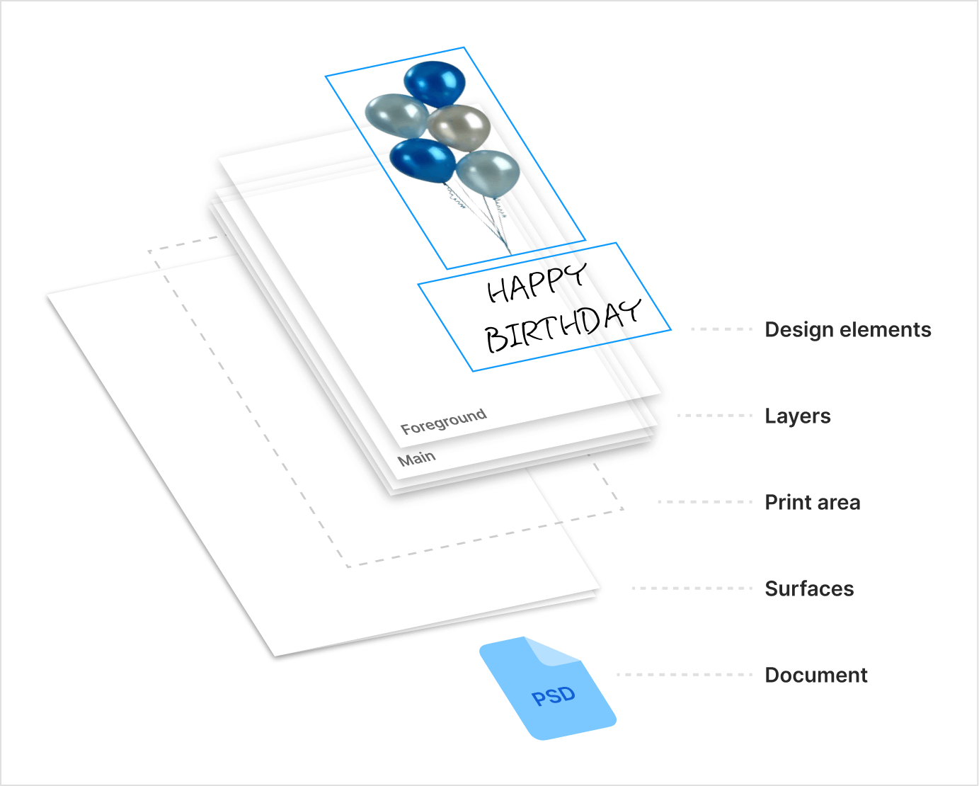
Customer's Canvas supports the following hierarchy of elements in a design file.

Print Product
The top-most element is the print product itself. It does not have its own properties. The only thing it contains is a list of "surfaces" (see below).
Surfaces
A surface represents a work area of the Design Editor where a user can manipulate elements at one time. The easiest way to think of it is a "page" or a "side" of a print product. For example, if you need a double-sided business card, you will most likely create a design file with two surfaces. A user will need to switch between the front and back sides in the Design Editor interface.
Note, it is important to distinguish surfaces/pages/sides in the user interface and real pages in the output PDF file that will be generated. A surface may contain more than this page. It may also have some elements "outside" of the page that will be visible on the screen, but won't be part of an output print file. Those pages in a print file are represented by "print areas" (see below), which are a part of a surface.
Print Areas
A print area is located inside a surface and, as mentioned above, represents the page in an output print file. They are very similar to Artboards in Adobe Illustrator.
Each print area has parameters, which are a part of a print file specification - width, height, bleed, and slug. Its children are the "layers" (also called "containers").
In addition to layers, a print area may have "areas" (safety lines) - markup in the editor to show the margins or specify special areas, like the left or right chest on a T-shirt. It may also include a region to limit an area where a user is allowed to make changes. See Regions for more details.
Although in most cases dimensions of print areas in one print product are the same, they do not have to be so. Technically, a design file may contain surfaces and print areas of different sizes and bleed settings.
Layers
Layers, also referred to as containers, hold "items" or "design elements" of various types. They are essential for separating elements that require different interpretations by the editor, such as background, main design layer, post-processing elements, and foreground.
The editor displays all elements of each layer in the same order as they are stored in the design (unless layers or elements are hidden). For example, if you have the following layers:
- Foreground
- Main Area
- Background
All items in the Foreground layer will always appear above any item in the Main Area, and all items in the Main Area will appear above any item in the Background layer.
Layers also simulate different printing techniques, categorized into three main types:
- Full Color – Standard full-color printing.
- Colorless – Used for techniques like engraving, foil stamping, etc.
- Limited Color – Used for techniques like screen printing, pad printing, etc.
Full Color layers support standard full-color printing. They allow for the use of a wide range of colors, color spaces, and color profiles to ensure accurate color reproduction in both the editor and the final output.
Colorless layers are designed for techniques such as engraving or foil stamping, where the final output is typically monochrome (e.g., black and white). However, in the editor, these layers can be configured to display differently for better visualization during the design process. For example, a wood grain texture might be used to simulate an engraved effect, while a solid gray color could represent foil stamping. For examples of how Colorless layers appear in the editor, see the Printing technique configuration topic.
Limited Color layers are used for printing techniques that restrict the number of colors, such as screen printing or pad printing. These layers require a predefined color palette (a set of allowed colors) to ensure consistency. Limited Color layers are currently supported only in the Handy Editor.
Items (design elements)
Items are the "atoms" of your design - text, shapes, images, barcodes, etc. You may learn about different types of items in the Element types section.
They have a lot of properties, which are basically divided into "design properties" (e.g. an item color, font settings, position, blending options, etc.) and "behaviors", i.e. the settings that control the behavior of items for the end-user in the Design Editor (e.g. whether the item is allowed to be resized, moved, placeholder settings, copyfitting settings, etc.).
How designs are imported
Photoshop
When you import a Photoshop file, the system automatically creates a print product with one surface and one print area inside it. The size of a print area and a surface are equal. Since Photoshop files do not support bleeds, it is always assumed that this design has a zero bleed.
The print area in such a file contains several layers (background, foreground, main, etc.). However, by default, all items are copied to the main layer.
Customer's Canvas attempts to copy as many item properties as possible, such as color, font settings, opacity, blending mode, etc. If it encounters some properties it does not support, it just ignores them (e.g. most of the effects). If you are using grouping in Photoshop, they are imported as group items (unless you override this behavior with markers - see below).
Of course, Photoshop was not designed to create templates for systems like Customer's Canvas, and it does not have any behavior settings. However, it is still possible to set the behavior properties by specifying so-called "markers" in item names. A marker is a special shortcode you add to the item's name to specify how Customer's Canvas should interpret it. For example, if you name it Layer 1 <LC>, it will lock this element. A list of all possible markers can be found in the Marker Reference article.
There are some markers that not only control behavior but also whether or not an item belongs to a background (<BG>) or a foreground (<FG>) layer.
InDesign
Customer's Canvas also supports designs created in InDesign. Note, it does not support INDD files; you must save them as IDML files before you can import them.
Importing IDML files works in a similar manner to Photoshop. However, the structure of an InDesign file is much closer to Customer's Canvas.
Each page from InDesign is converted into a surface and print area. The bleed and slug are read as well.
Items are read in a similar manner - all properties we can recognize are taken from InDesign. For the features that are not available, you may use markers. The marker syntax is the same, but certain markers are not supported or don't make sense in InDesign. For example, for multi-column text, there is no need to use markers because, unlike Photoshop, InDesign allows for configuring multi-column texts in the user interface.
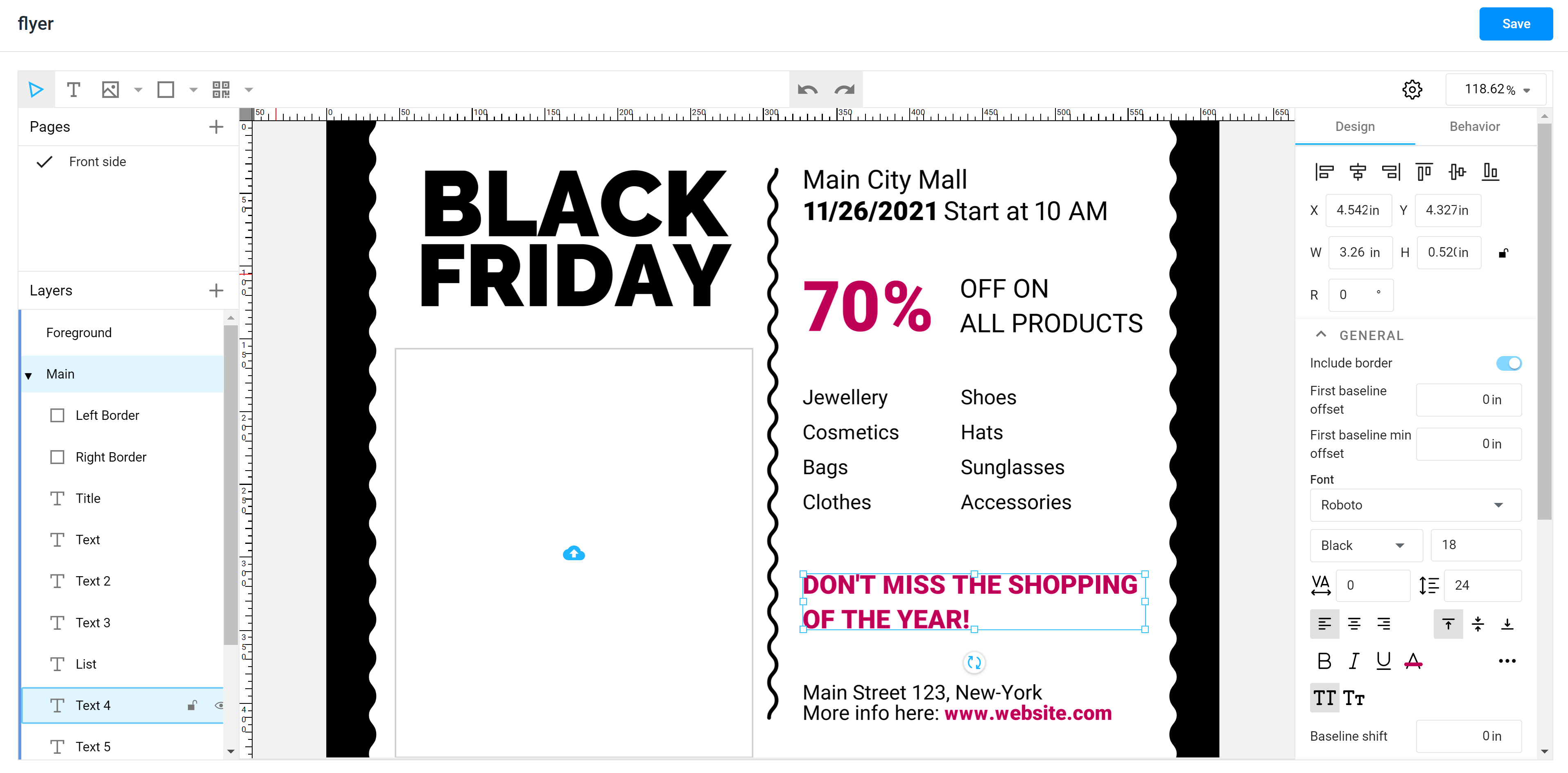
Designs in Template Editor
Depending on the Customer's Canvas integration scenario, you may either work with PSD or IDML files directly or convert them to the Customer's Canvas format and edit them using the Template Editor, which is built in the BackOffice app.

This editor is created to work with the design structure as explained above. The only exception at the moment is that it does not support multiple print areas on one surface. That's why you can see the Pages, which describe both a surface and its print area.
Other aspects are the same. On the left side you can see a hierarchy of layers and items. On the right side are the properties of currently selected items. They are separated into two tabs: Design and Behavior. The latter is equivalent to markers in Photoshop or InDesign. However, instead of adding shortcodes to the item names, you can just toggle certain permissions and properties on/off.