Editor overview
- Less than a minute to read
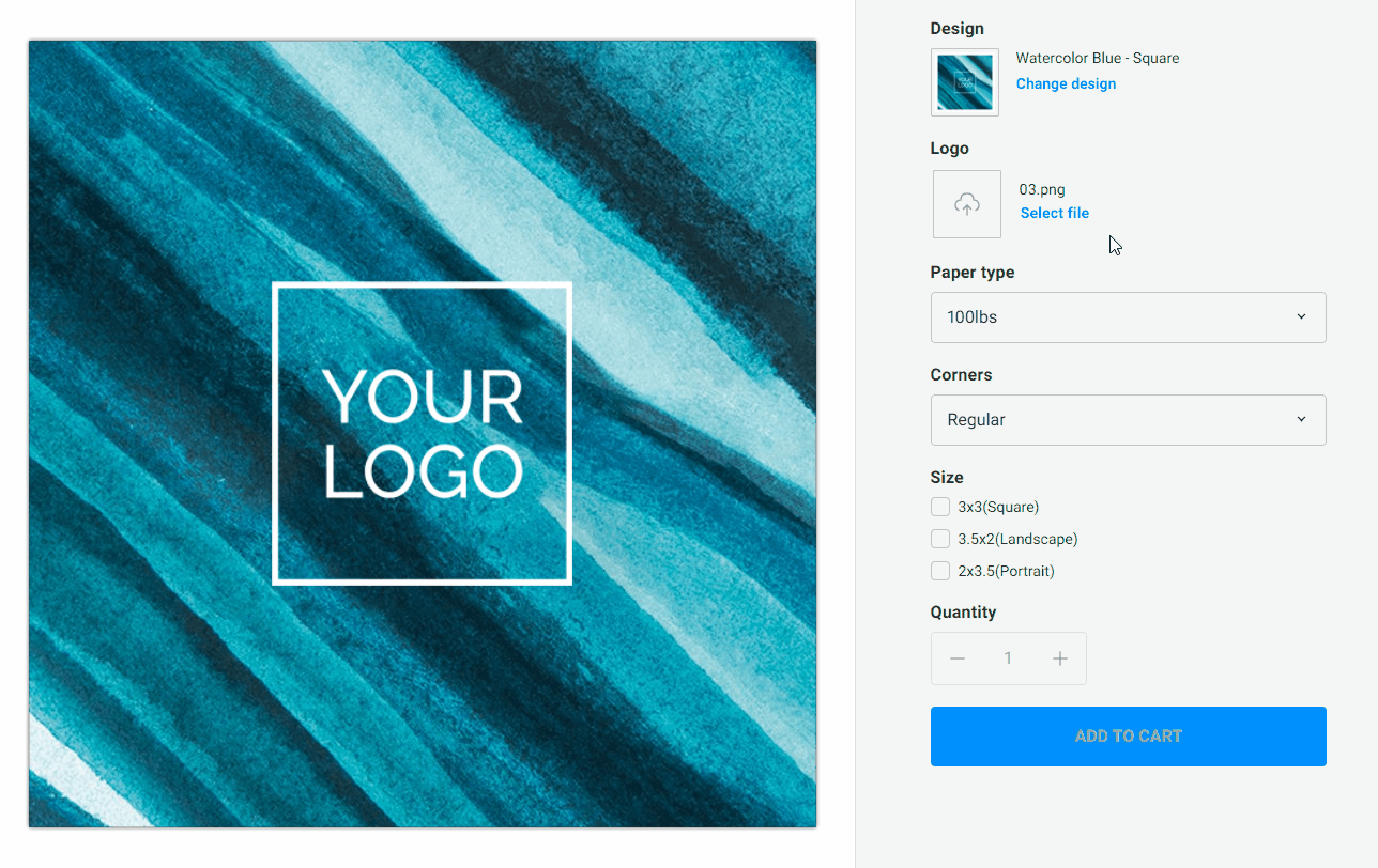
When you open the Simple Editor, it may look as follows:
- Viewer
- Pagination control
- Design selector
- Editable fields from the design
- Image placeholder
- Product options from PIM
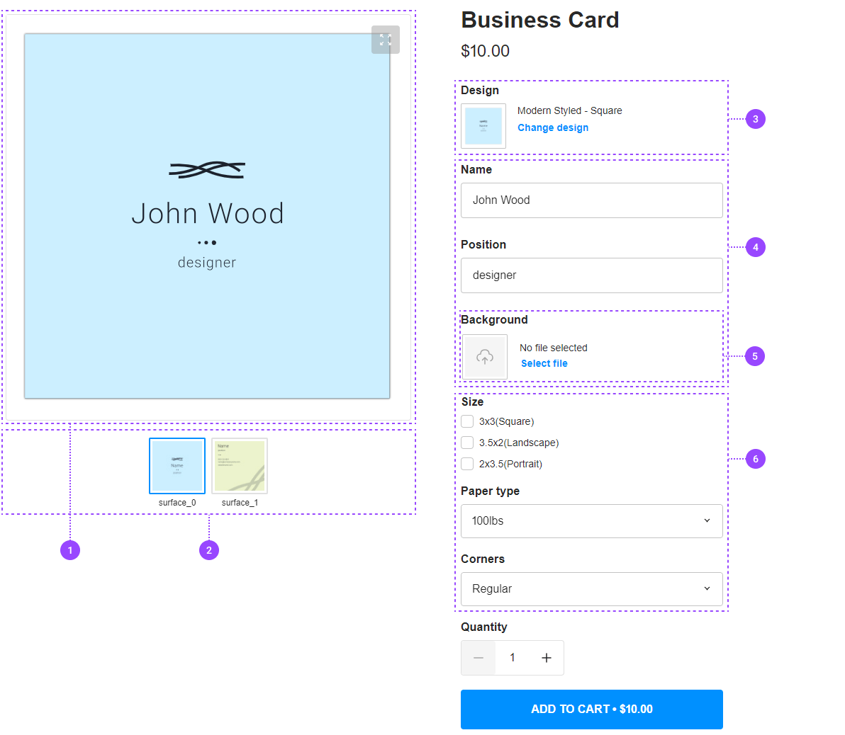
Main screen
The screen is split into two parts. On the left side, there is the Viewer with the product preview displaying the content of the design fields.
For multipage products, a pagination control with page thumbnails appears below the Viewer.
The form with options and design fields occupies the right side of the screen. This form contains the Design selector, which allows for replacing the design, editable fields loaded from the design, and the product options from the PIM module. When the user edits any field in this form, the changes are reflected in the Viewer.
Selecting alternative designs
When you have defined more than one design for a product variant, the Design selector appears in the form, and the user can click it to change the design.
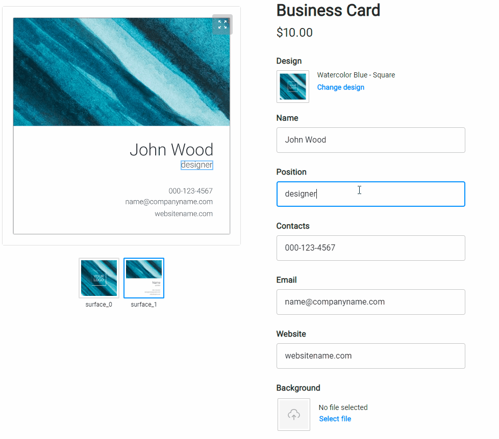
Selecting images in placeholders
When your user clicks an image placeholder, the cropping tool opens, and they can ensure that the aspect ratio of the selected image is compatible with the placeholder itself.