Slots
- Last updated on February 16, 2026
- •
- 3 minutes to read
Slots allow you to embed external HTML content into workflow elements, giving you greater flexibility to customize the editor and add new functionality. You can insert your own content into special slots and modify it via the Document Object Model (DOM), for example, by accessing elements by their ID. There are no restrictions on what you can embed—standard HTML, web components, or IFRAME elements are all supported.
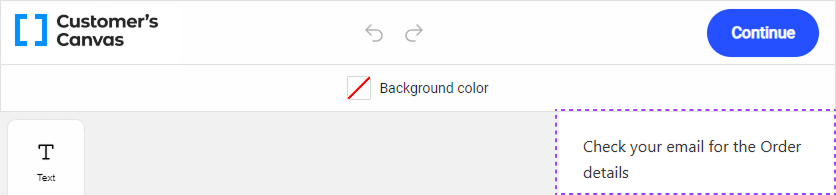
rightPanelContent
Use the rightPanelContent slot to display an additional panel with custom content on the right side of the editor.
Pass your content with the rightPanelContent attribute as a child element of au-handy-editor:
<au-handy-editor>
  <div rightPanelContent>Check your email for the Order details</div>
</au-handy-editor>
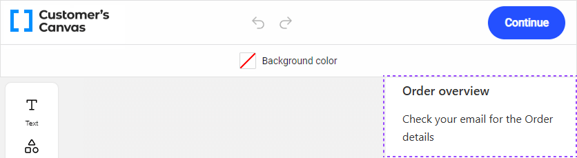
rightPanelHeader
Use the rightPanelHeader slot alongside rightPanelContent to set a title for the panel.
<au-handy-editor>
  <div rightPanelHeader>Order overview</div>
  <div rightPanelContent>Check your email for the Order details</div>
</au-handy-editor>
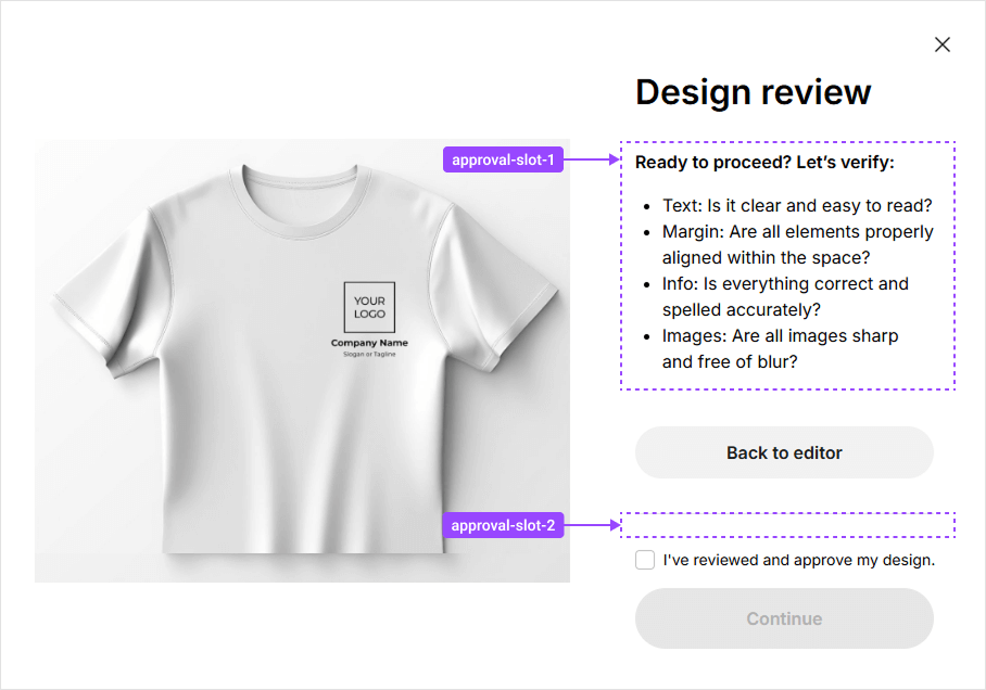
approval-slots
The approval-slot-1, approval-slot-2, and approval-slot-3 slots customize the approval modal window:
approval-slot-1: Replaces the default description text with a custom element.approval-slot-2: Adds a custom element below the Back to Editor button.approval-slot-3: Adds a custom element below the Continue button.
<au-handy-editor>
  <div approval-slot-1>Ready to proceed? Let's verify.</div>
</au-handy-editor>
overlay-spinner
Use the overlay-spinner slot to replace the default loading animation in the editor with your custom content. If no content is provided, the standard Customer's Canvas logo will be displayed as the loading indicator.
<au-handy-editor>
  <div overlay-spinner>
    <svg width="80" height="80" viewBox="0 0 44 44">
      <circle cx="22" cy="22" r="20" fill="none" stroke="#60A5FA" stroke-width="4">
        <animate attributeName="r" from="20" to="0" dur="1.5s" begin="0s" repeatCount="indefinite" />
        <animate attributeName="opacity" from="1" to="0" dur="1.5s" begin="0s" repeatCount="indefinite" />
      </circle>
    </svg>
  </div>
</au-handy-editor>
Here, the second <animate> element animates the circle's opacity, fading it out as it shrinks. Let's learn the parameters applied in the example:
<svg>:width,height: Define the dimensions of the SVG container.viewBox: Sets the coordinate system and aspect ratio (0 0 44 44means the SVG canvas is 44 units wide and tall).
<circle>:cx,cy: Coordinates of the circle's center (22places it in the center of the 44×44 SVG).r: Radius of the circle (20units).fill="none": Ensures the circle is not filled.stroke="#60A5FA": Sets the outline color of the circle.stroke-width="4": Sets the thickness of the circle's outline.
<animate>:attributeName="r": Animates the circle's radius.from="20",to="0": Radius changes from 20 to 0, creating a shrinking effect.dur="1.5s": Animation duration is 1.5 seconds.begin="0s": Animation starts immediately.repeatCount="indefinite": Animation loops indefinitely.
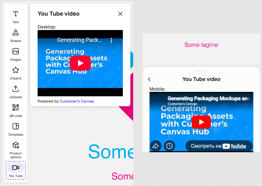
custom-panel
The custom-panel and custom-panel-mobile slots help you organize a panel with your own content in desktop and mobile editor versions, correspondingly.
<au-handy-editor>
  <div custom-panel>
    <p>Desktop:</p>
    <iframe
        width="560"
        height="315"
        src="https://www.youtube.com/embed/XjwA3Z8Q4sU" >
    </iframe>
  </div>
</au-handy-editor>
To display this panel, enable the custom button in the assetlibrary settings.
You can customize text labels through localization settings using the following keys:
assetLibrary.custom.headerLabel— Label for the panel header.assetLibrary.custom.actionPanelLabel— Label for the button in the toolbar.
Note
You can provide different content for the mobile and desktop versions of the editor. If no content is provided for the mobile version, the content for the desktop version will be displayed instead.
Troubleshooting
Problem: Slot content appears before the editor loads:
Solution: Hide slot content until the editor initializes by adding the following styles inside the editor tag:
<au-handy-editor>
  <style>
    *[rightPanelHeader],
    *[rightPanelContent],
    *[approval-slot-1],
    *[approval-slot-2] {
      display: none !important;
    }
  </style>
  <div custom>Test for custom panel</div>
  <div rightPanelHeader>My header</div>
  <div rightPanelContent>Lorem ipsum dolor sit amet consectetur adipisicing elit.</div>
</au-handy-editor>
Once the editor loads, it clears the tag content, positions the slots, and removes these styles automatically.
You can also create a simple text loader until the editor initializes:
<au-handy-editor>
  <style>
    au-handy-editor {
      height: 100vh;
      width: 100vw;
      display: flex;
      justify-content: center;
      align-items: center;
    }
  </style>
  <span>Loading...</span>
</au-handy-editor>