Barcodes
- Last updated on October 30, 2025
- •
- 4 minutes to read
The Design Editor allows you to add QR codes, linear barcodes, and Data Matrix to your designs. These elements are useful for encoding information such as contact details, URLs, product data, and more. They are widely used in various industries for tracking, identification, and marketing purposes. This article describes how to use the dialogs for each type and provides guidance on their configuration.
Enabling barcode buttons in the Toolbox
To make QR codes, linear barcodes, and Data Matrix accessible in the Design Editor, include their buttons in the Toolbox configuration:
{
  "widgets": {
    "Toolbox": {
      "buttons": [
        "QrCode",
        "LinearBarcode",
        "DataMatrixBarcode",
        ...
      ]
    }
  }
}
Working with barcodes
QR codes
QR codes can store different types of data, such as contact information (VCard), URLs, phone numbers, and custom text.
Configuring QR code dialog
The QrCodeDialog widget allows you to customize the default tab and the order of tabs displayed in the QR code dialog.
{
  "widgets": {
    "QrCodeDialog": {
      "defaultType": "QrUrl",
      "tabs": ["QrVCard", "QrUrl", "QrPhone", "QrData"]
    }
  }
}
defaultType: Specifies the tab displayed when the dialog opens. Default is"QrUrl".tabs: Defines the order and availability of tabs in the dialog. Possible values:"QrVCard","QrUrl","QrPhone", and"QrData".
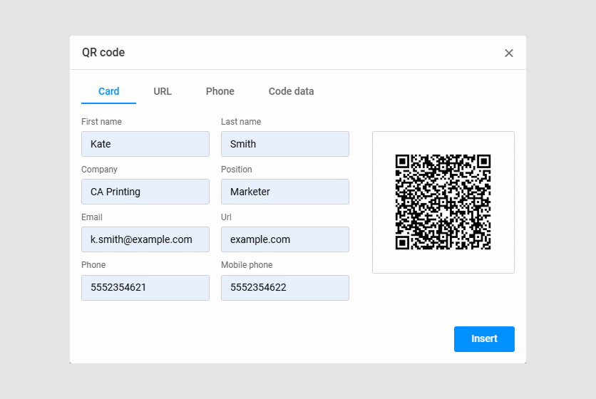
Dialog overview
When you open the QR code dialog, click a tab to select the type of data to encode:
- Card (VCard): Enter contact details such as first name, last name, company, position, email, phone, and mobile phone.
- URL: Enter a web address.
- Phone: Enter a phone number.
- Code Data: Enter custom text or data.
How to use
- Select the type of data you want to encode (e.g., Card).
- Fill in the relevant fields.
- Click Insert to add the QR code to your design.
Linear barcodes
Linear barcodes are used for encoding numerical and alphanumeric data for product labeling and inventory management. The Design Editor supports several types of linear barcodes, including EAN-8, EAN-13, UPC-A, UPC-E, and Code 128.
Configuring linear barcode dialog
The LinearBarcodeDialog widget allows you to set the default barcode type and control checksum behavior.
{
  "widgets": {
    "LinearBarcodeDialog": {
      "defaultType": "LinearEan8",
      "autoChecksum": false
    }
  }
}
defaultType: Specifies the default barcode type. Default is"LinearEan8". See the possible values in the Editor config reference.autoChecksum: Iffalse, allows manual entry of the checksum digit. Iftrue, the checksum is calculated automatically.
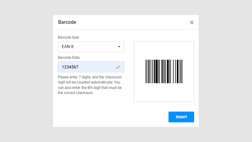
Dialog overview
- Barcode Type: Select the type of barcode (e.g., EAN-8).
- Barcode Data: Enter the data to encode. For EAN-8, you can enter 7 digits, and the checksum will be calculated automatically. Alternatively, you can enter all 8 digits, including the checksum.
How to use
- Select the Barcode Type from the dropdown menu.
- Enter the Barcode Data according to the selected type.
- Click Insert to add the barcode to your design.
Data Matrix
Data Matrix codes are 2D barcodes that can encode large amounts of data in a compact format. They are often used in industrial and manufacturing applications.
Configuring Data Matrix Dialog
The Data Matrix dialog does not include additional configuration options or multiple usage variants. The dialog opens when the Data Matrix button is added to the Toolbox and selected by the user.
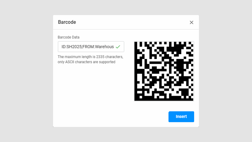
Dialog Overview
- Barcode Data: Enter the data to encode. The maximum length is 2335 ASCII characters.
How to Use
- Enter the data in the Barcode Data field.
- Click Insert to add the Data Matrix code to your design.
Setting default appearance for barcodes
You can define default appearance settings for all barcode types using defaultItemsConfig. This ensures consistency across newly added barcodes.
{
  "defaultItemsConfig": {
    "barcode": {
      "color": "rgb(0,0,0)",
      "fillColor": "rgba(0,144,255,0.5)",
      "width": "100",
      "barcodeOptions": {
        "margin": 10
      }
    }
  }
}
color: Default color of the barcode.fillColor: Default background color of the barcode.width: Default width of the barcode.barcodeOptions: Additional options, such as margin settings.
Customizing barcode buttons in the Toolbar
You can also customize the appearance and behavior for a single barcode button in the toolbar using itemConfig. This allows you to predefine barcode content, appearance, and manipulation permissions.
Note
Both defaultItemsConfig and itemConfig use the IBarcodeItemData interface. This means you can apply the same properties—such as color, width, barcodeOptions, and others—to configure the general behavior of all barcodes or customize individual barcode buttons in the Toolbox.
{
  "widgets": {
    "Toolbox": {
      "buttons": [
        {
          "action": "CustomBarcode",
          "iconClass": "cc-icon-qr-code",
          "itemConfig": {
            "barcodeContent": {
              "barcodeFormat": "QrUrl",
              "url": "example.com"
            },
            "name": "Example barcode",
            "color": "rgb(255,0,0)",
            "width": "100",
            "location": {
              "originX": "left",
              "originY": "bottom",
              "x": "0%",
              "y": "100%"
            },
            "barcodeOptions": {
              "margin": 0
            },
            "manipulationPermissions": {
              "allowMoveHorizontal": false,
              "allowMoveVertical": false
            }
          }
        }
      ]
    }
  }
}
barcodeContent: Predefined content for the barcode, such as format and URL.name: Name of the barcode button.color: Color of the barcode.location: Default position of the barcode on the canvas.manipulationPermissions: Restrictions on moving the barcode.
For more information on advanced settings, refer to the Reference Guide.