Color picker
- 4-5 minutes to read
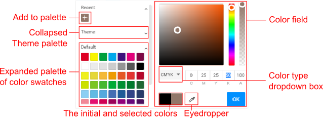
When editing product designs, you can change the colors of text and shapes, the fill and outline colors, the background color, and more. The following Color picker is used for this purpose.

The Color picker may either be configured globally through the ~/Configuration/clientConfig.json file, or individually for each product - or even for a single page - using the IConfiguration interface. In this topic, we will configure the Color picker through IConfiguration.
Configuring the Color Field
This field allows you to select colors in either HEX, RGB, or CMYK format by clicking a color or typing in channel values. To save the selected color in the Recent palette and continue with the selection process, click Add to palette. You can specify which color input formats will be available to your users as follows:
let configuration = {
    widgets: {
        ColorPicker: {
            colorTypeDropdownEnabled: true,
            defaultColorType: "cmyk",
            availableColorTypes: ["cmyk", "rgb", "hex"]
        }
    }
};
If colorTypeDropdownEnabled is false, your users will define the colors in the format specified in the defaultColorType property. When the availableColorSpaces array contains only one element, the Color type box will not appear. When several formats are defined, you can select one by using this drop-down box.
To disable the color field and allow your users to select colors only from the predefined palettes, you can set showPaletteOnly to true.
let configuration = {
    widgets: {
        ColorPicker: {
            showPaletteOnly: true
        }
    }
};
Configuring Palettes
The Color picker allows you to enable the following palettes:
- NoColorSection of the transparent color.
- RecentSection of previously selected colors.
- ThemeSection of colors specified in product themes.
- PaletteSection of predefined color swatches.
A color picker may contain as many PaletteSection palettes as you need. However, NoColorSection, RecentSection, and ThemeSection can be represented in a single copy.
To define a palette, you can use the IColorPickerConfigSection interface. This is how you can specify the section type and other properties.
let configuration = {
    widgets: {
        ColorPicker: {
            showPaletteOnly: true,
            sections: [
              {
                  // The section type.
                  type: "PaletteSection",
                  // The section name.
                  translationKey: "Text colors",
                  // The appearance of the color swatches.
                  viewType: "Line",
                  // A target color property.
                  targets: [ "Text" ],
                  // Color swatches.
                  palette: [["rgb(0, 0, 0)","rgb(255, 255, 255)"]]
              }
            ]
        }
    }
};
Note that section names are only displayed when a color picker has two or more sections. In this case, you can also set the sectionCollapseEnabled property to true to allow your users to collapse these sections by clicking their headers.
Now, let's see how you can configure these sections.
NoColorSection
This section only contains the swatch of the transparent color and it appears as follows:

To allow your users to reset a color, specify the NoColorSection type. In targets, you can set specific properties for this section, which will appear in the Color picker. You can assume that when you define targets, you create different pickers for different color properties.
sections: [
  {
    type: "NoColorSection",
    targets: [ "Fill", "Border", "Background" ]
  }
]
RecentSection
When the user assigns a color, this color will be automatically added to the RecentSection. To enable this section in the Color picker, you can only specify the section type.
sections: [
  {
    type: "RecentSection"
  }
]
ThemeSection
You can enable a section of theme colors when defining product themes in the editor. For example, this section may look as follows:

Here, we organized the colors as a Line to display the names of color categories. These swatches come from an active theme, and you don't need to explicitly list them. The following example illustrates how you can define product themes and the editor's configuration to set up the Color picker in this way.
// Define two color sets.
let themeColors = {
    "violetSet": {
        "main": "rgb(102,45,145)",
        "alternative": "rgb(150,67,214)",
        "text": "rgb(32,18,77)"
    },
    "roseSet": {
        "main": "rgb(241,160,175)",
        "alternative": "rgb(255,200,214)",
        "text": "rgb(224,102,102)"
    }
};

// Configure the editor.
let configuration = {
    // Pass these color sets into the editor.
    productThemes: themeColors,
    // Select an active theme.
    defaultProductTheme: "roseSet",
    widgets: {
        ColorPicker: {
            // Disable the color field.
            showPaletteOnly: true,
            // Display the colors of the active theme.
            sections: [
              {
                type: "ThemeSection",
                viewType: "Line"
              }
            ]
        }
    }
};
PaletteSection
When you need to predefine color swatches, you can configure the PaletteSection and list the colors in a two-dimensional array. Let us assume that we want to display the following colors:

The following palette configuration defines these colors in the rgb and cmyk formats.
let configuration = {
    widgets: {
        ColorPicker: {
            showPaletteOnly: true,
            sections: [
              {
                type: "PaletteSection",
                palette: [["rgb(0, 0, 0)", "rgb(255, 255, 255)"],
                          ["cmyk(0, 1, 1, 0, 1)", "cmyk(0%, 0%, 100%, 0%, 100%)", "rgb(0, 255, 0)", "rgb(0, 255, 255)", "rgb(0, 0, 255)", "cmyk(0, 0.9, 0, 0, 1.0)"]]
              }
            ]
        }
    }
};
For more details on how to define the color swatches in different color spaces, refer to the Defining colors topic.
You can define titles for your color swatches that appear when the user hovers over a specific color, for example:
let configuration = {
    widgets: {
        ColorPicker: {
            showPaletteOnly: true,
            paletteHintsEnabled: true,
            sections: [{
                type: "PaletteSection",
                palette: [[
                    {
                        "color": "rgb(25,25,112)",
                        "title": "Midnight blue"
                    },
                    {
                        "color": "rgb(139,0,130)",
                        "title": "Dark magenta"
                    },
                    {
                        "color": "rgb(189,183,107)",
                        "title": "Dark khaki"
                    },
                    {
                        "color": "rgb(255,99,71)",
                        "title": "Tomato"
                    }
                ]]
            }]
        }
    }
};
This palette will look as follows:

When you specify the viewType as a line, these titles also appear next to the swatches.

To disable the color titles, set paletteHintsEnabled to false.