Configuring UI on different pages
- 2 minutes to read
The Design Editor allows for customizing the designer's look and feel in several ways. You can set up:
All the listed parameters are defined either for an entire web-to-print designer or for a single print product, but there is another way to set up the user interface. You can customize widgets in a different way for different pages.
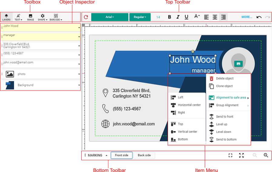
The standard user interface of the Design Editor is shown in the following screenshot.
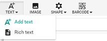
If you open the Text menu, you will notice that it contains the Add text and Rich text commands.
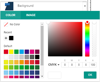
Also, there is the Background element in the Object Inspector. The following image shows the Color Picker with the default palette.
To find out how to set up these widgets for all your products and pages at once, refer to the UI customization example. Furthermore, what if you want your users to add texts and images to some pages, but not to other pages?
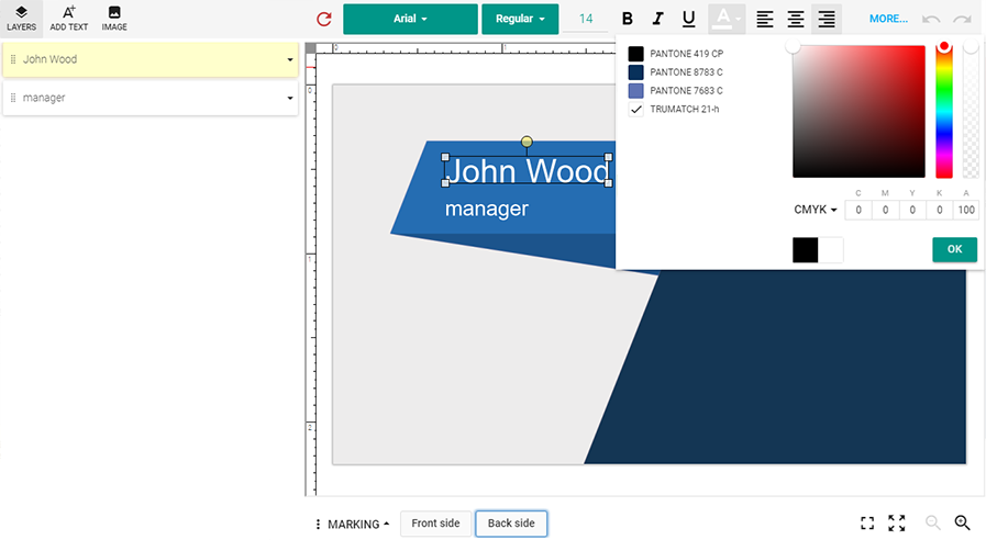
When you have a number of pages in a product, you can configure the Color Picker, the Object Inspector, and the Toolbox for those pages, using their names. For example, let us configure these widgets for the back side of the business card shown in the previous screenshot:
- Enable the Add text and Image commands in the Toolbox.
- Remove the Background element from the Object Inspector.
- Disable the default palette and define spot colors in the Color Picker.
product: {
    // Define a product which contains two pages. Their names are "FRONT" and "BACK".
    surfaces: [
        {
            name: "FRONT",
            printAreas: [
                { designFile: "Card_FrontSide" }
            ]
        },
        {
            name: "BACK",
            printAreas: [
                { designFile: "Card_BackSide" }
            ]
        }
    ]
};

config: {
    // Set the configuration for the "BACK" page. The "FRONT" page keeps default settings.
    perSurfaceConfiguration: {
        "BACK": {
            widgets: {
                Toolbox: {
                    buttons: ["Text", "Image"]
                },
                ObjectInspector: {
                    bgItemEnabled: false
                },
                ColorPicker: {
                    // Define a list of four spot colors.
                    sections: [{
                        type: "PaletteSection",
                        viewType: "Line",
                        palette: [[
                            "spot(PANTONE 419 CP, cmyk(86%,70%,69%,95%,100%), 1, 100%)",
                            "spot(PANTONE 8783 C, cmyk(100%,55%,0%,55%,100%), 1, 100%)",
                            "spot(PANTONE 7683 C, cmyk(75%,50%,0%,0%,100%), 1, 100%)",
                            "spot(TRUMATCH 21-h, cmyk(0%,0%,0%,0%,100%), 1, 100%)"
                        ]]
                    }]
                }
            }
        }
    }
};

// Load the editor.
CustomersCanvas.IframeApi.loadEditor(iframe, product, config);
As a result, for the BACK page, the editor appears as follows:
If the widgets are configured both for the editor and for a page, then the page settings override general settings.