User interface overview
- 8 minutes to read
In this topic, we will describe the user interface of the Design Editor and discuss how you can customize it. First, you can see how the editor may look like and the parameters that allow you to change the user interface. The Customization Sample illustrates the use of some of these parameters. To find out how you can configure the user interface in a different way for different pages, refer to Configuring UI on different pages.
Customizing Design Editor
As noted in the Simple and Advanced Modes topic, the web-to-print editor has two modes: simple and advanced. In this topic, we presume that the editor is in the advanced mode. You can switch to this mode by clicking the Switch to advanced editing button or set this mode as default via the initialMode parameter in clientConfig.json.
"initialMode": "Advanced";
Also, you can change the mode via the IConfiguration interface.
configuration = {
    initialMode: "Advanced"
};
The web-to-print editor can be customized mainly by hiding and displaying various interface elements. Let us review interface elements and the corresponding configuration parameters. User interface elements are visually grouped into widgets. Later in this topic, we will introduce and illustrate each widget with all its elements. The following screenshot shows where each widget is located in the interface in the Md theme.
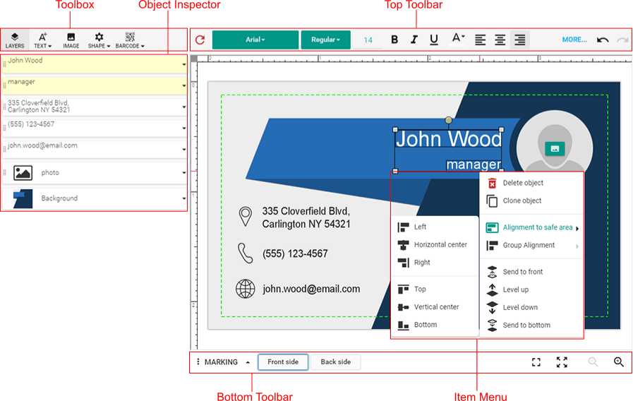
Now that you have an idea of how widgets work, let us start with customizable parameters. In the following screenshots, each interface element is tagged with the related parameter, one per widget. Most parameters reviewed in this topic are boolean: true means that the corresponding user interface element is displayed; false hides the element. All parameters can be set in the ~/Configuration/clientConfig.json file and through the IConfiguration interface. You can refer to the clientConfig topic describing these parameters, their possible values, and the structure of clientConfig.json.
Toolbox
To set up buttons in the Toolbox, you can use the IButton interface. You can enable standard and custom buttons. While the standard buttons add design elements to the canvas, the custom buttons allow you to implement custom actions in the editor. There are the following predefined standard buttons: Text, PointText, BoundedText, Image, Background, QrCode, LinearBarcode, DataMatrixBarcode, Line, Rectangle, Ellipse, Layout, and FillPlaceholders. The configuration sample shows how you can create the Toolbox by using these buttons. For more details, refer to the Toolbox topic.
Object Inspector
Every design element is located on a separate layer in the Design Editor. The Object Inspector contains the list of all the layers. To change the z-order of layers, drag their handles. You can change the z-order for all the layers, except for the background and foreground layers. To disable the handles, set the dndEnabled property of ObjectInspector to false. To hide the ObjectInspector, set the isHidden property to true. To keep the original order of in-string placeholders, set inStringPlaceholderMode to "Multiple".
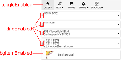
To allow your users to toggle the Object Inspector, you can enable the Layers button by using the toggleEnabled property.

Note
You can toggle the Object Inspector through the IFrame API. To do so, use the Editor.toggleObjectInspector method.
When you set dndEnabled to false, only the handles do not show. However, you can still change the z-order through corresponding Item Menu commands. To prohibit changing the z-order completely, you should disable these commands in the Item Menu too. Use the changeZOrderEnabled property in the editor configuration for that.
If a design element has the <OIAZC_f> marker, then other elements cannot be moved across this one, by neither changing the z-order nor using the handles.
Top Toolbar
The Top Toolbar contains buttons for manipulating the design elements.

The Undo and Redo buttons allow you to undo and repeat the last user action, correspondingly. The Revert button cancels all changes made by the user in a template. To prevent reverting a product inadvertently, you can enable a revert confirmation dialog with the revertProductConfirmationEnabled property.
You can enable a two-level mode for the Top Toolbar. If it contains more buttons than a row can fit, then an additional row shows instead of the More button.

Set the multiRowModeEnabled property to true to enable the two-level mode; false enables the one-level mode.
The previous Top Toolbar corresponds to text elements. The following image illustrates the available buttons for image placeholders.

You can find the full list of the buttons and a configuration example in the ITopToolbarConfig topic.
Bottom Toolbar
The Bottom Toolbar contains the Marking menu, page navigation buttons, and buttons for manipulating the canvas. On the Marking menu, you can toggle safety lines, the grid, and snap lines. To zoom the canvas, click the Full window, Full screen, Zoom in, or Zoom out buttons. You can also click the button displaying the current zoom level to select one of the predefined zoom levels or zoom the canvas to fit safety lines. The Rotate button allows for rotating the canvas (workspace).
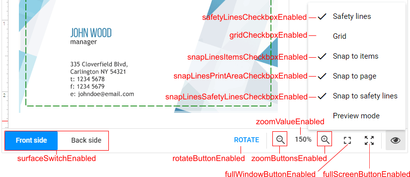
The full-screen mode is not supported in Internet Explorer and Safari, so the corresponding button is not displayed in these browsers even if it is enabled.
Canvas
The canvas allows your users to manipulate the design elements and edit their content. You can configure the color, padding, and shadows of the canvas. The suppressOutOfRegionManipulation property disallows for dragging elements out of regions. qualityMeterButtonsEnabled allows for displaying the image quality warnings.
You may want to enable the Floating Item Toolbar on the canvas by using floatingItemToolbarEnabled. Depending on the selected item type, this toolbar can contain the Select Image, Edit, and Delete buttons.
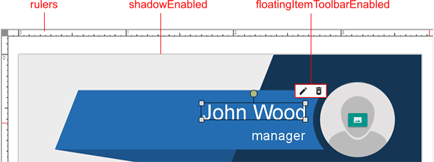
Also, you can set up the grid, rulers, and snap lines. For details, refer to the topic Rulers, grids, and snap lines.
Color Picker
The color picker contains predefined palettes and the color field.
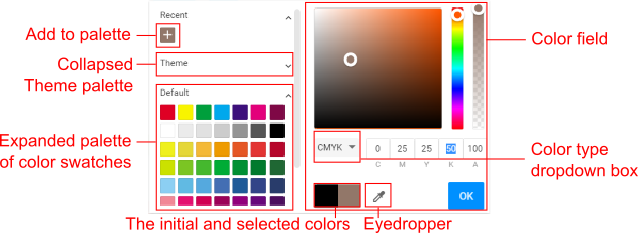
If your product requires a limited set of color swatches, you can define a palette and hide the color field, as it is done in the example. For more information about customizing palettes, refer to the Color picker topic.
Item Menu
In the advanced editor mode, the More button becomes available for every layer in the Object Inspector. These buttons open the Item Menu that contains object-related actions.
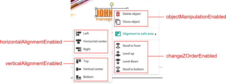
The screenshot above shows that the Item Menu has three groups of commands:
- The first group allows for manipulating the object by deleting or cloning it.
- The second group provides alignment options.
- The last one changes the z-order of object layers.
You can select multiple objects on the canvas using the mouse. When several objects are selected, the Item Menu also contains the Group Alignment command.
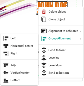
The alignment properties of the ItemMenu object, horizontalAlignmentEnabled and verticalAlignmentEnabled, are applied to both Group Alignment and Alignment to safe area.
Spell Checking
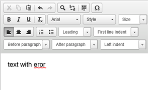
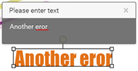
The Design Editor implements the spell checking feature for text fields and the Rich Text editor. This feature can be enabled through the spellCheckEnabled property. If spell checking is enabled, then misspelled words are shown as underlined:
Spell checking in the Rich Text editor.
Spell checking in the Object Inspector.

Spell checking in pop-up boxes.
Note
The spell checking feature utilizes the user's browser's spell checking. So, if the browser is set to check spelling in one language, and the user customizes a product in another language, then the spell checking in the Design Editor fails because of incorrect browser settings.
Image Editor
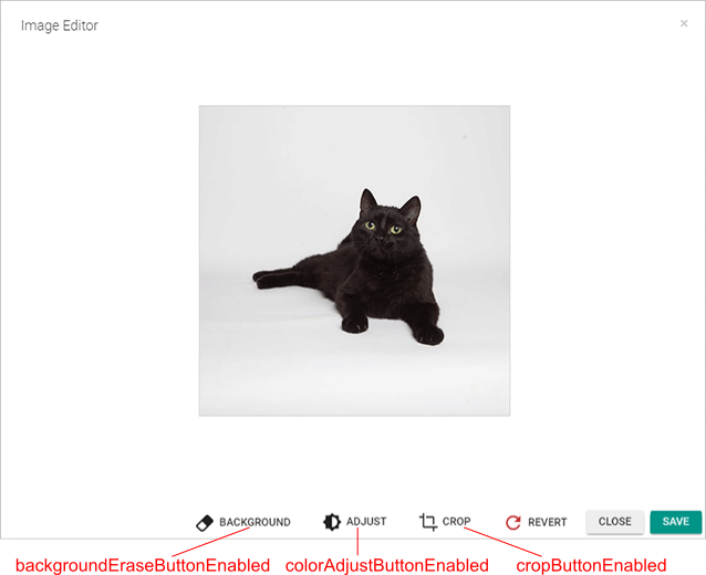
After a user clicks Edit, the Image Editor opens. The Image Editor allows for cropping images, adjusting image colors, and erasing the background. You can hide the Background, Adjust, and Crop buttons with the corresponding properties.
Warnings
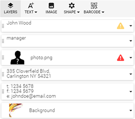
The Design Editor provides preflight of print products while your users work on their designs. The editor validates that images have good resolution, the safety zone and regions are not violated, and bounded text is not cropped. If an issue occurs, a corresponding warning appears both on the canvas and in the Object Inspector. You can configure the preflight through violationWarningsSettings. To enable warnings in the ObjectInspector, set the violationWarningsEnabled property to true. The violationWarningButtonsEnabled property enables warnings on the canvas.
When the user resizes images or adds a new image to the design, Design Editor checks the image resolution and displays a notifying icon if the image has a resolution that is too low. You can define the warning and bad quality levels as a percentage of the hi-res output DPI through the qualityMeter object.
If the user places an object on the canvas too close to safety lines, the safety line violation occurs and the corresponding message is shown. You can enable this check through the safetyLineViolationWarningEnabled property.
If the user moves an object on the canvas out of a region, the region violation occurs and the corresponding message is shown. You can enable this check through regionViolationWarningEnabled. If you set the suppressOutOfRegionManipulation property to true, then it prevents the warning message from being displayed.
These warnings appear on the right side of the Object Inspector as red and yellow icons.
Configuration Sample
This sample shows how to use both clientConfig.json and the IConfiguration interface to customize the web-to-print editor. For demonstration purposes, let us:
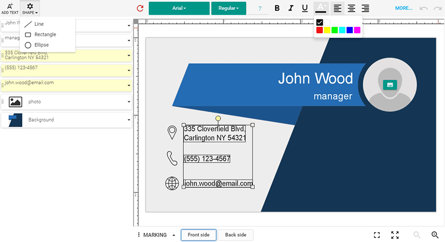
- Disable changing the background layer.
- Disable the color field for design elements.
- Enable the text and shape buttons in the Toolbox.
You can set up the Design Editor defining either common settings for all products or product-specific settings. To specify the common settings affecting all your products, edit the clientConfig.json file.
"ObjectInspector": {
    "bgItemEnabled": false,
    ...
},
"Toolbox": {
    "buttons": [
        "Text",
        {
            "translationKey": "Toolbox.SHAPE",
            "translationKeyTitle": "Toolbox.TITLE_ADD_SHAPE",
            "iconClass": "cc-icon-add-shape",
            "buttons": [
                "Line",
                "Rectangle",
                "Ellipse"
            ]
        }
    ]
}
To define the product-specific settings, you can use the IConfiguration interface and pass the configuration to loadEditor.
// Defining configuration.
configuration = {
    initialMode: "Advanced",
    widgets: {
        ColorPicker: {
            showPaletteOnly: true,
            sections: [
                {
                    type: "PaletteSection",
                    palette: [["rgb(0,0,0)","rgb(255,255,255)"],
                              ["rgb(255,0,0)","rgb(255,255,0)","rgb(0,255,0)","rgb(0,255,255)","rgb(0,0,255)", "rgb(255,0,255)"]]
                }
            ]
        }
    }
};
// Loading the editor with the given configuration.
CustomersCanvas.IframeApi.loadEditor(iframe, productDefinition, configuration);
As a result, the interface of the Design Editor looks like this:
