Changing product theme
- 12 minutes to read
You may want to provide a number of color options and text styles for product templates to your customers. Making separate templates for a single color or font property is not a good idea because it multiplies the number of PSD or IDML templates. Fortunately, you can define color sets and design element styles for a product, so-called product themes, and just toggle them in the web-to-print editor.
This topic gives an example of a Photoshop template, but you can apply themes to InDesign templates in the same way.
Defining Themes
In the Design Editor, a product theme represents a set of colors or styles.
To recolor design elements in your templates, you can use both color themes and styles. At the same time, styles are a more flexible way to customize the appearance of design elements. For example, styles allow you to change the fonts of text elements and their settings.
Color Sets
Each color theme is an associative array, where the key is the name of a color category.
var colorThemes = {
    "SkyBlue": {
        "main": "rgb(32, 83, 69)",
        "alternative": "rgb(26, 47, 41)",
        "borders": "rgb(133, 28, 101)",
        "texts": "rgb(176, 143, 37)",
        "shadows": "rgb(0, 159, 115)",
        "images": "rgb(21, 19, 15)"
    },
    "Contrast": {
        "main": "rgb(138, 135, 77)",
        "alternative": "rgb(72, 71, 58)",
        "borders": "rgb(93, 53, 128)",
        "texts": "rgb(124, 15, 218)",
        "shadows": "rgb(0, 88, 0)",
        "images": "rgb(72, 71, 58)"
    }
};
In this example, we will define two color themes: SkyBlue and Contrast. The main, alternative, borders, and other properties are the color categories. Note, you can define as many color themes as you need, but they should have the same number of color categories and the same category names. You can define such color sets in ~/Configuration/clientConfig.json to apply them globally. Also, you can apply them to a single product through the IConfiguration interface. In the latter case, you can pass these themes to the loadEditor method as a parameter.
// Define a color set.
var colorTheme = {
    "SkyBlue": {
        "main": "rgb(32, 83, 69)",
        "alternative": "rgb(26, 47, 41)",
        "borders": "rgb(133, 28, 101)",
        "texts": "rgb(176, 143, 37)"
    }
};

// Set up the color theme for your product.
var configuration = {
    productThemes: colorTheme,
    defaultProductTheme: "SkyBlue"
};

// Load the editor.
CustomersCanvas.IframeApi.loadEditor(iframe, productDefinition, configuration);
Styles
Styles represent a complete replacement for color sets and also allow you to customize other properties of design elements. In the current implementation, you can customize colors, opacity, and such text properties as fonts, leading, and tracking by using styles.
To define styles, you need to specify categories of the design elements in your theme. Each category is an associative array, where the key is an element property name. You can refer to the complete list of supported properties.
Let us take a look at the following style definition.
var styles = {
    "Classic": {
        "Shapes": {
            "borderColor": "rgb(7,70,63)",
            "fillColor": "rgb(9,90,81)"
        },
        "Headers": {
            "color": "rgb(185,90,155)",
            "underline": true,
            "font": {
                "postScriptName": "Calibri",
                "size": 20,
                "fauxBold": true,
                "fauxItalic": false
            }
        }
    },
    "Fancy": {
        "Shapes": {
            "borderColor": "rgb(241,160,175)",
            "fillColor": "rgb(224,102,102)"
        },
        "Headers": {
            "color": "rgb(200,190,0)",
            "underline": false,
            "font": {
                "postScriptName": "Roboto",
                "size": 18,
                "fauxBold": true,
                "fauxItalic": true
            }
        }
    }
};
Here, we define two styles: Classic and Fancy. The Shapes and Headers are categories, which you can apply to the corresponding design elements. For Shapes, we only define colors, while Headers change the color, font properties, and underlining.
You can define such styles either in clientConfig.json or through the IConfiguration interface. To apply these styles to a single product, you can pass them to the loadEditor method as follows:
// Load the editor.
CustomersCanvas.IframeApi.loadEditor( iframe, productDefinition,
    { productThemes: styles }
);
Preparing Templates
After you have defined the product themes, you need to prepare your templates so that they can apply the colors and styles. To perform this, you can add the <THMB> or <STYLE> markers to layer names in your template. Alternatively, you can define the themeBinding property in JSON files.
<STYLE> allows you to apply styles to design elements and needs only a style name to enable the style, for example: <STYLE_Headers>. The <THMB> marker takes on a list of properties that need to change colors. You can also use <THMB> to apply styles to design elements as follows: <THMB_styles:FancyText>. When you specify both <THMB> and <STYLE> for an element, the Design Editor will only apply colors specified in the <THMB> marker.
Note
At this moment, you may set theme or style settings to elements only in Photoshop or InDesign. It is not available in Template Editor yet.
Using the <THMB> Marker
Since it is not obvious how you can specify a list of properties, let us describe this in detail.
Each design element can have a number of colors, for example, the fill and border colors. When you define the color theme of an element, you can specify a color for every colorable property through the <THMB> marker as follows:
<THMB_propertyName1:colorName1;propertyName2:colorName2>
In this marker, you list the property-value pairs. Note that the color names must match the names in the theme definition. The following table contains design elements and their colorable properties supported in the Design Editor.
| Design elements | Colorable properties | Marker examples |
|---|---|---|
| Images |
|
<THMB_img:main;border:borders> |
| Lines and polylines |
|
<THMB_line:main> |
| Ellipses, rectangles, and shapes |
|
<THMB_border:borders> |
| All text types |
|
<THMB_shadow:shadows;text:main> |
| Placeholders |
|
<THMB_img:main;border:borders> |
| Barcodes and QR codes |
|
<THMB_barcode:main> |
| The Background |
|
<THMB_fill:alternative> |
Note, when you apply the fill property to images or image placeholders in combination with the colorize effect (<IFC> marker), then the specified color will be applied to tint the image or placeholder's content, correspondingly.
You can omit some properties in these bindings, for example, you can only specify the text color for texts: <THMB_text:main>. In this case, stroke and shadow colors will keep values from the template.
Using the <Style> Marker
You can configure the following properties of design elements when defining styles:
itemData: {
  opacity?: number;      // The opacity of design elements, in the range [0..1].
  color?: string;        // The color of elements in a CSS-compatible format.
  borderColor?: string;  // The border color of design elements.
  fillColor?: string;    // The fill color of design elements.
  leading?: number;      // The text leading, in points.
  tracking?: number;     // The text tracking, in points.
  underline?: boolean;   // Whether the text is underlined or not.
  visible?: boolean;     // Whether the element will be rendered or not.
  font?: {
    postScriptName?: string; // The PostScript name.
    size?: number;           // The font size, in points.
    fauxBold?: boolean;      // Whether the faux bold style is applied or not.
    fauxItalic?: boolean;    // Whether the faux italic style is applied or not.
    allCaps?: boolean;       // Whether the AllCaps style is applied
  };
}
To get PostScript names, you can open your fonts with a font editor (for example, FontForge) or a Photoshop plugin (like Get Font PostScript Name).
All properties of itemData are optional. Through different variations, you can define any design element supported in the Design Editor. The following table details the design elements and their properties that you can use when customizing styles.
| Images and barcodes | color, fillColor, borderColor, opacity, visible |
|---|---|
| Shapes, ellipses, rectangle, and image placeholders | fillColor, borderColor, opacity, visible |
| Lines | color, opacity, visible |
| Text elements | color, font, underline, leading, tracking, opacity, visible |
For example, you can define the RedShapes and BlueShapes categories for the Main and Alternative themes as follows:
var styles = {
    "Main": {
        "RedShapes": {
            "fillColor": "rgb(255,88,88)"
        },
        "BlueShapes": {
            "opacity": 1,
            "fillColor": "rgb(0,0,102)"
        }
    },
    "Alternative": {
        "RedShapes": {
            "fillColor": "rgb(224,102,102)"
        },
        "BlueShapes": {
            "opacity": 0.7,
            "fillColor": "rgb(12,12,224)"
        }
    }
};
In this case, to mark red and blue shapes in your templates, use <STYLE_RedShapes> and <STYLE_BlueShapes>, correspondingly.
Using External JSON Files
As an alternative to the previous way, you can use JSON files to set up markers for your templates. The following example demonstrates how you can bind theme colors and styles by using the themeBinding property.
{
    "frames": {
        "CentralImage": {
            "themeBinding": {
                "img": "main",
                "border": "borders"
            }
        },
        "Title": {
            "themeBinding": {
                "styles": ["FancyText"]
            }
        }
    }
}
Here, CentralImage and Title are the names of image and text layers, correspondingly. The themeBinding objects bind the colorable properties of the image layer to the theme colors and the text style to FancyText. To apply a number of styles to a design element, you can add a number of style names to the styles array. For example, "styles": ["FancyText", "FancyColor"] will work the same as the <STYLE_FancyText,FancyColor> marker.
For more details about setting up the markers through JSON files, refer to the corresponfing topic.
Color Overlay
You may notice that you can even specify a theme color for raster images. By default, the Design Editor recolors them in the same way as you would apply this color with the Hard Light blend mode and 80% opacity to the original image in Photoshop.
If you specify color overlay options in a PSD template, these options are applied to the corresponding design element on the canvas. If you also specify a theme color, then Design Editor applies the theme color, blend mode, and opacity to the original image.
To change the default blend mode and opacity, you can use the DefaultColorOverlayBlendMode and DefaultColorOverlayOpacity parameters in Aurigma.DesignAtoms.config.
<Aurigma.DesignAtoms>
    <add key="DefaultColorOverlayBlendMode" value="Normal" />
    <add key="DefaultColorOverlayOpacity" value="1" />
</Aurigma.DesignAtoms>
At the moment, the Design Editor supports the following blend modes:
ColorBurnColorDodgeDarkenDifferenceExclusionHardLightLightenLinearBurnMultiplyNormalOverlayScreenSoftLight
Changing Color Themes at Runtime
At runtime, you can switch themes through the applyProductTheme method. This method applies the color theme to a current product without reloading the editor. It accepts either a theme name or an object containing the color sets.
// Enable the SkyBlue theme.
const editor = await CustomersCanvas.IframeApi.loadEditor(iframe, productDefinition,
                                               { defaultProductTheme: "SkyBlue" });
// If the editor has been successfully loaded, change the color theme.
// Pass `false` if the user should not revert it with the Undo button.
editor.applyProductTheme("Contrast", { addToHistory: false });
If you want the user not to return to the previous theme with the Undo button, pass {addToHistory: false} as the second parameter. In this case, the action of theme changing won't be added to the history of user actions.
Samples
Using the Color Sets
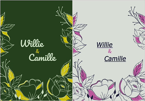
As an example, let us describe how you can design and recolor a wedding invitation. In Photoshop, we designed the following template.
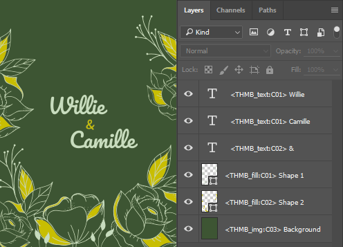
To keep it short, we use the C01, C02, and C03 color categories in the <THMB> marker. Let us assign the following colors to them with the White and Green themes.
| Color category | The White theme | The Green theme |
|---|---|---|
C01 |
rgb(30,30,59) |
rgb(200,220,190) |
C02 |
rgb(185,90,155) |
rgb(200,190,0) |
C03 |
rgb(255,255,255) |
rgb(61,85,51) |
Put the PSD template in the ..\assets\designs\ folder and use the following code sample to open it.
<!DOCTYPE html>
<html lang="en">
<head>
    <title>Customer's Canvas Color Themes Example</title>
    <!-- Change this URL to the address of your application. -->
    <script id="CcIframeApiScript" type="text/javascript"
        src="http://example.com/customersCanvas/Resources/Generated/IframeApi.js">
    </script>
</head>

<body onLoad="init();">
    <!-- The iframe to display the editor in. -->
    <iframe id="editorFrame" width="100%" height="800px"></iframe>
    <!-- The White and Green buttons that change the themes. -->
    <button onClick="applyTheme('White');">White</button>
    <button onClick="applyTheme('Green');">Green</button>
</body>

<script>
var editor = null;
function init(){
    // Initialize a product.
    const productDefinition = { surfaces: ["Invitation"] };
    // Define two color themes and select the default theme.
    const productTheme = {
        "White": {
            "C01": "rgb(30,30,59)",
            "C02": "rgb(185,90,155)",
            "C03": "rgb(255,255,255)"
        },
        "Green": {
            "C01": "rgb(200,220,190)",
            "C02": "rgb(200,190,0)",
            "C03": "rgb(61,85,51)"
        }
    };
    const configuration = { productThemes: productTheme, defaultProductTheme: "Green" };
    // Get the iframe element to display the editor in.
    const iframe = document.getElementById("editorFrame");
    // Load the editor.
    CustomersCanvas.IframeApi.loadEditor(iframe, productDefinition, configuration)
        // If the editor has been successfully loaded.
        .then(function (e) {
            editor = e;
        })
        // If there was an error thrown when loading the editor.
        .catch(function (error) {
            console.error("The editor failed to load with an exception: ", error);
        });
}

// Change a theme.
function applyTheme(themeName){
    editor.applyProductTheme(themeName);
}
</script>
</html>
Using the Green and White buttons, you can apply these theme colors to the template and obtain the following results in the Design Editor.
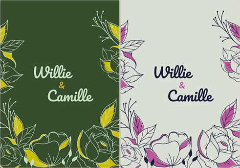
Using the Styles
Now, let us go further and change text properties in this template. Since it's not just about colors, you must use styles rather than pure color themes. First, specify markers as follows:
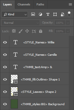
In this example, we use three styles of design elements: Names, Leaves, and BG. The following code sample contains style definitions for them.
<!DOCTYPE html>
<html lang="en">
<head>
    <title>Customer's Canvas Color Themes Example</title>
    <!-- Change this URL to the address of your application. -->
    <script id="CcIframeApiScript" type="text/javascript"
        src="http://example.com/customersCanvas/Resources/Generated/IframeApi.js">
    </script>
</head>

<body onLoad="init();">
    <!-- The iframe to display the editor in. -->
    <iframe id="editorFrame" width="100%" height="800px"></iframe>
    <!-- The White and Green buttons that change the themes. -->
    <button onClick="applyTheme('White');">White</button>
    <button onClick="applyTheme('Green');">Green</button>
</body>

<script type="text/javascript">
    var editor = null;
    function init() {
        // Initialize a product.
        const productDefinition = { surfaces: ["Styles"] };
        const WhiteC01 = "rgb(30,30,59)";
        const WhiteC02 = "rgb(185,90,155)";
        const WhiteC03 = "rgb(255,255,255)";
        const GreenC01 = "rgb(200,220,190)";
        const GreenC02 = "rgb(200,190,0)";
        const GreenC03 = "rgb(61,85,51)";
        // Define two themes by using the styles.
        const styles = {
            "White": {
                "Names": {
                    "color": WhiteC01,
                    "underline": true,
                    "font": {
                        "postScriptName": "Tahoma",
                        "size": 32,
                        "fauxBold": true,
                        "fauxItalic": true
                    }
                },
                "Amp": WhiteC02,
                "Outline": WhiteC01,
                "Leaves": {
                    "borderColor": WhiteC01,
                    "fillColor": WhiteC02
                },
                "BG": {
                    "color": WhiteC03
                }

            },
            "Green": {
                "Names": {
                    "color": GreenC01,
                    "underline": false,
                    "font": {
                        "postScriptName": "Pacifico-Regular",
                        "size": 42,
                        "fauxBold": false,
                        "fauxItalic": false
                    }
                },
                "Amp": GreenC02,
                "Outline": GreenC01,
                "Leaves": {
                    "borderColor": GreenC01,
                    "fillColor": GreenC02
                },
                "BG": {
                    "color": GreenC03
                }

            }
        };
        const configuration = { productThemes: styles, defaultProductTheme: "Green" };
        // Get the iframe element to display the editor in.
        const iframe = document.getElementById("editorFrame");
        // Load the editor.
        CustomersCanvas.IframeApi.loadEditor(iframe, productDefinition, configuration)
            // If the editor has been successfully loaded.
            .then(function (e) {
                editor = e;
            })
            // If there was an error thrown when loading the editor.
            .catch(function (error) {
                console.error("The editor failed to load with an exception: ", error);
            });
    }

    // Change a theme.
    function applyTheme(themeName) {
        editor.applyProductTheme(themeName);
    }
</script>
</html>
As a result, you can change font settings at runtime, and this product may look as follows: