Mockups
- 10 minutes to read
The mockup is additional graphic information that is displayed in the Design Editor while editing web-to-print products but is not included in the hi-res output. It allows the user to see what the product looks like after printing or displays additional information that helps in the design process. There are two main use cases of mockups:
- Displaying realistic preview images for products like stationary, personalized gifts, etc. - whenever you want to show a physical representation of a product rather than a plain design.
- Showing some additional information for printed products in the editor, like bleed lines, rounded corners, etc.
Mockups for Personalized Gifts and Stationary
For clarity, some products may need to display a design along with the product image while editing. This is the usual case for the products which have a design localized only in a small area, whereas the product size is more than this area. It could be some photo gifts, T-shirts, mugs, stationary, envelopes, post stickers, and so on.
To help you see what final products look like, the editor shows the whole product image, not only that small personalized area. So, you can verify the edited area, where it is placed (at least schematically), and the whole product.
For example, imagine that you are printing address stickers for envelopes. You may want to see an envelope image that shows the address in the upper-left corner. However, you do not want to display the envelope image in the resulting PDF file. In this case, you can set the Design Editor up so that it shows an envelope (a mockup) and a sticker on it in your editor during the design time.
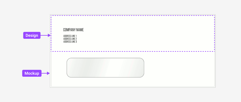
The following example shows how you can achieve this.
let productDefinition = {
    surfaces: [{
        printAreas: [{
            // Set a design template "sticker.psd".
            designFile: "sticker"
        }],
        mockup: {
            // Set a background mockup "envelopeMockup.jpg".
            down: "envelopeMockup"
        }
    }]
};
CustomersCanvas.IframeApi.loadEditor(iframe, productDefinition);
The sticker is a product that can be loaded from a template, personalized by users, and rendered to a PDF file.
Here, the surfaces array contains one object to define a single-page product usung a design template and a mockup.
Usually, mockups are located in the background layer and the design template is loaded in front of it. However, it is possible to send design templates to the back layer, for example, if you have a postcard with a "window" or a photo frame. In this case, the up property of the mockup should be set, instead of down in the previous example.
let productDefinition = {
    surfaces: [{
        printAreas: [{
            // Set a design template "photo.psd".
            designFile: "photo"
        }],
        mockup: {
            // Set a foreground mockup "photoFrame.png".
            up: "photoFrame"
        }
    }]
};
Also, you can specify both the up and down mockups for a product page. If your product consists of more than one page, you can specify a mockup for each page individually.
Note that both design and mockup files are specified without extensions. When looking for a mockup, the Design Editor uses the first file found from the following list: .psd, .png, .jpeg, .jpg, .svg, .pdf, .bmp, .tiff, .tif, .gif, .eps, and .ai. Since the up mockup is displayed above the design, the Design Editor will only look for those that support transparency: .psd, .png, .svg, .pdf, and .ai.
Preview Designed Products
Sometimes you may want to show additional information that helps the user in the process of designing the product, but do not want to include it in the hi-res output. It can be various cutting lines, safety lines, rounded corners, barcode stickers on book covers, the magnetic strip on a plastic card, and so on. You can easily add them with foreground mockups.
For example, you may want your customers to order business cards. Let us see how to add such products in Customer's Canvas. First, you need to figure out what sizes apply and what options exist (like rounded corners). Then, prepare templates for each size:
Add a background image into a PSD file in Photoshop.
Add any significant text fields like a name, a position, a phone, and an email to the template.
Initialize a product with the prepared template.
//Initialize the product with only one template - "BusinessCard.psd".
let productDefinition = {
    surfaces: ["BusinessCard"]
};
If you need a two-sided business card, prepare another template the same way. You can find more details in the topic about Multiple Pages.
To set up a safety-zone, define properties of the ISafetyLine object.
Now, let us assume that you need to print business cards with rounded corners and regular ones at the same time. What should you do in this case? Making separate templates with rounded corners is not a good idea because it doubles the number of PSD templates. Fortunately, we have mockups which allow us for adding graphics into the editor. So, we can just prepare such graphics and pass it to the Design Editor.
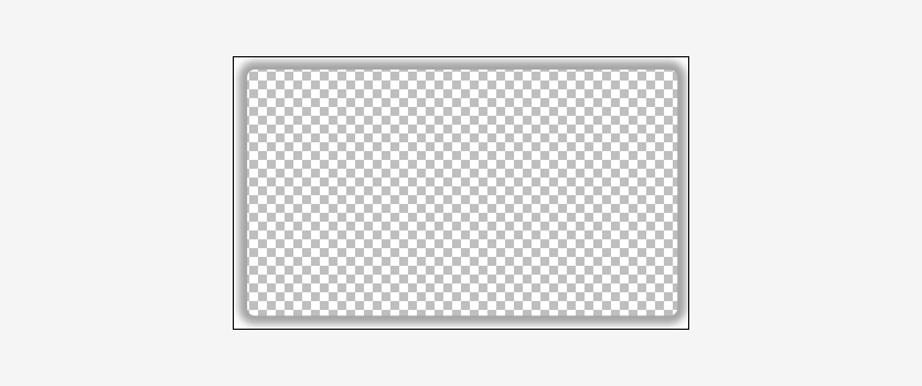
let productDefinition = {
    surfaces: [{
        printAreas: [{
            designFile: "BusinessCard"
        }],
        mockup: {
            // Set a foreground mockup "RoundedCorners.psd".
            up: "RoundedCorners"
        }
    }]
};
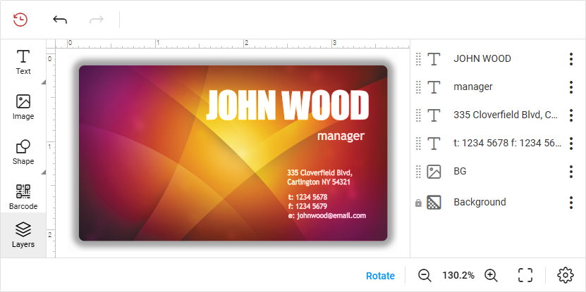
In this snippet, we initialize the up property of the mockup to place it into the foreground. In the Design Editor, the result looks like this:
Mockup and Design Locations
When you use mockups, it is most likely not enough to specify only file names. You should also configure where the design should appear relative to the mockup. You can do this using the designLocation property, which accepts X and Y coordinates as a JSON object, like {X:83, Y:120}. All values in Design Editor are measured in points (1/72 of an inch) and the {X:0, Y:0} point is the upper-left corner.
let productDefinition = {
    surfaces: [{
        printAreas: [{
            designFile: "circle",
            designLocation: {X:83,Y:120}
        }],
        mockup: {
            // Set a background mockup "cup.psd".
            down: "cup"
        }
    }]
};
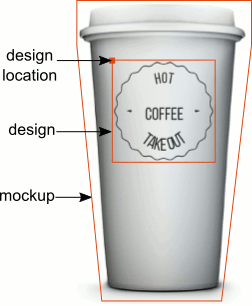
Mockups for non-design-file products
Sometimes, you may need to open an empty product with a mockup. In such cases, you can use the ISurfaceTemplate interface to define print area boundaries and set a mockup for a surface.
When working with a raster image, you'll know its dimensions in pixels. However, since the editor operates in points, you'll need to convert pixel values to points by dividing by 72. This ensures accurate sizing when defining the print area and applying the mockup. For example, here's how you can define a product with an 1130×684-pixel paper-texture.png mockup.
let productDefinition = {
    surfaces: [{
        printAreas: [{
            bounds: { x:0, y:0, width: 15.7, height: 9.5}
        }],
        mockup: {
            down: "paper-texture"
        }
    }]
};
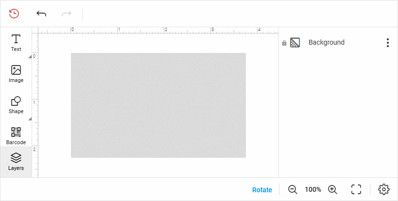
Mockups for Proof Images
Usually, when a user finishes a product design, they want to preview the image before placing an order. Also, you may want them to click a checkbox with a confirmation like "I confirm that this image is what I want and all the entered data is correct." Both these points are implemented in the proof images.
You can set a different mockup for the proof images or use the same one used at the design time. Mockups for the proof images can show another size or perspective. There are several ways to set separate mockups for proof images in the Design Editor.
Specifying Mockups for Proof Images
Use the ISurfaceTemplate.previewMockups property to set up mockups for a single surface. You can specify either up, down, or both. This allows you to add both overlaying and background mockups to a page.
let productDefinition = {
    surfaces: [{
        printAreas: [{ designFile: "envelopeDesign" }],
        mockup: { down: "envelopeMockup" },
        previewMockups: [{
            down: "envelopePreviewMockup",
            up: "envelopeWindow"
        }]
    }]
};
To define different copies of proof images, specify mockups in different objects of the previewMockups array.
let productDefinition = {
    surfaces: [{
        printAreas: [{ designFile: "envelopeDesign" }],
        mockup: { down: "envelopeMockup" },
        previewMockups: [
            { down: "envelopeMockupPaper" },
            { down: "envelopeMockupCardstock" }
        ]
    }]
};
Mockups from a Folder
Mockups for proof images and mockups for editing can be stored in the same folder. However, you may want to create a separate subfolder for the proof image mockups. It is a good solution for multipage products.
To load the proof image mockups from a subfolder, set up the ISurfacesFromFolder.previewMockupFolder property.
let productDefinition = {
    surfaces: {
        designFolder: "photoBook",
        mockupFolder: { up: "pageMockups" },
        previewMockupFolder: "pagePreviewMockups"
    }
};
Mockups for a Multipage IDML Template
When you have designed your product template in a multipage IDML file, you can define a mockup for all pages as well as for a single page. The following example illustrates how you can use the ISurfacesFromMultipageTemplate.pageTemplates property to specify a specific mockup for the first page and a default mockup for other pages. You can refer to a page by its name or index.
let productDefinition = {
    surfaces: {
        // Get surfaces from the multipage template "Booklet.idml".
        file: "Booklet",
        name: "Page {0}",
        pageTemplates: [
        {
            // The default mockup for all pages.
            mockup: { down: "bookletPages" }
            // The default preview mockup.
            previewMockups: [{ down: "previewBookletPages" }]
        },
        {
            // A mockup and a preview mockup for the first page.
            name: "Page 1",
            mockup: { up: "cover" },
            location: { X: "10", Y: "20" },
            previewMockups: [{ up: "previewCover" }]
        }]
    }
};
3D Mockups
The Design Editor allows previewing products in 3D. There is a pseudo-3D preview mode that requires at least two mockups: a blank mockup and a preview mockup. After that, you can set up your 3D preview as follows:
let productDefinition = {
    surfaces: [{
        printAreas: [{ designFile: "mug_design" }],
        // Set a mockup shown at editing.
        mockup: {
            // Down mockup is a background mockup.
            down: "mug_blank"
        },
        // Set three mockups for proof images from three views of the product.
        previewMockups: [{ down: "mug_right" }, { down: "mug_front" }, { down: "mug_left" }]
    }]
};
Setting of Mockups at Runtime
The previous examples in this topic demonstrated how you can set up mockups at the editor initialization. The Design Editor also provides API to set up mockups at runtime. You can set a mockup for a single page through the Surface.setMockup method as well as several mockups for several pages at once through the Product.setMockups method. For example, for a two-page product, you can specify mockups in the following way.
editor.getProduct()
    .then(function (product) {
        product.setMockups([
        {
            // Set both an overlay and a background mockups for the first page.
            surface: product.surfaces[0],
            mockup: {
                 up: "OverlayMockup",
                 down: "FrontSideMockup"
            }
        }, {
            // Set a background mockup for the second product page.
            surface: product.surfaces[1],
            mockup: { down: "BackSideMockup" }
        }
        ]);
    })
    .catch(function (error) {
        console.error("Setting up the mockups failed with exception: ", error);
    });
Mockup and Design Resolutions
The standard measurement unit in Design Editor is a point, which is equal to 1/72 of an inch. The points are particularly used for calculations of mockup sizes and mockup locations.
When you create a mockup, do not rely on the image size in pixels. Also, it is important to set the correct resolution. When Design Editor places a design on a mockup, it translates all coordinates to device-independent coordinates. For example, if you have a 500 x 500 pixels 100 DPI mockup image and 500 x 500 pixels 250 DPI design, then they are not of equal size for Design Editor because their sizes in points are:
- mockup size = 500 pixels / 100 dots per inch x 500 pixels / 100 dots per inch = 5 x 5 inches = 360 x 360 points
- design size = 500 pixels / 250 dots per inch x 500 pixels / 250 dots per inch = 2 x 2 inches = 144 x 144 points
The simplest way to get along with it is to keep mockup and design resolutions equal. In this case, their sizes are the same both in pixels and in any device-independent unit (inch, mm, cm, etc.)
Note
If you find that your mockup is too big or small for your design, then you should change its DPI. For example, in Photoshop, open the image, and then click Image > Image Size. In the Image size dialog, change the Resolution value.
Design Editor processes SVG images with the default 72 DPI. So, every 72 pixels of an image fit within an inch.