Bleed and Safety Zones
- 13 minutes to read
No one wants a part of the graphics painstakingly designed by a customer to be suddenly cut off. For example, if you place a design element right on the product edge and need to print many product copies on a single paper sheet, then it is not an easy task to cut off these copies both without white borders left and keeping the design intact. So, your users should be aware of a safety zone, where they can safely place their design elements. At the other hand, your personnel should know a bleed zone, where they can safely cut off printed products.
The Design Editor manages this case using safety lines and crop marks. The safety/bleed lines show the safety zone and allow for warning your users of placing the elements too close to a product edge in the web-to-print editor. The crop marks define the bleed zone on printed orders so that your personnel sees where they can safely cut off the product copies.
Safety Lines
You can define the safety lines through the product configuration in the editor but not through the PSD templates. These lines are shown only at the design time as follows:
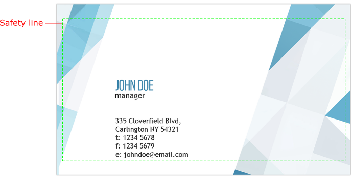
Technically, the ISafetyLine interface defines these lines. It contains parameters to set up a width of the bleed zone and a style of safety lines. The width is measured in points (1/72 of an inch). For example, if you need the bleed zone of 1/8 of an inch, you should set margins to 9. You can set up a single margin for all four product sides or two separate margins for top/bottom and left/right sides.
The Product Definition
You can configure the safety lines for either all product surfaces or a single surface.
To define safety lines for all product surfaces, pass the IProductDefinition.defaultSafetyLines property to loadEditor.
let productDefinition = {
    defaultSafetyLines: [{
        margin: {
            horizontal: 5,
            vertical: 10
        },
        color: "rgba(0,255,0,1)",
        altColor: "rgba(255,255,255,0)",
        stepPx: 5,
        widthPx: 1
    }],
    surfaces: ["pocket_calendar", "pocket_calendar_back"]
};

CustomersCanvas.IframeApi.loadEditor(iframe, productDefinition);
Note that the default measurement units in Customer's Canvas are points. If a parameter accepts other units, then the unit name is specified in the parameter name like stepPx and widthPx in this example.
If the IProductDefinition.defaultSafetyLines property is set up, then all product surfaces will have the same safety lines by default. The default safety lines can be overridden for any surface by setting the surface's safety lines as follows:
let productDefinition = {
    surfaces: [{
        designFile: "pocket_calendar",
        safetyLines: [{
            margin: 9,
            color: "rgba(0,255,0,1)",
            altColor: "rgba(255,255,255,0)",
            stepPx: 5,
            widthPx: 1
        }]
    }]
};
Here, the IPrintAreaTemplate.safetyLines property sets safety lines for a surface having a design template. To set safety lines for a blank surface having no design template, use the IPrintAreaDefinition.safetyLines property.
let productDefinition = {
    surfaces: [{
        width: 200,
        height: 150,
        printAreas:[{
            bounds: { x:0, y:0, width: 200, height: 150},
            safetyLines: [{
                margin: 9,
                color: "rgba(0,255,0,1)",
                altColor: "rgba(255,255,255,0)",
                stepPx: 5,
                widthPx: 1
            }]
        }]
    }]
};
The Safety Zone with Rounded Corners
You may want to define rounded corners of the safety zone for some products. In this case, add the borderRadius property to the safetyLines definition.
let productDefinition  = {
    surfaces: [{
        designFile: "sticker",
        safetyLines: [{
            margin: 9,
            borderRadius: "10 20"
        }]
    }]
};
The borderRadius property takes a string containing space-separated values. As well as in the CSS format, you can specify up to four values for all the corners:
borderRadius: "10"- one common radius for all four rounded corners.borderRadius: "10 20"- the upper-left and lower-right radiuses are10, and the upper-right and lower-left radiuses are20points.borderRadius: "10 20 30"- the upper-left radius is10; the upper-right and lower-left radiuses are20; the lower-right radius is30.borderRadius: "10 20 30 40"- the upper-left, upper-right, lower-right, and lower-left radiuses.
By default, these values are measured in points. Also, you can define them in percent of the width and height of the design: "20%". To apply arcs of ellipses to the rounded corners, you can specify the values as follows: "5/20". For example, borderRadius: "10 20 30/20 5%" is equivalent to the following widths and heights of ellipses:
- The upper-left corner: (10;20).
- The upper-right corner: (20;5%).
- The lower-right corner: (30;20).
- The lower-left corner: (20;5%).
The Editor Configuration
You can configure the safety lines' behavior both globally in the clientConfig.json file and for a single product through the IConfiguration interface. In the later case, you should pass the configuration to the loadEditor method.
If at least one safety line is specified for a surface, the Safety lines check box is displayed under Markings in the user interface.
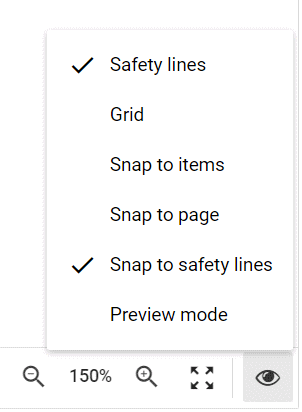
This button allows the user to show and hide safety lines. You can disable this check box using the safetyLinesCheckboxEnabled configuration parameter to disallow your users to hide these lines. There are several other configuration parameters related to safety lines:
previewModeCheckboxEnabledenables the Preview mode in the editor; in this mode, safety lines as well as bleed and slug areas are not displayed on the canvas.violationWarningsSettings.safetyLines.enabledenables a warning displayed if a design element crosses a safety line.proofImageSafetyLinesEnableddraws safety lines on the proof images.proofImageCropSafetyLinesets the name of a safety line which proof images are cropped to; if there is no safety line with the given name, proof images are not cropped. For more information, see the topic describing Proof images.alignToSafetyLineNamesets the name of a safety line which design items can be aligned to; if there is no safety line with the name, then the first safety line in the array is used.
For example, let us enable the warning, crop proof images, and disallow for hiding the safety lines for a product.
let productDefinition = {
    surfaces: [{
        designFile: "pocket_calendar",
        safetyLines: [{
            name: "line1",
            margin: 9,
            color: "rgba(0,0,255,1)",
            altColor: "rgba(255,255,255,0)"
        }]
    }]
};

let configuration = {
    widgets: {
        BottomToolbar: { safetyLinesCheckboxEnabled: false }
    },
    violationWarningsSettings: { safetyLineViolationWarningEnabled: true },
    rendering: { proofImageCropSafetyLine: "line1" }
};

CustomersCanvas.IframeApi.loadEditor(iframe, productDefinition, configuration);
PDF Page Boxes
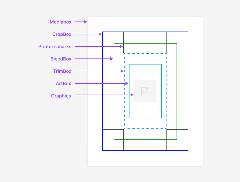
When you render hi-res outputs to PDF files, you can use the pdfBox property to apply margins of your safety lines to either CropBox, TrimBox, or BleedBox. By default, these document properties are not included in the PDF outputs.
In the following example, we set two safety lines in a product definition and specify that they will be assigned to CropBox and TrimBox page boxes in the resulting PDF file.
let productDefinition = {
    surfaces: [{
        designFile: "invitation",
        safetyLines: [
            {
                margin: 8,
                color: "rgba(200,10,10,0.7)",
                pdfBox: "Crop"
            },
            {
                margin: { horizontal: 8, vertical: 10 },
                color: "rgba(10,200,10,0.7)",
                pdfBox: "Trim"
            }
        ]
    }]
};
If you need to create CropBox in your PDF file, the corresponding safety line should have the property "pdfBox": "crop". To create TrimBox, define "pdfBox": "trim", and for BleedBox, define "pdfBox": "bleed".
This is how the PDF page boxes are arranged in a PDF file:
To verify that PDF Page Boxes exist in a PDF file and the content fits or fills them, Customer's Canvas provides the Preflight Tool with the corresponding rules.
If rendering takes place in CCHub, then, as an alternative to defining the safety lines for a product, you can add PDF boxes using the draw-crop-marks task.
Zoom to Fit
The Design Editor allows you to zoom the canvas to fit the predefined safety lines. This allows you to both zoom in the product and center the editing area. For example, let's load a business card into the editor and define two sets of safety lines.
let product = {
    surfaces: [{
        designFile: "bc_front",
        safetyLines: [{
            name: "Text zone",
            margin: {
                left: 32,
                right: 100,
                top: 50,
                bottom: 8
            },
            color: "red",
            altColor: "rgba(255,255,255,0)"
        },
        {
            margin: 7,
            color: "green",
            altColor: "rgba(255,255,255,0)"
        }]
    }, "bc_back"]
};
Here, the first set of safety lines has the Text Zone name. When you click the Zoom level button in the Bottom toolbar, you can see that this name appears in the menu along with the second safety line with the default name.
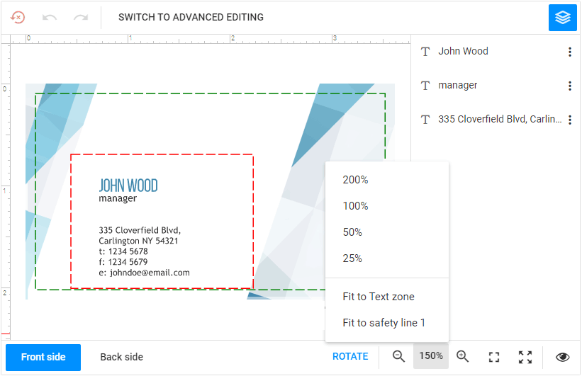
You can either zoom the canvas to a predefined zoom level or zoom it to fit the safety zone in the viewer. Now, if you click Fit to Text Zone, the editor will zoom the canvas and center it to the Text Zone.
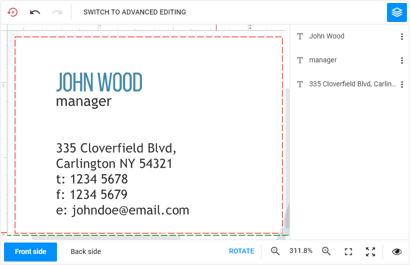
If you need to fit the editing zone closer to the viewer borders, you can change the canvas.paddingPct property.
To display the entire product on the canvas at the minimum zoom, click Best fit in the zoom menu.
Crop Marks
You can draw safety lines on proof images to verify that all elements are fit the safety zone. To specify bleed zones where the printed page should be cut off, you can draw crop marks. Design Editor allows for drawing additional page information like an order number, a file name, a date, and more. Crop marks are shown on both proof images and hi-resolution outputs.
For details, you can refer to the Cropping marks topic.
Defining Bleed and Slug Areas
You can define the bleed and slug (the space outside the bleed zone) through separate properties of the print area. When you create a product from scratch or based on a Photoshop template, you can just add the bleed and slug objects to the print area definition.
For example, you can load a template businesscard.psd with the bleed and slug of 10 points each as follows:
let product = {
    surfaces: [{
        printAreas: [{
            designFile: "businesscard",
            bleed: {
                top: 10, bottom: 10, left: 10, right: 10
            },
            slug: {
                top: 10, bottom: 10, left: 10, right: 10
            }
        }]
    }]
};
The Bleed and Slug Areas in InDesign
Customer's Canvas imports the bleed and slug margins from InDesign templates. The editor expands the product boundaries to accommodate the slug area and marks the bleed area with safety lines.
Importing the Bleed Zone
Starting from version 5.33, we have changed the way we define the bleed zone and print area size, bringing the user experience closer to Adobe InDesign and other professional tools. Earlier, if you wanted to create a 3.5x2" business card with 1/8" bleed, you created a 3.75x2.25" design and put a safety line inside it.
But now, when you create a 3.5x2" design, the bleed zone will expand outside the design.
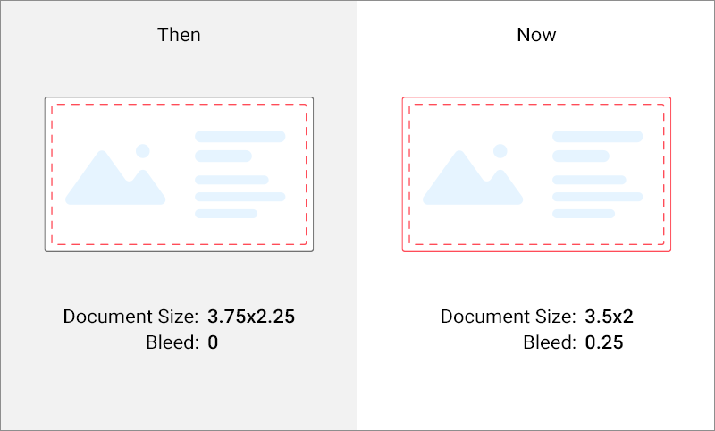
Bleed and Slug are now regulated by separate properties of the print area. If both Safety Lines and Bleed margins are defined, then Bleed margins have a higher priority. The Safety Lines are still displayed, but they no longer reflect the trim and bleed lines.
Accordingly, the logic for reading IDML files has changed when using the built-in Bleed and Slug fields. Earlier, the product size remains as is, and we automatically added a Safety Line object. Now, we expand the product by the size of Bleed and Slug. We consider the upper-left corner of the final product (i.e. trim line) as the origin, not the expanded design.
After upgrading to version 6, you may run into a problem when the size of the product is not what you expect, and unnecessary safety lines may also appear. If you encounter this, you can either rework the design and change the Bleed and Slug settings, or enable the old behavior. In the latter case, set LegacyIdmlBleedParsingEnabled to True in Aurigma.DesignAtoms.config.
Changing the Appearance of the Bleed Zone
You can define the bleed and slug safety lines in either defaultSafetyLines or safetyLines to change styles of these lines, for example:
let productDefinition = {
    surfaces: [{
        designFile: "flyer",
        safetyLines: [
            { name: "bleed", color: "rgba(0,0,0,1)", altColor: "rgba(0,0,0,0)", stepPx: 15, widthPx: 1 },
            { name: "slug", color: "rgba(110,110,110,1)" }
        ]
    }]
};
You can also change the appearance of bleed and trim lines on the canvas through the printZone object in the editor's config, for example:
let configuration = {
    canvas: {
        printZone: {
            bleed: {
                color: "rgb(0,100,0)",
                altColor: "rgb(0,100,0)",
                step: 5,
                width: 1
            },
            trim: {
                color: "rgb(0,0,0)"
            }
        }
    }
};
When a template contains the bleed and slug areas, the corresponding lines appear on the canvas. You can set proofImageSafetyLinesEnabled to true to enable them on proof images. To display these areas in the hi-res output, you need to define the crop marks.
Regions
Defining regions in Photoshop or InDesign templates as well as creating them in Template Editor, you can limit the editable area on the canvas. Although
regions do not allow users to edit the content outside of them, their borders are not marked by default. To display them, you can pass the printZone object to the editor's config, for example:
let configuration = {
    canvas: {
        printZone: {
            region: {
                color: "rgb(74, 255, 255)",
                altColor: "rgb(255, 0, 0)",
                step: 5,
                width: 1,
                visible: true
            }
        }
    }
};
To verify that user changes are only made in regions, you can enable the region violation warnings in the ~/Configuration/clientConfig.json file globally or through the IConfiguration interface for a single product. In the latter case, the configuration will look as follows:
let configuration = {
    canvas: {
        printZone: {
            region: {
                color: "rgb(74, 255, 255)",
                altColor: "rgb(255, 0, 0)",
                step: 5,
                width: 1,
                visible: true
            }
        }
    },
    violationWarningsSettings: {
        regionViolationWarningEnabled: true
    }
};
If the user moves an item on the canvas out of a region, the region violation occurs and the corresponding message is shown in the Object Inspector and on the canvas. You can also disallow moving items out of the regions. If you set the suppressOutOfRegionManipulation property to true, then it prevents both the user manipulations and displaying the warning message.
The Trifold Example
Let us look at a real use case of setting up a flexible markup. For example, if you print trifold-brochures, then every printed page is folded into three parts. While designing such a product in Design Editor, you can display safety lines for all three parts, folding lines, and the bleed zone with crop marks.
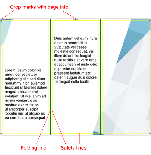
This is the proof image, so neither safety lines nor folding lines are printed on the resulting hi-res output. We applied the following settings for this markup.
let productDefinition = {
    surfaces: [{
        width: 792,
        height: 612,
        foldingLines: [{
            margin: "264",
            isVertical: true,
            pen: { color: "green", altColor: "green", width:2 }
        }, {
            margin: "528",
            isVertical: true,
            pen: { color: "green", altColor: "green", width:2 }
        }],
        printAreas: [{
            bounds: { x:0, y:0, width: 792, height: 612},
            cropMarks: [{
                margin: 8,
                length: 7,
                color: "black",
                topNotes: [
                    { fontSize: 7, alignment: "Left", text: "trifold-brochure.pdf", edgeMargin: 0.1 },
                    { fontSize: 7, alignment: "Center", text: '1/8" Bleed', edgeMargin: 0.1 }
                ]
            }],
            safetyLines: [
                { margin: 9, color: "yellow", altColor: "yellow" },
                { margin: { horizontal: 255, vertical: 9 }, color: "yellow", altColor: "yellow" },
                { margin: { horizontal: 273, vertical: 9 }, color: "yellow", altColor: "yellow" }
            ]
        }]
    }]
};

let configuration = {
    rendering: {
        proofImageSafetyLinesEnabled: true
    },
    violationWarningsSettings: { safetyLines: { enabled: false }}
};

CustomersCanvas.IframeApi.loadEditor(iframe, productDefinition, configuration);
Note that margins, heights, and widths are in points. In this example, they define the 8.5" x 11" page with the 1/8" bleed zone.
Non-rectangular Products
You can easily set up safety lines and crop marks for rectangular products in the web-to-print editor as this topic describes. Alternatively, you can put bleed lines in a design template in Photoshop as shown in the following image.
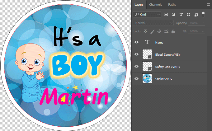
Here, the red circle defines the safety zone. This layer has the <VNP> marker to show only in the editor. The black circle defines where your personnel should cut off this product. To hide a layer in the editor but at the same time print it on hi-res outputs, you can add the <VNS> marker to this layer in Photoshop.
However, when a product shape allows for applying the built-in functionality of the Design Editor, like rounded corners of the safety zone, do not include such lines in your templates. Editing the designer's configuration is more flexible than modifying your PSD files.