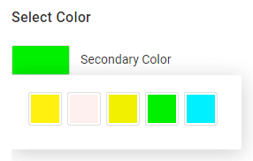
Color picker
- 1 minute to read
A widget displaying color swatches to allow your users to change colors of design elements.

Instead of this widget, consider using the Color selector widget. It allows you to open a list of colors in a separate pop-up box and display the title of colors. It also allows you to implement such scenarios as choosing a pair of colors at once.
General info
- type:
color-picker
Params
text- a hint displayed for the color picker.displayColor- the preview of the selected color.colors- an array of color swatches available for the user.
In the colors array, you can define the following properties:
value- the color value in the CSS format.displayColor- the color preview in the RGB color space.preselected- iftrue, highlights this color when the color picker opens.props- an object defining the color-specific properties. Here, you can also specify arbitrary properties that can be used in dynamic configs.
Example
The following example illustrates how you can define five color swatches in the color picker displayed above.
{
    "type": "color-picker",
    "name": "picker",
    "title" : "Select Color",
    "params": {
        "text": "Secondary Color",
        "colors": [
            {
                "displayColor": "#fff00f",
                "value":"cmyk(0, 0, 93, 0, 1)"
            },
            {
                "displayColor": "#fff0f0",
                "value":"cmyk(0, 5, 2, 0, 1)"
            },
            {
                "displayColor": "#f0f000",
                "value":"cmyk(11, 0, 96, 0, 1)"
            },
            {
                "displayColor": "#00f000",
                "value":"cmyk(66, 0, 100, 0, 1)",
                "preselected": true
            },
            {
                "displayColor": "#00f0ff",
                "value":"cmyk(53, 1, 9, 0, 1)"
            }
        ]
    }
}