Color selector
- 3 minutes to read
This widget displays color swatches that users can select. Unlike the Color picker, it displays not only the color box but also an alternative color and their names, if needed.
Configuring widget
To add a color selector to your editor, you must configure a widget for the color-selector type.
{
    "name": "color-selector",
    "type": "color-selector",
    "params": {
        ...
    }
}
In params, you can define the widget caption text that appears on panels, popupText that appears as a hint in the pop-up box, and an array of color swatches.
{
    "name": "color-selector",
    "type": "color-selector",
    "params": {
        "text": "Selected colors",
        "popupText": "Select a color set",
        "colors": [
            ...
        ]
    }
}
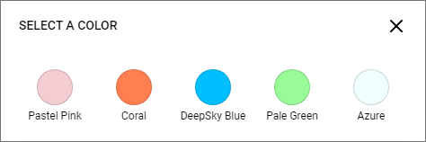
This widget allows you to implement scenarios when selecting a single color as well as a pair or more colors at once. You can define a color by passing a HEX or CSS-style color value as a string.
{
    "title": "Deep Sky Blue",
    "value": "#00BFFF"
}
You can also specify it as an array with a single element.
{
    "title": "Coral",
    "value": ["rgb(255, 127, 80)"]
}
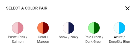
If you add two colors to the array, a pair of colors will be selected.
{
    "title": "Pale Green / Dark Green",
    "value": [
        "#98FB98",
        "#006400"
    ]
}
Note that you can define any number of colors in this array. If you refer to the value of this widget in the config, you will get the entire array.
{
    "type": "static-text",
    "name": "txt",
    "params": {
        "text": "{{JSON.stringify($['color-selector']._.value)}}"
    }
}
Visualization of color selector items
When you define a set of single colors, they will fill the background of the circle corresponding to the element.
When you define a set of color pairs, the circle will split into two parts.
In some cases, you may need to overlay these colors on top of each other to display, for example, how text may look on a background. You can provide a custom inline SVG string in which you must refer to currentColor.
{
    "name": "color-selector",
    "type": "color-selector",
    "params": {
        "text": "Selected colors",
        "popupText": "Select a color set",
        "svg": "<svg viewBox='0 0 20 20'><path d='m5 5h10v10h-10z' fill='currentColor'/></svg>",
        ...
    }
The currentColor corresponds to the first color in the array, and the second color fills the background.
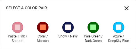
If you use SVG with one color, this color is used to draw the SVG on a white circle.
For more details about configuration parameters, refer to IColorSelectorConfig.
Config example
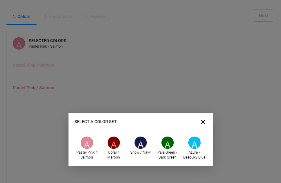
The following example illustrates how you can define five color pairs in the color selector displayed above. When a swatch is selected, its colors and title will appear in the text widgets.
{
    "widgets": [
    {
      "name": "sidebar",
      "type": "group",
      "params": {
        "type": "noncollapsible",
        "tabs": [
          {
            "widgets": [
            {
                "name": "color-selector",
                "type": "color-selector",
                "params": {
                    "text": "Selected colors",
                    "popupText": "Select a color set",
                    "svg": "<svg width='57' height='60' viewBox='0 0 57 60' fill='none' xmlns='http://www.w3.org/2000/svg'>\n<path d='m15.29 53.57 10.996-28.633h4.082l11.719 28.633h-4.3164l-3.3398-8.6719h-11.973l-3.1445 8.6719zm8.2617-11.758h9.707l-2.9883-7.9297q-1.3672-3.6133-2.0312-5.9375-.54687 2.7539-1.543 5.4688z' fill='currentColor'/></svg>",
                    "colors": [
                    {
                        "title": "Pastel Pink / Salmon",
                        "value": [ "#F4CDD3", "#E08697" ]
                    },
                    {
                        "title": "Coral / Maroon",
                        "value": [ "FF7F50", "#800000" ]
                    },
                    {
                        "title": "Snow / Navy",
                        "value": [ "#FFFAFA", "#151B4E" ]
                    },
                    {
                        "title": "Pale Green / Dark Green",
                        "value": [ "#98FB98", "#006400" ]
                    },
                    {
                        "title": "Azure / DeepSky Blue",
                        "value": [ "#F0FFFF", "#00BFFF" ]
                    }
                    ]
                }
            },
            {
                "type": "static-text",
                "name": "txt1",
                "params": {
                    "text": "{{$['color-selector']._.title}}",
                    "style": {
                        "color": "{{$['color-selector']._.value[0]}}"
                    }
                }
            },
            {
                "type": "static-text",
                "name": "txt2",
                "params": {
                    "text": "{{$['color-selector']._.title}}",
                    "style": {
                        "color": "{{$['color-selector']._.value[1]}}"
                    }
                }
            }]
          }
        ]
      }
    }
}