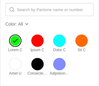
Pantone color picker
- 1 minute to read
A widget displaying color swatches to allow your users to change colors of design elements. This is an improved Color picker widget for working with Pantone colors. It displays color options and can apply filters to the color set, for example, filter them by name.

General info
- type:
pantone-color-picker
Params
colors- an array of color swatches available for the user in the value-tags format:value- the color value in the formatspot(PANTONE 123 C, rgba(1,2,3,1)).tagsan array of strings corresponding to filter tags.
filters- an array of filters:titlethe filter name displayed when the filter is activated.displayColor- the preview of the selected color.tag- the tag bound to the colors
height- the widget height in pixels, optional. The default value is"275px".
Example
{
  "name": "pantone-color-picker",
  "type": "pantone-color-picker",
  "params": {
      "colors": [
        {
          "value": "spot(PANTONE Lorem C,rgba(5,255,0,1))",
          "tags": ["green"]
        },
        {
          "value": "spot(PANTONE ipsum C,rgba(255,5,0,1))",
          "tags": ["red"]
        },
        {
          "value": "spot(PANTONE sit C,rgba(255,105,0,1))",
          "tags": ["red"]
        },
        {
          "value": "spot(PANTONE dolor C,rgba(5,255,255,1))",
          "tags": ["others", "green"]
        },
      ],
      "filters": [
        {
          "title": "green",
          "displayColor": "#0f0",
          "tag": "green"
        },
        {
          "title": "red",
          "displayColor": "#F00",
          "tag": "red"
        },
        {
          "title": "not sure",
          "displayColor": "#fff",
          "tag": "others"
        }
      ],
    "height": "600"
  }
}
You can find more details about the properties of this widget in AuWidgetPantoneColorPicker.
For more details about configuration parameters, refer to AuWidgetPantoneColorPickerConfig.