This section describes an obsolete configuration of Simple Editor v1. We recommend using Simple Editor v2, which is based on workflow elements.
Simple Editor styling
- Last updated on April 9, 2024
- •
- 6 minutes to read
In this article, you will learn how to change the style of UI elements in Simple Editor.
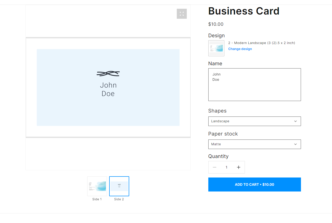
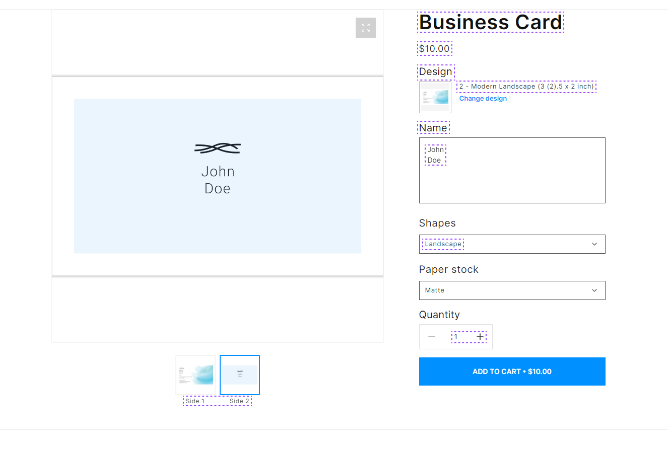
Main page
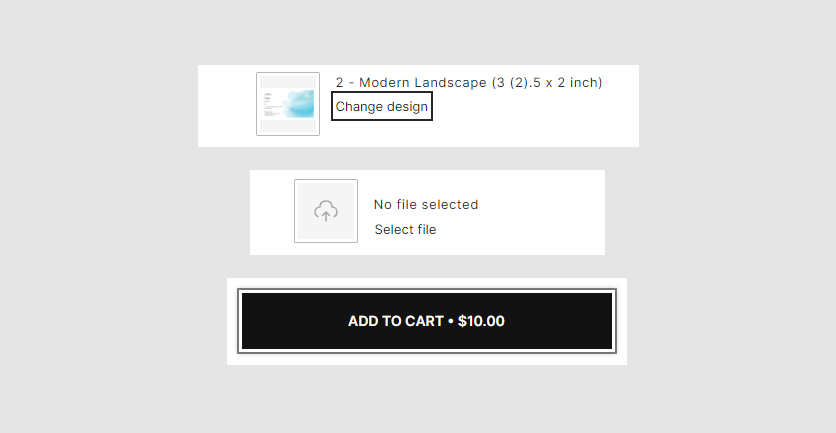
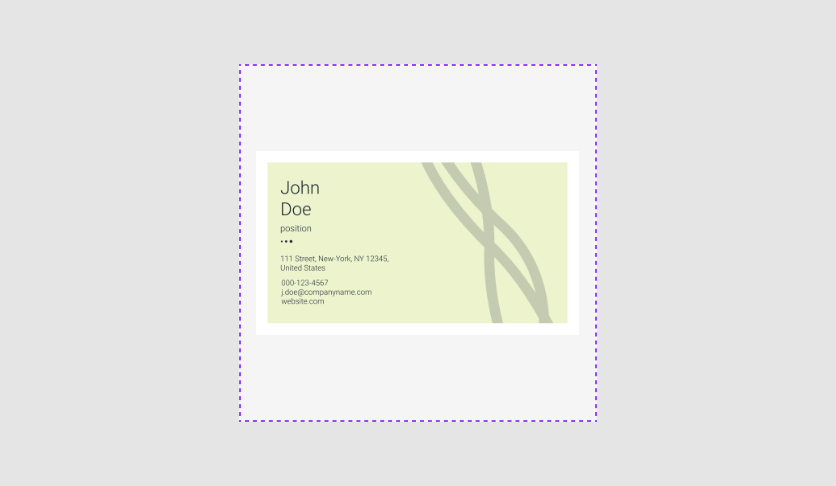
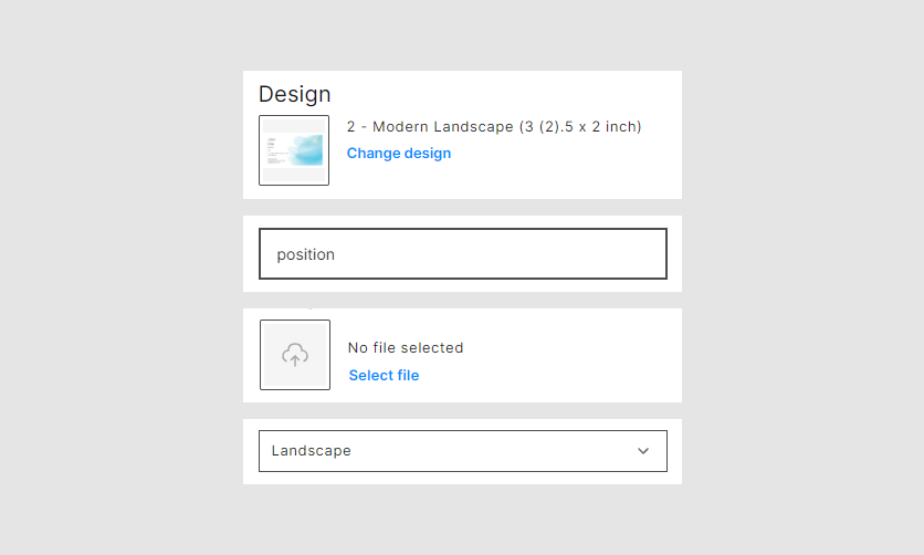
Let's consider how the main page looks. It consists of the following parts:
viewer, representing a product design.- a product name.
- a product price.
- the
Add to cartbutton. - the
Change designbutton. - the
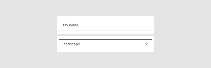
Select filebutton. - input fields.
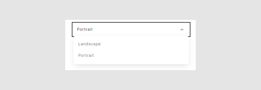
- drop-down lists.
- checkboxes.
To learn more about creating a product for Simple Editor, read the Simple Editor Guide section.
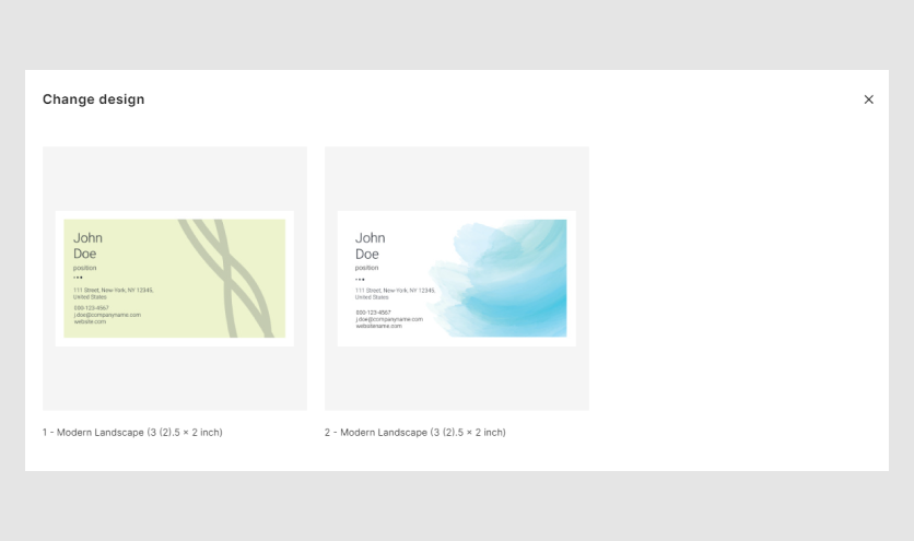
Dialog boxes
Simple Editor has the following dialog boxes. Let's consider them.
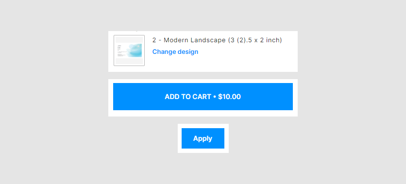
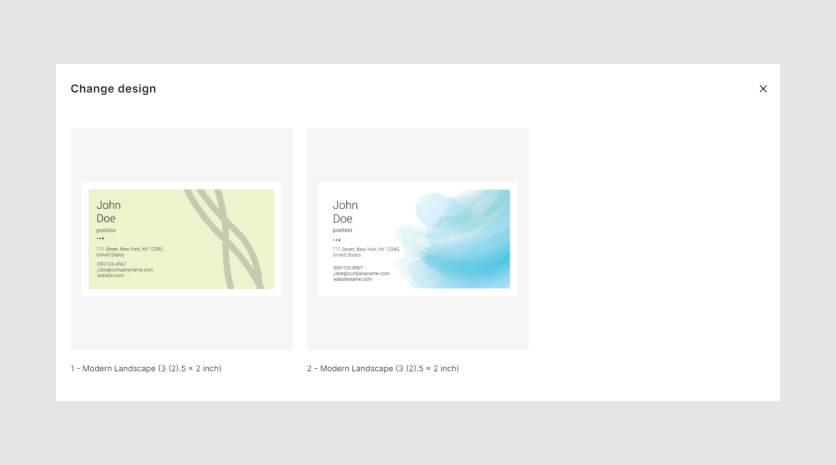
Change design
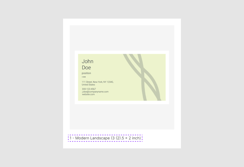
In the Change design dialog box, you can select one of the designs connected to the product.
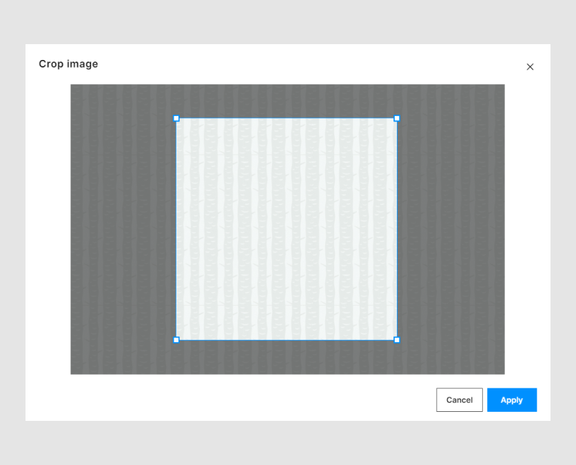
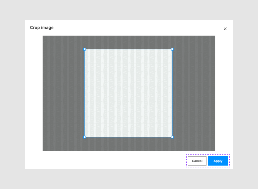
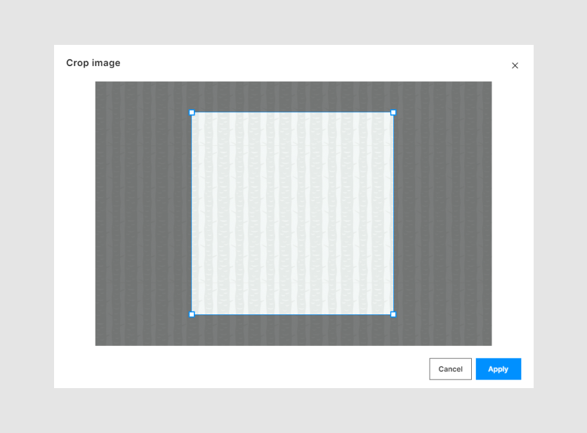
Crop image
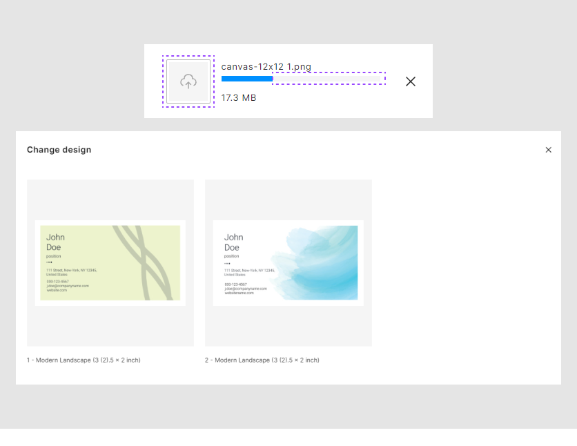
If your design has image placeholders, a new button will appear in the main page. By clicking it, you can select an image, and then see it in the Crop image dialog box.
This dialog box crops an image according to the aspect ratio of an image placeholder in a design file.
Next, we will consider the usage of CSS variables in Simple Editor.
How to use Simple Editor variables
You can use CSS variables in following ways:
Embed them in an HTML page inside the
<style></style>tags. It looks like this:<style> *{ --se-sm-h-button-padding: 30px; } </style>Create a separate CSS file and add it to an HTML page using the
<link>tag.<link rel="stylesheet" href="my-css-variables.css">Write JS code, where you can define the values of variables:
window.addEventListener("DOMContentLoaded", async () => {
  function setCssVariables(){
    const root = document.querySelector(':root');
    root.style.setProperty('--se-accent-color', 'lawngreen');
    root.style.setProperty('--se-text-color', 'royalblue');

  }
  setCssVariables();
}
Write JS code, which adds the
STYLEelement with new values to the page:window.addEventListener("DOMContentLoaded", async () => { function modifyCssVariables(){ const stylesTag = document.createElement('style'); stylesTag.textContent = ` :root { --se-accent-color: green; }`; const headTag = document.querySelector('head'); headTag.appendChild(stylesTag); } modifyCssVariables(); }
General styles
Here we will consider the variables, that impact many essential elements on the Simple Editor main page. For example, it will be sizes of containers, accent colors, and so on.
Adaptive
CSS allows you to change the variable values dependence on the screen width.
For example, if the screen is less than 1000px, the color of the Add to cart button changes.
@media screen and (max-width: 1000px) {
  :root {
    --se-accent-color: green;
  }
}
Container
The following variables represent the padding of the Simple Editor main container. The default values are 0 px.
The --se-container-max-width shows the viewer width.
The --se-viewer-height: 100%; defines what percentage the viewer will fill the height of the container.
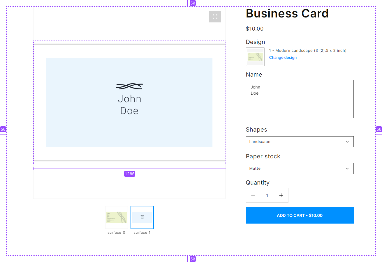
--se-container-max-width: 1280px;
--se-container-padding-left: 50px;
--se-container-padding-right: 50px;
--se-container-padding-top: 50px;
--se-container-padding-bottom: 50px;
--se-viewer-height: 100%;
Core
The --se-border-radius defines border radius for the following elements with visible frames:
- Text fields.
- Checkboxes.
- Drop-down lists.
- The Crop Image dialog box, with the Cancel and Apply buttons.
- The Add to cart button.
- The Quantity buttons with the
+and-buttons. - The Change design button.
For example, let's look at this border radius on an input text field.

--se-border-radius: 0px;
Layout
Here we divide a page into two columns: for viewer and options.
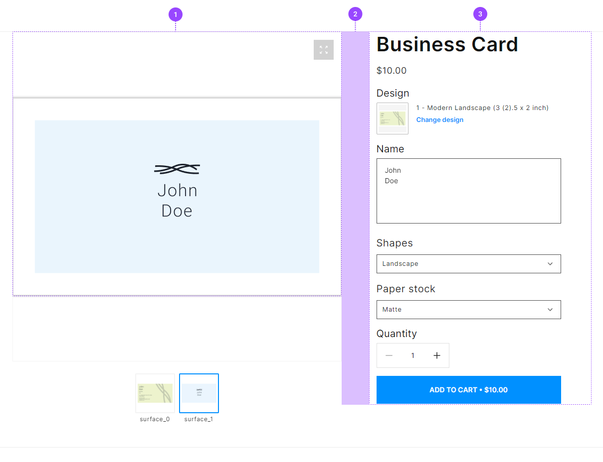
- The width of the viewer container
- The width of the option container
- The gap between the viewer and options
  --se-viewer-column-size: 1fr;
  --se-options-column-size: 400px;
  --se-columns-gap: 40px;
Margins and paddings
The following variables manipulate padding and margins between elements: product name, price, options title, input fields, and so on.
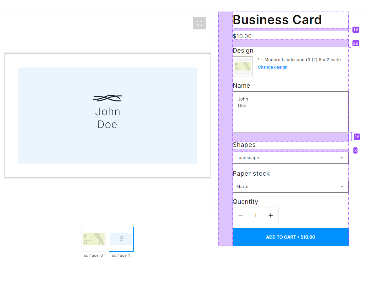
--se-options-left-padding: 30px;
--se-title-bottom-margin: 16px;
--se-heading-bottom-margin: 20px;
--se-option-bottom-margin: 16px;
--se-option-value-padding: 8px;
Font size
The following variables can manage the font sizes.
Plain text
The --se-text-font-size variable represents the font size in:
input fields.
drop-down lists.
the Quantity button.
the Add to cart button.
the Crop image dialog box.
--se-text-font-size: 1.4rem;
Option names
The --se-option-names-font-size variable defines the font size of option titles.
--se-option-names-font-size: 2rem;
Colors
Here we will consider the variables defining colors for UI elements.
Text color
The --se-text-color variable represents the color of most text elements.
In the main page, these are the following elements:
product name.
price.
option titles.
text in input fields.
the name of a file in the Select file button.
the elements in the Quantity button.
In the Crop image dialog box, the text on the Cancel button.

--se-text-color: #282828;
Accent color
The --se-accent-color variable highlights some elements in the interface:
the default color of the Add to cart button.
the default color of the Select file button.
the default color of the Change design button.
the active border of input fields.
the default color of a selected checkbox.
the preloader.
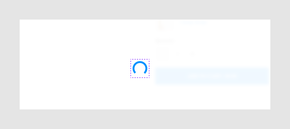
--se-accent-color: #0090ff;
Active color
The --se-active-color variable represents:
the border element in the Change design dialog box.
the сolor of the pressed condition for the
+and-buttons.the color for the pressed condition of the Cancel button.
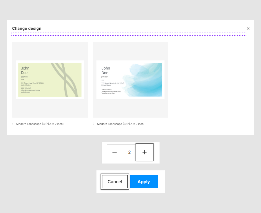
--se-active-color: #fff;
Wrapper color
The --se-wrapper-color variable shows:
the background color of the Change design and the Select file buttons.
the progress bar when an image uploads in an image placeholder.
Background of designs in the Change design dialog box.
--se-wrapper-color: #f5f5f5;
Hover button
The se-accent-hover-color variable manages the color of buttons when the user hovers the mouse over it.
These are the following buttons:
the Add to cart button.
the Change design button.
the Apply button in the Crop Image dialog box.
the selected checkboxes.
--se-accent-hover-color: #0090FF;
Pressed buttons
This variable shows the color of the pressed buttons:
the Change design button.
the Select file button.
the Add to cart button.
--se-accent-active-color: #121212;
Element styles
In this paragraph, we will see the variables that change the style of separate elements.
Product name
The --se-title-font-size variable manages the font size of a product name.

--se-title-font-size: 4rem;
Price
The --se-subtitle-font-size variable represents the font size of a product price.

--se-subtitle-font-size: 1.8rem;
Change design
The --se-variant-name-font-size variable represents the font size of design names in the Change design dialog box.
--se-variant-name-font-size: 1.3rem;
Background
Here we will see the variables for the backgrounds of some elements.
Drop-down list
The --se-dropdown-bg-color variable represents the background color of drop-down lists.
--se-dropdown-bg-color: #fff;
Input field
The --se-field-background-color variable represents the background color of input fields.
--se-field-background-color: transparent;
Dialog boxes
The --se-modal-bg-color variable represents the background color of the following dialog boxes:
Change design
Crop Image
--se-modal-bg-color: #fff;
Change design
In the Change design dialog box, the --se-grid-wrapper-color variable defines the background color of design variants.
--se-grid-wrapper-color: #eeeeee;
Frames
The following variables show the colors of frames of elements in different conditions.
Active frame
The se-border-hover-color variable represents the color of the frame when the user hovers the mouse over it.
the
Change designbutton.an input text field.
the button of an image placeholder.
a drop-down list.
a checkbox.
--se-border-hover-color: rgba(18, 18, 18, 0.75);
Change design
The --se-grid-wrapper-border-color variable represents the frame of a selected design variant.
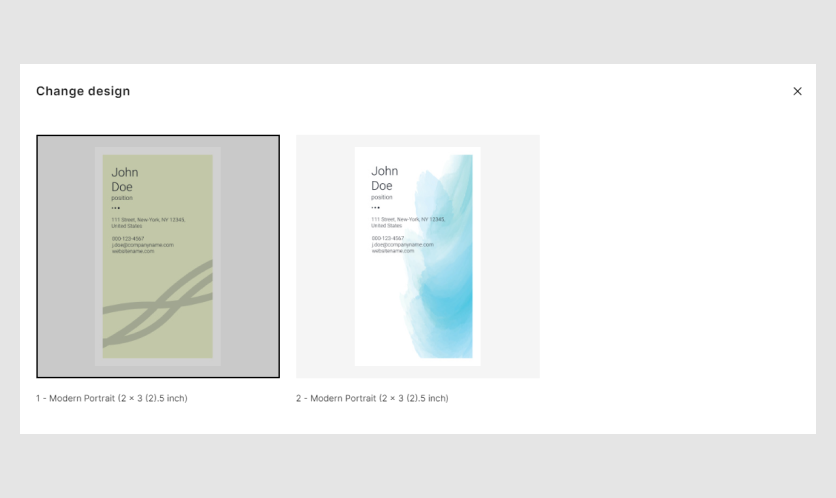
--se-grid-wrapper-border-color #000000;
Drop-down list
The --se-focus-color variable represents the color of a drop-down arrow and the pressed condition for drop-down list.
--se-focus-color: #121212
Default frame
The --se-border-color variable represents the default color of:
an input field.
a drop-down list.
a checkbox.
--se-border-color: rgba(18, 18, 18, 0.75);
Button size
Add to cart
The --se-lg-h-button-padding and --se-lg-v-button-padding variables manage the size of the Add to cart button.
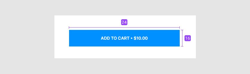
--se-lg-h-button-padding: 32px;
--se-lg-v-button-padding: 16px;
Crop image
In the Crop image dialog box, the --se-sm-h-button-padding and --se-sm-v-button-padding variables define the size of the Cancel and Apply buttons.

--se-sm-h-button-padding: 16px;
--se-sm-v-button-padding: 8px;
Preloader
The --se-min-height variable defines the height of the editor when a page loads.
The --se-blur-color variable defines the color of the preloader when you change the PIM options.
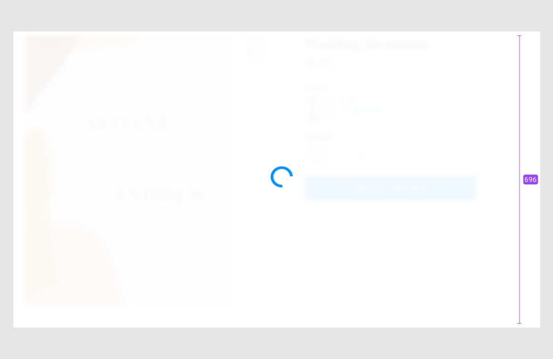
--se-min-height: 696px;
--se-blur-color: rgba(255, 255, 255, 0.94);
Errors
Error text color
The --se-error-color variables represents the font color of error and warning messages.
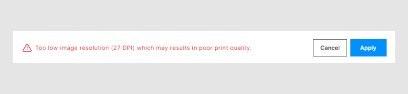
--se-error-color: #db1919;
Warnings
Warning text color
The --se-warning-color variable represents the font color of warning messages.
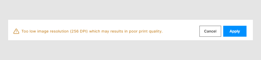
--se-warning-color: #bc6e00;