This feature is available only upon request. To enable it in your account, contact our support team.
Editing options
- Last updated on July 7, 2025
- •
- 4-5 minutes to read
In this article, you will learn what an option and an option value is, and how to create them. You can read more about the concepts of options in the What is a product? article.
The Options tab
Let's observe options in a product. For this, go to your product and select the Variants tab. Here you can see all your options and option values.
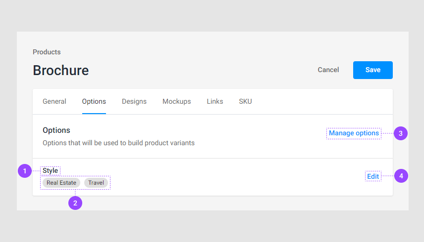
The option name
The option values.
Manage option. Here you can manipulate options as described in the Manipulating options paragraph.
Edit. Here you can customize an option. For more details, refer to the Editing options paragraph.
Manipulating options
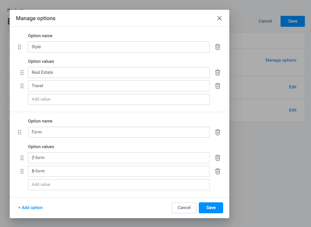
To manipulate options, click Manage options. When a new dialog box opens, you can see your options and values.
Let's observe how you can manipulate them.
Adding
To create a new option, click Add option.
In the Option name field, insert an option name. Then, add option values to the Option values fields. After you've inserted a name for an option value, a field for a new value will appear.
Renaming
You can rename options. For this, click the input field to make it active. Now you can delete the its name and insert a new name.
Changing the order
You can change the order of options and option values. To do so, place your cursor at the drag buttons, click and hold the element to move the element up or down.
Deleting
To delete an option or an option value, click the delete buttons.
Now let's see how to edit options.
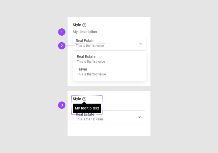
Editing options
To set up an option, click Edit in its row. The option dialog box will open.
Let's see the General tab for the Size option.
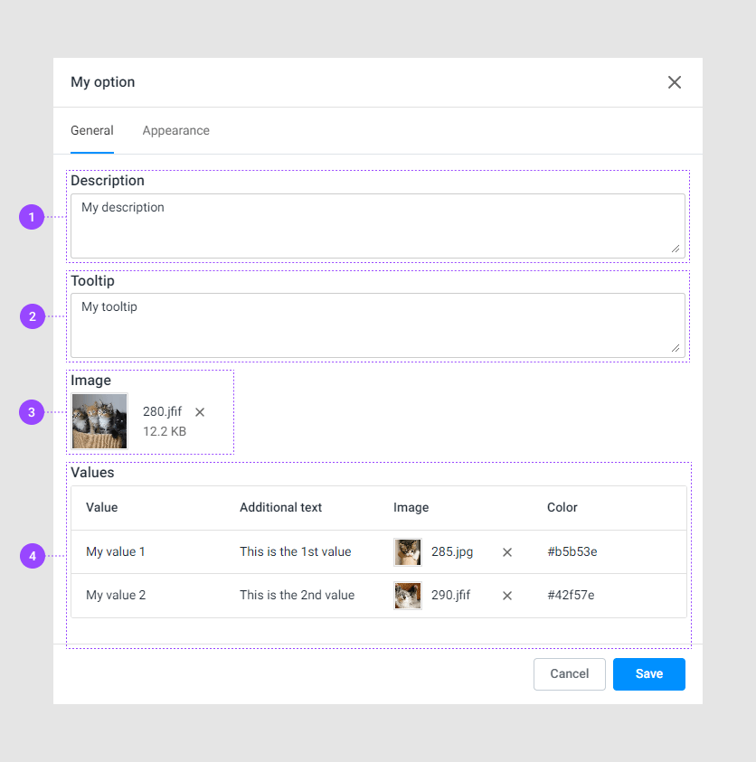
Description. This text appears under an option title in your editor.
Tooltip. This is hidden text that appears when you hover the pointer over the tooltip sign (?).
Image. This image visualizes the option in BackOffice and won't be available in your editor for customers.
Values. Here, you can modify option values and change their appearance.
Let's consider values in detail in the next paragraph.
Modifying values
You can add a color, text, or an image to an option value.
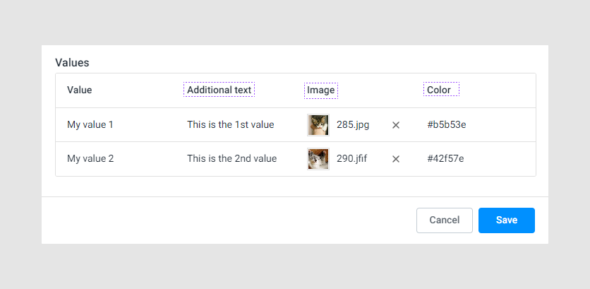
Additional text
This text appears in the option values for the Radio, Dropdown, Image list, and Color list. For more details, see the Appearance paragraph.
Image
Your option value can be an image or can display an image.
To upload an image, click the Select Image tooltip in the option value row.
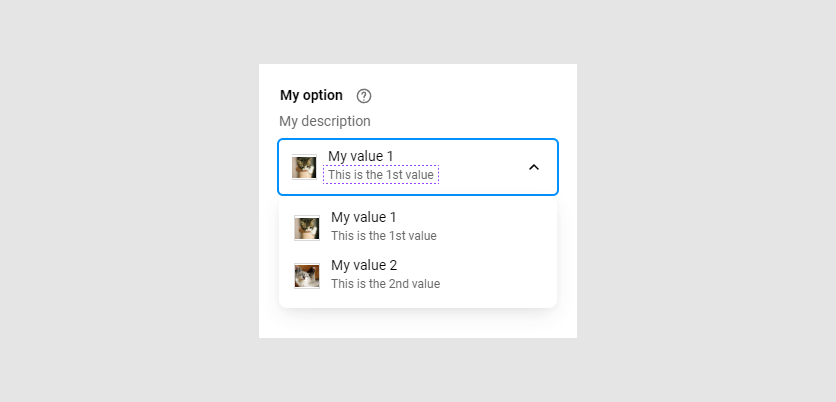
Only the option types Dropdown, Image list, Image grid can display images. For example, this is how appears an image list:
For more details, see the Appearance paragraph.
Color
You can associate a color with an option. For this, insert a color in the HEX format, for example, #1090FF. The Dropdown, Color list, and Color grid can display colors. For example, let's examine another option that configures the paper type as a color grid.

Note
If you add both an image and a color to a value, the Dropdown, Color grid, Color list will display the image by defalut.
Appearance
In the Appearance tab, you can select the option type that defines the visual form of an option in your editor. To select an option type, click the Display type drop-down list.
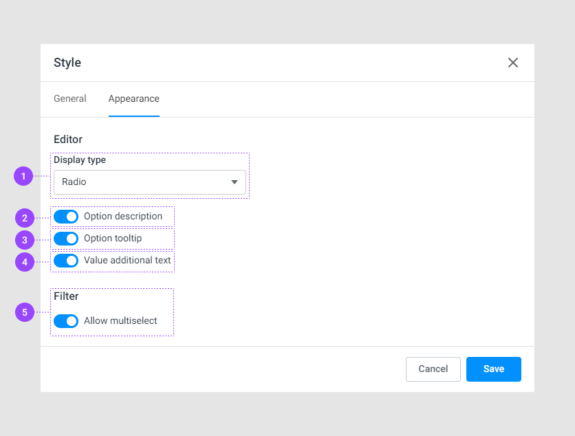
Display type. You can select an option in the Display type drop-down list. The following option types are available: Radio, Dropdown, Chips, Color grid, Color list, Image grid, Image list.
Option description shows a description that is added in the General tab.
Option tooltip displays text when you hover the pointer over the tooltip sign (?). If you don't add this text, but this toggle is on, the tooltip sign won't appear.
Value additional text displays a text in option values. Available for the Radio, Dropdown, Color list, Image list.
Allow multiselect displays option values as checkboxes. This toggle has higher priority than Display type. If you switch on this toggle, the option values will be checkboxes.
Let's look at the option types.
Option types
Multiselect
The multiselect mode displays option values as checkboxes. Only this type allows you to select multiple values.

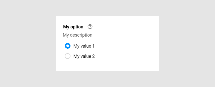
Radio
The radio buttons are the default view of options.
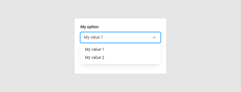
Dropdown
This option type allows you to embed options and option values compactly. It can display text, images, and colors.
Chips
The chips are buttons with text inside.

Color grid and Color list
These option types may display colors. The option will be a colored reclangle. To learn how to define a color, read the Modifying paragraph.
Color grid represents rectangles in a grid.
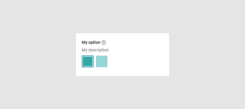
Color list shows rectangles vertically.
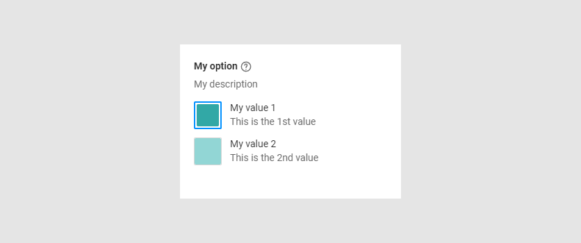
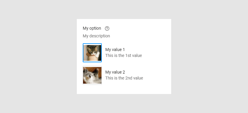
Image grid and Image list
Your options may display images. To read how to upload photos, see the Modifying paragraph.
The Image grid displays graphics in a grid.
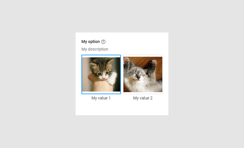
The Image list displays graphics in a vertical orientation.
Descriptions and tooltips
Here, you can see the toggles that make descriptions, the tooltip, and additional text visible. These toggles are on by default.
- The Option description toggle displays a description below the option title.
- The Value additional text toggle appears if the option type is Radio, Dropdown, Color list, or Image list. The text will be below the option value title.
- The Option tooltip toggle shows text when you click the tooltip sign.
Note
If you don't insert text for a description, a tooltip, or for additional text, they won't appear even if the toggles are on.
Now that the options are ready, you can add assets to your product. To do this, go to the Connecting assets to products article.