Preflight
- Last updated on September 1, 2024
- •
- 8 minutes to read
This widget integrates the Preflight Tool into your personalization workflow. For validation, you can load a state file from Asset Storage, or define the product properties and allow your users to upload their files.
{
    "name": "preflight",
    "type": "preflight",
    "params": {
        "config": {...}
    }
}
Referencing the backend
This widget requires a running instance of the Preflight Tool. In workflow files, you can refer to the instance deployed in your tenant through the settings.preflightToolUrl property. Define this URL in the config.backendUrl property of the preflight widget. The best practice in workflows would be to create a variable and then use it in the widget definition.
{
    "vars": {
        "backendUrl": "{{ settings.preflightToolUrl }}"
    },
    ...
    "widgets": [
        {
            "name": "preflight",
            "type": "preflight",
            "params": {
                "config": {
                    "backendUrl": "{{vars.backendUrl}}",
                    ...
To be short, we will omit this property in the following examples.
Setting up product properties
Now let's define the properties of the product for which we will check the designs. The product object allows you to define the size and DPI, manage product pages, and configure the bleed zone.
Product size
Let's define a product of 10 x 8 inches.
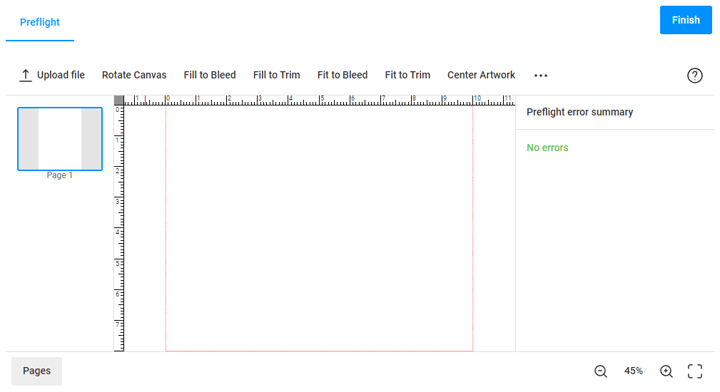
The preflight widget uses points as measurement units (1 point = 1/72 inch). For example, to define a product of 10 x 8 inches, you need to set the width to 720 and height to 576. To define the resolution of the resulting print files, you can use the dpi property.
If you need to open the editor page first, set the startFromUploader property to false.
{
    "widgets": [{
        "name": "preflight",
        "type": "preflight",
        "params": {
            "config": {
                "product": {
                    "dpi": 300,
                    "size": {
                        "width": 720,
                        "height": 576
                    }
                },
                "startFromUploader": false
            }
        }
    }]
}
Product pages
By default, this widget opens a one-page product in the editor. For multipage products, you can specify the number of available product pages, for example, two.
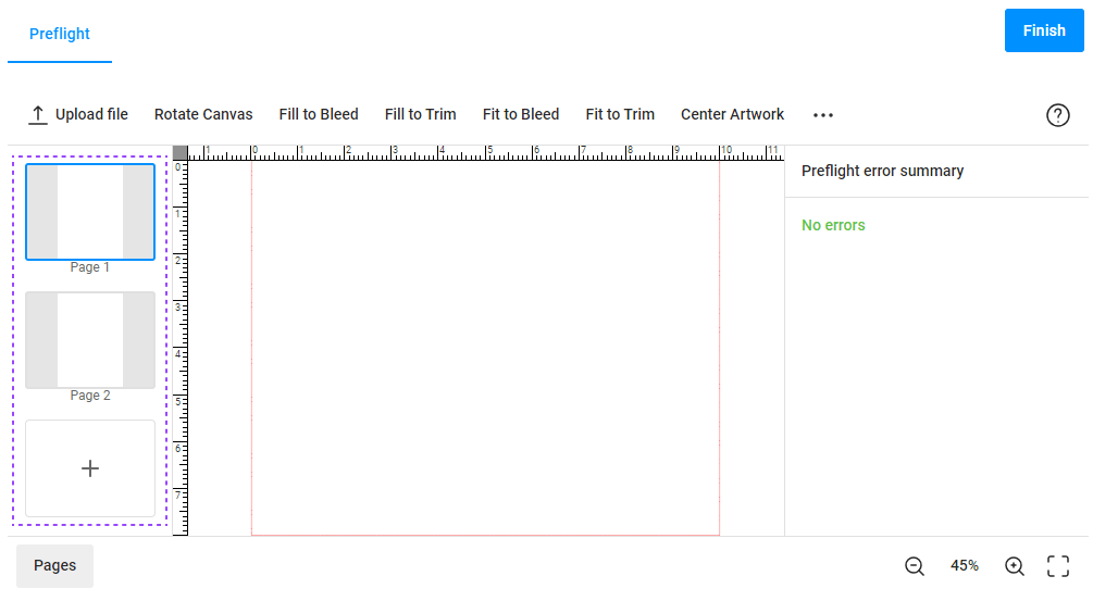
Set up the page number in the pages property. You can also allow your users to add and delete pages by using the allowAddPages and allowDeletePages properties, correspondingly.
{
    "widgets": [{
        "name": "preflight",
        "type": "preflight",
        "params": {
            "config": {
                "product": {
                    "pages": 2,
                    "allowAddPages": true,
                    "allowDeletePages": true
                }
            }
        }
    }]
}
To limit the number of pages that can appear in the editor, you can define the initial, min, and max values as follows:
{
    "widgets": [{
        "name": "preflight",
        "type": "preflight",
        "params": {
            "config": {
                "product": {
                    "pages": {
                        "init": 2,
                        "min": 1,
                        "max": 4
                    },
                    "allowAddPages": true,
                    "allowDeletePages": true
                }
            }
        }
    }]
}
Bleed zone
In the preflight widget, you can display both safety lines and bleed margins. The safety lines only appear in the editor and do not affect print files, whereas the bleed margin is added into print files, thereby enlarging the product size.
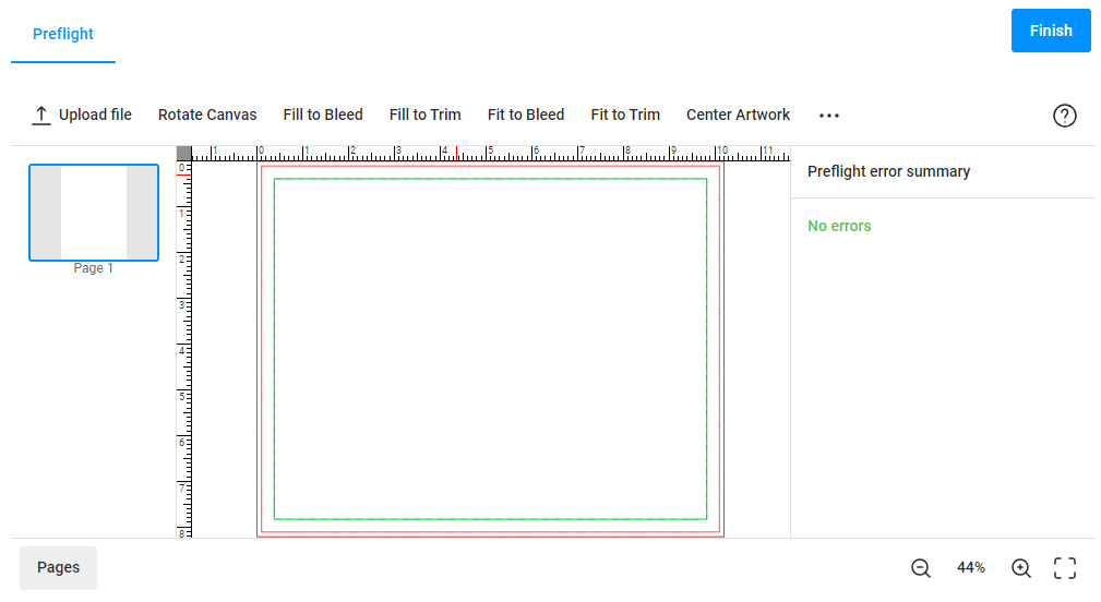
You can configure this bleed zone as follows:
{
    "widgets": [{
        "name": "preflight",
        "type": "preflight",
        "params": {
            "config": {
                "product": {
                    "bleed": 8,
                    "bleedLineWidth": 1,
                    "bleedLineColor": "#880000",
                    "safetyLines": [{
                        "stepPx": 5,
                        "widthPx": 1,
                        "color": "#22b980",
                        "altColor": "#00ff00",
                        "margin": 20
                    }]
                }
            }
        }
    }]
}
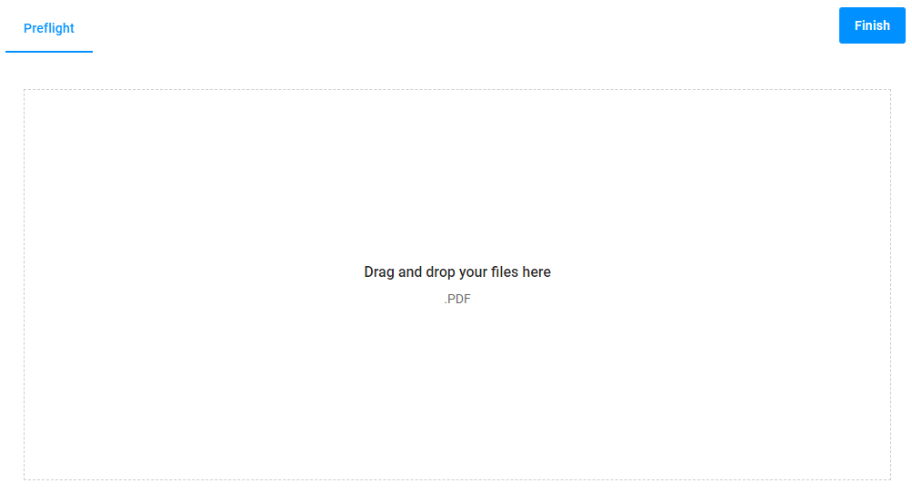
Uploading files
You can define the file uploader properties in the uploader object. For example, you can enable the upload of multiple files at once and define how images should be resized and inserted after their upload. By default, the preflight widget supports files of the following types: PDF, JPEG, PNG, BMP, GIF, PSD, TIFF, AI, and EPS. If you want to allow users to upload files of only specific types, you can list their extensions.
When this widget opens, it displays the upload page.

{
    "widgets": [{
        "name": "preflight",
        "type": "preflight",
        "params": {
            "config": {
                "uploader": {
                    "fileTypes": [".pdf", ".jpg", ".jpeg"],
                    "multiple": true
                }
            }
        }
    }]
}
Loading state files
Instead of configuring products in the JSON format, you can prepare a product design, save it as a state file in your tenant, and then load it into a preflight widget as a product definition.
To load a state file, pass its ID in the config.state.stateId property.
{
  "name": "preflight",
  "type": "preflight",
  "params": {
    "config": {
      "state": {
        "stateId": "64f6d1be4737b3417c7a546a"
      },
      "product": {
        "dpi": 300
      }
    }
  }
}
Since all the product properties will be read from the state file, you can pass only the following settings within the product object:
allowAddPagesallowDeletePagesdpi
Defining validation rules
Now, let's define the conditions that user designs must meet. To enable a preflight check, you need to define the config.rules array. This array contains as many elements as the rules that must be checked.
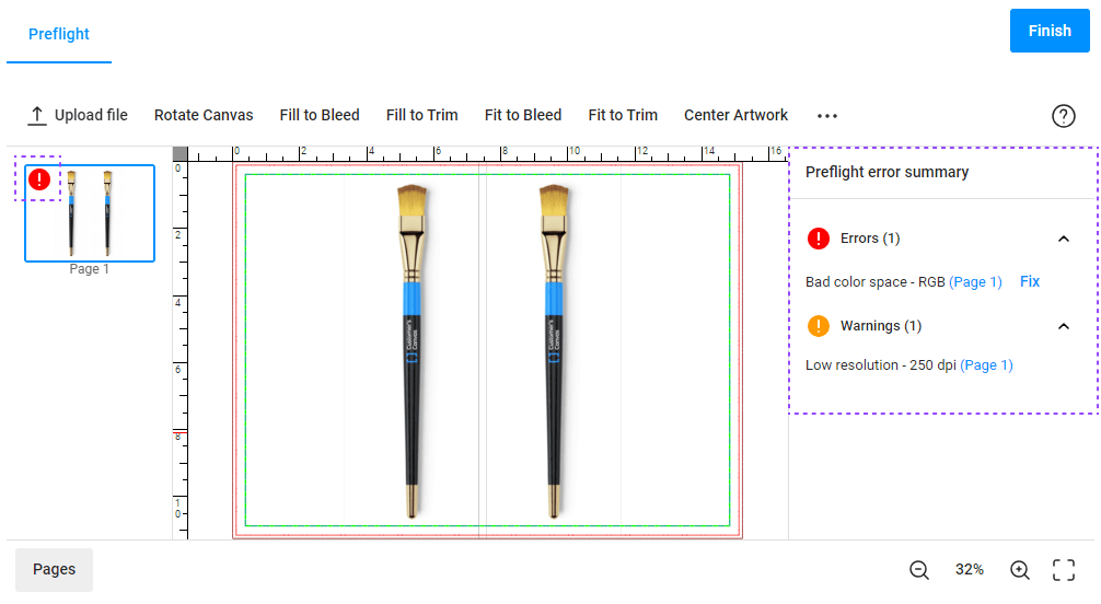
As a result of checking this file, a color space error and a low image resolution were found. The corresponding messages appear on the right panel. The error icon is displayed on the page thumbnail.
How to set up preflight rules
For example, you may want to adjust the color space and resolution of products. In this case, you must define two elements in the rules array.
{
    "widgets": [{
        "name": "preflight",
        "type": "preflight",
        "params": {
            "config": {
                ...
                "rules": [
                    {
                        "type": "colorspace",
                        "severity": "error",
                        "enableFix": true,
                        "params": {
                            "allowedColorSpaces": ["CMYK"]
                        }
                    },
                    {
                        "type": "resolution",
                        "severity": "warning",
                        "params": {
                            "target": 300
                        }
                    }
                ]
            }
        }
    }]
}
Here, severity specifies whether a preflight problem should should be reported as a warning and can remain in the print file, or if it's an error that needs to be fixed.
As a result, if user files contain graphics in color spaces other from CMYK, then the Preflight Tool considers them invalid and enables the Fix button to resolve this issue automatically. If these files have a resolution of less than 300 DPI, then a warning only appears in the editor.
How to configure the Fix All button
You may want to configure a single button to fix several or even all preflight problems in one click. Let's see how you can configure the Fix All button to resolve errors and warnings from the rules with the enableFix property set to true.
{
    "widgets": [{
        "name": "preflight",
        "type": "preflight",
        "params": {
            "config": {
                ...
                "interface": {
                    "customButtons": [
                        {
                            "title": "Fix All",
                            "filter": {
                                "severity": ["error", "warning"]
                            }
                        }
                    ]
                }
            }
        }
    }]
}
Here, we only specified the severity of the rules. Instead, you can list the required rules in the types array.
Defining the rendering properties
The rendering object allows you to set up the preview images, specify color profiles for print files, and add metadata fields to PDF files.
{
    "widgets": [{
        "name": "preflight",
        "type": "preflight",
        "params": {
            "config": {
                "rendering": {
                    "hiResOutputToSeparateFiles": false,
                    "trimPreviewOnBleed": true,
                    "previewSize": {
                        "width": 400,
                        "height": 400
                    },
                    "hiResOutputPdfMetadata": {
                        "author": "CA Printing",
                        "title": "Invitation"
                    }
                },
                ...
            }
        }
    }]
}
Changing the interface
In the interface section of the config, you can configure a toolbar from any combination of standard buttons.
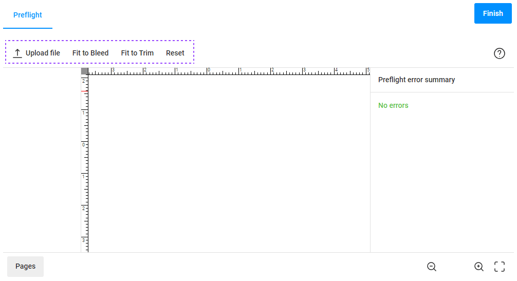
To do so, add the topToolbar array as follows:
{
    "widgets": [{
        "name": "preflight",
        "type": "preflight",
        "params": {
            "config": {
                ...
                "interface": {
                    "topToolbar": [
                        {
                            "name": "upload"
                        },
                        {
                            "name": "fitToBleed"
                        },
                        {
                            "name": "fitToTrim"
                        },
                        {
                            "name": "reset"
                        }
                    ]
                }
            }
        }
    }]
}
If you skip defining the topToolbar, the default toolbar will appear. However, if you add at least one button, it will be created based on your list.
The following actions are supported:
"upload"- uploads a new file or files."rotateCanvas"- rotates the canvas 90 degrees."fillToBleed"- fills the bleed zone with the image."fillToTrim"- fills the trim zone with the image."fitToBleed"- fits the image to the bleed zone."fitToTrim"- fits the image to the trim zone."center"- centers the image."reset"- resets the image to the initial position."keepAspectRatio"- allows for changing the aspect ratio of the image."rotateImage"- rotates the image 90 degrees."applyToAll"- applies the image position on the current page to the images on other pages.
Generating preview images
To display preview images generated by the Preflight widget, you can use another widget, for example, the Image carousel widget. This widget can be initialized with the images stored in $['preflight'].preview.
{
  "name": "preview",
  "type": "image-carousel",
  "params": {
    "containerColor": "#eee",
    "images": {
      "{{ #each $['preflight'].preview as image}}": {
        "url": "{{ image }}"
      }
    }
  }
}
To generate preview images, use one of the following methods:
getPreviews(): Generates preview images in the background and stores their URLs in$['preflight'].preview.getResults(boolean): Renders print files and stores their URLs in$['preflight'].hires. If its parameter is omitted or set totrue, it also generates preview images. Iffalse, it only prepares print files.
You can call these methods when moving to a specific Step, such as a confirmation step for personalized results.
{
  "name": "Preview design",
  "mainPanel": {
    "name": "preview"
  },
  "onActivate": [
    "{{#function $['preview'].showPreloader(1) }}",
    "{{#function $['preflight'].getResults() }}",
    "{{#function $['preview'].showPreloader(0) }}"
  ]
}
Setting up the output
Once the Preflight Tool has rendered previews and print files, you can pass them to a Customer's Canvas project in the props object of the order widget. These custom properties don't appear in the order, but are available in the project.
{
    "name": "order",
    "type": "order",
    "params": {
        "props": {
            "images": "{{ $['preflight'].preview }}",
            "downloadUrls": "{{ $['preflight'].hires }}",
            "_userId": "{{ user.id }}",
            "resources": "{{ $['preflight'].origins.map(o => { return { type: 0, url: o.url, name: o.fileName}; }).concat($['preflight'].hires.map((o, index) => { return { type: 2, url: o, name: 'hires_' + index}; })) }}"
        }
    }
}
In the resources, we create an array of links to origin images and print files. Each element in this array is an object that includes a type, a name, and url. The type represents one of three values:
0- general binary file1- preview image2- hires file
To get a resource in a processing pipeline, you can find it by name or by type. For more details, refer to the pipeline examples.
In the Developer's Center, you can find the guide on the config and the complete list of available rules.