Adding style variations
- Last updated on June 25, 2025
- •
- 7 minutes to read
This tutorial demonstrates how to introduce stylistic flexibility into your designs. By utilizing toggle sets in the Simple Editor, you can predefine multiple style variations for elements and easily switch between them directly within the editor.
Prerequisites
Before starting, ensure you have already learned:
- How to create designs in the Template Editor.
- How to manage files in the Asset Manager.
- The specification of the Toggle set format.
Objective
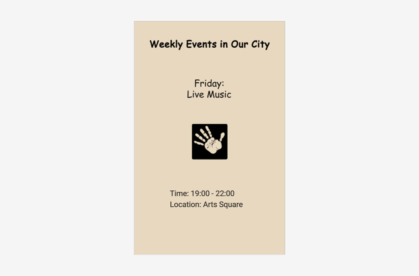
We aim to configure a template for the Simple Editor to allow simultaneous recoloring of a group of text elements, changing their font, and replacing their content. For example, an event poster.
Steps
Step 1: Planning
The goal of this step is to determine what we want to personalize using toggles on this template, how many toggles are needed, and what types they should be. We need to consider the toggle types for all templates and products in our storage. We should aim to minimize the number of toggle sets.
Suppose we have in our storage:
- Ten product categories (Flat Card, Note Card, Business Card, etc.).
- Each category has 50 designs.
- Each design has an average of 5 color variations.
In the worst case, we would need to create a toggle set for each template, resulting in 10 * 50 * 5 = 2500 files.
Clearly, all design variations have roughly the same elements as the main design. This means that by using the same element classes, we can easily use the same toggle set across all variations of the same design (reducing the number from 2500 to 500 files).
However, the structure of different designs for the same product is often similar. For example, if we look at our design example, we see that all elements are divided into two parts: the title (special font) and other text elements (different font). Even if another flyer has fields not present in this design (e.g., contact details), the style of the additional field should match the style of the Event name or Schedule.
In some cases, the style of all texts on a flyer should be the same (i.e., the title style matches the other fields). In this case, we would need two toggle sets.
Another reason to create different toggle sets is to use different sets of colors and fonts. For example, if the design is in pastel tones, the list of colors should differ from a design in saturated tones.
By classifying our design base, we can determine:
- Approximately how many toggle sets we need (ideally, no more than a dozen or so, even for large template libraries).
- What toggles to add, including colors/styles and other parameters.
- How to name elements and their classes (preferably with semantically meaningful names like
main-textandsecondary-textrather thanclass1andclass2, etc.).
Step 2: Creating templates
The template creation process is similar to the usual process but includes an additional procedure: class markup.
Suppose we decide that:
- All text elements are recolored in one color.
- Most elements have a unified style, but there are special elements (e.g., the flyer title) with their own style.
- Event name takes one of the predefined strings.
This means we need to add the following classes:
main-colorfor all recolorable elements.special-stylefor the title.main-stylefor other text fields.event-textfor event variants.
This naming system allows us to adapt to new conditions with minimal changes, such as when a client wants a separate color for special elements or introduces another type of element. There will be no need to change style names on already marked elements.
To set the class of an element:
- Open the design in the Template Editor.
- Select the element to which you want to assign a class.
- Click the Behavior tab and find the Class property.
- Use the plus sign to specify one or more classes.
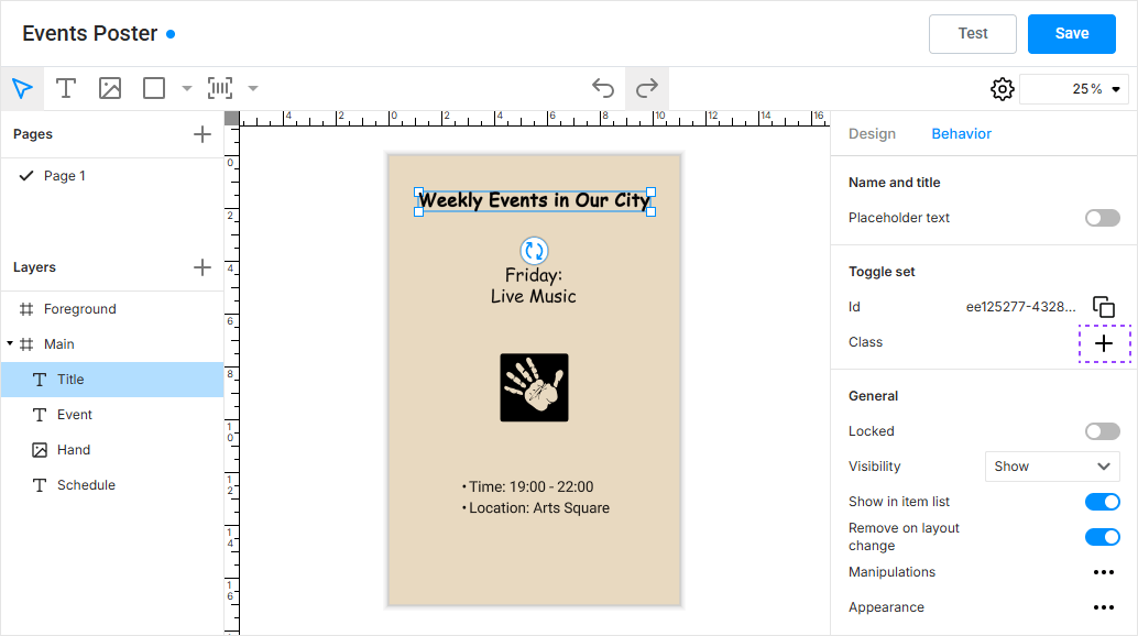
In our example, we need to configure:
For Title:
special-styleandmain-color.
For Schedule:
main-styleandmain-color.
For Event name:
event-text,main-style, andmain-color.
If you make a mistake, delete the class and add it again.
After marking and saving the design, you can proceed to the next step.
Step 3: Creating a toggle set
You can manage toggle sets in the Documents section of Assets.
Navigate to Assets > Documents and organize the file structure for your toggle sets. It is recommended to create a folder Toggle Sets and store all toggle sets directly in it. If you have more than a dozen toggle sets, consider organizing subfolders for easier navigation.
For our example, let's create our toggle set at the root of this folder.
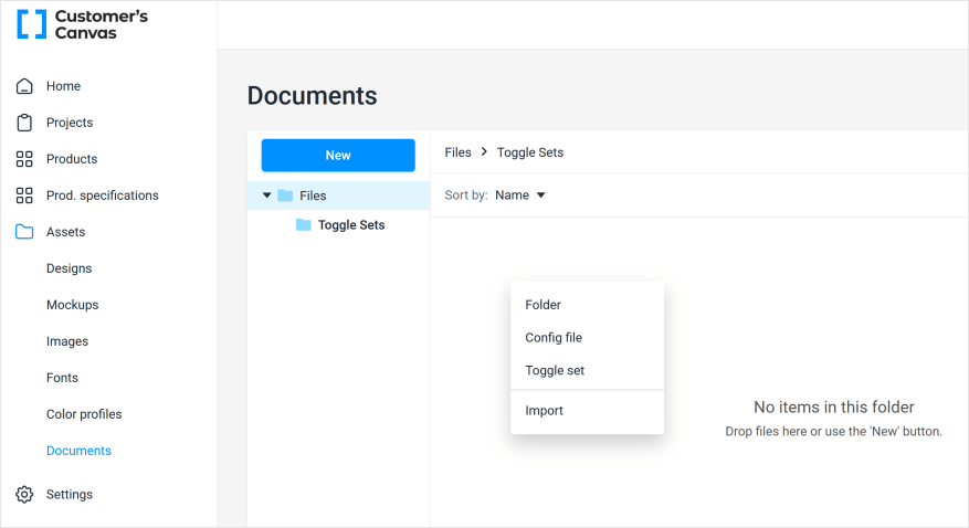
Give it a clear name, such as One Color and Two Styles.
If you plan to use the same toggles with different products, avoid names like Business Card Toggle Set or similar, as it would be illogical to apply them to, say, a Note Card, even if all classes and elements match.
Now, we need to write a JSON description of our toggles. The full JSON specification is described in the article Creating toggle sets. For our task, the JSON file will look as follows:
{
    "id": "one-color-two-styles",
    "name": "One Color and Two Styles",
    "toggles": [
        {
            "id": "main-color",
            "name": "Text Color",
            "selector": ".main-color",
            "colorParams": {
                "items": [
                    {
                        "label": "Black",
                        "previewColor": "rgb(0,0,0)",
                        "value": {
                            "color": "cmyk(0%,0%,0%,100%, 1.0)"
                        }
                    },
                    {
                        "label": "Green",
                        "previewColor": "rgb(0,100,0)",
                        "value": {
                            "color": "cmyk(100%,0%,100%,50%, 1.0)"
                        }
                    },
                    {
                        "label": "Brown",
                        "previewColor": "rgb(60,40,20)",
                        "value": {
                            "color": "cmyk(0%,33%,67%,76%, 1.0)"
                        }
                    }
                ]
            }
        },
        {
            "id": "special-style",
            "name": "Title font style",
            "selector": ".special-style",
            "fontParams": {
                "items": [
                    {
                        "label": "Comic",
                        "value": {
                            "postscriptName": "ComicSansMS"
                        }
                    },
                    {
                        "label": "Monserrat",
                        "value": {
                            "postscriptName": "Montserrat-Bold"
                        }
                    }
                ]
            }
        },
        {
            "id": "main-style",
            "name": "Main text style",
            "selector": ".main-style",
            "fontParams": {
                "items": [
                    {
                        "label": "Roboto regular",
                        "value": {
                            "postscriptName": "Roboto-Regular",
                            "fauxBold": false
                        }
                    },
                    {
                        "label": "Classic arial bold",
                        "value": {
                            "postscriptName": "ArialMT",
                            "fauxBold": true
                        }
                    }
                ]
            }
        },
        {
            "id": "event-text",
            "name": "Event name",
            "selector": ".event-text",
            "textParams": {
                "items": [
                    {
                        "label": "Friday",
                        "value": {
                            "value": "Friday:\n Live Music"
                        }
                    },
                    {
                        "label": "Wednesday",
                        "value": {
                            "value": "Wednesday:\n Board Game Night"
                        }
                    },
                    {
                        "label": "Sunday",
                        "value": {
                            "value": "Sunday:\n Outdoor Cinema"
                        }
                    }
                ]
            }
        }
    ]
}
Key points:
- The toggles will be displayed in the same order as you specify. If you want to prioritize fonts or place the title style after the main style, change the order of the elements in the file.
- Each toggle can have its own list of items, such as different sets of allowed fonts for the general style and the title.
- When specifying colors, we separately configure the preview color (used in the interface) and the design color. It is reasonable to specify the design color in CMYK or even Pantone and coordinate the palette with the client.
This tutorial does not cover scenarios where we configure not only the colors of elements but also shapes. Technically, it is possible to make the card background dark when a light color is selected and vice versa, but for simplicity, this scenario is not considered.
Save the file. During saving, the system checks if the JSON is correctly written. If there is a typo, you will see something like this:
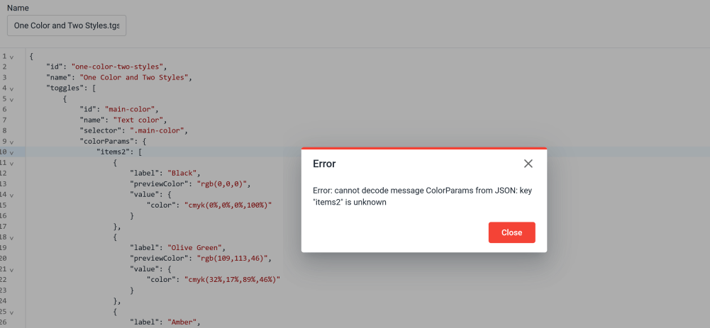
Carefully check your JSON text for typos, such as writing items2 instead of items.
If everything is saved, the JSON was correct. A file with the .tgset extension will be created. You can re-edit it by double-clicking or downloading it (for example, to transfer it between tenants).
Warning
After saving, the file is converted into an internal format. When you download such a file, it will no longer be JSON, and special tools are required for editing.
Step 4: Combining toggle set and design
Now, we need to combine our toggle set with the template. To do this:
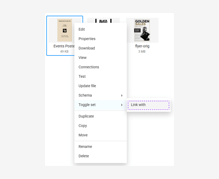
Go to Assets > Designs.
Navigate to the folder with templates and right-click the desired template.
Select Toggle Set > Link with.
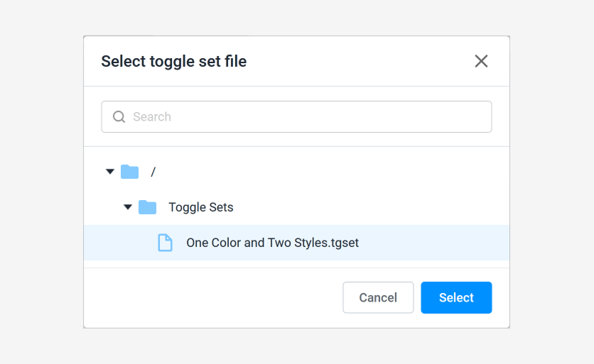
Find our toggle set and select it.
As a result, our file will have an icon indicating the presence of a linked element.
![]()
Repeat this for all designs in your product.
Step 5: Adding the design to a product with the Simple Editor
Next, configure the PIM product as usual and link the templates with toggle sets to its options.
Add a Workflow file for the Simple Editor. It automatically recognizes the presence of a toggle set and will display it.
After opening the editor with this template, we will see something like this:
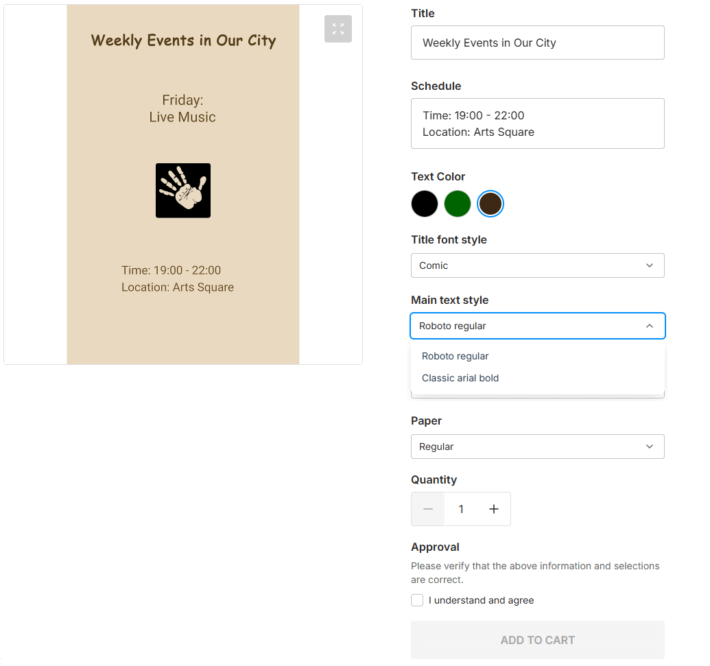
We have successfully configured the toggle functionality for the Simple Editor.