Text behavior
- Last updated on March 20, 2025
- •
- 3-4 minutes to read
This article describes text-specific behavior settings.
Text placeholders
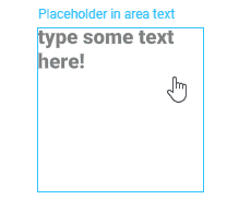
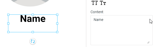
Sometimes you may want text elements to behave as placeholders. The main difference between placeholder text and regular text items is what happens when they are blank. While a regular text item will be displayed as empty text, an empty placeholder text item will prompt the user to enter text. If the user does not fill a placeholder, this prompt won't be rendered on a print file.
This prompt will be displayed as semi-transparent. Once the user enters text, it will disappear. If they clear the content of the text element, they will see the prompt again.
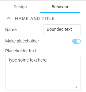
Text placeholder behavior can be applied to both point and area text. You can do so as follows:
- Select a text element.
- On the Behavior tab, in the Name and title group, enable Placeholder text.
- Edit the prompt in the text field below.
Note
Text placeholders are typically used for variable elements. See the Variable elements article to learn how to set up variables.
Copyfitting
When you create area text and let the user edit this element, they may type in a string that is too long to fit this area's bounds. By default, when the content does not fit the text element bounds, the part of the text that goes out of the text frame is clipped. However, you can change this behavior.
- Select one or more area text elements.
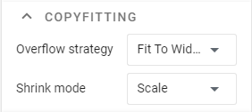
- On the Behavior tab, in the Copyfitting group, define the Overflow strategy and Shrink mode.
Important
These settings are applicable only when a text element has bounds (i.e. area text). It is not available for point text, which always automatically expands its width, and not available for arched text, which always fits its bounds.
Text Overflow Strategies
Clip
Crops text that goes out of the text region. This is the default behavior.
ExpandBox
Expands the bottom bound of the original text area when the text goes out of this area. After that, if you erase the text, the bounding rectangle remains expanded.
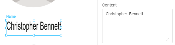
FitToWidth
Downsizes text to fit the bounding rectangle's width. The text moves to a new line only when the user presses Enter. The following image illustrates how this option looks in the editor.

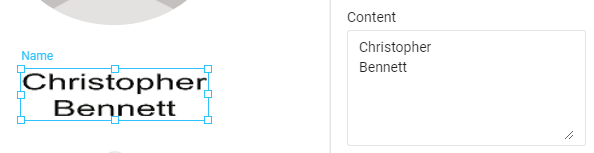
FitToBox
Moves text to the next line when the end of the current line is reached and starts to downsize the text only when the bottom of the bounding rectangle is reached.
Shrink Modes
In addition to a strategy, you can specify in what way the editor downsizes text that goes out of its bounds. There are two options:
Size
Changes the font size. This is the default shrink mode.
Scale
Disproportionally shrinks text in width:
or height:
Text permissions
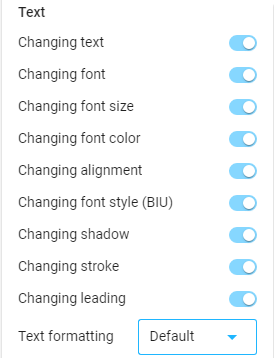
Similar to Manipulation permissions, you can manage text permissions and define which properties of the text users can personalize. You can do so as follows:
- Select one or more text elements.
- Click the Behavior tab.
- Scroll to the General group and click Text.
- Set up the required properties.
Limits
To limit users' character input:
- Select a text element.
- On the Behavior tab, in the Data group, you can define the Max characters, Max lines, and Max line charactters.
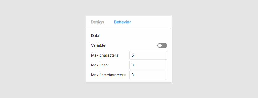
By default, these limits have no values, meaning users can enter any number of characters.
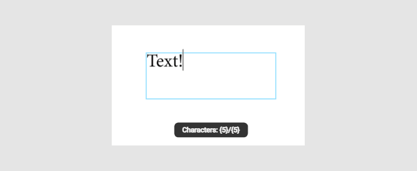
When you apply a limit, users will see a message in the workspace indicating how many characters or paragraphs they can still add to the element.
Max characters
This value defines the character limit for a text string. For example, if this value is set to 5, the following message appears when the user has entered all five characters.
Max lines
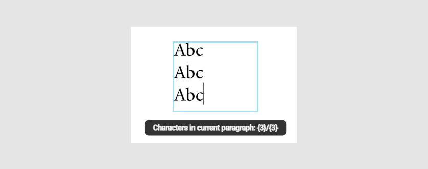
This value defines the line limit in a text area. For example, if this value is set to 3, the following message appears when the user has entered two of the three lines (paragraphs) in the text area.
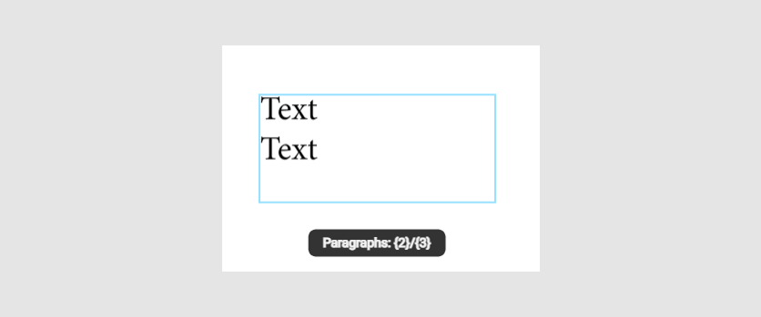
Max line characters
This value defines the character limit per line in a text area. The limit counter resets to 0 when starting a new line. For example, if this value is set to 3, the following message appears when the user has entered two of the three lines (paragraphs) in the text area.
In the next section, you will find instructions on how to add variables to a template.