Under the hood of editor configs
- 5 minutes to read
The Setting up products topic illustrates that the field list in the Customization settings panel may change when you select an editor or a config. You may have further questions related to this: what are configs, how do I make a config, how do I display other parameters, and so on. This topic dwells on these questions.
How configs appear in the list
The Aurigma Personalization Plugin looks for the editors in the \editors\ folder. Every subfolder of this folder contains an editor. If you want to add a new version or modify your current editor, put a new folder with that version in \editors\. You can also upload editors into this folder from the admin panel on the Personalization Plugin Editors page. After that, the new editor will appear in the corresponding drop-down list in the Customization Settings panel.
An editor contains a description in the editor.json file and a set of predefined configurations in the \configs\ subfolder.
{
  title: "The config title for Personalization settings",
  name: "internal_config_id",
  version: "1.0",
  config: { /* The configuration itself is explained further. */ }
}
The plugin reads titles in such files and displays them in the drop-down list. If you want to create your own config either from scratch or based on another config, make sure that you define all these fields and your title describes that this is a new config. The unique title is important when you copy configs from standard editors.
Note that configs are always bound to an editor. If you install a newer editor, do not forget to transfer your customized configs to it.
Now that we know how the Personalization plugin forms the editor list and how you can add your own config to it, let's have a look at a config example.
Config sample
For example, let us see the following configuration sample. This config allows you to select a design template and a mockup image right from the Customization Settings panel. To set up the personalization workflow, this config defines the required widgets and steps.
{
  "title": "Single Page Products",
  "name": "single-page",
  "version": "4.6.1",
  "config": {
    "language": "en",
    "attributeNames": {
      "template": {
        "name": "Front-side Template",
        "settings": {
          "type": "design"
        }
      },
      "previewMockup": {
        "name": "Preview Mockup",
        "settings": {
          "type": "mockup"
        }
      }
    },
    "vars": {
      "template": "{{ product.attributes.find(item=>item.title=='Front-side Template').value }}",
      "previewMockup": "{{ product.attributes.find(item=>item.title=='Preview Mockup').value}}"
    },
    "widgets": [
      {
        "name": "cc",
        "type": "design-editor",
        "params": {
          "initial": {
            "productDefinition": {
              "surfaces": [
                {
                  "printAreas": [{ "designFile": "{{ vars.template }}" }],
                  "previewMockups": [{ "down": "{{ vars.previewMockup }}" }]
                }
              ]
            },
            "editorConfig": {
              "initialMode": "Simple"
            }
          }
        }
      },
      {
        "name": "order",
        "type": "order",
        "params": {
          "images": "{{ $['cc'].proofImageUrls.map(item=>item[0]) }}",
          "downloadUrls": "{{ $['cc'].hiResUrls }}",
          "data": {
            "stateId": "{{$['cc'].stateId}}"
          }
        }
      },
      {
        "name": "preview",
        "type": "image-carousel",
        "params": {
          "lightbox": true,
          "containerColor": "#ffffff",
          "images": {
            "{{ #each $['cc'].proofImageUrls as url }}": {
              "url": "{{ url[0] }}"
            }
          }
        }
      },
      {
        "name": "agree-checkbox",
        "type": "checkbox",
        "params": {
          "prompt": "I have reviewed and approve my design.",
          "value": false
        }
      },
      {
        "name": "finish-button",
        "type": "finish-button",
        "params": {
          "enabled": "{{$['agree-checkbox']._}}",
          "visible": true
        }
      }
    ],
    "steps": [
      {
        "name": "Design",
        "mainPanel": {
          "name": "cc"
        }
      },
      {
        "name": "Preview",
        "mainPanel": {
          "name": "preview"
        },
        "toolPanel": {
          "name": "agree-checkbox"
        },
        "onActivate": [
          "{{ #function $['cc'].getHiResImages(800,800)}}"
        ]
      }
    ]
  }
}
Here, you can find the following sections:
languagespecifies the language of the user interface.attributeNamesbinds variable fields to the Specification attributes.widgetsdefines thedesign-editor,order,image-carousel,checkbox, andfinish-buttonwidgets. For more details about widgets, you can refer to the UI Framework widget reference.stepsdefine the editing sequence.
Variable fields
In the simplest case, you can define all the properties in the config, including names of design templates, but you have to create a separate config for each product, which differs by just one line - the template name. This is a laborious approach, especially if you have a lot of products. To resolve this, we added the possibility to make variable fields for your products.
For the previous config sample, you can see the following variable fields.
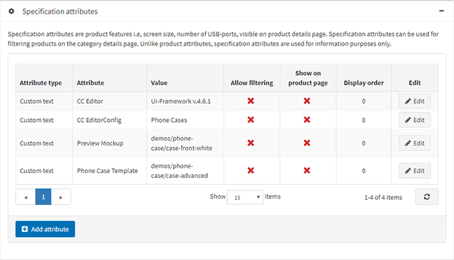
To apply these attributes, define the attributeNames section.
"attributeNames": {
  "template": {
    "name": "Front-side Template",
    "settings": {
      "type": "design"
    }
  },
  "previewMockup": {
    "name": "Preview Mockup",
    "settings": {
      "type": "mockup"
    }
  }
}
Here, name is a specification attribute name, and settings defines a type of this attribute:
design- the drop-down list containing PSD templates from the\ProductTemplates\designs\folder.mockup- the drop-down list containing mockups from the\ProductTemplates\mockups\folder.desingFolder- the drop-down list containing subfolders with designs.mockupFolder- the drop-down list containing subfolders with mockups.list- the list ofsettings.values, for example:"values": ["album", "portrait"].text- the text input.number- the text input for numbers, you can define thesettings.minandsettings.maxvalues for such an attribute.
Now, you can refer to these attributes from any section of your config by using the {{...}} syntax and the product object. For more details about so-called parametrized configs, you can refer to the UI Framework reference.
"vars": {
  "template": "{{ product.attributes.find(item=>item.title=='Front-side Template').value }}",
  "previewMockup": "{{ product.attributes.find(item=>item.title=='Preview Mockup').value}}"
}
When the editor loads a product on a page, the Personalization plugin evaluates the content between the brackets and substitutes this expression with the obtained value.
More about the {{...}} syntax
The previous example illustrates how you can refer to specification attributes of a product. Also, you can apply the following shortcodes:
{{product.title}}{{product.sku}}{{product.price}}{{product.description}}{{product.attributes.Specification Attribute}}whereSpecification Attributeis the name of a specification attribute. Unlike the previous use, it does not display fields in the Customization settings panel. Instead, it just reads the value that you type in the standard Specification Attributes panel.
You may use this approach if you have a file name convention - e.g. if you know that all your PSD files include an SKU in their file names, there is no need to choose a template on the Personalization Settings tab manually. However, in this case, you are responsible for the integrity of your PSD design folder for it to function properly.
If you have any questions or problems with this plugin, feel free to contact our support team.