Editor Layout
- 8 minutes to read
Layouts
Desktop layout
The editor consists of one or multiple steps. You may think of steps as the editor screens. They are displayed as tabs, and you can also switch between them using the Next/Back buttons.
Each step consists of several placeholders for widgets, and these placeholders have a layout like this:
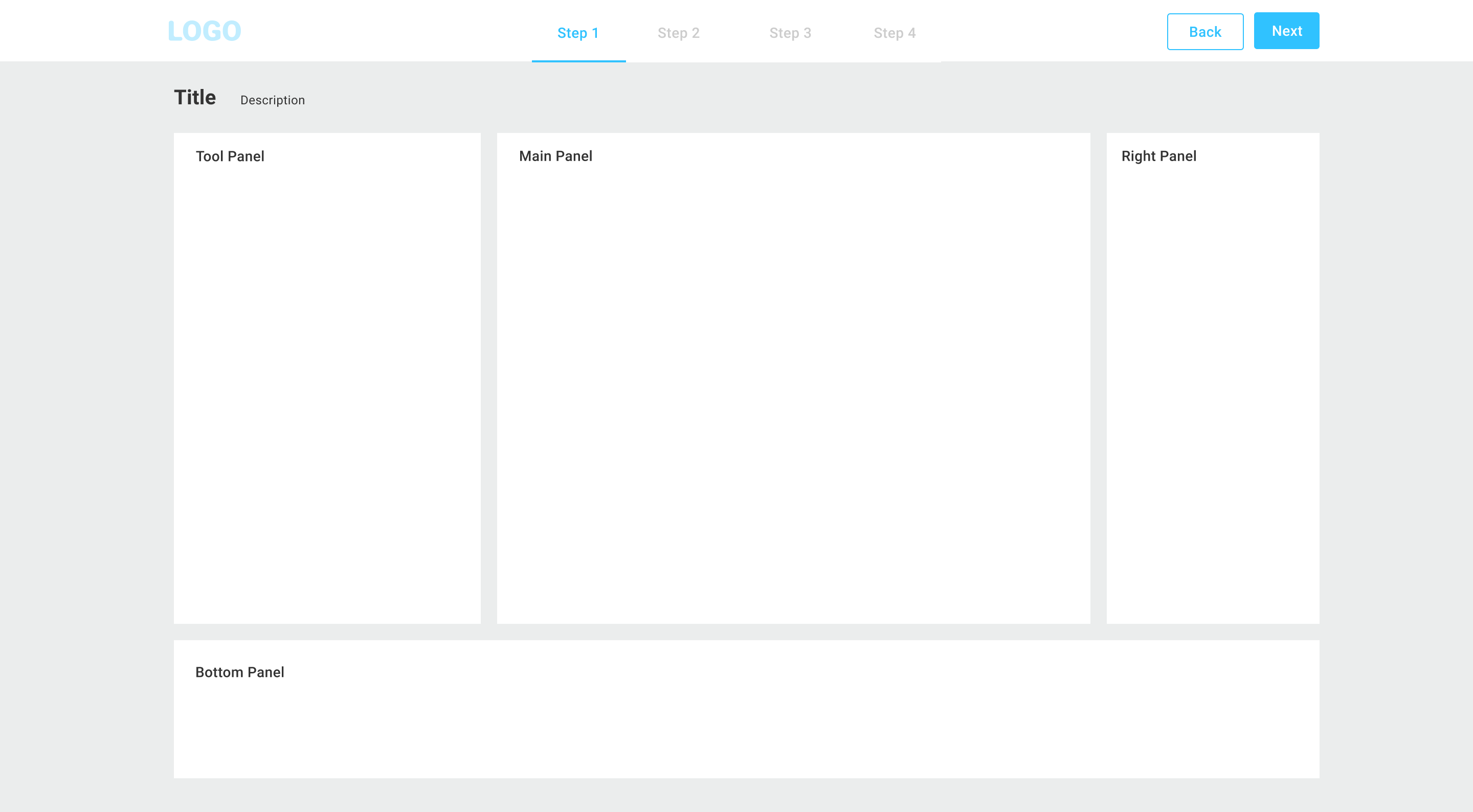
- The navigation panel allows you to switch the steps.
- The main panel holds a basic widget like the design editor, preview, or preflight tool.
- The tool panel and right tool panel may include an option selector, context-dependent blocks, a gallery, or a combination of these.
- The bottom panel allows you to enable additional widgets like a gallery.
Mobile layout
On a narrow screen, such as mobile phones, the default behavior is the following. The main panel occupies 100% of the screen and the tool panel automatically collapses. A user may expand it by clicking the menu icon.
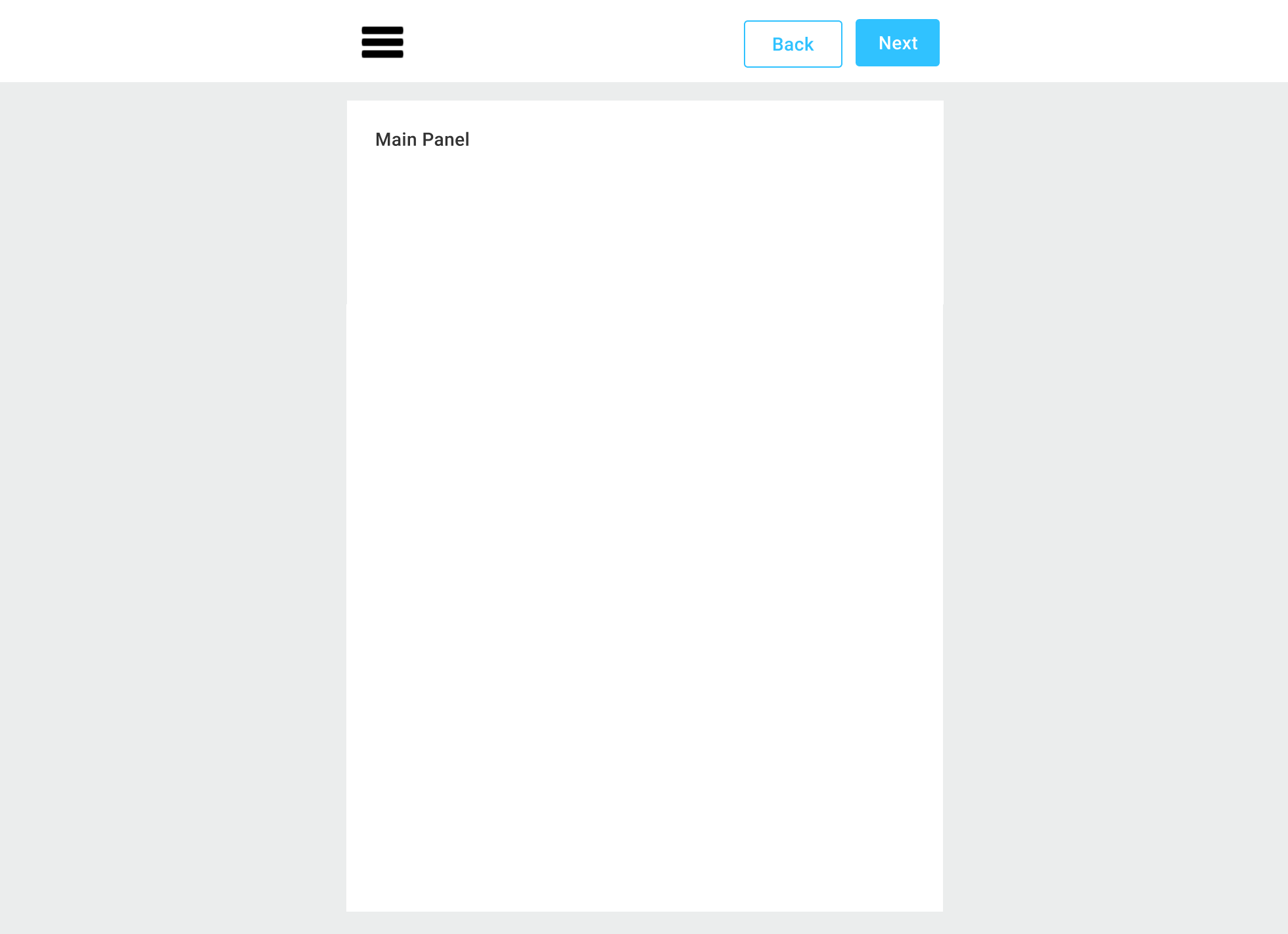
Note, to save space, step tabs are not displayed on a mobile screen. The only way to navigate between screens is the Next/Back buttons.
Alternative mobile layout
Sometimes you may prefer another mobile layout when the widget placeholders are stacked vertically like this.
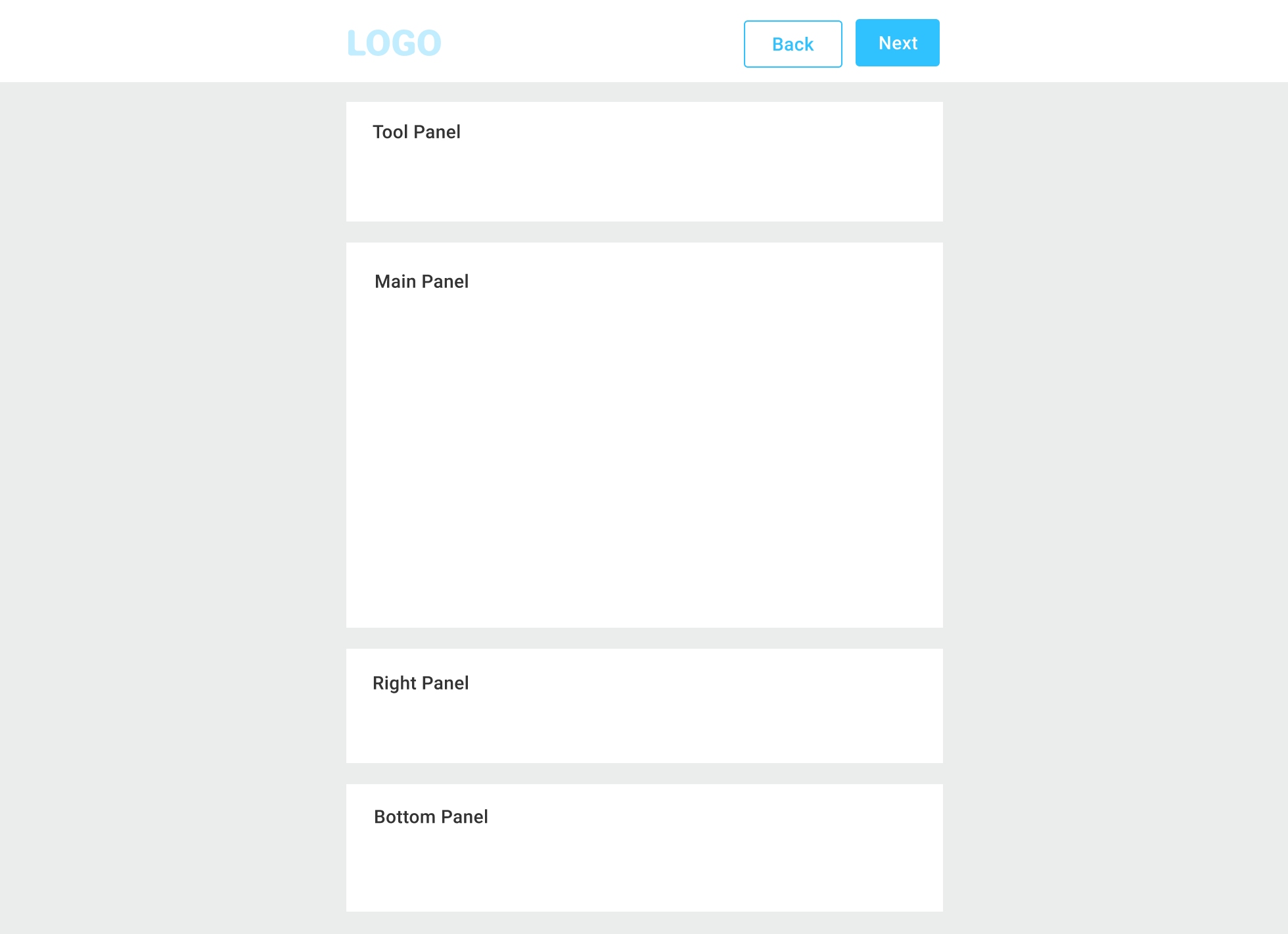
It works better when you always want a user to always see the content of the placeholders, and the amount of widgets in the tool panel is reasonable.
To enable this layout in the config, use the following parameter in the root of the config:
{
    "layout": "verticalmobile",
    ... // other settings
}
Note
This option only applies to mobile devices and does not affect desktop browsers.
You can change the order of the panels and the height of the main panel as explained in the UI Framework Styling article.
Steps
In the Configs topic, you may have already learned about configuring the UI Framework. Now, let's see how you can define the steps that the user must go through to order a personalized product.
Since the ordering process can be a step-by-step process, you need to associate a set of widgets in each of these containers with a step in the config. For example:
- The first step: the main panel displays the Design Editor, and the tool panel displays the color options.
- The second step: the main panel displays an approval page, and the tool panel displays the delivery options.
In some cases, configs of different steps point to the same widget, but with different settings. A typical case is when Design Editor should display the first page in the first step and other pages in the other steps. Also, widget containers may remain the same at different steps, e.g. you can use a single tool panel for all steps.
You can leave the tool and bottom panels undefined to hide them on a screen if needed.
By default, this wizard starts with the first step, but you can also override this behavior in the config.
Parameters of Steps
When defining steps, you can configure the following parameters:
name: [string] - an internal name of a step.title: [string] - a step title to be diaplayed on the tab.icon: [string] - an icon to be displayed next to in the title. This icon should be added asiconset:iconwith the default size of 24px.imageUrl: [string] - a link to an arbitrary icon.imageWidth: [string] - the icon width.imageHeight: [string] - the icon height.description: [string] - the step description to be displayed on the tab.mainPanel: [object] - description of the main panel.toolPanel: [object] - description of the left toolbar.rightToolPanel: [object]-description of the right toolbar.topPanel: [object] - description of the top panel.bottomPanel: [object] - description of the bottom panel.onActivate: [string] | [Array<string>] - the functions executed during the transition to this step can be a single function or an array of functions.onLeave: [string] | [Array<string>] - the functions executed during the transition from this step can be a single function or an array of functions.initOnRestore: [boolean] - iftrue, the step will be activated when restoring the editor. You can define this parameter whendesign-editorappears after the first step that contains a widget that affects the uploaded design (for example, anoptionor agallery).
For example, you can configure a step with following parameters:
{
    "name": "Design",
    "icon": "custom-icons:first",
    "imageWidth": "32px",
    "imageHeight": "32px",
    "title": "Design a product",
    "description": "Personalize your product and select the options",
    "mainPanel": {
        "name": "editor"
    },
    "toolPanel": {
        "name": "option-list",
        "width": "200px"
    },
    "rightToolPanel": {
        "name": "color-list"
    },
    "topPanel": {
        "name": "custom-top-toolbar",
        "height": "8%"
    },
    "bottomPanel": {
        "name": "table",
        "height": "40%"
    }
}
Setting Up Widgets in Steps
For a better understanding, let's take a look at the structure of a config file.
As we explained earlier, you must first place widgets on the panels and then refer to them when defining steps. The following examples illustrate how you can enable the design-editor widget.
{
   "widgets": [
        { name: "cc", type: "design-editor", params: { ... } }  /* the DesignEditor widget */
    ],
    ...
    "steps": [{
        title: "Front Page",
        mainPanel: {
            name: "cc"
        }
    }]
}
Now, let's discuss widgets in more detail.
Widgets
A widget is a control that may appear in the main, tool, or bottom panels. For example, image editor, radio buttons, text block, etc.
Technically, a widget can be placed in any of these panels. In practice, we assume that, for example, the Design Editor will always be in the main panel, the options list will be in the left panel, and so on.
Every widget may contain the following properties:
type: [string] - the widget type specifying the module that the editor will load.name: [string] - the name of a widget instance that can be referenced.title: [string] - the name displayed in the user interface.prompt: [string] - explanatory text.description: [string] - help tips (appears as a tooltip).params: [object] - additional parameters of this widget. By default, this is an empty object.
You can find a complete list of supported widgets, in the widget reference.
There are no mandatory widgets, but without certain widgets, it is unlikely that you will be able to build a usable editor. In most cases, all your configs will contain design-editor, some option widgets, and you will configure the output from the editor through the order or cart widget. You can use the image-carousel to organize a preview section.
Other important widgets are ajax and asset-storage-ajax. They allow for receiving data from the server, such as a list of images, dynamically generated images, or any other data you may need.
Modals
The UI Framework allows you to define modal windows displaying text, widgets, HTML content, or content of external web pages. These modals may appear on the editor startup or in a Help widget.
Every modal window may contain the following properties:
name: [string] - the name of a modal window that is used to open it viamain.ShowModal(%name%);.header: [string] - header text.content: [string] - text content of the window.htmlContent: [string] - html content to be displayed in the window.widget: [string] - name of the widget to be displayed in the window.externalContent: [object] - sets up the content:url: [string] - link.selector: [string] - element selector. All content except this element will be removed from the DOM.scrollTo: [string] - selector of the element to which thescrollIntoView()method will be applied.
styles: { [key: string]: string } - modal window styles. For example,widthandheight.closeOnOutsideClick: [boolean] - closes the modal window when clicked outside. The default value istrue.showOkButton: [boolean] - displays the OK button.showOnStartup: [boolean] - whether to show the modal window when the editor starts. There will be a checkbox in it so that you can disable the display of this window next time.onOpening: [string] | [Array<string>] - the functions executed when opening the modal window.
Let's see how you can display different content in modals.
Text
This modal window will display Text.
{
    "modals": [{
        "name": "string-content",
        "header": "The window header",
        "content": "Text"
    }],
    ...
}
Widgets
This config will display the option-group widget. Note that you cannot embed preflight and design-editor widgets in the window.
{
    "modals": [{
        "name": "widget-content",
        "header": "The window header",
        "widget": "option-group"
    }],
    ...
}
HTML code
This modal window will display an IFRAME element. It occupies half of the editor's working area.
{
    "modals": [{
        "name": "html-iframe",
        "header": "The window header",
        "htmlContent": "<iframe src='https://example.com/manual/' ></iframe>",
        "styles": {
            "height": "50%"
        }
    }],
    ...
}
Websites
This modal window will display the site content by a link, and when opened it will scroll to the element with the selector #hotkeys.
{
    "modals": [{
        "name": "external-scrollTo",
        "header": "The window header",
        "externalContent": {
            "url": "https://example.com/manual/",
            "scrollTo": "#hotkeys"
        }
    }],
    ...
}
Elements
This config will display the content of an element with the div.user-content selector from a webpage. This window will also be displayed when the editor is opened.
{
    "modals": [{
        "name": "external-selector",
        "header": "The window header",
        "externalContent": {
            "url": "https://example.com/faq",
            "selector": "div.user-content"
        },
        "showOnStartup": true
    }],
    ...
}
Using modals
You can display modals in the help widget. For example, you can enable a modal window with hotkeys defined above as follows:
{
    "name": "help",
    "type": "help",
    "params": {
        "base": {
            "type": "modal",
            "content": "external-scrollTo"
        }
    }
}