Structure
- 6 minutes to read
When customers edit a product, they will go through personalization steps. This personalization process is called a workflow. Usually, it contains an editor at the first step and a preview of results at the final step. All these steps are described in a workflow file. You can configure these files to create the workflow for your product. Read the Creating and editing workflows article, to learn where workflow files are in your Customer's Canvas account.
In this article, you will learn the structure of a workflow file. These are the basic elements of the top level of any workflow.
{
  "attributes": [],
  "vars": {},
  "widgets": [],
  "steps": []
}
Usually, when defining a workflow, you can't do without the Widgets and Steps elements. Let's consider each of them.
Widgets
A widget is the smallest element in a workflow file. A widget can display, change, or exchange some data. For example, a checkbox, a gallery, and the editor are widgets. Widgets can be visual and non-visual. Read more about the widget types and widget anatomy in the Widgets articles.
In the following example, two widgets are defined. The my-input-text widget creates a field to input some text, and the my-checkbox widget displays a checkbox.
{
    "widgets": [
        {
            "name": "my-input-text",
            "type": "input-text",
            "params": {
                "placeholder": "Type here...",
            }
        },
        {
            "name": "my-checkbox",
            "type": "checkbox",
            "params": {
                "value": false,
                "prompt": "Click the checkbox"
            }
        }
    ]
}
To use these definitions in a workflow, you must refer to these widgets in steps. To do this, you need to add a widget name to a panel displayed in a step. To know how it works, read the next paragraph about steps.
Steps
The personalization process is divided into steps. You can consider a step as a screen of a multistep personalization wizard. At each step, customers go through one action: editing, selecting variants, or approving results. A step in turn is divided into parts called panels. A panel is a widget container on the screen.
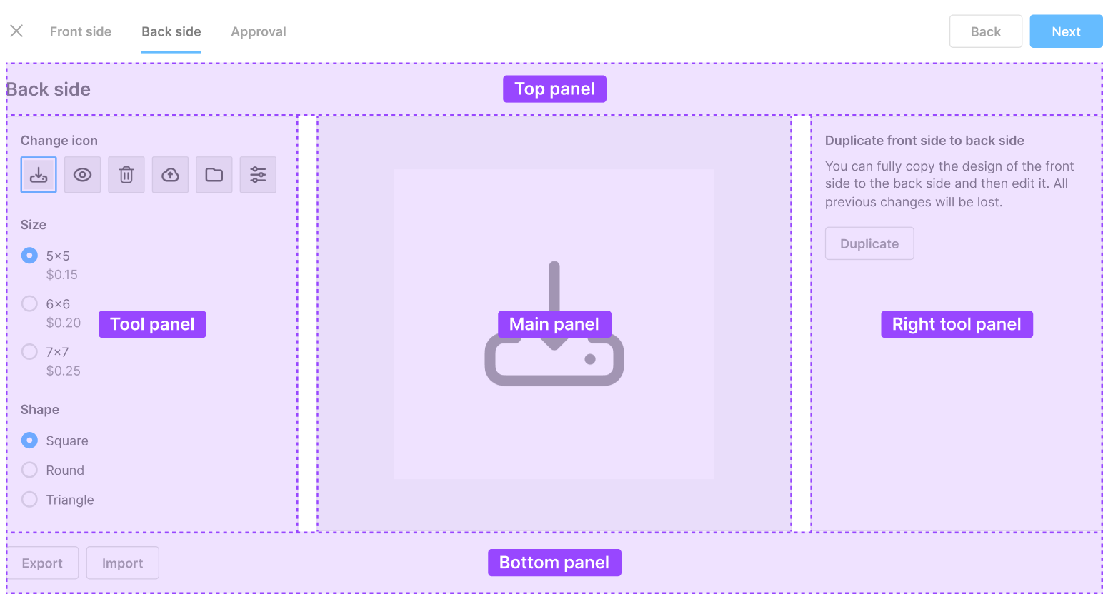
The following are different types of panels..
| Panel name | Description |
|---|---|
topPanel |
workflow title and navigation |
mainPanel |
center panel for the main widgets |
toolPanel |
left panel for auxiliary widgets |
rightToolPanel |
right panel for auxiliary widgets |
bottomPanel |
contains tables or approval controls |
This is an example of a real workflow with highlighted panels.
Let's see an example of how to embed a widget in the mainPanel when defining a step. To do so, just use the widget name in the name property of the panel.
{
    "widget": [
        {
            "name": "introduction",
            "type": "static-text",
            "params": {
                "text": "No options available for this product."
            }
        }
    ],
    ...
    "steps": [
        {
            "title": "Step 1",
            "name": "Step 1",
            "mainPanel": {
                "name": "introduction"
            }
        }
    ]
}
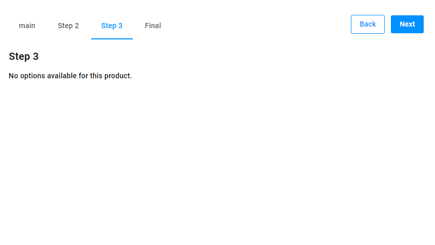
This is how this widget in the step looks in the user interface.
Embedding several widgets in a panel
If you want to display more than one widget in a panel, use the group widget, which combines several widgets together and embeds them in one panel. Let's see the example.
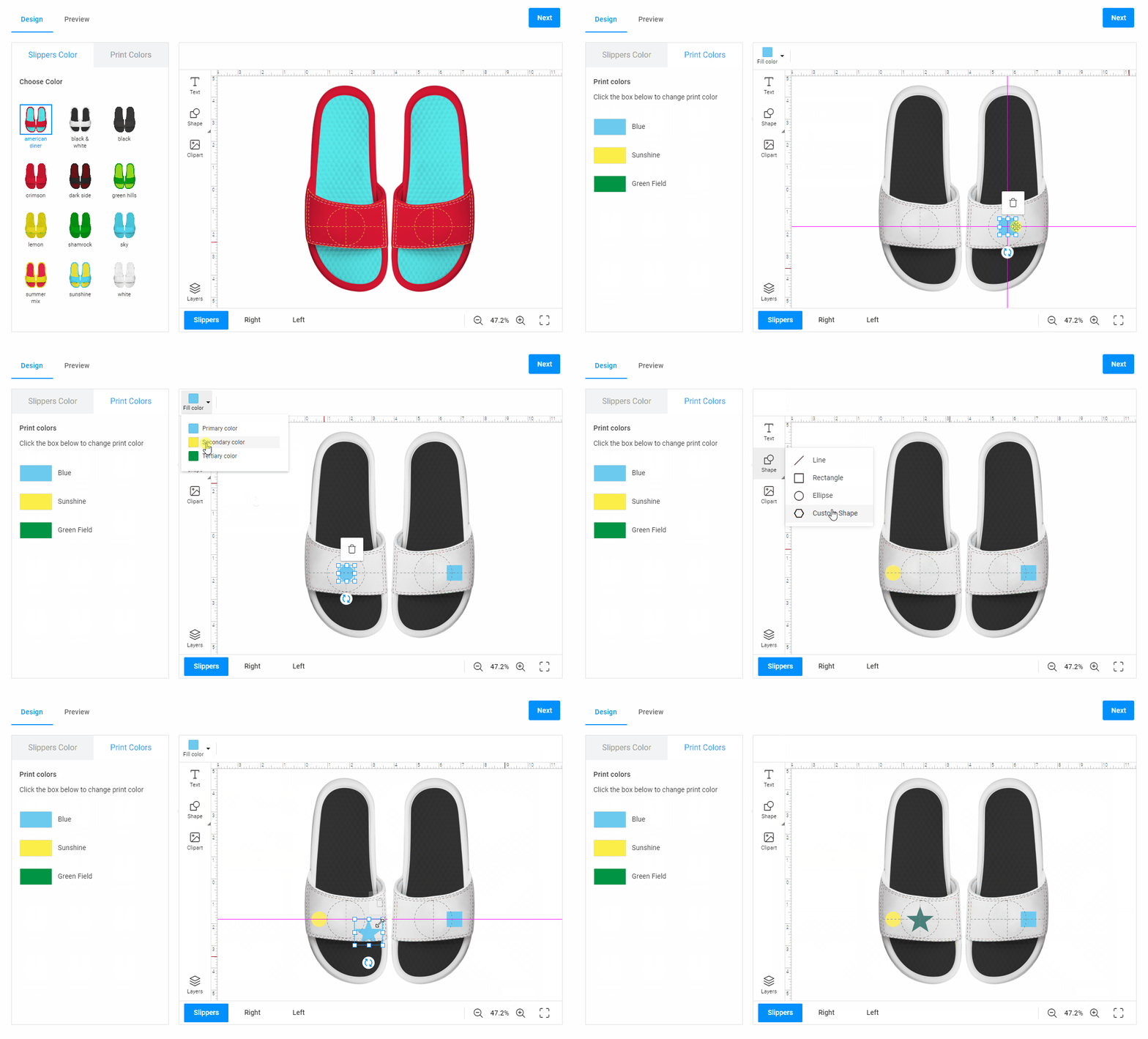
To learn about the group widget in detail, read the Group article.
Vars
In a workflow file, you may need to use some data in several places. For this purpose, you can define vars. It works the following way: a value, object, or array is assigned to a variable. Then, you can use this variable in your workflow file, for example, in dynamic expressions. Using shorter expressions, you can avoid syntax mistakes, and a workflow file becomes more convenient to read.
All the variables are defined in the vars object. To use their values in your workflow file, enclose variable in curly brackets {{...}}.
For example, you may want to define some JS code in vars and then use vars in the static-text widget.
If you decided to change the JS code, you would need to change it only in vars, not in the widget.
{
    "vars": {
        "basicVar": "{{ 1 + 1 }}",
    },
    ...
    "widgets": [
        {
            "name": "text1",
            "type": "static-text",
            "params": {
                "text": "{{vars.basicVar}}"
            }
        }
    ],
    ...
    "steps": [
        {
            "title": "Step 1",
            "name": "Step 1",
            "mainPanel": {
                "name": "text1"
            }
        }
    ]
}
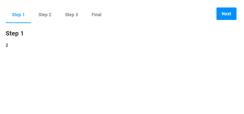
This is how the result looks.
Let's consider another example of using variables. Let's say, you have a drop-down list with four strings in the Option widget. For this list, you can create an array in vars, and then embed it in params. If you need to change something, you just change them in vars, not in the widget.
{
   "vars": {
       "list": [
           "Lime Green",
           "Chili Red",
           "Snow White",
           "Salmon"
       ],
   },
   ...
   "widgets": [
       {
           "name": "list-from-vars",
           "type": "option",
           "params": {
               "type": "radio",
               "values": {
                   "{{#each vars.list as colorValue}}": {
                       "title": "{{colorValue}}"
                   }
               }
           }
       }
   ],
   ...
   "steps": [
       {
           "title": "Step 3",
           "name": "Step 3",
           "mainPanel": {
               "name": "list-from-vars"
           }
       }
   ]
}
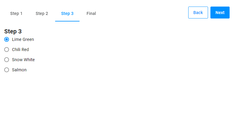
Attributes
When creating a real-life workflow file, you will need to refer to a design, a mockup, a background, or another kind of asset that you want to load in the editor. To avoid specifying the asset name or ID in a workflow file, you can declare a product attribute in your workflow.
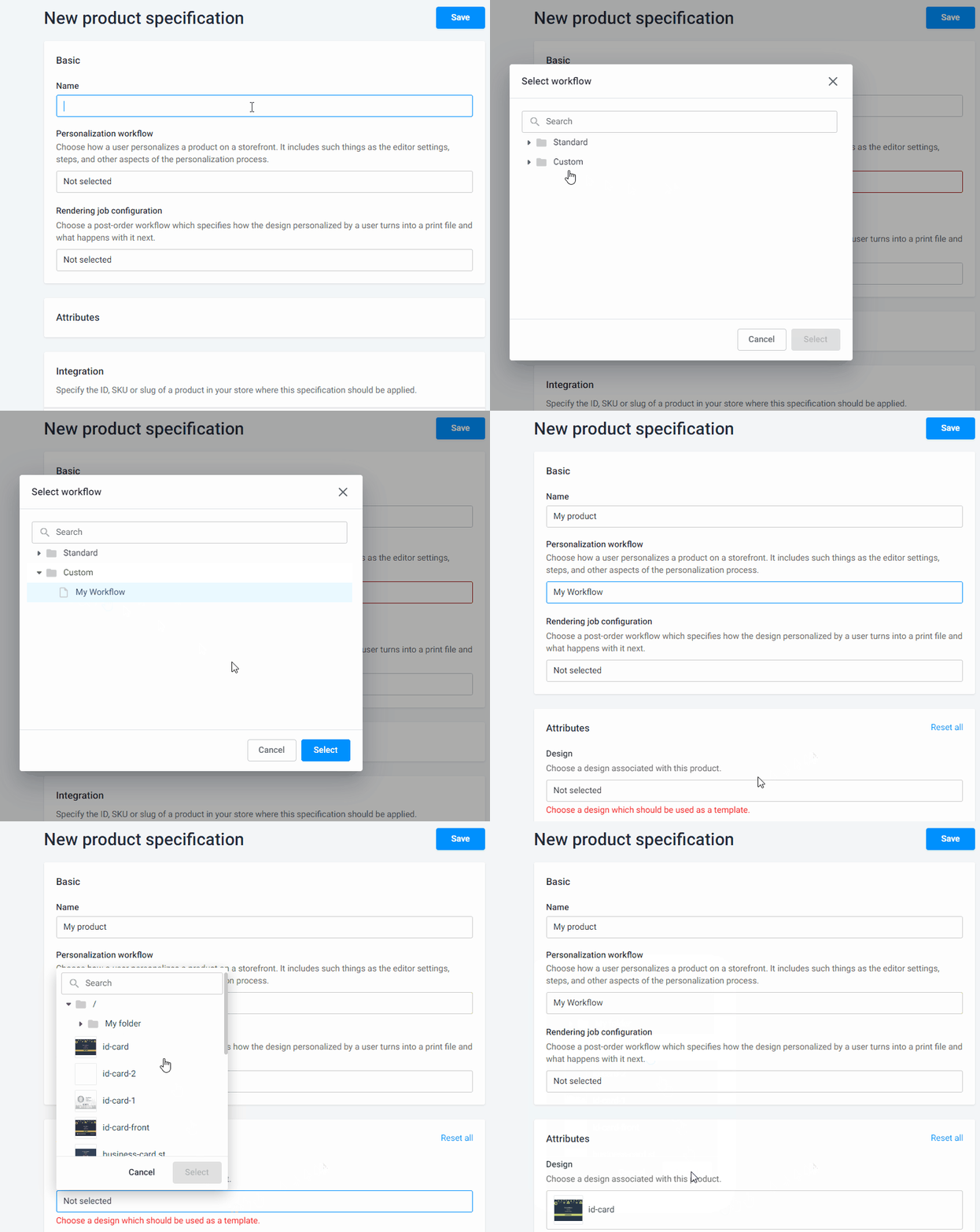
When you create a workflow file with attributes, it will look like this. First, you need to define the attributes in a workflow file. Then, create a product using this workflow in Product Specification and attach designs, mockups, and so on.
You can reuse this workflow file for other products with the same attributes.
This is how attaching attributes looks in Product Specification.
Note
Attributes exist only in Product Specification. In the PIM module, it works by creating options and values and connecting designs to them. To learn more, read the Product specifications sections.
To create an attribute in your workflow file, add it to the attributes section. You can provide the attribute type, name, title, description, and other information there.
For example, the following code adds a Design attribute, which allows a user to select a design file.
{
    "attributes": [{
        "name": "Design File",
        "label": "Design",
        "type": "single-asset",
        "assetType": "design",
        "description": "Choose a design associated with this product. Your design file can contain text, shapes, images, and backgrounds.",
        "validations": [
            {
                "type": "required",
                "message": "Choose a design which should be used as a template."
            }
        ]
    }]
}
To refer to this attribute in a workflow file, you need to use a dynamic expression like this:
"{{ product.attributes.find(x=>x.name==='Design File')?.value?.id }}"
You may find it a bit awkward to add this expression every time you need to read the attributes. Let's add this to the vars block.
"vars": {
    "myAttrib": "{{ product.attributes.find(x=>x.name==='design')?.value?.id }}"
}
As a result, you can refer to the Design File attribute in a widget using a shortcut from vars.
{
    "widgets": [
        {
            "name": "label",
            "type": "static-text",
            "params": {
                "text": "{{ vars.myAttrib }}"
            }
        }
    ]
}
To read more about attributes, see the Attributes article.
Optional elements
In addition to the objects described above, let's look at optional elements of workflow files that affect the user interface.
Logo
You can add a logo to the root level of your workflow file.
{
    "logo": {
        "src": "https://example.com/images/logo.svg",
        "url": "https://example.com/"
    },
    "attributes": [],
    "vars": [],
    "widgets": [],
    "steps": []
}
Mobile interface
You can also switch the user interface to the mobile view. In this view, you can see only the main panel, and all the others are hidden in the menu.
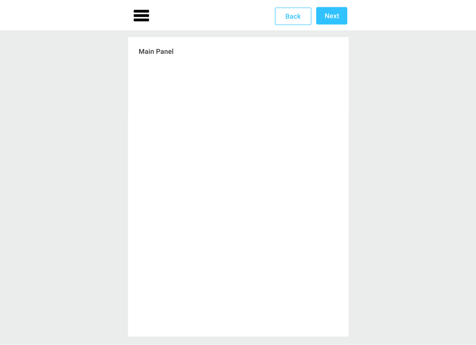
To make all the panels visible, you need to add a section to a workflow file. It looks the following way.
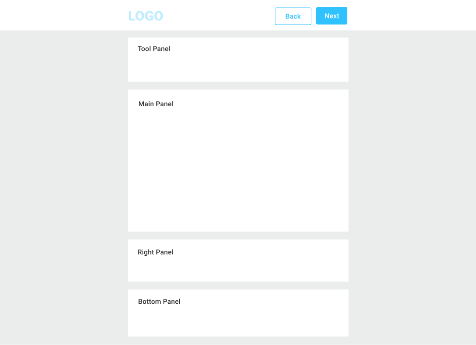
{
    "layout": "verticalmobile",
    "attributes": [],
    "vars": [],
    "widgets": [],
    "steps": []
}
Then, you can manage the size of panels and their location through the styles.
"style": {
    "--theme-vertical-mobile-left-order": 20,
    "--theme-vertical-mobile-main-order": 30,
    "--theme-vertical-mobile-main-height": "50vh"
},
Now, let's go further to the the Dynamic expressions article to learn how to make widgets and attributes change their parameters.