Attributes
- Last updated on November 14, 2025
- •
- 8 minutes to read
This article explains how to define and use attributes in product specifications. When using the PIM module, this variability is implemented through options and their values.
If you have many products in your e-commerce store, there's no need to create a new workflow file for each of them. Instead, you can use only one workflow file for all of them. It will work because workflows have variable parts. There you can attach a design and define other properties. These variable parts are called attributes.
For example, let's say you have two products: Brochure and Business card. Although these products are different, their workflows are the same. Both workflows include two steps: Editor and Approval. The editor allows you to add text, shapes, QR codes, clipart, and backgrounds.
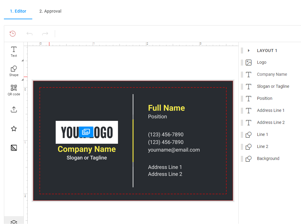
The workflows of these two products are the same because they use the same workflow file. Designs are not written in a workflow file, so you can add any design with attributes.
Concepts
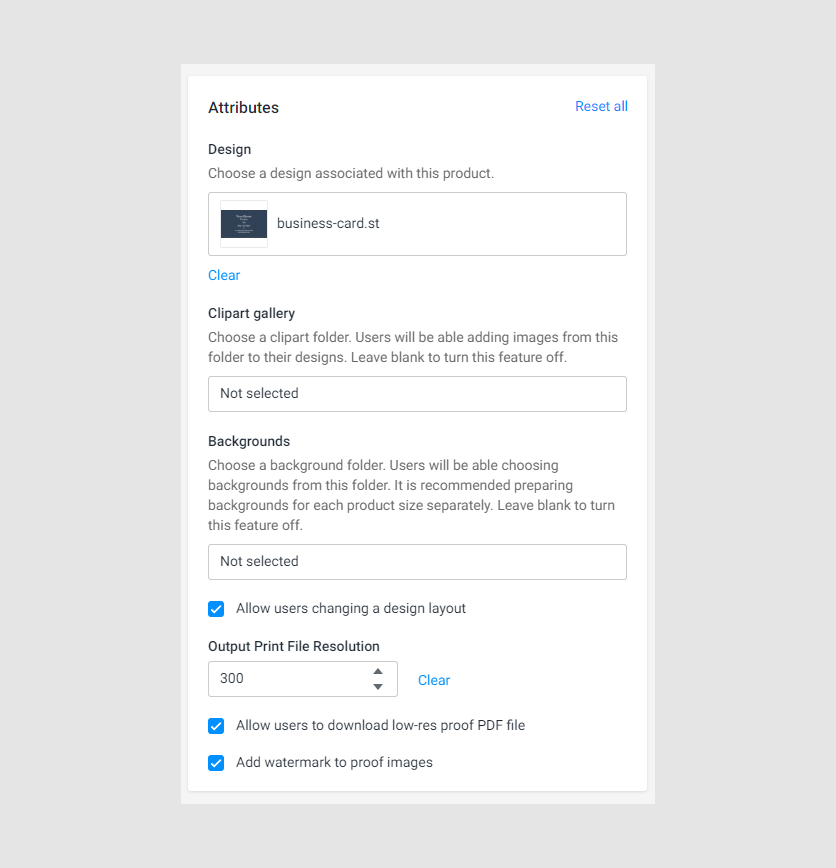
Attributes are usually divided into three groups:
- adding a design, which includes the
Designattribute. - configuring the Editor, which includes
Clipart gallery,Backgrounds, andAllow users to change a design layout. - defining output attributes, which include
Output Print File Resolution,Allow users to download low-res proof PDF file, andAdd watermark to proof images.
To learn how to add a workflow file to a product, read the Blank Print Product Editor article.
Defining attributes in a workflow file
Attributes are objects that help to save the metadata of a product. In workflow files, attributes are contained in an array.
{
    "attributes": [{...}, {...}]
}
For example, the Design attribute allows you to add a design to a product:
{
    "attributes": [
        {
            "name": "Design",
            "label": "Design",
            "type": "single-asset",
            "assetType": "design",
            "description": "Choose a design associated with this product.",
            "validations": [
                {
                    "type": "required",
                    "message": "Choose a design which should be used as a template."
                }
            ]
        }
    ]
}
Each attribute has a value. To obtain this value, add attributes in the vars block. It looks like the following:
{
    "vars": {
        "design": "{{product.attributes.find(x=>x.name==='Design').value}}"
    }
}
Let's consider what happens in this expression.
"{{product.attributes.find(x=>x.name==='Design').value}}"
This expression means that you want to return the Design attribute value.
The {{product.attributes}} part shows that the system asks the product object to show attributes.
Then, use the find method to return an array element. You look for an element that has the Design name.
The .value part returns this attribute value. The attribute type is single-asset, it returns an object:
{
    "id": "123abc",
    "fullPath": "/path/from/root/",
    "assetType": "design"
}
To read in detail about attributes in the workflow structure, see the Structure article.
Attribute anatomy
The attributes block is an array that contains each attribute as an object. An attribute has necessary and optional properties.
This is an example attribute schema:
{
    "attributes": [
        {
            "name": "...",
            "type": "...",
            "label": "...",
            "validations": [
                {
                    "type": "...",
                    "validationName": "...",
                    "message": "..."
                }
            ]
        }
    ]
}
Now let's examine the properties in detail.
| Name | Type | Description | Defaut value |
|---|---|---|---|
Name |
string | Identifies an attribute in a workflow file. | empty string |
type |
number| text| textarea| checkbox| radio| list| rgb-color| design-item| font| asset-root| single-asset| single-asset |
Defines the attribute type. | empty string |
value |
object | Shows variants for the radio and list type |
empty object |
defaultValue |
depends on the type |
Defines a value after clicking Reset all (Optional). | empty string |
label |
string | Shows the attribute title. | empty string |
description |
string | Describes the attribute (Optional). | empty string |
validations |
object of Validations | Limits and checks the input values for the attribute (Optional) | empty object |
Validations
| Name | Type | Description | Defaut value |
|---|---|---|---|
type |
required|min|max|minlength|maxlength|pattern |
Defines a validation type. | empty string |
name |
string | Identifies a validation in a workflow file. | empty string |
message |
string | Shows an error message. | empty string |
Now let's consider each attribute type in detail.
Attribute types
Asset-root
This attribute shows asset sections and folders inside, where a customer selects an asset for personalization from. The asset type defines by the assetType property.
The assetType can be following:
designfontimagecolorprofiledataschemadataset
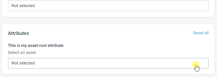
{
    "name": "my-attribute",
    "type": "asset-root",
    "description": "Select an asset",
    "label": "This is my asset-root attribute",
    "assetType": "image"
}
This attribute value is an object:
{
    "id": "123abc",
    "fullPath": "/path/from/root/",
    "assetType": "design"
}
Validations
required
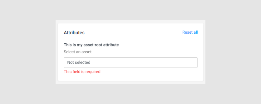
{
    "name": "my-attribute",
    "type": "asset-root",
    "description": "Select an asset",
    "label": "This is my asset-root attribute",
    "assetType": "design",
    "validations": [
        {
            "type": "required",
            "message": "This field is required"
        }
    ]
}
Checkbox
This attribute displays a checkbox.
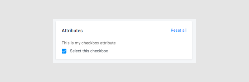
{
    "name": "my-attribute",
    "type": "checkbox",
    "description": "This is my checkbox attribute",
    "label": "Select this checkbox",
    "defaultValue": true
}
Validation
required
{
    "name": "my-attribute",
    "type": "checkbox",
    "description": "This is my checkbox attribute",
    "label": "Select this checkbox",
    "defaultValue": false,
    "validations": [
        {
            "type": "required",
            "message": "This field is required"
        }
    ]
}
Design-item
This attribute allows you to select a design from the Design section. This is a drop-down list with design thumbnails and names.
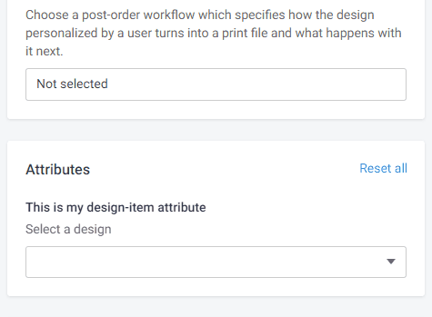
{
    "name": "my-attribute",
    "type": "design-item",
    "description": "Select a design",
    "label": "This is my design-item attribute"
}
This attribute value is the stateID.
Validations
required
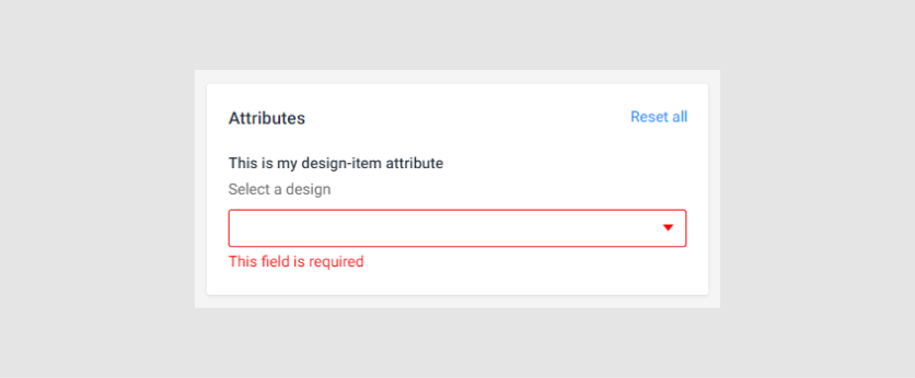
{
    "name": "my-attribute",
    "type": "design-item",
    "description": "Select a design",
    "label": "This is my design-item attribute",
    "validations": [
        {
            "type": "required",
            "message": "This field is required"
        }
    ]
}
Font
You can select a font from the Fonts section.
The grouped property groups fonts by their family.
{
    "name": "my-attribute",
    "type": "font",
    "description": "Select a font",
    "label": "This is my font attribute",
    "grouped": true
}
Validations
required
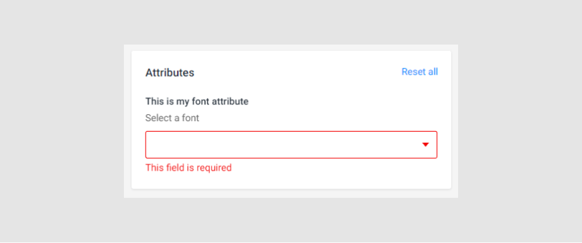
{
    "name": "my-attribute",
    "type": "font",
    "description": "Select a font",
    "label": "This is my font attribute",
    "grouped": true,
    "validations": [
        {
            "type": "required",
            "message": "This field is required"
        }
    ]
}
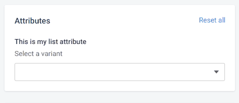
List
This attribute shows values in a drop-down list.
{
    "name": "my-attribute",
    "type": "list",
    "description": "Select a variant",
    "label": "This is my list attribute",
    "values": {
        "first": "Ruby",
        "second": "Diamond",
        "third": "Emerald"
    }
}
Validation
required
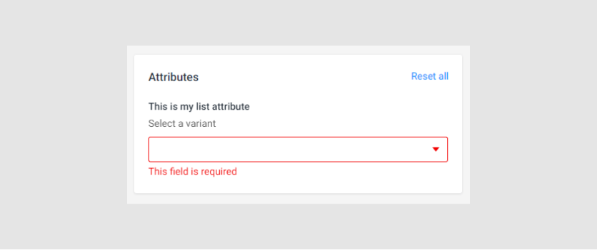
{
    "name": "my-attribute",
    "type": "list",
    "description": "Select a variant",
    "label": "This is my list attribute",
    "values": {
        "first": "Ruby",
        "second": "Diamond",
        "third": "Emerald"
    },
    "validations": [
        {
          "type": "required",
          "message": "This field is required"
        }
    ]
}
Number
This is the number attribute. Here, the default value is 2.
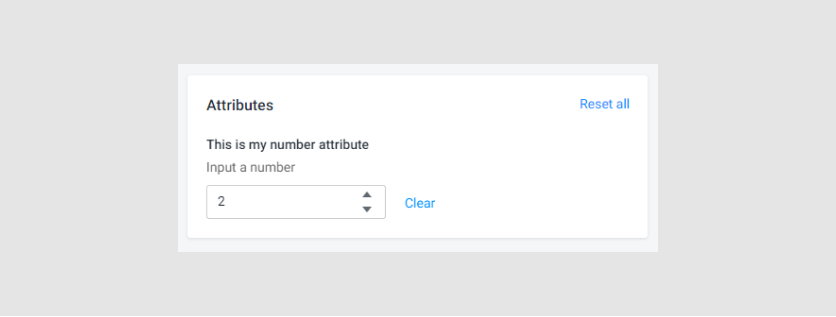
{
    "name": "my-attribute",
    "type": "number",
    "label": "This is my number attribute",
    "description": "Input a number",
    "defaultValue": "2"
}
Validations
minimalandmaximalvaluesrequired
Here's how these validations look:
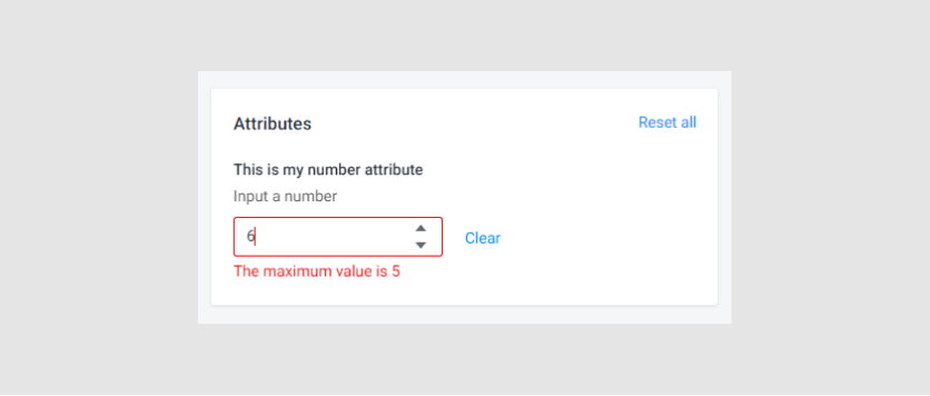
{
    "name": "my-attribute",
    "type": "number",
    "label": "This is my number attribute",
    "description": "Input a number",
    "defaultValue": "2",
    "validations": [
        {
          "type": "required",
          "message": "This field is required"
        },
        {
            "type": "min",
            "min": 1,
            "message": "The minimum value is 1"
        },
        {
            "type": "max",
            "max": 3,
            "message": "The maximum value is 5"
        }
    ]
}
Radio
The Radio attribute shows radio buttons.
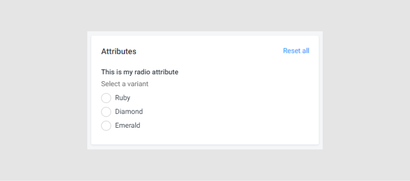
{
    "name": "my-attribute",
    "type": "radio",
    "description": "Select a variant",
    "label": "This is my radio attribute",
    "values": {
        "first": "Ruby",
        "second": "Diamond",
        "third": "Emerald"
    }
}
Validations
required
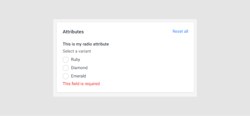
{
    "name": "my-attribute",
    "type": "radio",
    "description": "Select a variant",
    "label": "This is my radio attribute",
    "values": {
        "first": "Ruby",
        "second": "Diamond",
        "third": "Emerald"
    },
    "validations": [
        {
          "type": "required",
          "message": "This field is required"
        }
    ]
}
RGB-color
This attribute shows a palette to select a color.
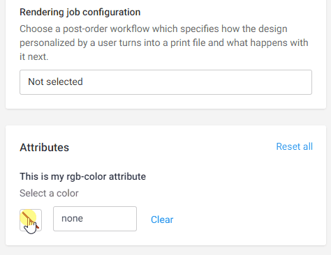
{
    "name": "my-attribute",
    "type": "rgb-color",
    "description": "Select a color",
    "label": "This is my rgb-color attribute"
}
Validations
required
{
    "name": "my-attribute",
    "type": "rgb-color",
    "description": "Select a color",
    "label": "This is my rgb-color attribute",
    "validations": [
        {
            "type": "required",
            "message": "This field is required"
        }
    ]
}
Single-asset
This attribute allows you to select an asset. It displays a folder manager, where you select an asset. The type of asset defines by the assetType property.
The assetType can be:
designfontimagecolorprofiledataschemadataset
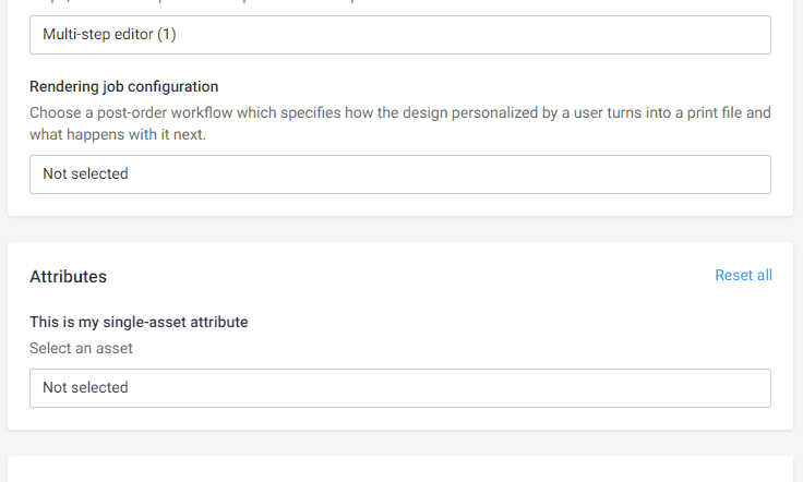
{
    "name": "my-attribute",
    "type": "single-asset",
    "description": "Select an asset",
    "label": "This is my single-asset attribute",
    "assetType": "design"
}
This attribute value is an object:
{
    "id": "123abc",
    "fullPath": "/path/from/root/",
    "assetType": "design"
}
Validations
required
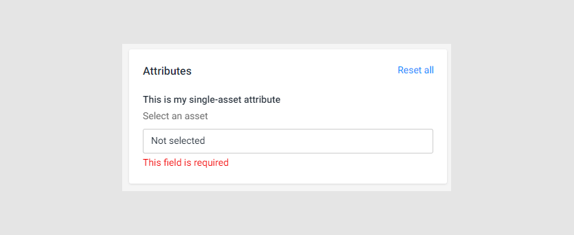
{
    "name": "my-attribute",
    "type": "single-asset",
    "description": "Select an asset",
    "label": "This is my sigle-asset attribute",
    "assetType": "image",
    "validations": [
        {
          "type": "required",
          "message": "This field is required"
        }
    ]
}
Text
The text attribute allows you to input text in a single-line string.
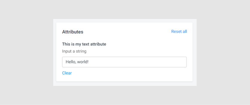
{
    "name": "my-attribute",
    "type": "text",
    "label": "This is my text attribute",
    "description": "Input a string"
}
Validations
requiredminlengthandmaxlengthpattern
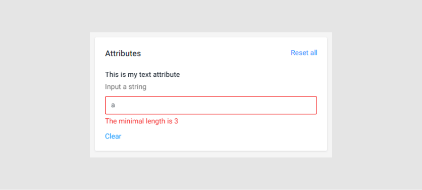
{
    "name": "my-attribute",
    "type": "text",
    "label": "This is my text attribute",
    "description": "Input a string",
    "validations": [
        {
            "type": "required",
            "message": "This field is required"
        },
        {
            "type": "minlength",
            "minlength": 3,
            "message": "The minimal length is 3"
        },
        {
            "type": "maxlength",
            "maxlength": 9,
            "message": "The maximal length is 9"
        },
        {
            "type": "pattern",
            "pattern": "[a-z]",
            "message": "Only letters allowed"
        }
    ]
}
Textarea
You can input some text in a multi-line input field.
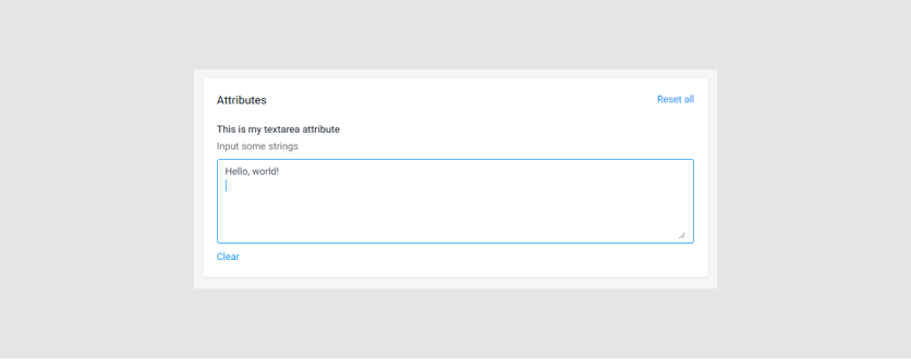
{
    "name": "my-attribute",
    "type": "textarea",
    "label": "This is my textarea attribute",
    "description": "Input some strings"
}
Validations
requiredminlengthmaxlengthpattern
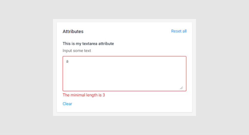
{
    "name": "my-attribute",
    "type": "textarea",
    "label": "This is my textarea attribute",
    "description": "Input some text",
    "validations": [
        {
            "type": "required",
            "message": "This field is required"
        },
        {
            "type": "minlength",
            "minlength": 3,
            "message": "The minimal length is 3"
        },
        {
            "type": "maxlength",
            "maxlength": 9,
            "message": "The maximal length is 9"
        },
        {
            "type": "pattern",
            "pattern": "[a-z]",
            "message": "Only letters allowed"
        }
    ]
}
Changing a workflow
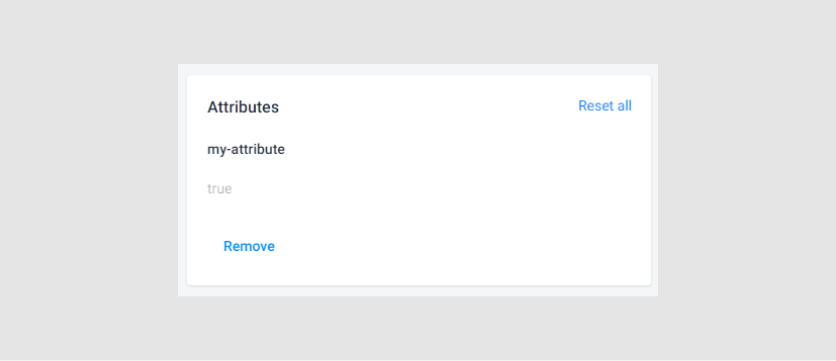
If you change or delete attributes in your workflow file or select another workflow file, then the system will show the selected values of the previous attribute.
For example, if you have the checkbox attribute with the true value, this attribute may look as follows:
{
    "name": "my-attribute",
    "type": "checkbox",
    "description": "This is my checkbox attribute",
    "label": "Select this checkbox",
    "defaultValue": true
}
When you delete it, the system will still show this attribute value. However, this doesn't impact the workflow.