Settings
- Last updated on March 25, 2026
- •
- 9 minutes to read
Settings represent a collection of configurable options that control the behavior and appearance of the Simple Editor. These settings are divided into sections, each focusing on a specific group of related features, like the text editor, design variants, or product details.
Below is a breakdown of these sections and their corresponding configurations.
{
    "settings": {
        "disablePricing": true,
        "proof": {},
        "preview": {},
        "inputGroup": [],
        "textEditor": {},
        "designVariants": {},
        "imageSelector": {},
        "validations": {},
        "productDetails": {},
        "imageCropper": {},
        "options": {},
        "designViewer": {},
        "quantity": {},
        "surfacePagination": {},
        "order": {}
    }
}
The disablePricing property allows you to disable price requests if only the quantity functionality is needed.
Let's dive into the parameters of each section.
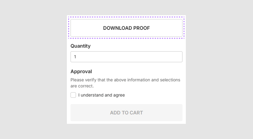
Proof
The proof object configures the settings related to the generation and display of proof images.
{
    "proof": {
        "downloadButtonEnabled": true,
        "openInNewTab": true,
        "proofRenderingConfig": {
            "width": 800,
            "height": 600,
            "format": "Pdf",
            "safetyLinesEnabled": true,
            "watermarkEnabled": true,
            "watermarkOpacity": 0.5,
            "watermarkRepeat": true
        }
    }
}
downloadButtonEnabled: Determines if the Download button is visible.openInNewTab: Specifies if proof images will be displayed in a new tab.proofRenderingConfig: Configures the rendering parameters.width: Sets the width of proof images, in pixels.height: Sets the height of proof images, in pixels.format: Specifies the format of proof images (e.g.,"Jpeg","Png","Tiff", or"Pdf").safetyLinesEnabled: Enables or disables safety lines on proof images.watermarkEnabled: Enables or disables the watermark on proof images.watermarkOpacity: Sets the opacity level of the watermark.watermarkRepeat: Determines if the watermark repeats across the proof.
Preview
The preview object enables control over the way product visualizations are shown during the ordering process.
{
    "preview": {
        "renderingMode": "preview",
        "renderingConfig": {
            "stub": true,
            "width": 200,
            "height": 200,
            "format": "Jpeg"
        },
        "addToLineItem": true
    }
}
renderingMode: Defines the rendering mode for pre-rendered images ("proof"for proof images,"preview"for regular previews).renderingConfig: An object containing specific rendering settings.stub: Indicates whether to show stub content for preview image.width: Width of the image in pixels.height: Height of the image in pixels.format: Output format of the image ("Jpeg"or"Png").
addToLineItem: Iftrue, renders preview images when creating an order and adds them to order line items.
inputGroup
The inputGroup array configures groups of input fields.
{
    "inputGroupsEnabled": true,
    "inputGroup": [
        {
            "name": 'Alphanumeric',
            "settings": {
                "alphanumericCharactersOnlyMode": true
            }
        },
        {
            "name": 'Capital Letters Only',
            "settings": {
                "capitalCharactersOnlyMode": true,
                "calculateInputWidthMode": true
            }
        }
    ]
}
inputGroupsEnabled: Enables or disables input groups for the design.inputGroup: An array defining the input groups.name: The name of the displayed group, the same as in the design.settings: Input settings for a specific group:alphanumericCharactersOnlyMode: Enables input of only alphanumeric characters.capitalCharactersOnlyMode: Allows entry of uppercase characters only.calculateInputWidthMode: Iftrue, dynamically calculates the input field width based onfontSize,fontWeight, andfontFamily. By default, it'sfalseand is controlled by the variable--se-symbol-input-width.
textEditor
The textEditor object configures the text editing experience.
{
    "textEditor": {
        "defaultRowCount": 3,
        "maxRowCount": 10,
        "scrollbarType": "default",
        "resizeMode": "auto"
    }
}
defaultRowCount: Sets the initial number of lines displayed without scrolling. The default value is5.maxRowCount: Sets the maximum number of rows available. The default value is10.scrollbarType: Specifies the type of scrollbar ("default"or"custom"). The default value is"custom".resizeMode: Defines how the text editor can be resized ("fixed","manual", or"auto"). The default value is"fixed".

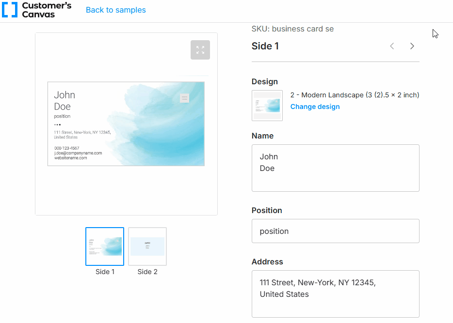
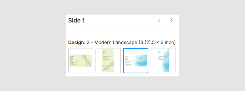
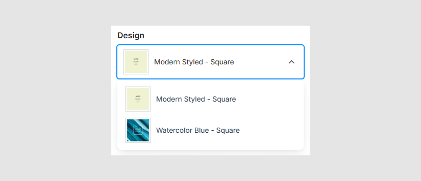
designVariants
The designVariants object configures the selector of design variants, which displays thumbnails of available design variants in three ways:
- In a modal window for focused viewing.
- As an expanded list directly on the page for easy browsing.
- As a compact dropdown list for quick selection.
To enable one of the design variant selector mode, set the type property to "Dialog", "List", or "Dropdown". The default value is "Dialog".
Dialog
By default, a user must click Change design to select a design variant in a modal window.
{
    "designVariants": {
        "type": "Dialog"
    }
}
List
An inline list is displayed on the editor's page. You can enable the Less mode that optimizes the display of design variants by limiting the initial number of visible rows and optional showing titles for clarity.
{
    "designVariants": {
        "type": "List",
        "showLessModeEnabled": true,
        "showLessModeRows": 3,
        "showValueInTitle": true
    }
}
showLessModeEnabled: Enables the Show less / Show all button when displaying design variants in the"list"view.showLessModeRows: Sets the number of rows in the ShowLess mode for the"list"view. The default value is2.showValueInTitle: Iftrue, displays the title under the design variant preview in the"list"view. The default value istrue.
Dropdown
A dropdown displays items in a compact format. You can configure the maximum number of visible items and the icon size to improve visual clarity.
{
    "designVariants": {
        "type": "Dropdown",
        "maxVisibleItems": 3,
        "iconSize": 24
    }
}
maxVisibleItems: Sets the maximum number of items displayed in the dropdown without scrolling. The default value is5.iconSize: Defines the size (in pixels) of the dropdown arrow icon. The default value is20.
imageSelector
When creating an image placeholder in a design, if you define the Allowed Subfolder field with a path to a folder containing images, you can display those images on the option page in ShowLess mode. The imageSelector object controls the appearance of the image list.
{
    "imageSelector": {
        "showLessModeEnabled": true,
        "showLessModeRows": 2,
        "showValueInTitle": true,
        "enableEmptyImage": false,
        "preselectFirstItem": true,
        "filters": [],
        "showValueInFiltersTitle": true
    }
}
showLessModeEnabled: Enables or disables the Show less / Show all button. The default value istrue.showLessModeRows: Sets the number of rows in the ShowLess mode. The default value is2.showValueInTitle: Iftrue, displays the title for the selected image. The default value isfalse.enableEmptyImage: Iftrue, adds a button to the list that clears the placeholder's content. The default value isfalse.preselectFirstItem: Iftrue, automatically preselects the first item if there is no placeholder image in the list. The default value isfalse.filters: Configures filters for images (e.g., by category, tag, or other metadata).showValueInFiltersTitle: Iftrue, displays the selected filter title. The default value isfalse.
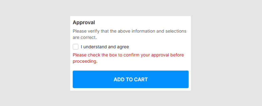
validations
The validations object configures validation settings.
{
    "validations": {
        "ignoringFormValidationEnabled": false,
        "approvalCheckboxEnabled": true,
        "approvalWarningModeEnabled": true
    }
}
ignoringFormValidationEnabled: Allows adding products to the cart even if there are validation errors. The default value istrue.approvalCheckboxEnabled: Iftrue, shows the checkbox for approving the product. The Add to cart button will be active only if the checkbox is selected. The default value istrue.approvalWarningModeEnabled: Iftrue, activates the Add to cart button, but shows the approval warning if the approval checkbox is not selected. The default value isfalse.
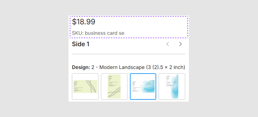
productDetails
The productDetails object adjusts the visibility of product details.
{
    "productDetails": {
        "skuVisible": true,
        "priceVisible": true
    }
}
skuVisible: Iftrue, shows the product SKU. The default value istrue.priceVisible: Iftrue, shows the product price. The default value istrue.
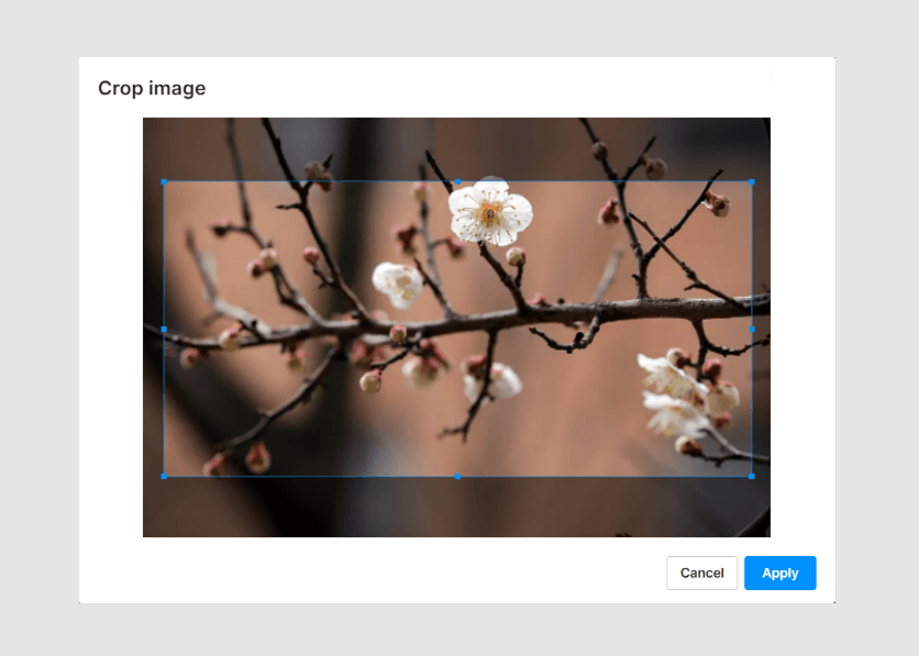
imageCropper
The imageCropper object adjusts the cropping parameters of images when they are inserted.
{
    "imageCropper": {
        "minSide": 100,
        "zoomStep": 0.1,
        "zoomMaxValue": 3,
        "gripsHitboxSize": 10
    }
}
minSide: Sets the minimum side length for the cropped image. The default value is100.zoomStep: Sets the step value for zooming. The default value is0.2.zoomMaxValue: Sets the maximum zoom value. The default value is1.8.gripsHitboxSize: Sets the size of the hitbox for the grips. The default value is20.
options
The options object configures the appearance of product options in the editor by applying modifiers to the options by name.
{
    "options": {
        "showSingleValueOptions": false,
        "disableUnavailable": false,
        "modifiers": [{
            "name": "Orientation",
            "type": "Chips",
            "visible": true,
            "priority": 1,
            "preselected": "Portrait",
            "description": "Select page orientation",
            "tooltip": "Option Tooltip"
        }]
    }
}
showSingleValueOptions: Iffalse, hides options that only have one value. The default value istrue.disableUnavailable: Iftrue, disables unavailable options. The default value istrue.modifiers: An array of objects defining the product options.name: The option name used to identify the option for applying modifiers. This mandatory property can be used with any combination of the following properties.type: The display type of the option. For more details, see how those types appear.visible: Iftrue, displays the option even if it has only one value.priority: The numeric priority; options with higher priority values appear higher in the list. The default value is1.preselected: A string or array of strings specifying values to be preselected when the options are loaded.description: A text description of the option.tooltip: The message that appears when clicking the (i) icon.

designViewer
The designViewer object is responsible for the appearance of the viewer.
{
    "designViewer": {
        "surfaceShadowEnabled": false,
        "previewMode": false,
        "noViewerMode": false
    }
}
surfaceShadowEnabled: Iftrue, shows a shadow bounding a product page. The default value istrue.previewMode: Iftrue, shows the actual product size without displaying the bleed zone. The default value istrue.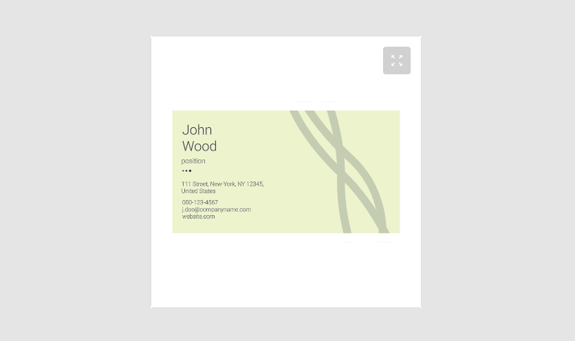
noViewerMode: Enables the viewerless mode, where the viewer interface is hidden. Default:false. This setting requiresresources.productImagesto be configured.
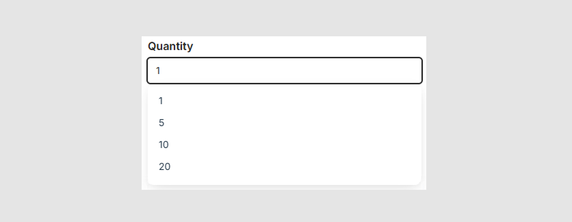
quantity
The quantity object configures how quantities are managed within an order.
{
    "quantity": {
        "enabled": true,
        "type": "List"
    }
}
enabled: Controls the visibility of the quantity component. The default value istrue.type: Specifies the type of the quantity selector. It can be either"List"or"Stepper". The"List"type displays a dropdown list of predefined quantities, while the"Stepper"type uses increment and decrement buttons and accepts arbitrary values. The"Stepper"is the default type.step: Defines the value to increment and decrement the"Stepper".

To enable the list mode, set the quantity.type property to "List". By default, the quantity list will include predefined values [1, 5, 10, 20]. To customize these values, define them in the quantity.list array within the resources.
surfacePagination
The Simple Editor allows you to display the paginator near the viewer, either vertically or horizontally oriented. You can also define the justification of thumbnails and specify whether titles should be displayed.
{
    "surfacePagination": {
        "showTitle": "false",
        "isVertical": "false",
        "itemsJustify": "center"
    }
}
For the justification, you can specify either "center", "start", or "end".
Order
The order object configures the display sequence of elements in the editor, including both default elements (e.g., header, texts, placeholders, options) and custom slots. You can arrange elements or groups using integer or float values for precise placement. Only the elements explicitly listed in the order will be repositioned, while all other elements will shift down to accommodate the changes.
{
    "order": {
        "header": 0,
        "designVariants": 1,
        "imageSelectorFilter": 2,
        "toggles": 3,
        "texts": 4,
        "placeholders": 5,
        "options": 6,
        "quantity": 7,
        "approvalCheckbox": 8,
        "downloadButton": 9,
        "finishButton": 10,
        "slots": {
            "price-info": 7.5
        },
        "customOrder": {
            "order": 1,
            "items": []
        }
    }
}
Default elements: Override the default order of built-in elements (e.g.,
header,texts,options) by specifying their new positions.Example:
"quantity": 2will move thequantityelement afterdesignVariants.Custom slots: Add custom slots and specify their positions using the slot name as the key.
Example:
"customOrder": {
    "price-info": 7.5 // Places the 'price-info' slot between 'quantity' and 'approvalCheckbox'.
}
Custom order`: Define a custom sequence for individual elements, regardless of their type.
order: Position for the custom group (default: after the first valid element).items: Array of element names in the desired order.
Example:
"customOrder": {
    "order": 1,
    "items": ["Hair color", "Hair type", "Skin color", "Body type"]
}
For more details, refer to the Custom field order topic.