Text
- Last updated on March 26, 2024
- •
- 5 minutes to read
In this article, you will learn how you can create InDesign text elements and how to import them into Customer's Canvas.
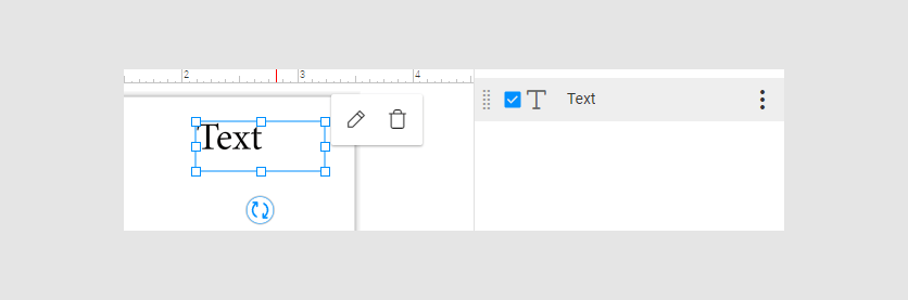
Text frame
Customer's Canvas supports text frames. Read the Layers and frames article to observe the supported properties.
Text formatting
Customer's Canvas supports plain and rich formatted text.
Plain text has the same formatting for all the symbols in a frame.

Rich formatted text has different formatting in a frame.

By default, Customer's Canvas imports text from your IDML file as rich formatted text. You can change the settings by markers:
You can create plain text by the
<TATF_f>and<RT_false>markers. In such a text frame, you can't define different styles for this text.The
<RT_auto>marker defines the text formatting based on your current text. If your text has one type of text formatting, Customer's Canvas recognizes this text as plain text. If your text has different formattings, Customer's Canvas recognizes this text as rich formatted text.
Multicolumn Text
Customer's Canvas supports multicolumn text. When the first column is filled, your text will flow into the second column.
Multicolumn text can be rich formatted or plain.
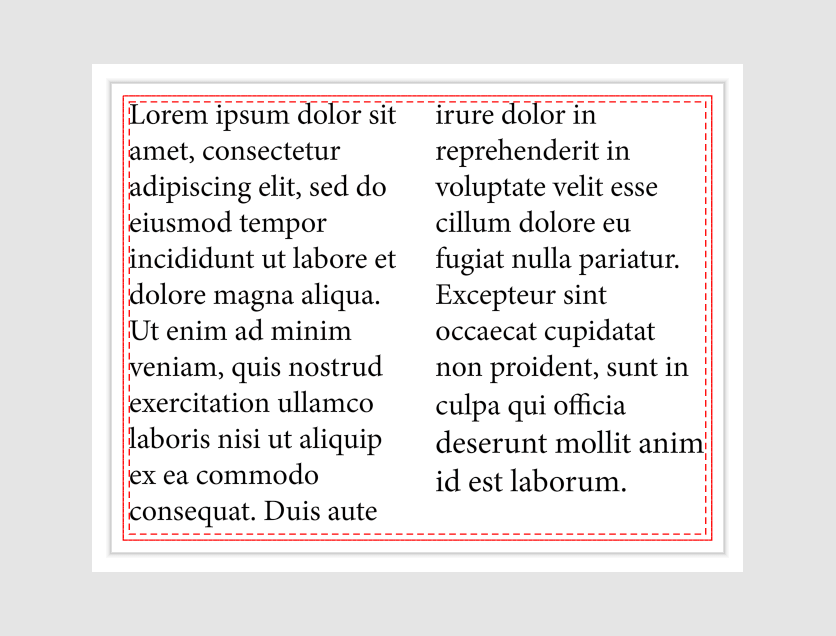
Copyfitting
When you type text in a text frame, your text may be longer than this frame. Customer's Canvas supports copyfitting with overflow strategies. These strategies define how to fit the text into a text frame:
Clip. This is default strategy in Customer's Canvas.ExpandBox.FitToWidth.FitToBox.
You can see how these strategies work on the GIF images in the Copyfitting paragraph.
To create a text frame with such overflow strategies, you can use the <TOS> marker: <TOS_expandBox>, <TOS_fitToBox>, and <TOS_fitToWidth>.
To define overflow strategies for your text in Template Editor, select the text and go to Behavior > Copyfitting > Overflow strategy. Read more in the Text Overflow Strategies paragraph.
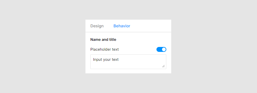
Placeholders
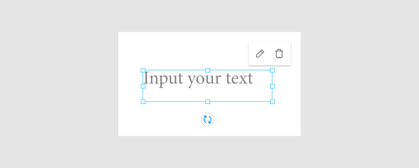
When you create a design, you can add text placeholders. They motivate customers to fill them out. If not filled out, they display a prompt on the canvas.
You can create a text placeholder in your IDML file by the <TPH> marker.
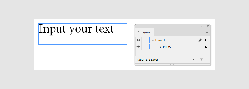
You can create these placeholders in Template Editor. To do so, select a text element and click the Behavior tab. In the Name and title properties, turn on the Placeholder text toggle. When a new text field appears, insert a prompt that will be displayed in the placeholder.
This is how such a placeholder looks like in Design Editor.
Limits
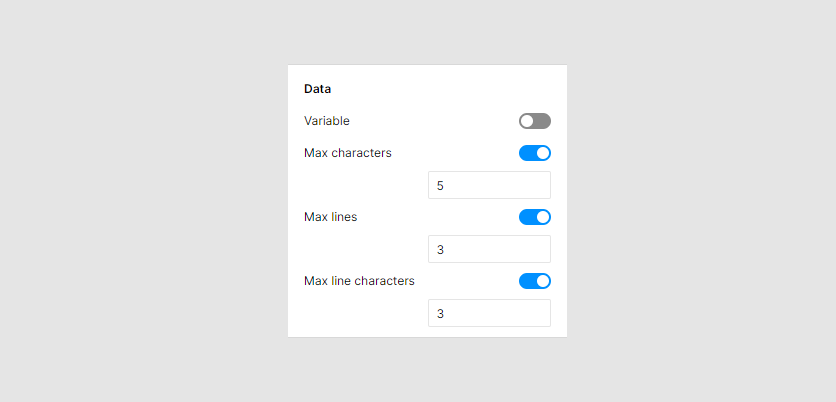
In Customer's Canvas, you can set limit for text placeholders. Let's consider types of limits.
| Name | Limit | Marker | Example |
|---|---|---|---|
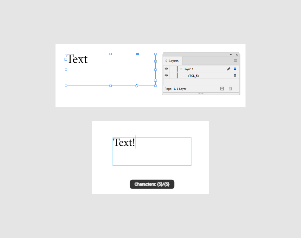
Max characters |
Characters for entering in one text string. | <TCL> |
<TCL_5> |
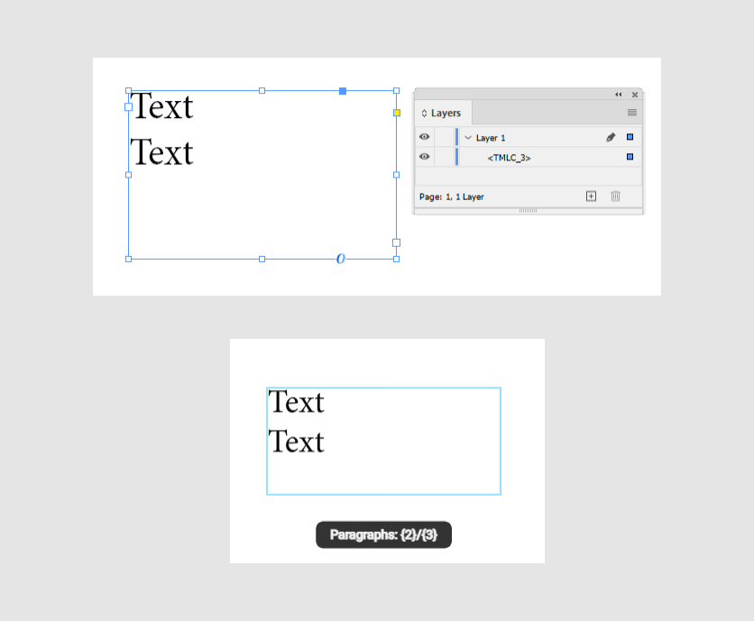
Max lines |
Lines in a text area. | <TMLC> |
<TMLC_3> |
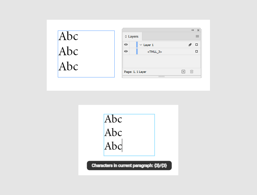
Max line charactters |
Characters in a line of text area. When you start a new line, the limit counter starts from 0. |
<TMLL> |
<TMLL_3> |
You can create such limits by markers or in Template Editor. To do so, select a text element and go to Behavior > Data.
Let's see how you can add these markers to text object, and how the result looks in Design Editor.
Max characters
Max lines
Max line characters
Text permissions
You can set detailed behavior of your text by the Text markers.
For example, the <TACF_f> marker forbids to change the font type. The <TACA_f> marker disables the horizontal alignment buttons.
In-String placeholders
In-string placeholders are text elements that contain specially formatted strings.
Using these placeholders, you can add the following features:
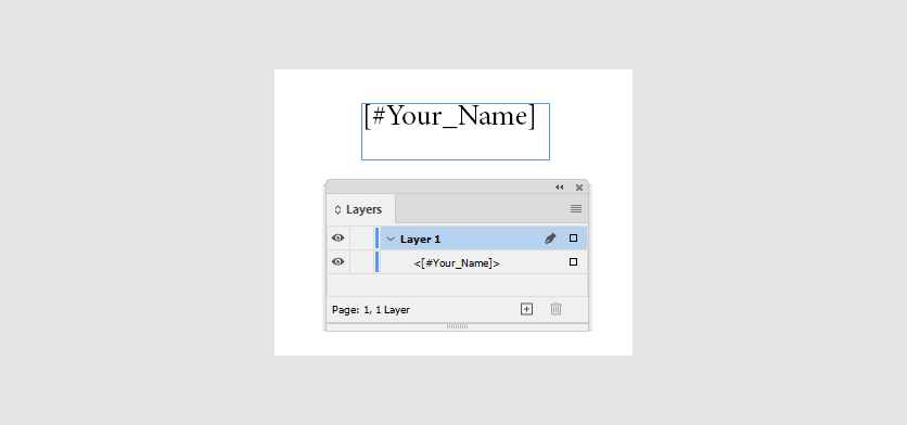
To create such placeholders in your IDML file, add text frames with text in the [#...] format. For example. [#Your_Name]. The text after the hashtag (#) is the placeholder name.
Let's consider replaceable text.
To create such placeholders, add text frames with text in this format. When customers input a text in one of them, this text will appear in all these placeholders.
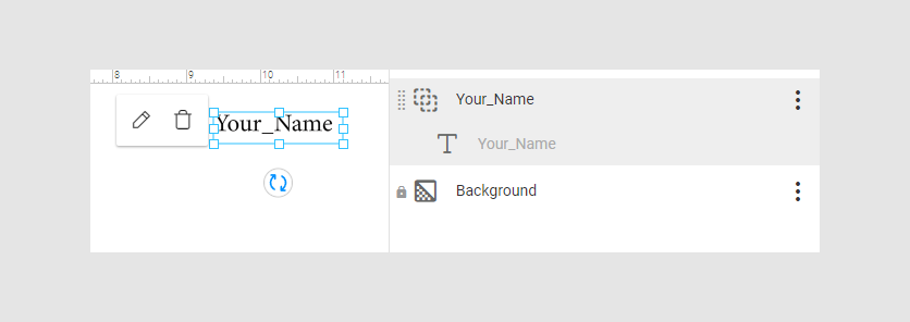
In the Design Editor, these placeholders will display the user input.
For more details about in-string placeholders, refer to the In-String Placeholders article.
Variable fields
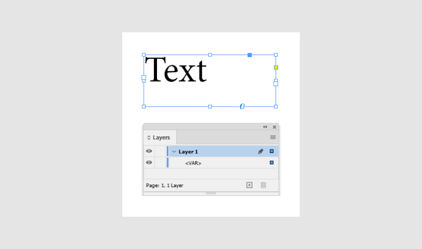
You can create variables by the <VAR> marker.
In Template Editor, you can also create such a field in the Behavior tab > Data > the Variable toggle.

This is how variables look in the Design Editor.
Interpolation placeholders
An interpolation placeholder is a text element that contains a string in the {{...}} format. The text in the brackets is the placeholder name.
To create an interpolation placeholder, you need to create a text frame and type the {{...}}. Inside these brackets, you can add a text. For example, {{Names}}. If a customer doesn't fill these placeholders, they won't be printed.
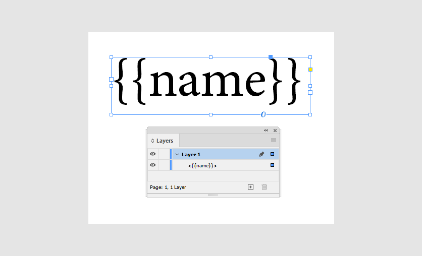
You can create interpolation placeholders on the canvas in the Design Editor.
Customer's Canvas supports variable data printing scenarios with these placeholders. For example, see the ID Card VDP demo product.
For more details, read the Variable elements article.
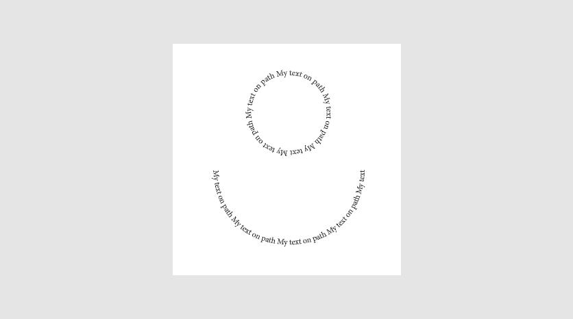
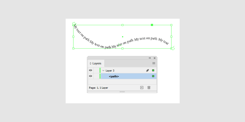
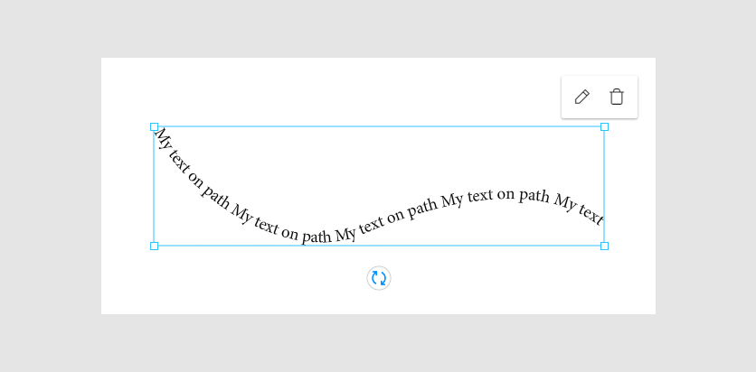
Curved text
If you create text on a path with the Pen Tool in InDesign, this text will be imported as curved text in Customer's Canvas.
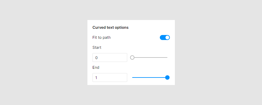
In Template Editor, you can edit this path in the Design panel > Curved text options.
This is how curved text may look in Design Editor.
Note
Starting from version 7.1.13, curved text correctly appears on closed paths. If you have configured curved text based on an ellipse (or other closed shape) in your design, then after loading such a design element on earlier versions, it will be displayed incorrectly. In this case, we recommend upgrading to one of the latest versions of the Design Editor or changing the design to use an open path, for example, such as an arc instead of an ellipse.
Arched text
Customer's Canvas supports arched text created from an arbitrary path.
To create arched text in InDesign, use <ART> and <ARTB> markers together.
The ARTB marker takes a value in the [-1, 1] range to create the necessary bend. For example:
| Figure | Marker values |
|---|---|
| Semicircle | <ART><ARTB_0.5> |
| Circle | <ART><ARTB_1> |
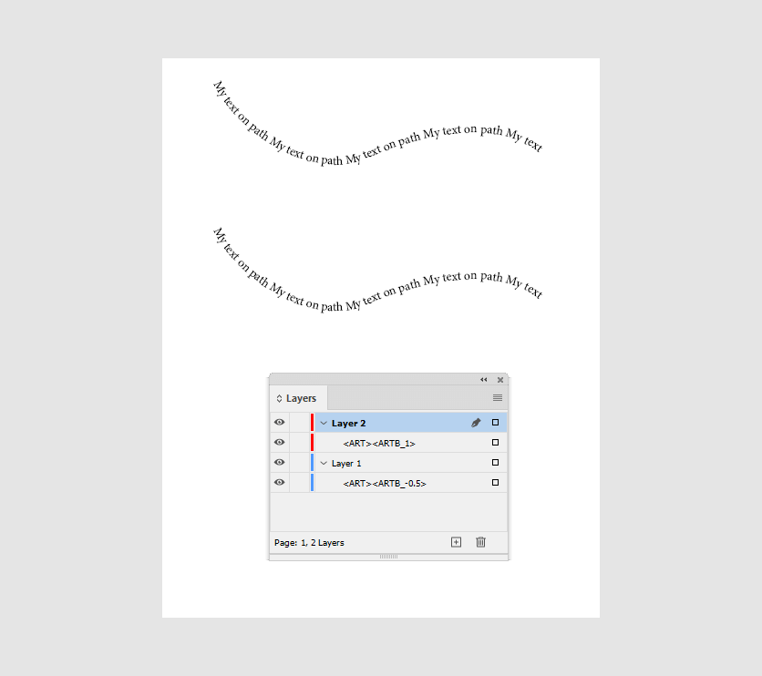
This is how these paths will look in Design Editor.