How to create editor mockups
- Last updated on December 29, 2023
- •
- 7-8 minutes to read
In this article, you will find out how to create editor mockups - the images that help the user personalize a product that is more complicated than a paper sheet, such as garments, pens, drinkware, magnets, etc. They are not a part of a design but rather visualize the product itself. They can also be used for paper products, for example, to visualize different trim styles.
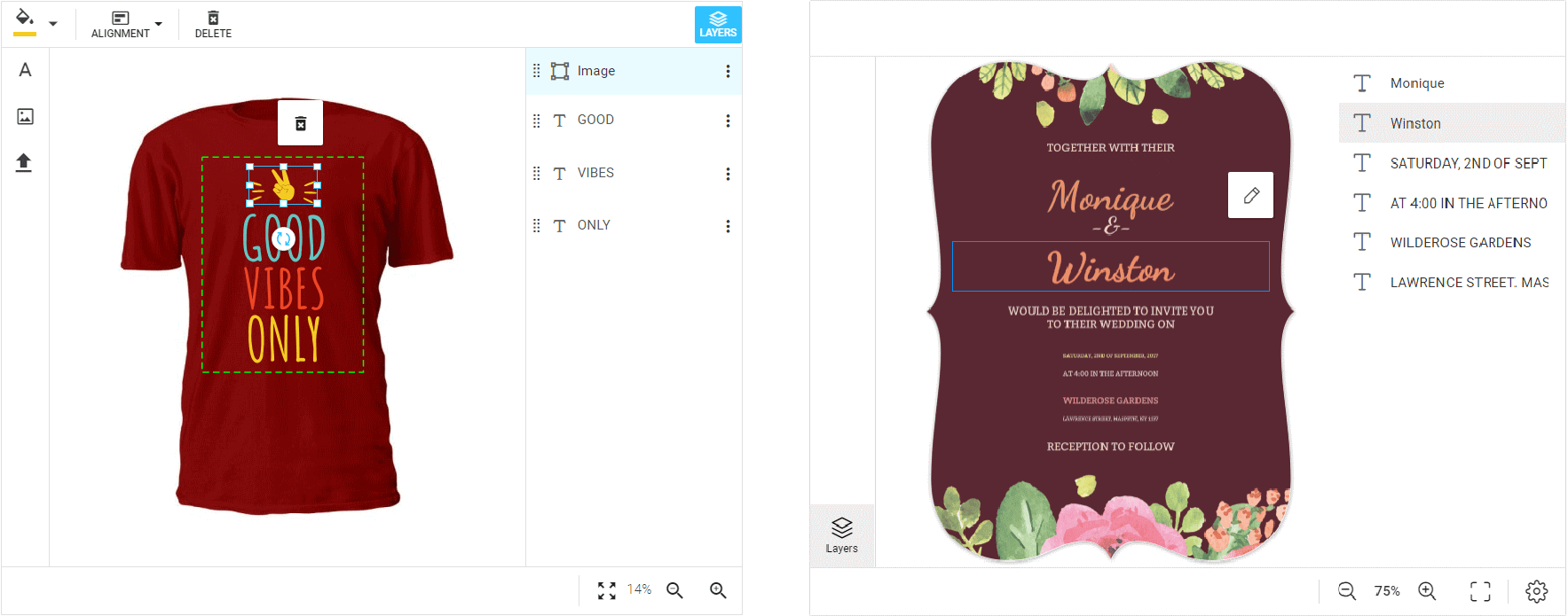
How mockups are organized
A mockup is just an image file. It can be any file format supported by Customer's Canvas, but the most popular choices are PNG, JPEG, PSD, or SVG. It is assumed that you are editing mockup images in Photoshop.
When configuring the Design Editor, you may add two types of mockups: up mockup, which is displayed above the design (sometimes it is called an overlay), and down mockup, which is displayed under the design (a substrate). You may add one down mockup, one up mockup, or both.
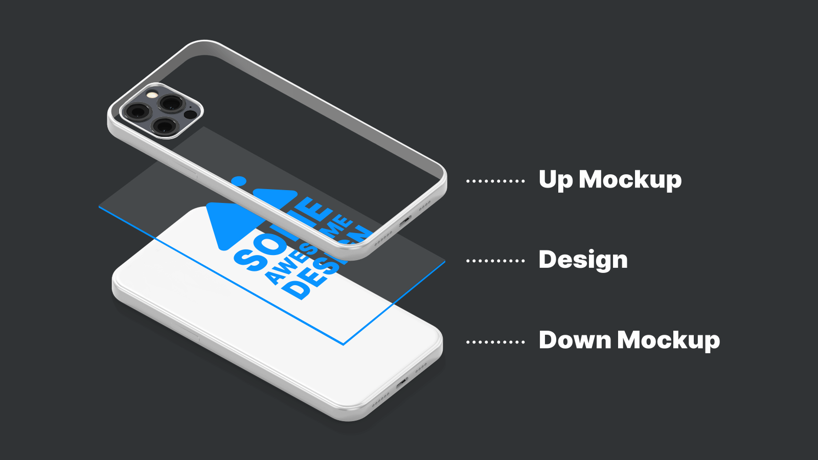
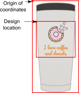
If the mockup is larger than the design, in addition to images, you need a design location - coordinates of the upper-left corner of a design relative to a mockup. When creating a mockup, you need to record the coordinates and save them along with the images.
Overlays and substrates (up and down mockups)
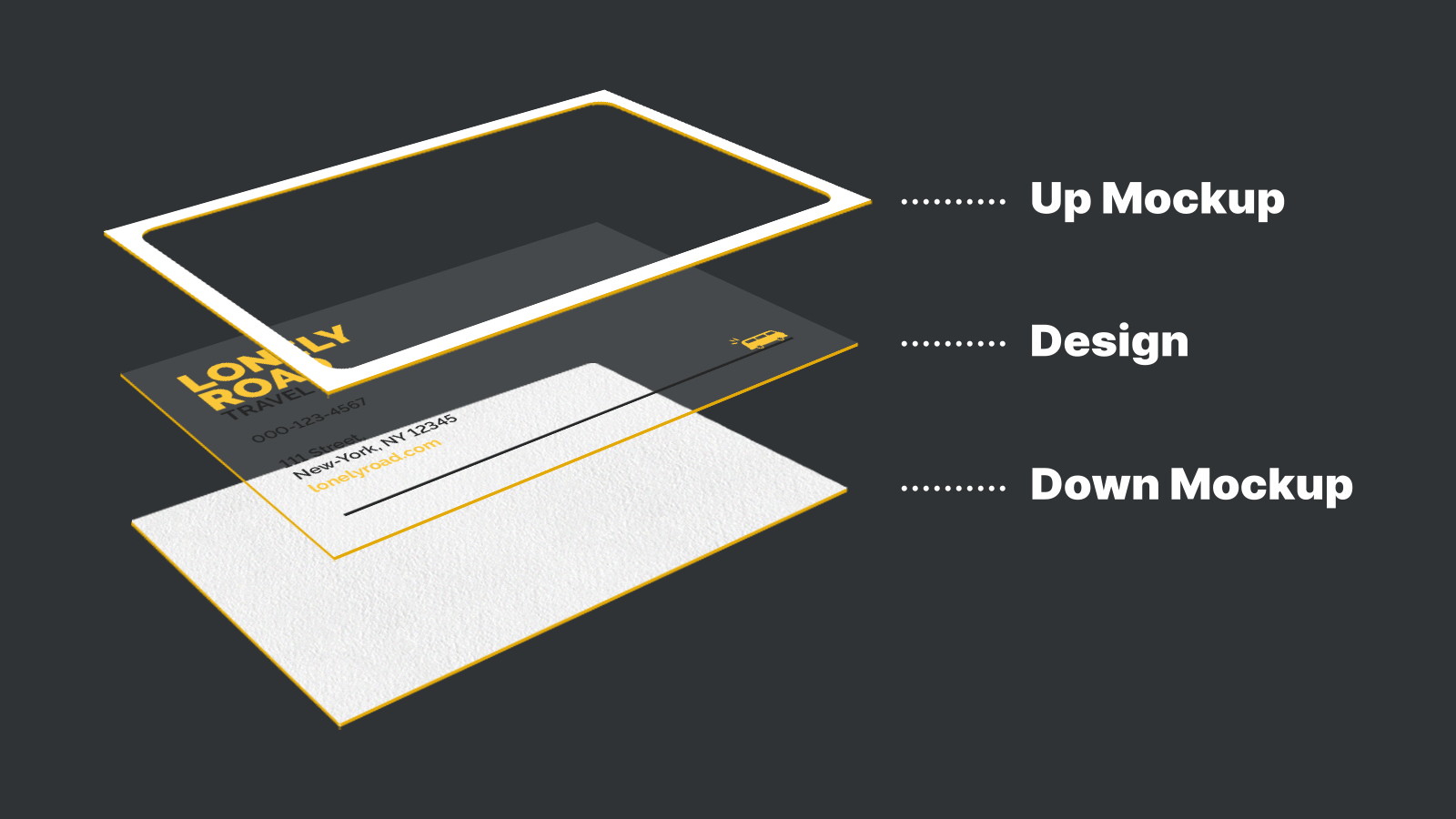
Since the up mockup is always located above the design, it is always an image of a product with a transparent fragment where the print area should be located. This way when a user adds some elements outside of the print area, they will be clipped.
Note, it should have the same size as a trim box. This way, if the design contains a bleed or slug area, it will be clipped as well.
Since you always need transparency with the overlays, you should use PSD, PNG, or SVG files.
You can use the down mock up to visualize a material when a design does not occupy the entire print area or if it has some transparent areas.
With down mockups, you never need any transparency, which makes JPEG a good choice for them, although other file formats are supported as well.
Here are the most common configurations of up and down mockups.
Garments, drinkware, and other specialties
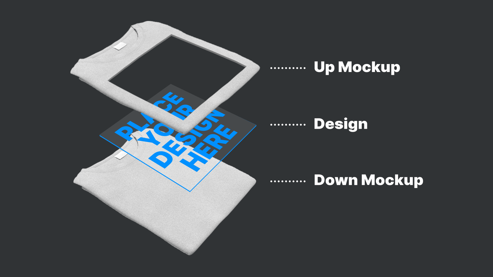
In most cases, you will use the same image for both overlay and substrate mockups, but the print area is cut on the up mockup, while the down mockup is an original image.
Tip
Check out the Garment editor mockup tutorial for the instructions on how to create an editor mockup for a similar product.
Cards with different trim styles
You can make cards with different trim styles without a down mockup.
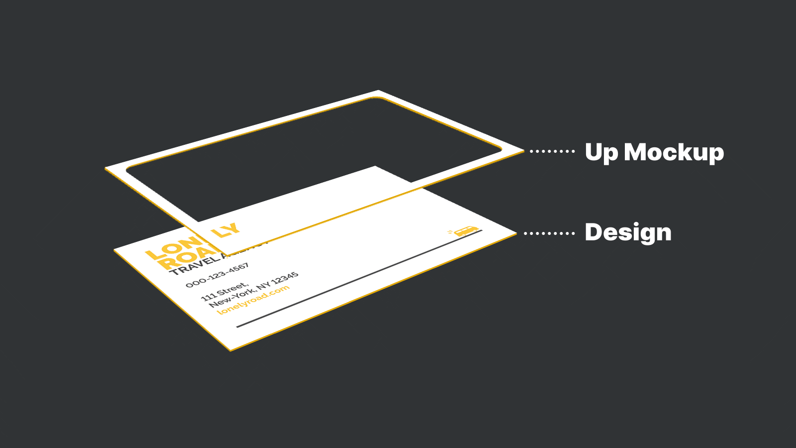
When this card is ordered with an unusual material (like kraft paper, etc), you may want to add a texture of this material as a substrate.
Tip
Check out the Cards with different trim styles tutorial for the instructions for this type of product.
Locked designs
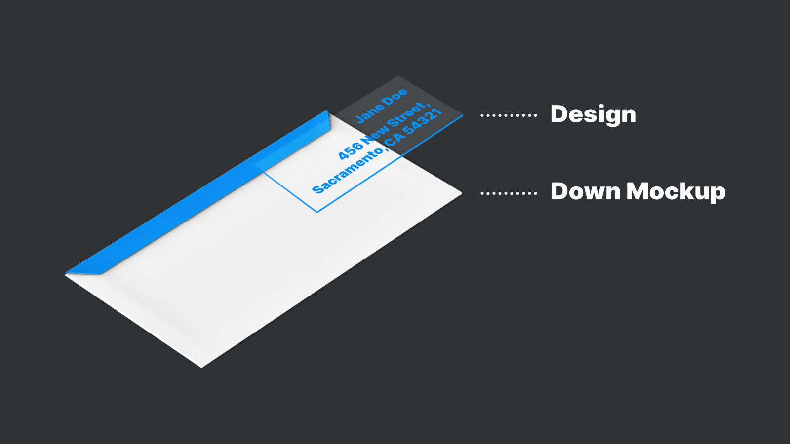
When you don't need to clip a design that goes beyond the print area, you only need to prepare a down mockup. For example, you may take this approach for envelopes where the text elements are locked.
Design location and a coordinate system
When you add a mockup to the Design Editor configuration, the upper-left corner of a mockup will be interpreted as the point of origin. The design location is calculated in points (1/72 of an inch) relative to the upper-left corner of a mockup.
Determining a design location in Photoshop
To get the coordinates of the design location on the mockup:
- Place the design on the mockup as you want it to appear in the editor.
- Set units to points: Edit > Preferences > Units & Rulers > Type.
- Enable the transform mode for the design layer: Edit > Free Transform (
Ctrl+T). - Click Window > Info (
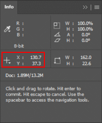
F8) and write down theXandYcoordinates to add them to the product configuration later.
Using both up and down mockups together
What if you put both up and down mockups together? Customer's Canvas does not allow for specifying a position of an overlay relative to a substrate or vice versa. They will both start from the same point of origin.
For this reason, we highly recommend using the same size for both up and down mockups. Moreover, as you will find out from the next paragraph, it is quite common to create a pair of up and down mockups from the same image.
Physical mockup size
When creating mockup images, it is important to remember the physical size of the real product. In pixels, the mockup image should have a reasonable size - around 1000-1500 pixels wide. However, you need to set the proper resolution to obtain the real product size.
Note
If you find the image quality with such dimensions low or insufficient, you may increase the image size. However, the larger the size, the longer the image will take to load in the editor.
Calculating a mockup image resolution
Determining the real size of a mockup image may be challenging. Let's imagine you are preparing a mockup for a T-shirt. You may know the length of the T-shirt in a photo (say 30 inches by 22 inches). However, the photo may have been taken in a situation where the T-shirt is not flat, for example, if it is worn by a person.
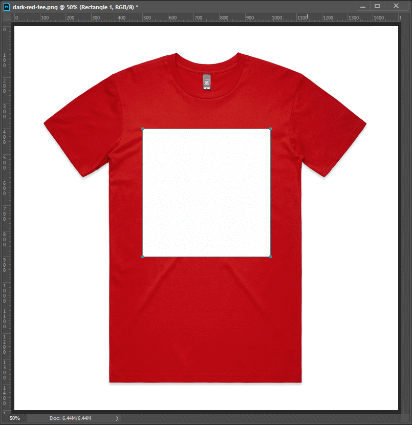
The most reliable way to understand the real size of a product is the print area. Typically, print files have precise specifications. For example, for a T-shirt, it may be 9.5x12 inches. You can draw a rectangle with the same aspect ratio on the T-shirt in the same place where the real design will be printed. Measure how many pixels it takes up relative to the full image.
For example, the full image width is 1500 pixels and the print area is 500 pixels wide. In other words, the full image is 3 times larger than the print area. Therefore, the full image width will be 9.5 x 3 = 28.5 inches.
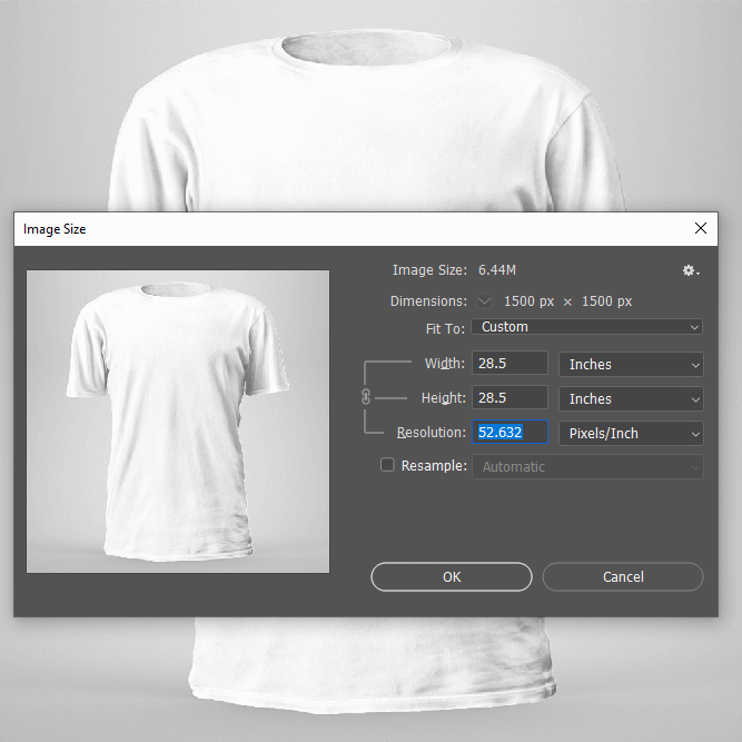
When you save this design, you need to set the resolution to approximately 52.6 DPI. This way, a 1500-pixel image will have a physical size equal to 28.5 inches.
Verifying a print area size
To ensure that we do the math correctly, we can add some real designs prepared for this product into a mockup to see whether their sizes match. Depending on how you prepare designs, you can obtain the file you want to add to a mockup as follows:
- If you are preparing a file in the Customer's Canvas Template Editor, you need to "order" this design and receive a PDF print file or at least a proof image.
- If you are creating designs in Photoshop, just use the PSD file you create.
- If you are creating designs in InDesign, export them as PDFs. We recommend including the bleed zone, if any (File > Adobe PDF Presets > High Quality Print > Save > Marks and Bleeds > Use Document Bleed Settings > Export).
Add the design file to the design location and make sure it looks right.

Saving a mockup in the right resolution in Photoshop
If you are using Photoshop, to save an image correctly, follow these steps:
- Open Image > Image Size.
- Set the correct size in pixels. It should be a reasonable size for a browser, usually around 1000-1500 pixels wide. You may use smaller sizes, but it won't look crisp on Retina displays.
- Turn off the Resample option.
- Set the Resolution you have calculated as described above. Alternatively, you may switch to Inches (or other units you prefer) and set the Width and Height fields.
Note
Since the mockup file is displayed on the screen, changing the Resolution does not significantly decrease the image quality. However, you can use the resolution to calculate the physical size of an image.
Product shape - mockups vs design layers
As you may have learned, specifying a product shape is one of the things you can do with the help of up mockups. However, you can achieve the same goal in another way: by adding this layer to the foreground of a design file. Which approach is preferable?
We recommend the following. If any of your shapes apply to any design and you would like to switch between them, go with mockups. If a shape only applies to a specific design, add it to a design file.
For example, when working with cards with different trim styles (rounded corners, scalloped corners, etc.), you can easily apply all of these trim styles to any design, and you certainly don't want to create multiple copies of the same design with different corner styles. Using mockups is a great choice. However, circular and rectangular stickers will differ not only by shape but also by design. In this case, it is much easier if you make the shape a part of the design file.
Now, let's walk through the process of creating a mockup for garments. The same approach will work for any specialty item as well.