Image placeholder behavior
- Last updated on June 10, 2025
- •
- 4 minutes to read
A placeholder is an area on the design where end-users place their logo or image. When the user resizes or moves the image, it doesn't go outside of this box. Instead, it is zoomed and cropped according to the placeholder boundaries.
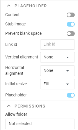
Let's assume that you have already created a placeholder and need to set up its behavior. To perform this, select the placeholder, click the Behavior tab, and scroll down to the Placeholder group.
Placeholder content
Content
A placeholder may be either empty or populated with an image. To add an image to a placeholder, you can use the Content toggle. If you turn it on, a file selection dialog appears. The image you insert as the content becomes a part of the design. A user can replace it, but even if they don't change this image, it will become a part of a print file when the design is rendered.
Stub image
When the placeholder does not have any content, it may either be completely blank or display a stub image — an image that encourages users to insert some content. The stub image is visible only in the editor. If the user does not insert anything, the placeholder will behave as an empty element — no image is rendered on the print file.
Content behavior settings
On the Behavior tab, you can also configure how the content inside the placeholder should behave.
Fitting mode
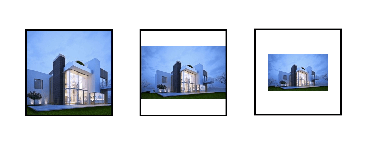
Initial resize This setting determines what to do with the content size when inserting:
- The Fill mode resizes the content to fill the entire placeholder, even if part of the image turns out to be clipped. As a rule, it is used for photo products together with Cover mode.
- The Fit mode fits the content to the placeholder's bounds. This behavior is well suited for logos.
- The Original mode inserts the placeholder in the original size.
Horizontal/vertical alignment
This setting determines how the content should be placed inside the placeholder if their size and aspect ratio do not match. This setting mainly concerns insertion behavior. The user can always move the content on their own.
Content manipulation
Manipulations include standard actions: move, resize, rotate, and delete.
In addition, for specific user editors, additional features may be enabled or disabled by this toggle. For example, in the Simple Editor, it allows disabling the cropping tool after selecting an image.
Cover mode
This setting determines whether the content can be reduced or shifted so that an empty space appears inside the placeholder.
As a rule, this setting makes sense for almost all photo products, especially if there is some kind of décor around the placeholder. However, you should never use it for logo placeholders because it will always truncate some portions of the logo unless it has the same aspect ratio as the placeholder.
Linking placeholders
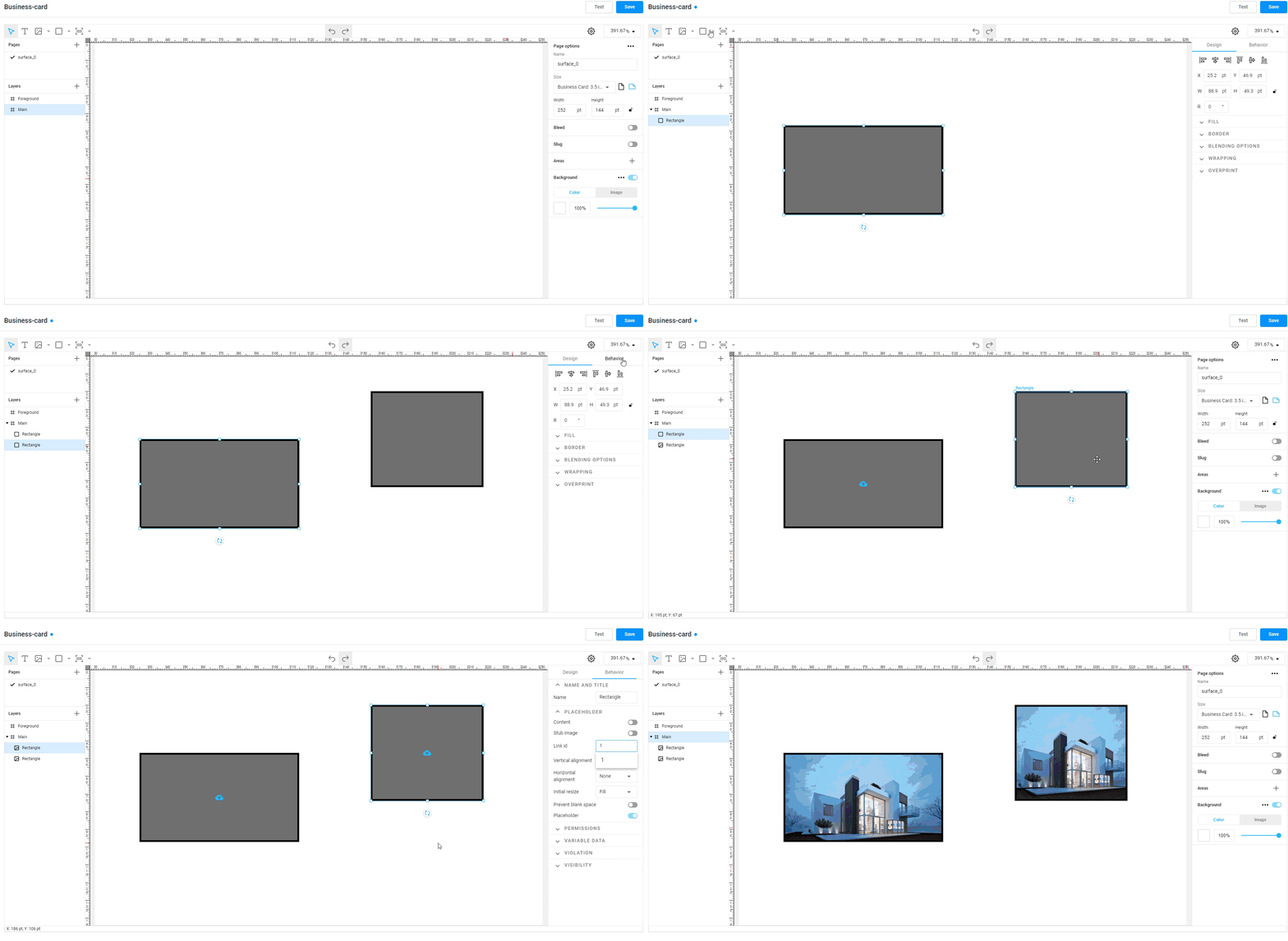
Sometimes you may need to fill in the same content in several placeholders at once. For example, when you have a logo in the header and footer, the same photo on several pages, or you make a backdrop with logos.
To do this, you can use the Link id property. If you have several placeholders on your design and they have the same Link ID, then the content is inserted into all of them at once.
Examples
Now, let's look at how you can configure two types of placeholders: logos and photos.
Logo placeholders
When you create a placeholder for a logo, you may want to set the following settings:
- Fitting mode to Fit.
- Both alignments to Center.
- Turn on the Cover mode toggle.
Additionally, if you have several placeholders for the same logo (e.g. in a footer and header), you need to set the same value as Link ID, for example, Logo 1.
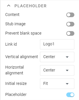
Photo placeholders
For a photo placeholder, you may want to set the following settings:
- Fitting mode to Fill.
- Alignments — as per your design. Leave it on default settings if it doesn't matter.
- Turn on the Cover mode toggle.
It is also a good idea to add a stub image like "Add your photo here" or something like that.
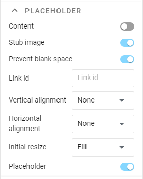
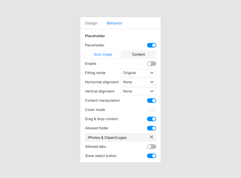
Image selector for Simple Editor
The Simple Editor supports three options for uploading images to placeholders:
- Upload images from public storage in Customer's Canvas account.
- Upload images from the user's local environment.
- A combined option featuring both these sources.
To enable both private and public sources:
- Enable the Allowed folder toggle and click the field below.
- In the Select folder window, browse the folder tree, click a folder, and click Select.
- Turn on the Show select button.
If you don't want the cropping tool to open for selected images, disable the Content manipulation toggle.
Now, let's learn how to configure the behavior of another important item type called text elements.