Image placeholders
- Last updated on August 28, 2024
- •
- 4-5 minutes to read
In the previous section, we learned how to add images to a template. Sometimes we need end-users to insert an image in a certain place on the canvas. Customer's Canvas has a special type of element called an image placeholder for this purpose.
For more information about how they work, see the Image Placeholder section in the Designs anatomy section.
Throughout this article, you will learn how to work with image placeholders in the Template Editor.
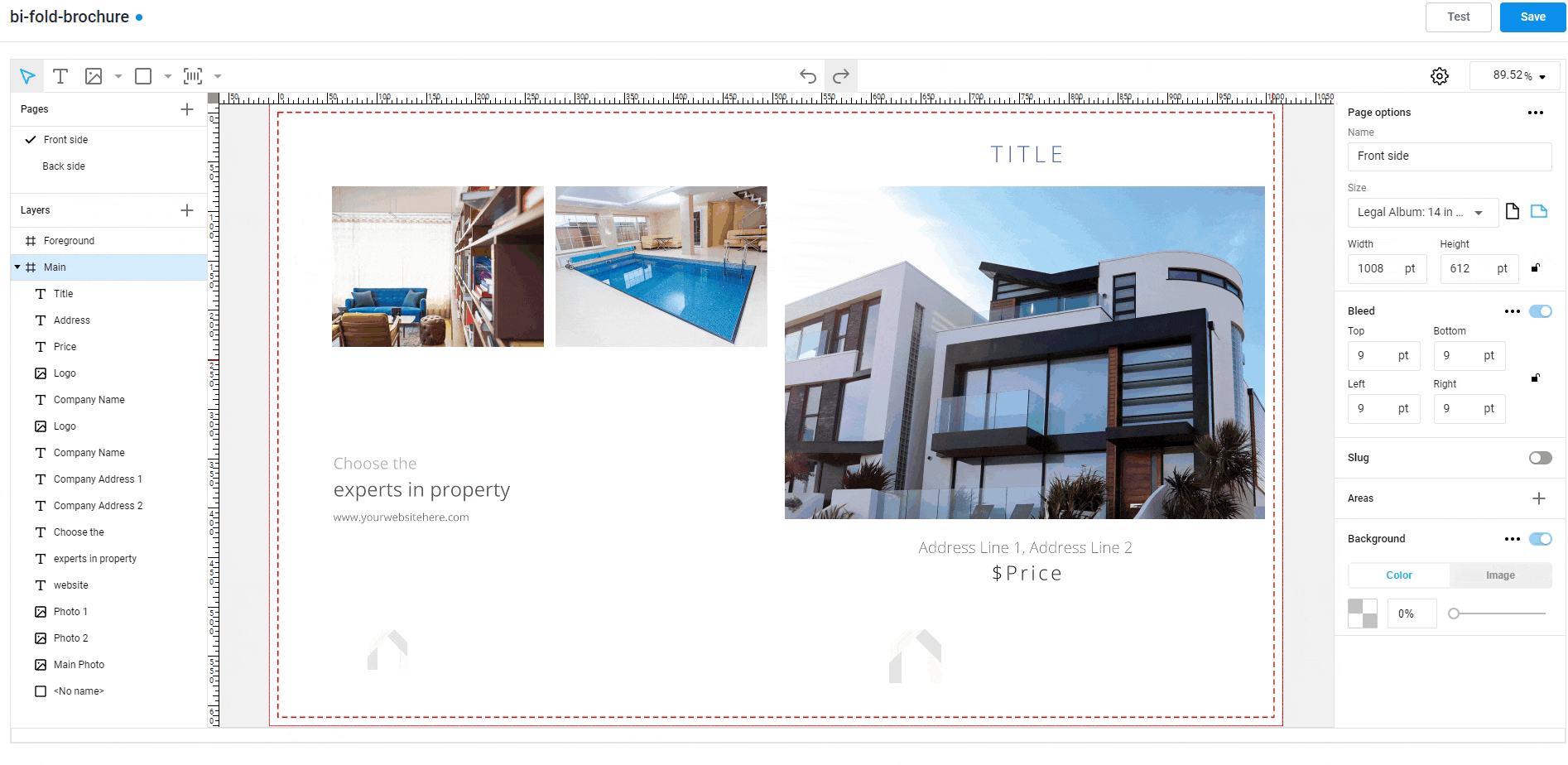
Creating placeholders
Unlike other types of elements, you cannot create a placeholder using the Top toolbar. Instead, you must first add either an image or a shape to the design, then convert it into a placeholder.
This is the easiest way to create a placeholder:
- Create a rectangle using the appropriate tool (hotkey
R). - In the toolbar, on the Behavior tab, find the Placeholder section, and turn on the Placeholder toggle.
- The Upload button appears in the middle, which means that the element is now a placeholder.

Non-rectangular placeholders
Rectangular placeholders are the most common option, but you can choose other shapes. For example, a common task is to make a round placeholder for a photo of a person. It can be created in the same way, but instead of the Rectangle creation tool, you can use the Ellipse creation tool (hotkey E).

You are not limited to a rectangle or an ellipse. Prepare a one-color SVG containing the path of the desired shape and upload it to the editor (hotkey M). You can also convert it to a placeholder in the same way.
Placeholder color
You can set the fill and border for placeholders just as you do for other elements. However, the Background Fill will always be visible, even if the user does not insert anything or inserts an image with transparent areas (for example, a logo).

This is not always the desired behavior. If you prefer a transparent background, choose No color in the Fill color picker.

Stub images
A common technique is to display an image that motivates the user to insert their image there, like a silhouette of a person or the text YOUR LOGO HERE. In Customer's Canvas, this picture is called a stub image.

It is displayed only while the placeholder is empty. As soon as a custom image is inserted into it, it replaces the stub image. The stub image is also visible only in the editor but not in the print file. If the user does not insert anything into the placeholder and orders that product, there will be a void in the print file in place of the placeholder.
Creating a placeholder with a stub image
The easiest way to create a placeholder with a stub image is to convert an image item into a placeholder. The steps are identical to creating a placeholder from a rectangle or an ellipse, but the only difference is that we upload an image that should become our stub image.

Adding a stub image to an existing placeholder
What if we have already created a placeholder and just want to add a stub image without recreating it? In this case, you just need to go to the properties panel, click the Behavior tab, expand the Placeholder section, and turn on the Stub image. As a result, the image upload dialog opens, where you can select a stub image.
Note
Try to make stub images of the same aspect ratio as the placeholder.
Resetting the stub image
If this switch is turned off, the image is reset.

Stub images and non-rectangular placeholders
Suppose we want to create a round placeholder for a photo, for example, like this:

A common mistake is to make a round stub image, like the one we see on the screen and convert this image into a placeholder. In this case, the editor will not be able to recognize the round shape of this picture. From its view, this is a rectangular picture that has transparent areas. Thus, the placeholder will turn out to be rectangular, and you will see it only when you try to fill this placeholder.
The correct way to create this stub image is to first create a round placeholder from an ellipse as described above, and then add a stub image. This ensures the correct behavior.

Pre-filled placeholders
As a rule, when creating placeholders, we assume that users will fill them in. But sometimes it is a good idea to pre-fill the placeholder directly in the template. The user will be able to change the image in the placeholder. Unlike the stub, the image will remain part of the design if the user doesn't change it.
To achieve this task, first, create a placeholder in any way described above. Then, click the Upload button on the placeholder and upload the image there. By clicking on the arrows, you can enter the content editing mode and adjust which part of the placeholder the user sees.
An alternative way to do this is to use the Content toggle in the Placeholder section of the Behavior tab. You can also use this toggle to reset the content.
Placeholder behavior settings
You may find more information about configuring the placeholder behavior in the How to set up item behavior section. In particular:
Let's go further and learn how to work with shapes.