Image placeholders
- 9 minutes to read
Sometimes you may not only want to give a user the ability to add or change an image, but also to limit an image by a specific sized box. When the user resizes or moves such an image, it does not go outside of this box, but instead, it is zoomed and cropped according to the placeholder boundaries.
Marking a Layer as a Placeholder
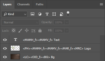
To turn this feature on and add a placeholder to your template, you should add an image and add the <PH> marker to its name in your Photoshop or InDesign template. When you open this template in the Design Editor, it looks like this:
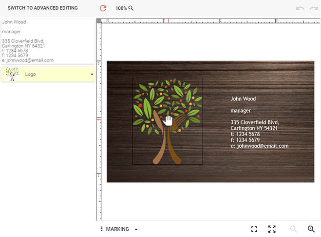
To edit the image, you can click the Handle on the placeholder. As an alternative, you can enable the auto edit mode. In this mode, the Design Editor hides the Handle, and you can just click a placeholder to edit its image.
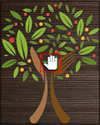
You can resize, rotate, or move the image. The grayed-out area will be cropped. Click the Done button to finish editing.
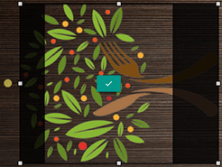
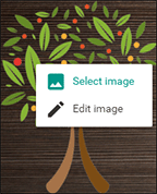
To select another image from the image gallery, double-click the image placeholder.
Also, you can right-click the image placeholder, and then click Select image to open the gallery.
Creating Non-rectangular Placeholders
The <PH> marker allows you not just to set up rectangular placeholders defining a position and a size of a selected image on a product, but also artistic placeholders with arbitrary shapes. To define such placeholders in Adobe Photoshop, use vector shapes to crop out a portion of the image in the Design Editor (for more information, refer to the Non-rectangular image placeholders topic. In InDesign, you can simply create an image frame of the desired shape.
Encouraging Users to Select Images for Placeholders
You can define empty placeholders in your templates. These placeholders require users to select images before they can edit or output the content of the placeholders. To turn this on, add the modified <PH_empty> marker to an image layer name. The Design Editor does not load images to such placeholders when the editor opens the product on the page. Instead, the placeholder is displayed as empty with a light gray border and the Select image button.

Instead of showing an empty placeholder, you can place an image encouraging users to select images for it. For example, it could be an add a picture or double click to add an image message. The <PH_stub> marker allows you to implement this approach. The Design Editor displays this image but does not include it in the hi-res output.

Unless a user selects an image, neither empty nor stub placeholders show the Edit button and appear in the hi-res output.
Configuring Placeholder Manipulation Capabilities
In addition to the <PH> marker, you can set one or more markers limiting abilities of interaction between users and placeholders:
<PSSB_f>- removes the Select image button.<PAEC_f>- disallows manipulating content of the placeholder.<MAMH_f>- disallows moving the placeholder horizontally.<MAMV_f>- disallows moving the placeholder vertically.<MAR_f>- disallows rotating.<MRC>- disallows resizing.
For example, combine the <PH> marker with <MAMH_f><MAMV_f><MAR_f><MRC> to lock the element. This ensures that the user cannot move, rotate, or resize the placeholder. You can also use <PAEC> to control whether you want the user to manipulate the image inside the placeholder and to replace the image.
If you prefer to define the JSON permissions instead of the markers, you can use the following definition, which leads to the same result as markers from the previous picture.
{
    "frames": {
        "Text": {
            "manipulationPermissions": {
                "allowMoveHorizontal": false,
                "allowMoveVertical": false,
                "allowRotate": false
            }
        },
        "Logo": {
            "placeholder": true,
            "manipulationPermissions": {
                "allowMoveHorizontal": false,
                "allowMoveVertical": false,
                "allowRotate": false,
                "resizeGrips": {
                    "edge": false,
                    "corner": []
                }
            }
        },
        "Bg": {
            "locked": true,
            "frontendPermissions": {
                "displayInObjectInspector": false
            },
            "background": true
        }
    }
}
Defining the Image Insertion Mode
The <PHRM> marker allows you to define how images should be resized when users insert them into the image placeholder. The images can either be resized proportionally to fit the placeholder or maintain the original size. This marker stands together with <PH>. You can specify the fit, fill, or original mode:
<PH><PHRM_fit>results in that the image size is equal to or smaller than the placeholder size.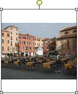
<PH><PHRM_fill>results in that the image size is equal to or larger than the placeholder size.
<PH><PHRM_original>results in that the original image remains unchanged and is placed in the center of the placeholder.
If the cover mode is enabled, then images can only be inserted in the fill mode.
To align the content of image placeholders horizontally and vertically, you can use the <PCHA> and <PCVA> markers.
Using the Same Image in Several Placeholders
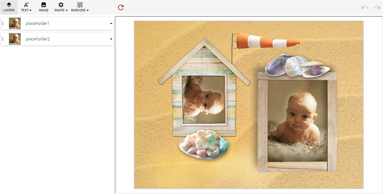
The Design Editor allows populating multiple image placeholders with the same content at once. To use this feature and link placeholders together, use the <PLID> marker in desired layers. This way, the layers containing a shared image are marked with <PH><PLID_id>. Such a group of image placeholders is linked by the id name which enables you to have multiple groups within a single template (with different ids). All the image placeholders included into a group are shown in the Object Inspector. When the user changes an image in one placeholder in the group, it is changed in all the linked placeholders.
Let us say you have a flyer, and there is an image shown in a number of places on it. If you mark such image placeholders with the <PLID_id> tag in your template, they become linked based on this id name. As soon as the user replaces the image, the new image is applied to all linked placeholders. Note that only a picture itself is updated, but transformations done by the user are still applied. So, if you have the first image in the group full-sized with no transformations and the second one rotated at 90 degrees and reduced by 50%, changing the image in the first layer will cause it to update in the second layer and it is still rotated and downsized.
Adding Transformed Placeholders
The Design Editor supports transforms for image placeholders such as scale, translate, and rotate. To use them in Photoshop templates, convert image layers to Smart objects, which are special layers that allow you to apply geometric transforms to objects. Note that in this case, the <PH> marker should be added to the smart object.
For example, the following image shows two linked placeholders. The rotated placeholder is a smart object. When the user uploads an image to one of the placeholders, both of them get the same content, but the second image is rotated 90 degrees and reduced by 20%.
For design elements defined within a layer group, like placeholders with frames or non-rectangular placeholders, the same transform should be applied to all the layers. If such a group contains raster layers, convert them to smart objects. Shapes keep transforms without being converted to smart objects. For example, if you want to rotate a placeholder at 90 degrees, then you need to convert raster layers to smart objects and apply the rotation at 90 degrees to all the layers in the placeholder group. If the angles differ, then the parsing of the PSD template causes an error.
For more details about smart objects, you can refer to the Smart objects topic.
Limiting Placeholders with Predefined Images
Let us assume you do not want to allow your users to upload arbitrary images into placeholders. For example, when you have prepared a collection of themed images for every template and put it to a special folder, and want a user to choose only those images. To do it, you may use a special behavior setting - allowed image folder (<IASF> marker).
To demonstrate this feature, let us set up the \europe_photos\ folder in the public gallery as an image source for an image layer:
The Design Editor will be searching for the specified path in the public images folder. So, we will first make sure that the public folder has been set up. To perform this, open ~\Configuration\AppSettings.config and find the
PublicGalleryFolderparameter. Its value should be"..\assets\images"(this is the default value); if it is not, change the value to"..\assets\images"Make sure that the \europe_photos\ subfolder is in the ..\assets\images\ folder. If there is no such subfolder, then create it and place some images there.
Create the \London\ subfolder under \europe_photos\ and move the default tower.jpg and harrods.jpg images to it.
In Photoshop, create a new file, add an image layer, and put the
<IASF_/europe_photos/>marker into the layer name. Here,/europe_photos/is a path to the folder from which it will allow users to select content for the image layer. The path is relative to the public images folder, which we have set to ..\assets\images\.Save the template.
Load the template into the web-to-print designer.
Open the gallery by double-clicking the image. Note that the open file dialog displays no tabs and contains only images from the \europe_photos\ folder and its subfolder.

To hide this folder in the asset tab, you can prefix its name with [hidden], for example, [hidden]europe_photos. In this case, you can still specify it as the image source folder without the prefix: <IASF_/europe_photos/>.
Note
This feature works properly only in a local mode. It does not work for the galleries located in the cloud.
Image list
An alternative way to allow choosing some subset of images is to put them to a design, group, and put an <MVI> marker as explained in the Predefined multi-value Items topic.
Drag-and-Drop the Placeholder Content
To swap the content of placeholders on the canvas, you can just drag and drop images. To enable the drag-and-drop mode, disable the horizontal and vertical moves of placeholders by using the following markers:
<PH><MAMH_f><MAMV_f>
To disable the drag-and-drop mode when you need this marker combination, add the <MADND_f> marker.
When you drag an image, the Design Editor highlights placeholders, where you can drop this image, with the swap or place icons, depending on whether they have the content. In the following screenshot, you can swap the image with the second placeholder or move the image to the third (empty) placeholder. The fourth placeholder does not offer to swap the content.
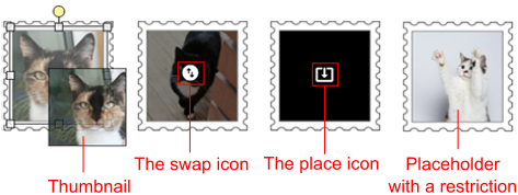
You can remove the content of placeholders by moving its thumbhail out of the canvas.
If your design contains linked placeholders, then they are cleared or filled at the same time.
Note, if you define a placeholder by using the <AT> or <IASF> markers restricting a gallery tab or a folder, then you can swap images only between placeholders that have the same restriction.