Images
- Last updated on December 29, 2023
- •
- 5 minutes to read
The Images folder contains graphics used to prepare product designs, personalize the designs, and display some types of mockups in the editors.
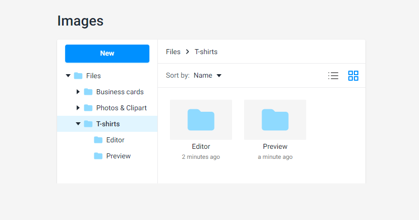
In this article, you will learn:
What types of images you can put in this folder.
Where you and your customer can use them.
How to organize a folder hierarchy.
First, let's see what types of images may be placed in the Image folder.
Image types
The Images folder supports the following file extensions: AI, BMP, GIF, JPEG, JPG, PDF, PNG, PSD, SVG, and TIFF.
You can use these images for two primary purposes:
Creating designs in the Template Editor and personalizing designs in the Design Editor as an image bank.
Displaying a product view or additional graphic information when customers personalize their design. This type of images is called mockups and works only for products based on product specification.
Let's see what images you can use in each case.
Image bank for editors
You may use the same types of images for creating a design in Template Editor and personalizing a design in Design Editor.
The following classification isn't strict, and you can add your graphic type. Also, you don't need to have all these graphic types in your tenant.
Photos
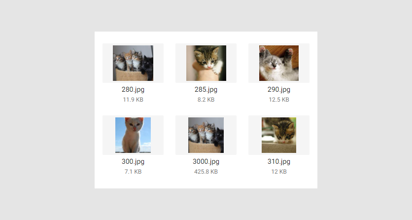
For example, you can use a set of photos for a collage or ID cards. These can be images in JPG, JPEG, PNG, BMP, or TIFF format. The recommended DPI value is 300 or more. The lower DPI value, the worse the quality of a printed image.
Clipart
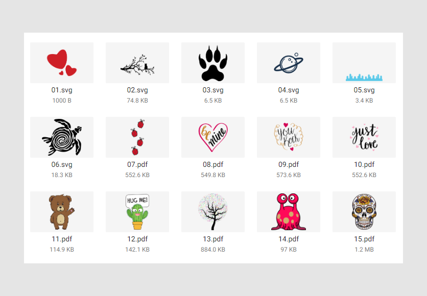
To decorate designs, you and your customers can use clipart. These vector images can be in SVG, AI, or PDF formats.
Shapes
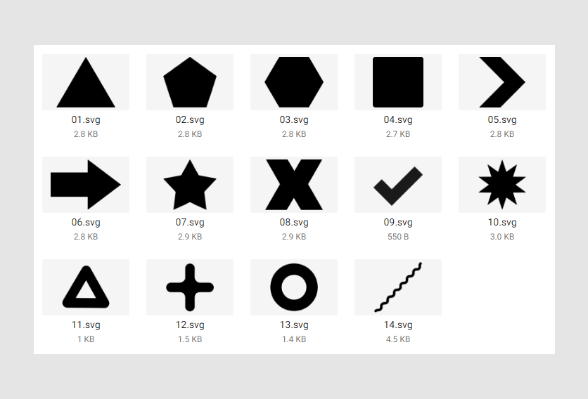
In Customer's Canvas, you can add only lines, rectangles, and ellipses through a toolbox. However, you can upload complex vector shapes in SVG, AI, or PDF format to assets and add them to designs.
Logos
For some products, you may want to add logos to designs. Vector logos allow you to resize them without loss of quality. This graphics can be in SVG, AI, or PDF format.
You can also create logos as raster images in the appropriate formats if needed.
Backgrounds
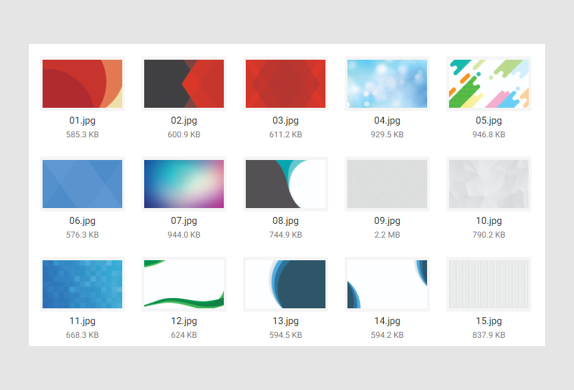
Designs usually have a background. These images can be both vector and raster.
In this example, these are backgrounds for business cards.
Folder hierarchy
Let's see how you can create a folder hierarchy for images.
First, create a subfolder for your product designs.
- Business cards
If you need different image categories for different products, you can stick to a product-based approach. Create subfolders for images under the product folder. For example, if you want to assign backgrounds and logos to the Business Card product, you can arrange the folders like this:
- Business cards
- Backgrounds
- Logos
As an alternative, you can arrange images based on their types. The following example illustrates how you can organize clipart and photos into subfolders for different products. For common images, create a subfolder on the same level as the product subfolders.
- Photos and Clipart
- Business cards
- T-shirts
- Common
Mockups for product specifications
Product specification is one of the approaches to create a product in Customer's Canvas. It allows you to create a product with different attributes, mockups, and so on.
Mockups in product specifications are of two types: editor and preview. An editor mockup, in turn, can be an overlaying or background image.
You can find more information about creating both mockup types in the Product specification section of the Designer's Manual.
Let's consider the concept of editor and preview mockups.
Editor mockups
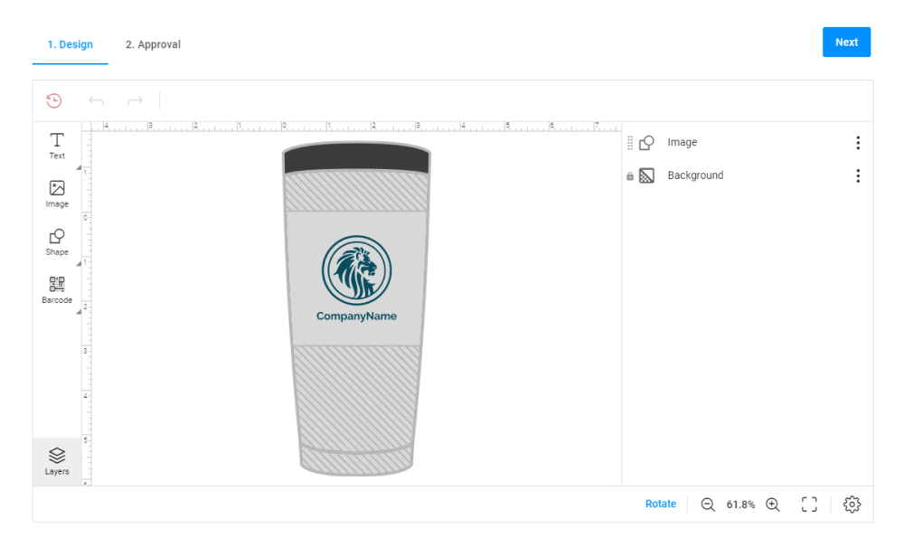
The Editor mockups help you visualize a product in the Design Editor. This type of mockup may represent the product only in a schematic way, but the customer can see the proportions of the product and how the design will look on it.
For example, this is a tumbler editor mockup illustrating the product schematically.
Defining design location
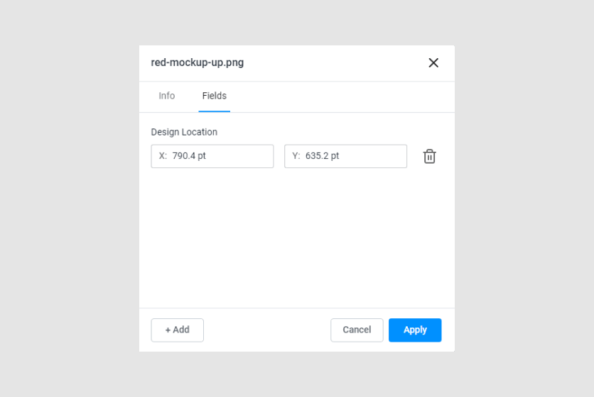
This mockup type requires coordinates of the design location to place the design in a suitable area. These coordinates correspond to the upper-left corner of the design area and are measured in points.
To define the design location, right-click a mockup and select Properties. In a new dialog box, select the Fields tab.
To add new fields, click Add, then select Design location. Insert the coordinates in the corresponding input fields. X is the horizontal axis, and Y is the vertical axis. Finally, click Apply.
Note
If units are not points in these fields, then change them through Settings > Editor > Default measure unit.
Preview mockups
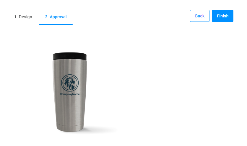
The preview mockup is a realistic product image that represents the personalization result for a customer. This mockup may represent a design both in projection and frontally. The image format is PSD.
For example, this is the preview mockup for a tumbler.
Defining design layers
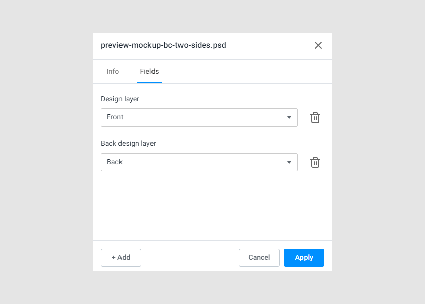
A PSD file may contain one or more smart objects. Customer's Canvas uses them as a placeholder for the design. You need to define which smart object is for the front side and which one is for the backside (if any).
To do so, right-click a mockup file and select Properties. In a new dialog box, go to the Fields tab. Click Add and select Design layer. It will add a new field. This field's values are the smart object names from this PSD file. In the drop-down list, select the layer name of the front-side smart object.
If your mockup has a backside, select Back design layer. In the drop-down list, select the layer name of the back-side smart object.
To save results, click Apply.
Folder hierarchy
To create folders for mockups, you can create a Mockups subfolder. This allows you to keep your files organized.
- Mockups
In the Mockups folder, define a subfolder for your product mockups.
- Mockups
- Tumbler
In the folder for the product, create two subfolders for the editor and preview mockups.
- Mockups
- Tumbler
- Editor
- Preview
- Tumbler
In the next article, you will learn how to add fonts to your asset storage.