Single-sided Promo/Gift Item Editor
- 4 minutes to read
Single-sided Promo/Gift Item Editor is a standard personalization workflow for one-page print products. In this topic, you will learn how to set up a product specification to personalize a T-shirt using mockups.
For reference, you can download and use our ready-made design and mockups.
Tip
If you need to personalize specialty products with two sides, you can use the Double-sided Promo/Gift Item Editor workflow instead.
If you need to personalize some commercial printing products, you need to use the Template-based Print Product Editor workflow instead.
Attributes of this workflow can be divided into the following categories:
- Design file
- Asset folders
- Editor mode
- Output file settings
Let's look at these attributes.
Selecting a workflow
First, create a product specification. Go to the Product specifications section in your BackOffice panel and click Create new.
In Basic settings, type in the name and click the Personalization workflow. When the Select workflow window opens, you can see standard and custom workflows available in your BackOffice tenant. Click Single-sided Promo/Gift Item Editor and then click Select.
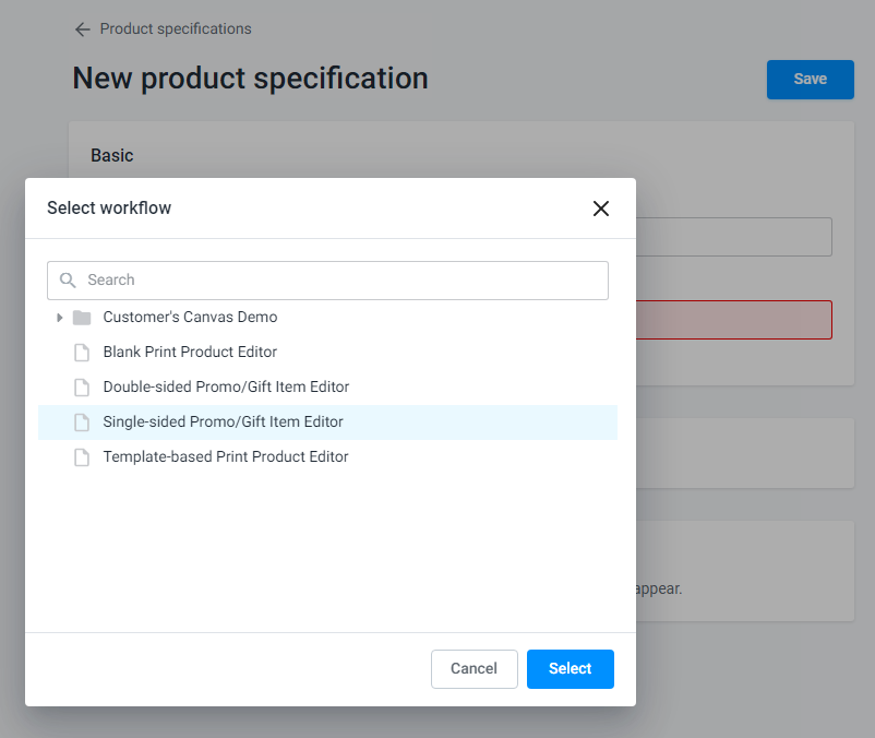
Once a workflow is selected, you will see the required attributes. You can follow the prompts to fill in the attributes.
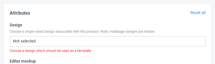
Design file
The first attribute is the product design. You must click the Design field and select a design from your assets (Design section). Usually, this attribute is mandatory.
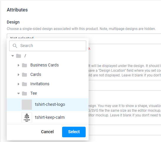
Since the selected workflow applies to single-page products, all multipage designs are hidden in the asset tree.
Note
If you don't have any designs yet, you need to create one or import one from InDesign/Photoshop, as discussed in the Designs section of the Help Center.
Mockup files
You can visualize a physical item, such as a t-shirt, mug, pen, etc., by using mockups. You already learned about managing mockups in BackOffice in the Importing mockup files article. Now let's learn how to use those mockups in product specifications.
Editor mockup
You can display a product as a background image in your editor. Click the Editor mockup field and select an image.
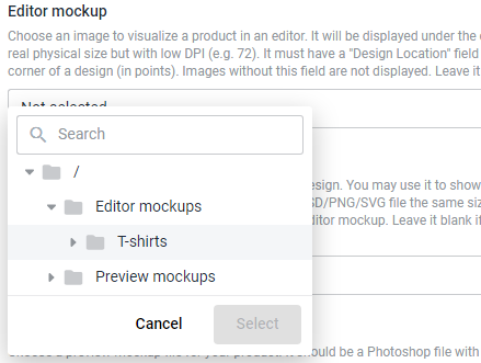
Editor mockups are usually JPEG, PSD, or PNG files of the real product size but with low DPI (e.g., 72).
Such mockups must have a Design Location field, where you define coordinates of the upper-left corner, in points, to put the design. Images without this field are not displayed for selection.
Overlay mockup
You can also add an image that will appear above the design in the editor. You may want to use it this way to display a "window" to cut the design or visualize some elements that are not printed. Overlay mockups contain transparent fragments, so these images must be in a format supporting transparency: PNG, PSD, or SVG.
Since overlay mockups must have the same size as editor mockups, you can only select an overlay from images of a similar size. If an image has the Design Location field, it will only appear if no editor mockups have been defined above.
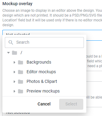
In this tree, you can see already filtered assets that are suitable for overlay mockups.
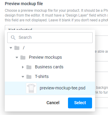
Preview mockup
A preview mockup is a Photoshop file with a smart object, which is used as a container when you need to display the personalization result. This PSD file must have a Design Layer field that specifies the smart object name, e.g., "Design". Assets without this field are not available for selection.
Asset folders
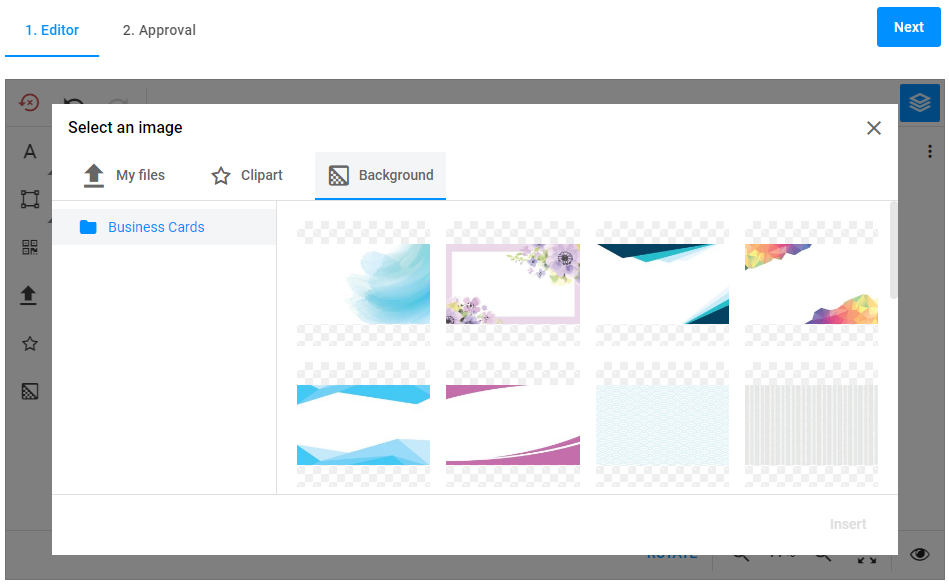
Your users must first upload their assets to the editor to add them to designs by default. You can also enable public galleries from which your users can add images. This workflow supports two galleries: the photos & clipart gallery and the gallery of backgrounds.
During the personalization process, your customers will see the following buttons:
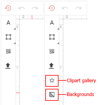
They can click one of them and choose clipart or a background like this:
If you leave one or both of these fields blank, the appropriate buttons won't be displayed in the Design Editor, so the user won't be able to choose them.
Output file settings
Target resolution
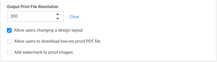
You can specify the product resolution, in DPI, in the Output Print File Resolution box. The typical resolution for commercial printing is 300 dpi, but you may want to use smaller values for larger products to improve processing time.
Enable low-res preview
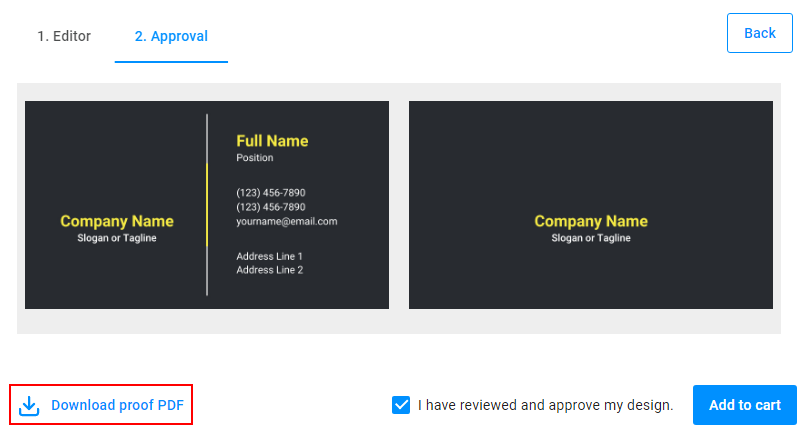
The Allow users to download low-res proof PDF file option specifies whether the Download proof PDF button should appear in the approval step. Clear it if you don't want to allow the user to download a proof PDF.
Editor mode
You may choose whether you want users to completely modify the design or only provide the content for the text fields and image placeholders. If you want them to use this simplified editing mode, clear the Allow users changing a layout checkbox. To give them complete freedom, leave it checked.

Watermarks
This workflow allows you to display watermarks on preview images. Select the checkbox Add watermark to proof images to display them in both the approval step and the downloaded PDF files.
Now, let's go further and learn how you can configure the Double-sided Promo/Gift Item Editor workflow for two-side products.