How to create designs
- Last updated on October 22, 2025
- •
- 7 minutes to read
The Simple Editor uses the same format of designs as other Customer's Canvas editors. You can prepare templates in the Template Editor or import them from Adobe Photoshop and Adobe InDesign. However, there are additional features and limitations that you need to be aware of to create designs correctly.
Creating a new document
First, let's create a new document. To define its parameters, navigate to Designs > New > Design file. When the Create new design form opens, specify the required document size and your bleed zone if needed.
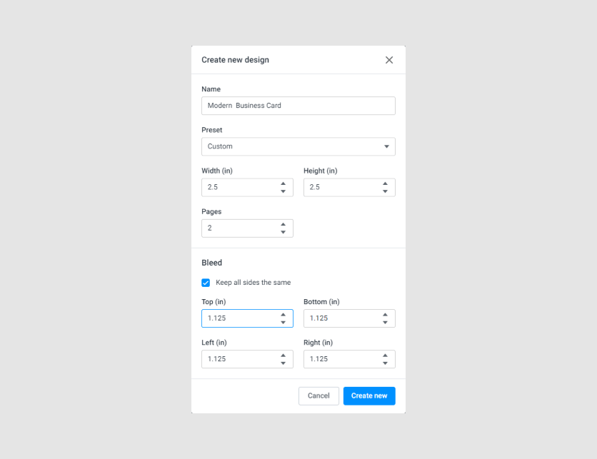
If the Preset field does not contain your product size, select Custom and define the Width and Height.
Now, let's find out where the fields of design elements come from in the Simple Editor.
Form building
The Simple Editor builds its interface from two sources:
- The currently selected design file (the current page).
- The PIM module that generates product variants.
In the following screenshot, the frame indicates the group of fields that is built based on the design.

Field names
The field names on this form are based on the names of design elements. If we open this design in the Template Editor, we can see the same names.

Note that even if an element is inside a group, the name of its "final" element is used.
When creating your designs, pay attention to the names and double-check them. Keep in mind that you probably don't want to keep the default names.
If you use non-Latin letters, make sure that the font used on the storefront supports that encoding.
Hiding fields from the panel
There are several ways to hide a design field from the fields' panel in the Simple Editor:
Using the "visibility" property
In the Behavior tab of the Template Editor, set
visibility: Hide in editor. This will hide the field in the viewer and in the fields' panel.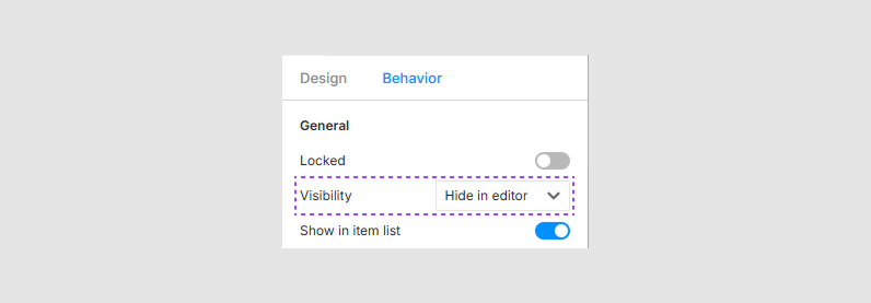
Disabling "Show in items list"
In the Behavior tab of the Template Editor, switch the Show in items list toggle to
off. This will remove the field from the fields' panel, but it will still be visible in the viewer.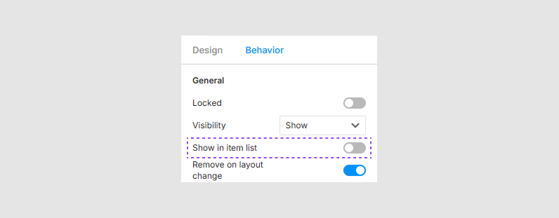
Disabling "Text > Content"
For text fields, disable the Text > Content toggle in the Behavior tab. This will prevent the design field from appearing in the fields' panel and ensure that its text will not reset when switching between designs.
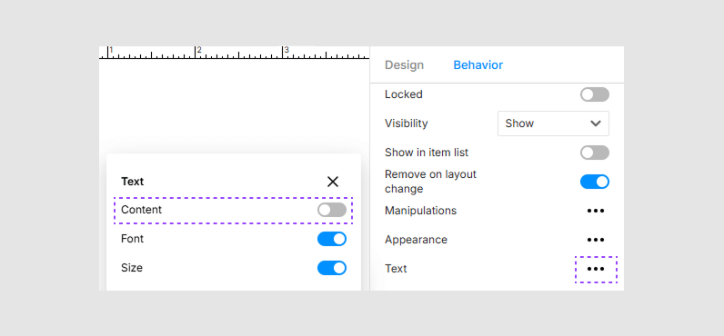
By using these properties, you can control which fields are editable or visible in the Simple Editor, preventing unwanted text resets when switching designs.
Transferring changes between designs
It is important to use the same field names across all design versions (in the same group as well as in different ones). For example, let's take the business card product and change the values of Name and Position.
Let's switch to a different design in the Simple Editor that also has the Name and Position fields.
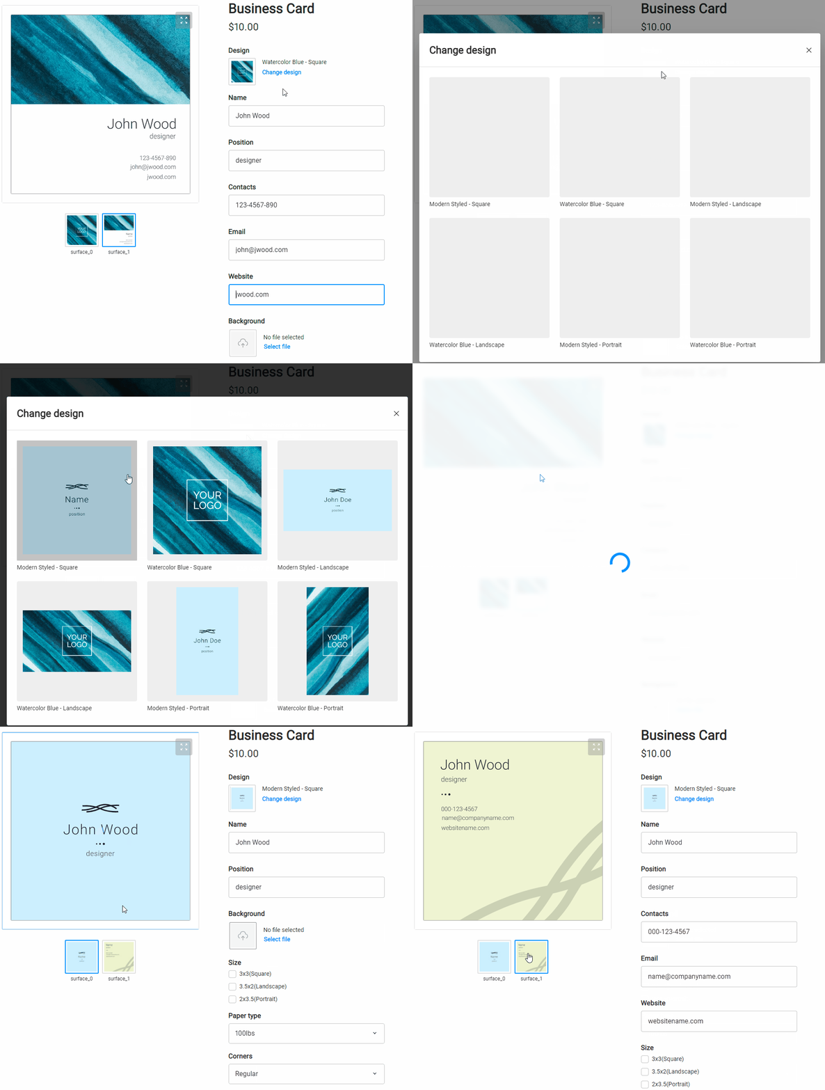
The changes that the user made before are automatically transferred to this design. However, if the fields have different names, the Simple Editor will ignore those changes and take the values from the original design. If we switch to another page of the same design, we can see that the fields with the same names have also migrated.
Note that the Email field, which was filled in the first screenshot, has been reset because this field is absent in the original design.
Adding text
After you have added a text element to your design, the Simple Editor determines whether to include it in the list of editable fields or not by using the behavior toggle Text > Content:
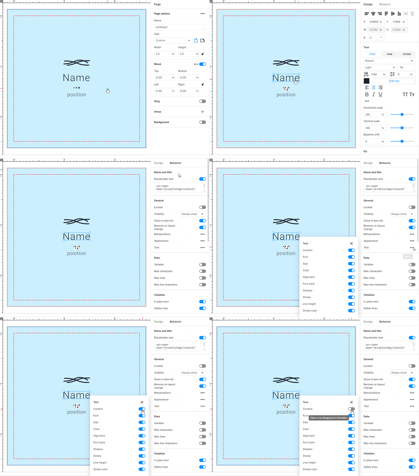
By default, this permission is enabled. To hide an element from the form, turn it off explicitly.
At the moment, markup and multiline elements are not supported. All line breaks are removed from the text, and the text formatting is reset.
The Simple Editor allows you to display a tip in a text field. To do so, in the Behavior tab for that text field, enable the Placeholder text toggle and fill in the tooltip that will be displayed when the field is empty. For more details about configuring text in the Template Editor, see the Text behavior topic.
Adding images
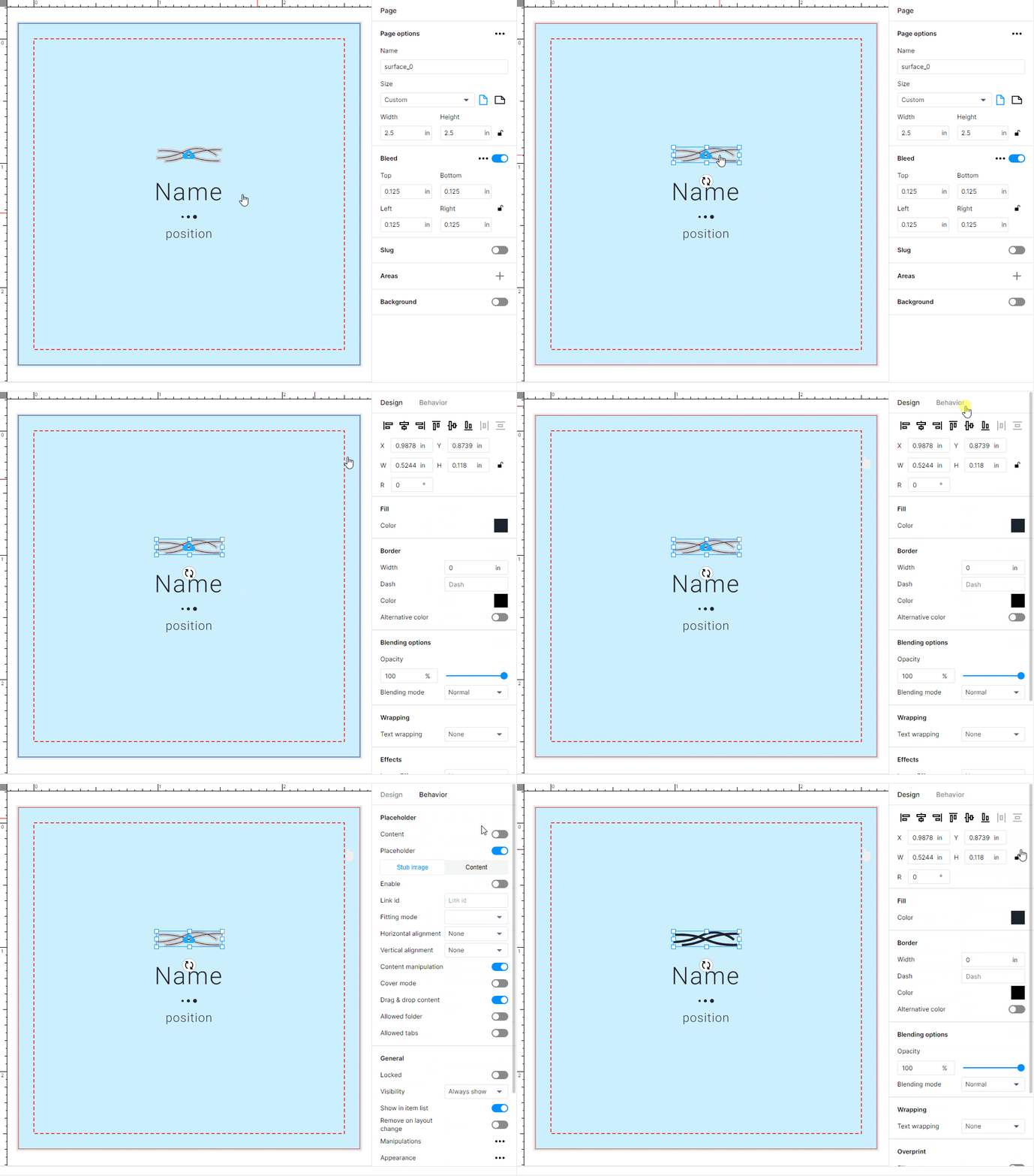
The Simple Editor excludes regular images from the form and displays image placeholders instead.
The image selector
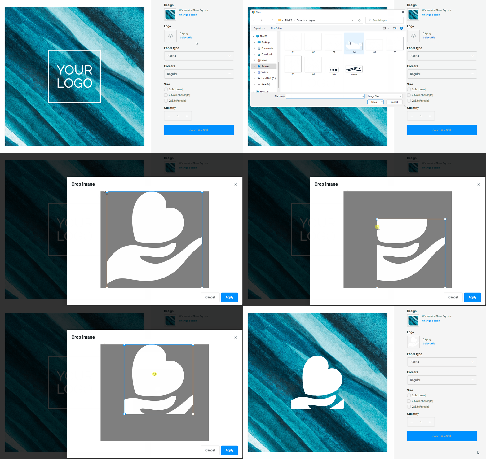
Image placeholders appear in the editor as follows:

This selector appears by default for uploading images from the user's local environment. After selecting an image, a cropping tool opens so that you can ensure that the aspect ratio of the selected image is compatible with the placeholder itself.
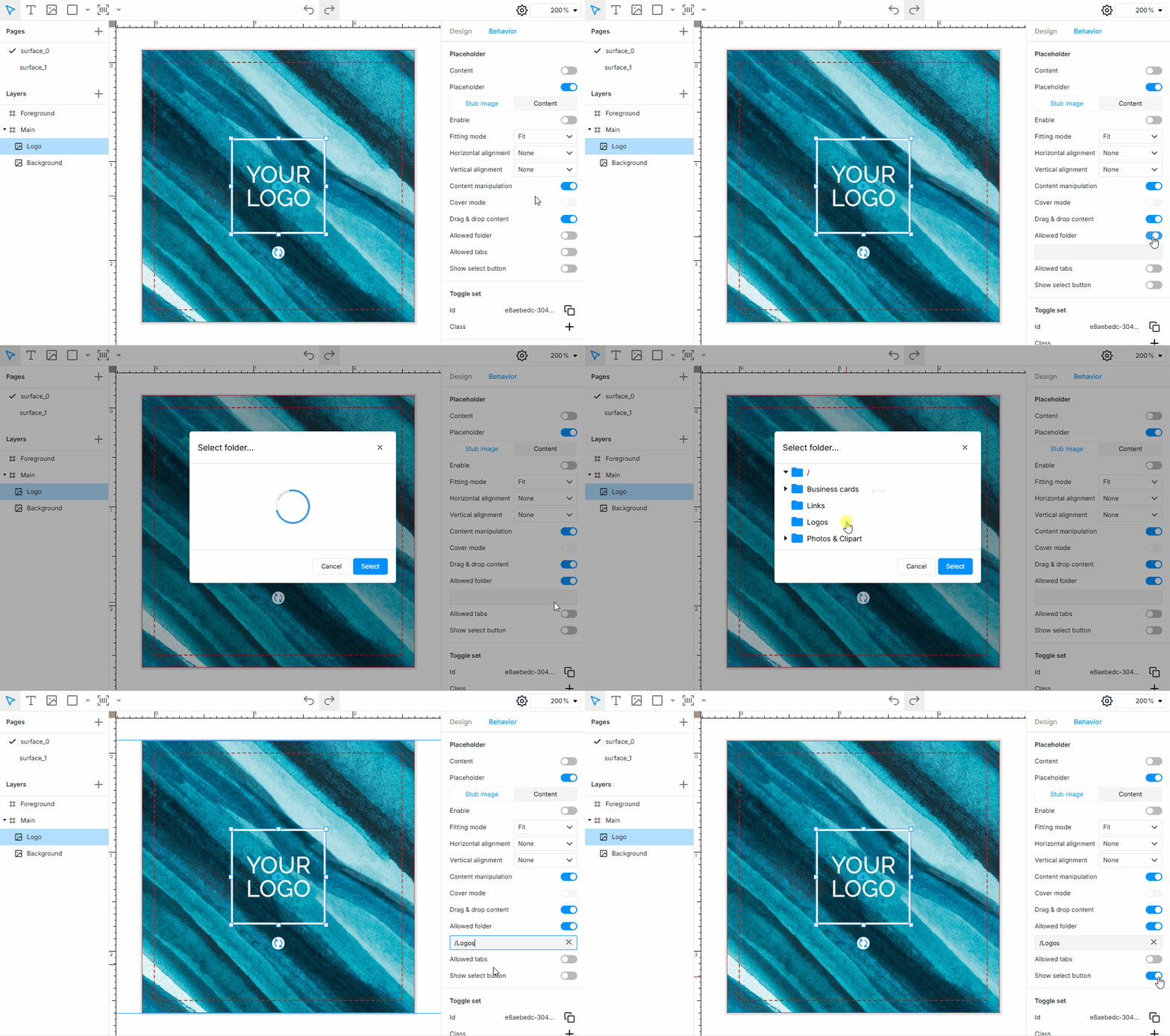
If you need to provide images only from storage in your Customer's Canvas account, open the template in the Template Editor, click the image layer, click the Behavior tab, click Allowed folder, and select one. If you need both image sources, public and private, you also need to turn on the Show select button toggle.
As a result, the image selector may look as follows:

Notice on IDML templates
When importing designs from IDML, some regular images may become image placeholders even if you did not use a <PH> marker. This happens because the IDML importer may interpret image frames as placeholders in some cases.
If you observe such an unexpected interpretation of the image, open your design in the Template Editor and turn off the Placeholder toggle.
Managing backgrounds
The background may also be recognized as a placeholder. Moreover, since the background element is present on all design pages and has the same name, you will apply it to other side as well when selecting a background for one side of a business card.
At the moment, we recommend always turning off the background. In the Template Editor, select a page in the Pages section and disable the Background toggle.
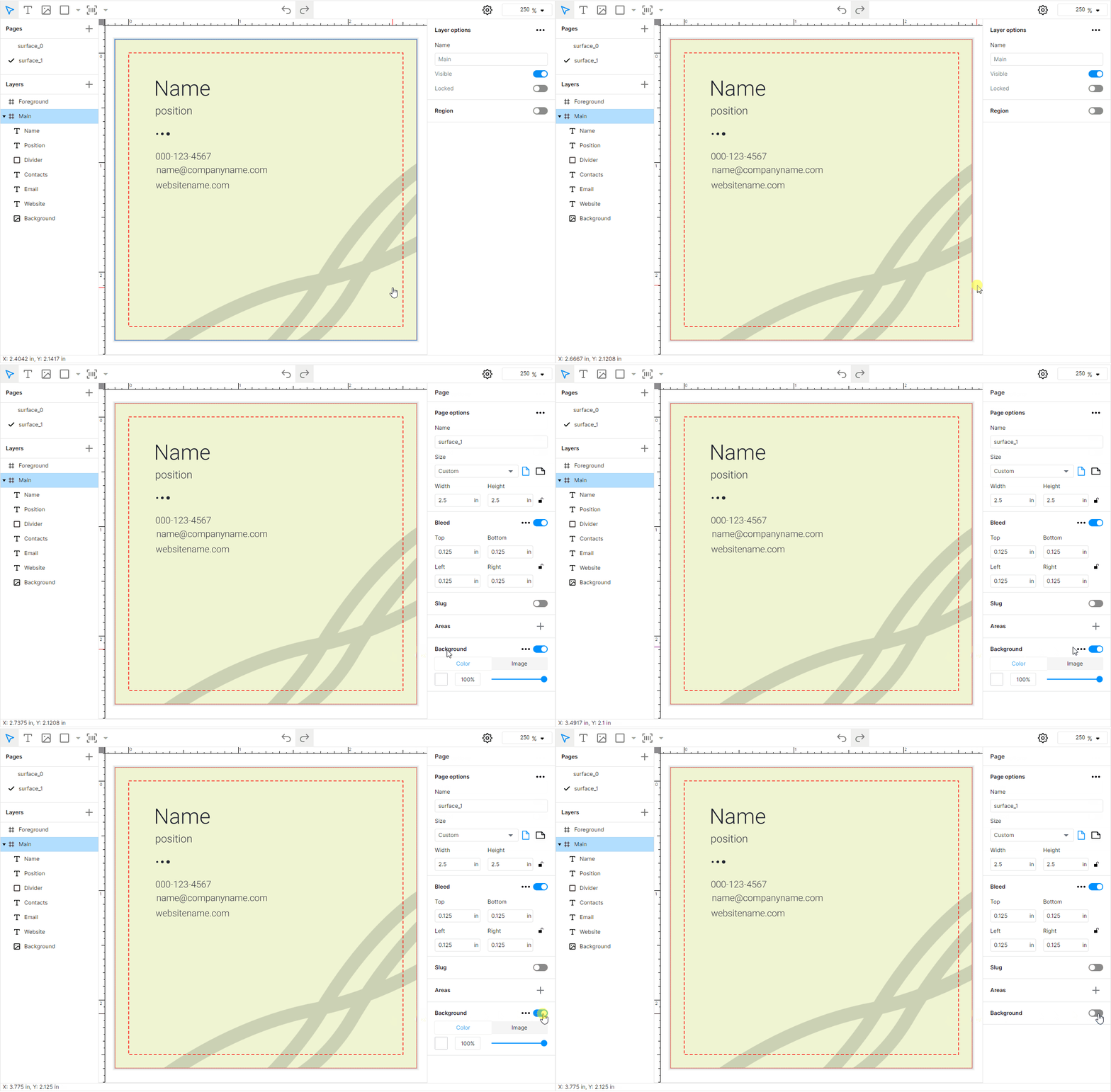
If you still require a background image, add it as a regular image to the lowest element in the Main layer and ensure that it is not a placeholder.
For more details about configuring image placeholders in the Template Editor, see the Image placeholder behavior topic.
Alternative designs
If a product variant has multiple designs available, the Design selector will appear in the form. This selector is based on products created in the PIM module in accordance with the current options. To learn how to set up product variants, refer to the PIM Module section.
The name of the design corresponds to the file name in the asset manager. The thumbnail is generated from the design itself, without any mockups.
Designs for product options
Let's see what happens when changing the values of options. Consider a standard business card product with the Modern and Watercolor designs. We also have a Size option that specifies the vertical, horizontal, and square versions of the design.
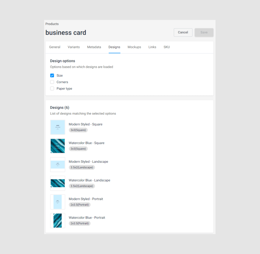
Although it may appear that we have two designs visually, in practice, we have six design files - the number of designs multiplied by the number of Size values. For example, if we remove the square version for Watercolor, selecting the Square Size option will give us only Modern.
Arranging designs
Another problem may arise. For example, we first selected Watercolor in the Horizontal version. Then, we change it to Square. Most likely, you expect that Watercolor will be displayed. However, to do this, the system must determine that this is actually the same design.
This is done by using the concept of design groups, which combines a group of design files into a single entity. Currently, to achieve this, you need to put all the files that belong to the same design in one folder.
For example, this is how the designs of our product are organized.
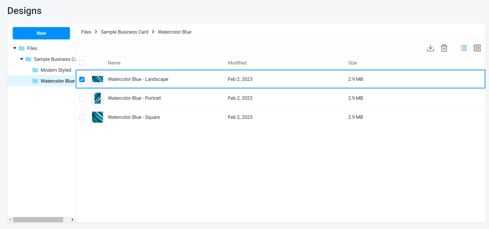
Therefore, the recommended arrangement of designs is as follows:
{Product_name}/{Design_name}/{design_name}_{option_value 1}_..._{option_value 1}.st
The name of the design in the design file allows you to see it in the design selector.
The options that form the options, of course, must influence the design.
It is desirable to specify the value of the options to understand where which file is. This will also allow you to automate assigning the options when adding them to the product.
In the example above, we separated the components of the name with a dash (
_), but you can use any name structure that is consistent throughout the tenant.It is quite acceptable to have a deeper hierarchy, for example, to include product categories, etc. The main concept is that the "leaf" folders contain design files related to one "actual" design.
{Category}/{Product_name}/{Design_name}/{design_name}_{option_value 1}_..._{option_value 1}.st