Auto layouts
- 7 minutes to read
When you are preparing templates, you may quite often face the task of creating a single block consisting of several elements.
Some examples are:
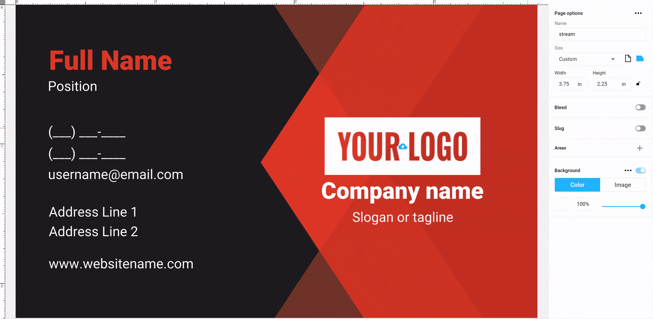
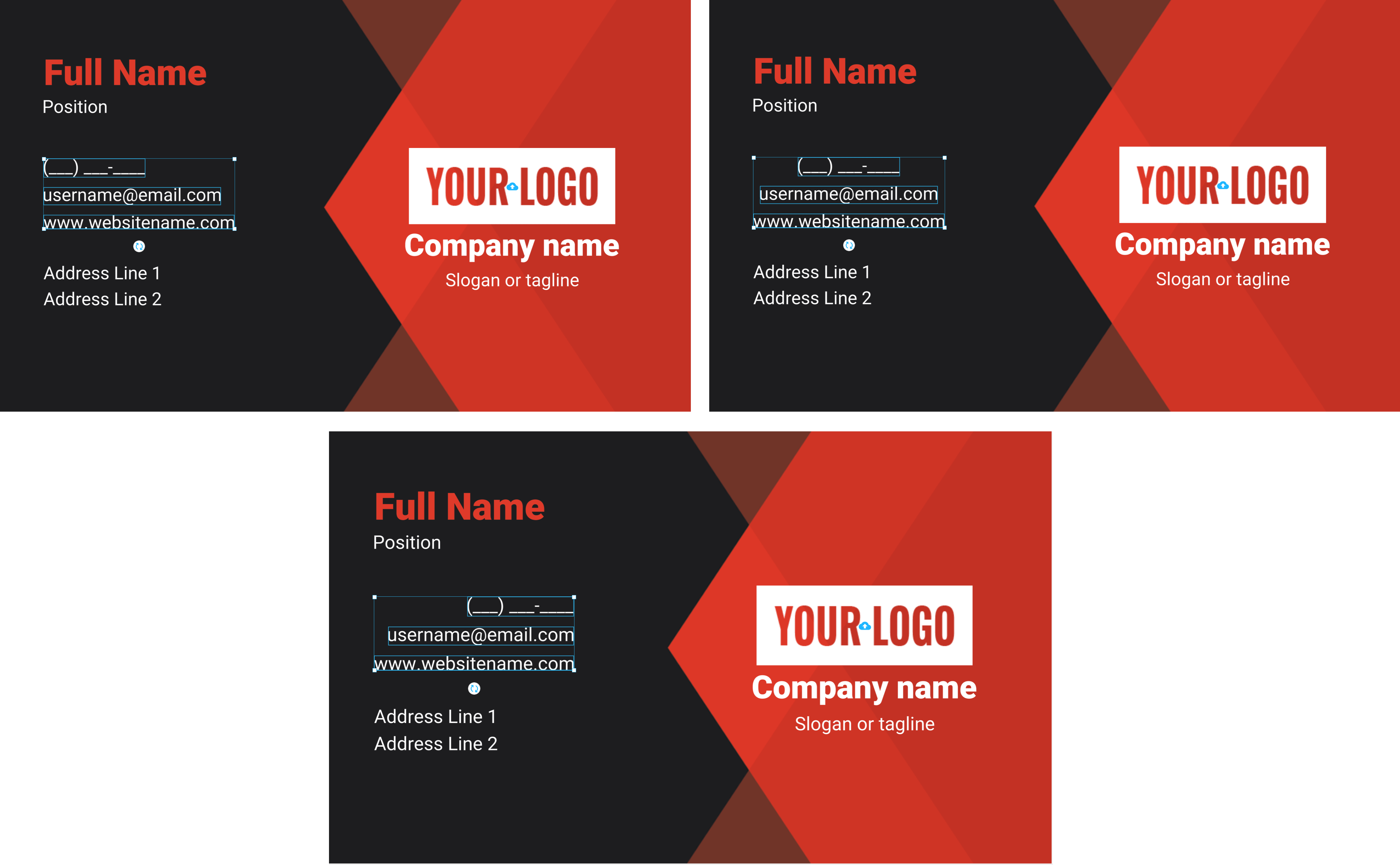
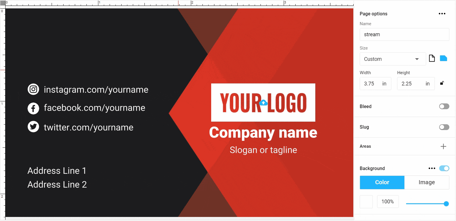
- Address block consisting of Address Line 1, Address Line 2, City, ZIP, State.
- Contact information block: Work phone, Cell phone, Email.
- Social links block: Instagram, Facebook, Twitter.
- Text block: Title, Lead-text, Text block.
- And many other examples of similar blocks.
Such blocks do not create problems when you make them for specific clients or when you know exactly what will be in these blocks. However, the end-user can omit some of the data, for example, specify only the Work phone or Email. In this case, a space appears in place of the data not entered, which has to be adjusted manually. Another example is when entering an address, the city name will crawl over the zip code if it is too long.
To solve these problems, you should use the Auto Layout, as described in this article.
Tip
For a better understanding, we also recommend reading the description of Auto Layout in the Design Anatomy section.
Creating the Auto Layout
The auto layout is created in several stages.
You need to place several elements, for example, point text under each other (for a vertical auto layout) or in one row (for a horizontal auto layout). Try to arrange the elements evenly, at the same distance from each other.

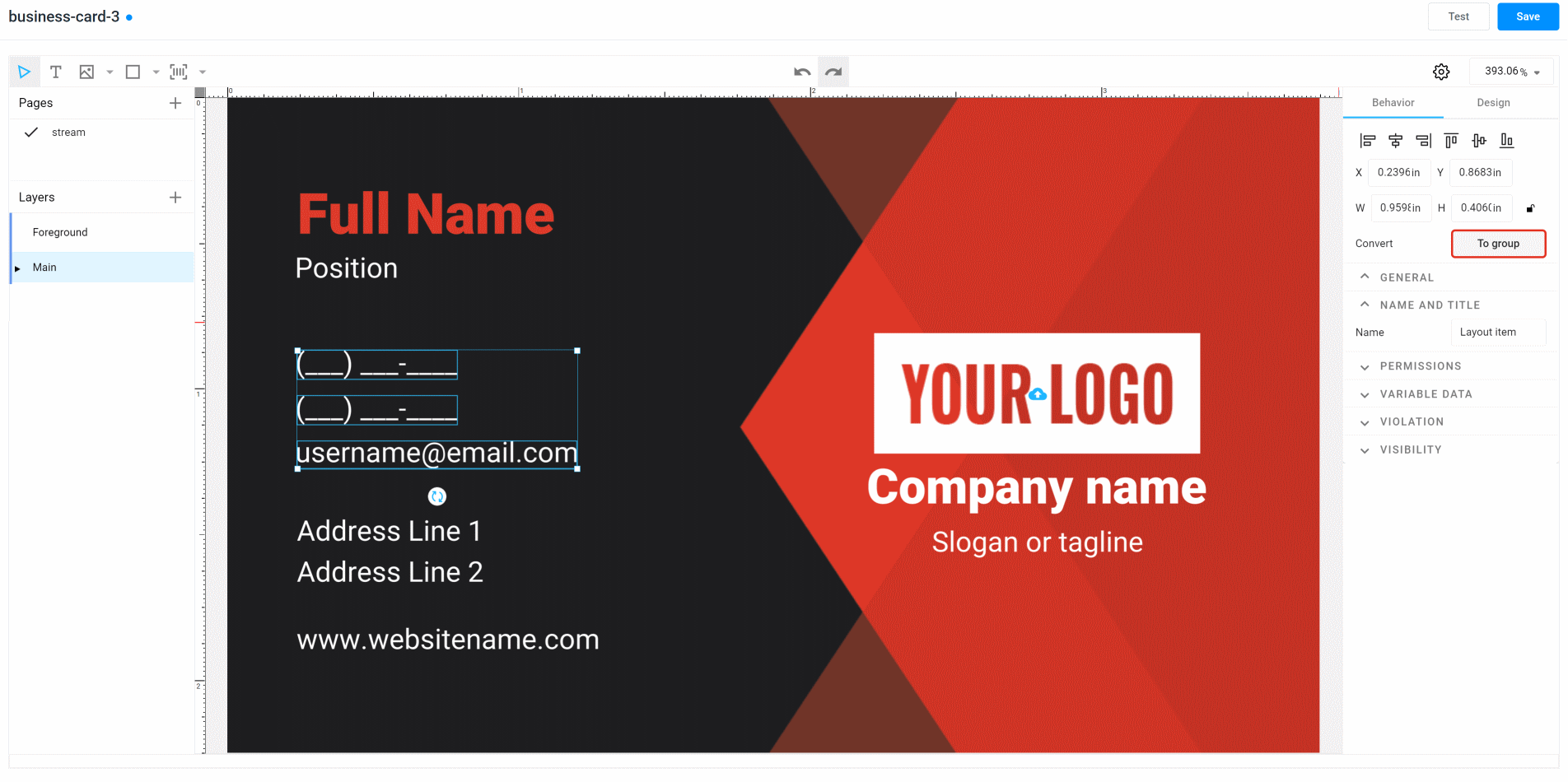
Select and group them by right-clicking and choosing Group Selection or by pressing
Ctrl+G.In the right toolbar, click Convert to Layout.
At that moment, our group of elements will become the auto layout. The editor will automatically try to determine the orientation and the auto-layout properties, such as orientation, alignment, margin. That is why it is important to arrange the elements correctly. If this is not done carefully enough, the algorithm may incorrectly understand what values you have set and choose the wrong orientation or alignment type.
You can fix this by changing the auto-layout properties, as described below. However, it is better to correctly arrange the elements where you want them beforehand.
Important
Another thing that you should remember when creating auto layouts is to set the correct names for the elements. This will allow the end-user to understand which element they are working with. Refer to the article about manipulating elements to learn how to set names.
Canceling the Auto Layout behavior
If you want to turn the auto layout back into the original group, click To Group in the properties panel.
If you want to completely ungroup the auto-layout elements and make them independent, first click To Group, and then ungroup the auto-layout group by right-clicking or using the keyboard (see hotkeys).
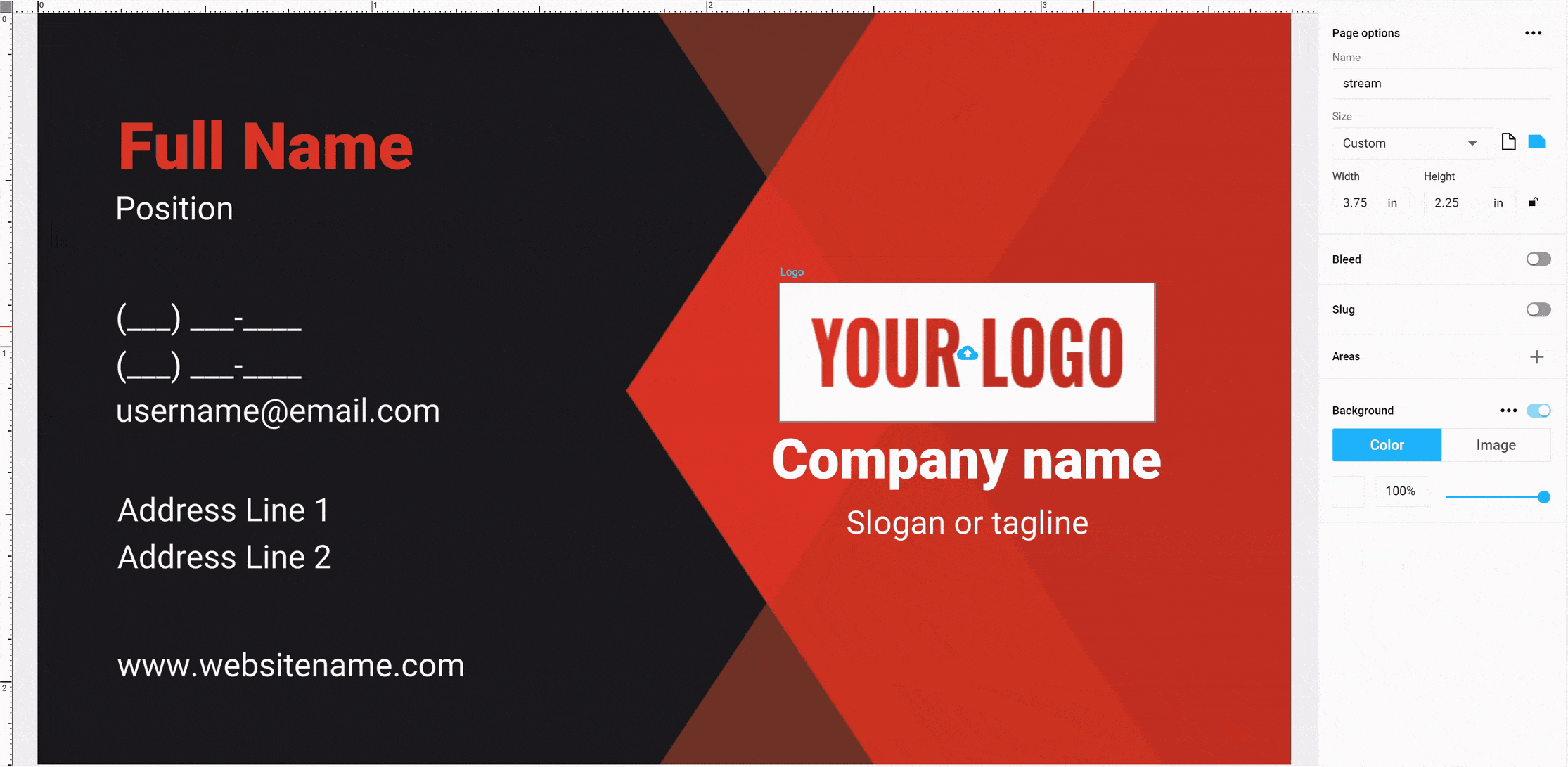
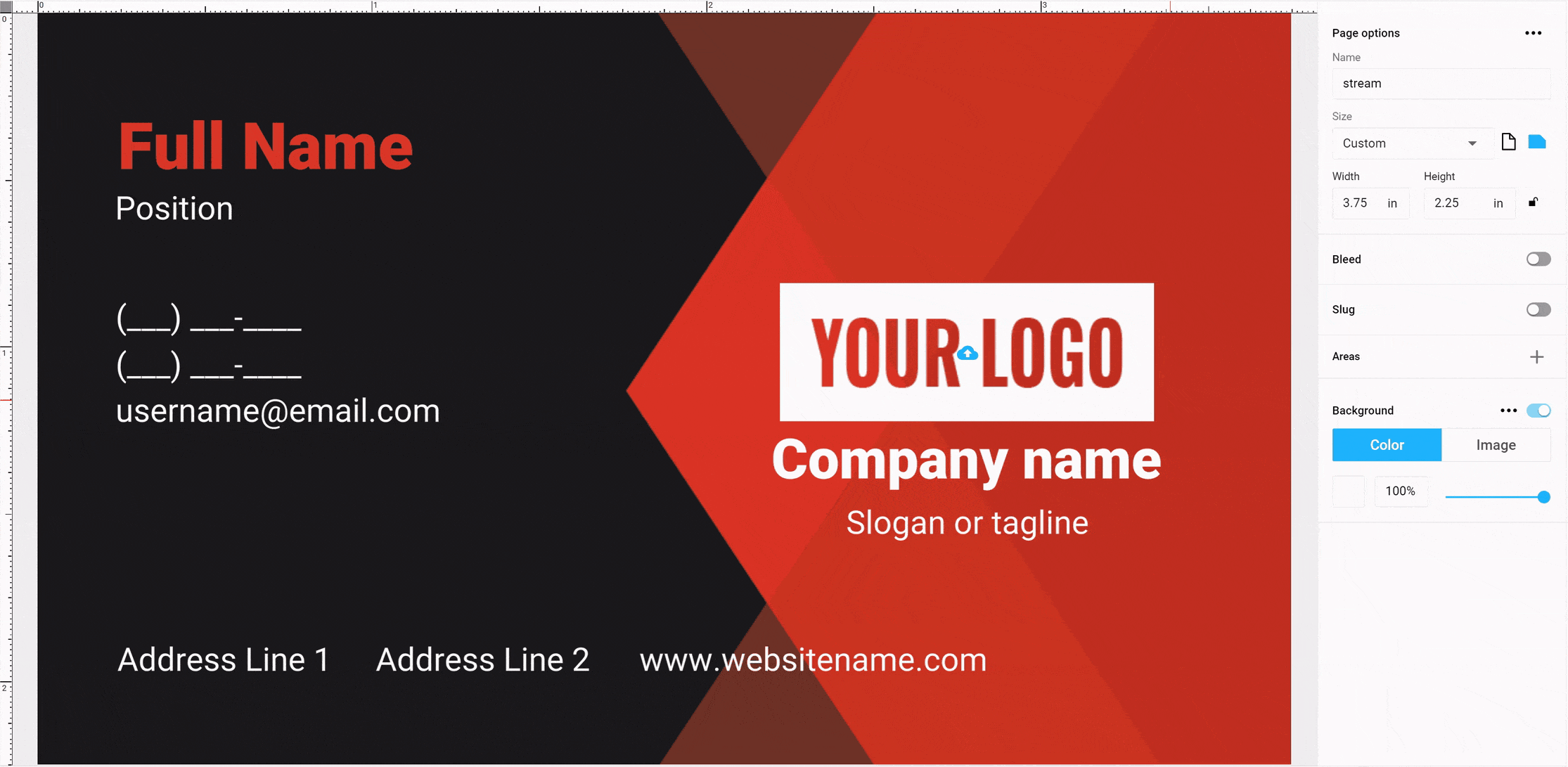
The Auto-Layout properties
When a group is converted into the auto layout, its elements can no longer be in arbitrary positions. Their position is automatically calculated based on the following properties. These properties are located on the Design -> Layout Settings tab.

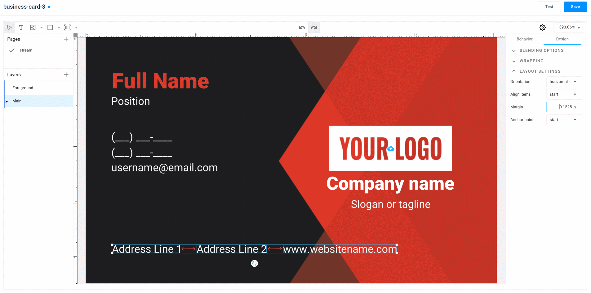
If you don't see the layout properties, it means that you haven't selected the layout object itself, but its nested element. Visually, this can be understood if you see that the layout borders are displayed as a dash line, and the borders of one of the elements are displayed as a solid line, like in the image below:

To select the entire auto layout, either click on a space inside the group (for example, between elements), or deselect and select the object again.
Let's go back to the layout settings.
You will see the following 4 properties:
- Orientation
- Align items
- Margin
- Anchor point
To make it easier to understand how they work, let's consider two cases: vertical auto layouts and horizontal ones.
The Vertical Auto Layout
If you set the auto-layout value to vertical, the objects will begin to line up under each other in a single column.
The distance between the elements will be set by the Margin property. This property is the same for all auto-layout elements.

Tip
If there is a need to have blocks in which the distance between various elements differs, you can use nested auto-layouts, as described below.
Use the Align items property when you need to set up the alignment relative to the necessary edge. The left edge of the element is considered to be the start, and the right edge is considered to be the end. You can also set none if you want the auto layout to not follow the alignment.
The Anchor Point property determines what will happen when the height of the group begins to change. For example, a row is added or removed, or the entire object disappears. Using this property, we fix the part of the object that should remain stationary.
For example, by setting the start value, we fix the upper part of the auto layout. By increasing the height of the elements, we shift only the lower edge.
For the center value, we fix the middle of the group, and both the upper and lower edges are shifted by the same distance.

Finally, for the end value, we fix the lower edge. Thus, when the height increases or decreases, only the position of the upper part changes.

The Horizontal Auto Layout
If the orientation value is horizontal, then all the elements are lined up in one row. The operation is identical to vertical alignment. The Margin is also responsible for the distance between objects, but horizontally.
The elements are aligned according to the same logic, but the upper border of the objects is considered the start, and the lower one is considered the end.
The *anchor8 also works similarly. But for horizontal layout, the starting point is the left edge, and the end point is the right edge.
Start anchor point for the group.

Center anchor point for the group.
End anchor point for the group.

Nested Auto Layouts
The group elements that include the auto layout can include not only text elements but also elements of other types, including other auto layouts. This allows you to build layouts of any complexity.
Let's look at how you can create a block that combines a horizontal and vertical layout. For example, we will create a block of personal information about an employee on a business card and add the following data:
First name Last name
Position
In this example, we want to make a vertical auto-layout group of two elements, one for each row. The first line itself is a horizontal layout. Since First name and Last name are separate elements, using this approach, we can easily apply different styles for each of them, for example, use a bold font for Last name.
Let's perform all the necessary actions:
- Create 3 text elements. Give them names like First name, Last name, Position, and set the style and the correct sample text.
- Place them as you want to see them in the editor.
- Select the First name and Last name elements. Group them, then turn it into an auto layout. Make sure that the orientation is horizontal and that the Margin corresponds to the space with which you want to divide the elements.
- Select a new group and Position, then turn it into an auto layout. Make sure that it has a vertical orientation and that the Margin corresponds to the distance between the lines.
As a result, we now have a block in which you can change the elements. The position of neighboring elements will adjust.

Dependent elements
Let's look at another case in which we create an auto-layout group for contacts in a social network. As a rule, it looks like several text objects with an icon.
In this case, you can expect that when the end-user decides to skip, for example, an Instagram address, the text will be hidden along with the icon. Auto layouts in Customer's Canvas are smart enough to do this automatically. If you combine Text and a Shape image into one auto layout, it will automatically hide the entire auto layout if the text element is empty.
To do so, you need to combine the icon with the text into the horizontal auto layout, then combine several of these auto layouts into a single block.
Let's go further and learn how to set up item behavior.